Right! I upldoaded the wrong png!
I treated Gal Gadot’s name properly!
I’m moving this to the student section since it’s a student project.
I don’t think you’ve paid that much attention to what’s been written because you’re struggling with the same mistakes and seem reluctant to change what isn’t working.
Conceptually, you have a decent idea, but you’re going around in circles trying to dress it up in slightly different clothes to decorate your way out of it. Your newest two ideas contain the same problems as they first, while adding a few more.
I’m not saying what you’ve designed is bad for student work. It isn’t. I’m saying you’re stuck and trying to plow forward through the mud instead of backing up and driving around it.
I sincerely doubt you’ve looked into anything said to you seriously.
Step away from the computer.
Draw the poster by hand 20 different ways.
Then come back to the computer with 3 of the best out of the 20.
Thank you for your answers.
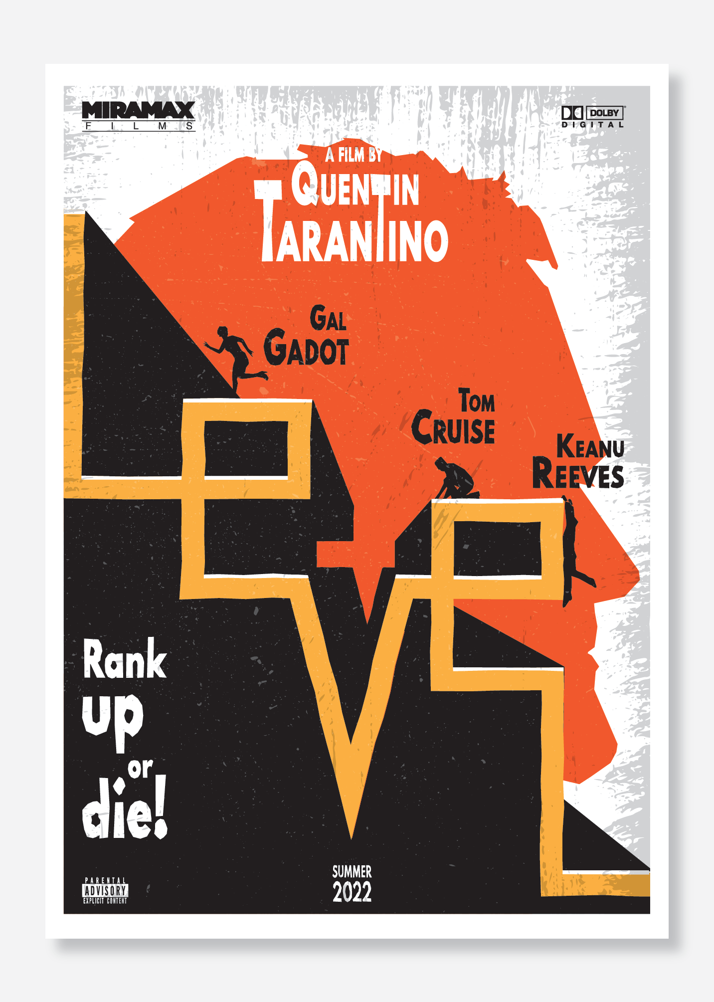
Are you suggesting to abandon the whole idea of the continuous line shaping the word LEVEL with the actors climbing on it?
As a student I don’t have the experience to understand my mistakes and I think I will stuck permanently.
I can only fathom some of my mistakes as
-Tarantino’s name is too complicated
- Actor’s names shoud me more prominent and not above of the heads of the figures
-Is there a rule for production company placement as well as parental advisory and dolby digital?
-Maybe I should scale down the LEVEL shape to be more easily readable as movie title
-Tarantino’s name looks like movie’s title
Stretching the font was in purpose ,although I know it is a red flag for design, trying to mimic tarantino style of being eccentric.
The fact that, when finished that poster I thought it was good, makes me anxious and very sceptical about me as a designer.
Not at all.
Part of the process is exploration of what is possible.
We don’t think you’ve explored enough.
That’s why we are suggesting that you delve deeper into what you can achieve.
This is not about us telling you what’s good and bad, what works and doesn’t work.
This is about you growing as a designer.
We cannot do the work for you.
But certainly have not seen enough to warrant better designs submitted.
It’s all the same. Unleash what is beneath. Go BOLD or go home!
You have what it takes - YOU CAN DO IT!
As an experienced designer 25 years in the business I am still making mistakes.
Welcome to the wonderful world of design!
You’ve listed quite a few - work on them! Show us what YOU can do!
Have you seen this anywhere else? Why focus on this element rather than the glaring obvious! The MOVIE - focus on the MOVIE!
In all his movie posters he is lesser ‘levels’ than the other actors - his text treatment is on par with the mood of the poster.
This is me every single day.
Dig deep. It’s tough at first.
But again, we can’t design the poster for you.
You’ve picked up on the points - and seem willing to improve.
Go forth, improve the poster.
But don’t just change a background, or a colour.
Make it better.
Come up with 20 similar concepts of the same Levels you have already.
On pencil and paper.
Again, pick your top 3.
Then design them on the computer.
Your work is good - the execution I believe is being hindered by sitting at the computer and messing around with what you have.
Take a drawing pad or an A4 pad or whatever you have. Go for a walk in a park or somewhere local.
Sit on a bench. And fill that pad with ideas.
Trust me. This process gets easier as time goes on.
You’ll soon reduce the amount of time it takes to build the concepts.
But at the moment you’re not there just yet. You’re learning.
And this is part of the learning process.
Good luck. And I look forward to the next itterations.
Thanks for your motivating and kind words!
I will try to work on this poster.
Too bad my graphic design teacher only compliments me, I believe they’re trying to keep me happy to get my money, haha!
That’s why I’m coming here. For honest critique.
I tend to focus more on “looking good” rather than to be functional as a visual design. And graphic design is all about the latter.
Really thank you for sharing your experience and spending your time with me.
One of the greatest slogans I ever saw was for a company selling window blinds.
Their company van was emblazoned with the slogan
‘We’ve upped our standards, now up yours!’
…in our country saying ‘up yours’ is the verbal meaning of giving the middle finger.
1 Like
Others have offered great feedback. My other small bit of advice is if you continue with this general design, why have you placed the actor names near the silhouettes? Especially since the silhouettes are pretty generic. Most posters, the actors names are not used as “labels” next to the actors. Instead they are used (if at all) to highlight the stars in the movie.
Thanks for your reply!
Ι can see your point.
But that’s just my personal approach on the poster, to make it like “comic” style, labeling the figures.
Does it harm the visual design?
Do I break some rule by making that?
Totally off subject, but when I worked at a newspaper years ago, the paper managed to increase its circulation by several thousand people over a couple of month’s time. Unbeknownst to us, the publisher put a half-page ad in the paper bragging about it.
The ad showed the publisher smiling using both hands in a big thumbs-up gesture. In huge words above the ad, it read, “We’ve upped our circulation, now up yours.”
When confronted, he said it meant, get your blood (circulation) pumping each morning by reading the newspaper. He seemed to have no clue that “up yours” meant something entirely different — especially with both thumbs in the air. I can say this now because I no longer work there, but the guy was a complete idiot.
1 Like
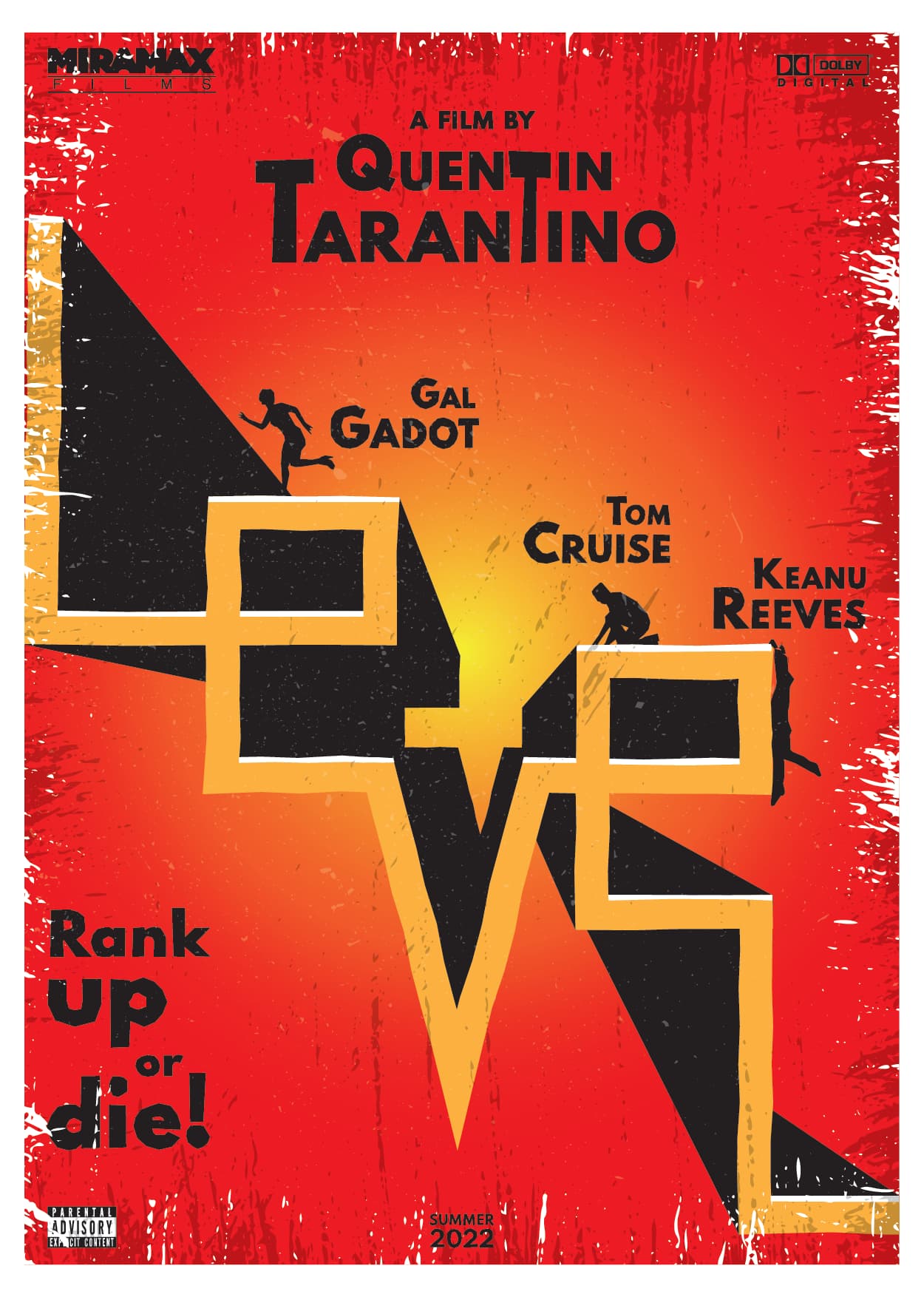
Trying to fix the original layout I did some changes that i mentioned before.
At least the title is more obvious now, that’s for sure
This is better, you may be relying on the rough edges gimmick a little too heavy but this may be the strongest example yet.
1 Like
You’re a student. You’re not supposed to be a great designer yet. Otherwise, there would be no reason for you to attend school. No one would be spending time here on someone who didn’t show talent and promise. You’re right where you should be, and your work shows it. Your instructor has every reason to say the work is good because you’re displaying both creativity and making aesthetic judgments of the sort that are part of the learning process.
Putting into words what I might do differently or making suggestions about this or that isn’t easy. Sometimes, it’s necessary to show what the alternatives are. I had about 40 minutes this evening to play around with this, so I took your idea and worked it into something that I might do if this were an actual job for a client. Unfortunately, it’s against forum rules to show it here.
Basically, though, I think you’re not paying enough attention to negative space. Your background seems like just that — a background onto which you’ve arranged the other elements.
I don’t think the distressed grunge thing works. It’s a valid technique (sometimes), but I think you’re using it as a decorative device to disguise underlying weaknesses in the composition.
I mentioned this before, but the logotype is difficult to read. There are ways to fix this without destroying your idea, but again, I can’t really show you here.
Distorting type is fine when it serves a purpose, looks good, and is central to the idea behind the work. However, you’ve used it as sort of a gimmick to dress up your design.
I don’t think the little silhouettes are necessary nor do I think they’re working. The type and the arrangement of the letter say levels. You don’t need miniature figures climbing up the cliffs.
I’m not really liking the “Rank up or die” tagline either, but that might just be me.
However, your basic idea of the logotype communicating what the word spells out is really a pretty good idea — you just don’t know quite what to do with your good idea (yet).
Thank you for your time, again!
It is true that there is a lot of negative space which I try to camouflage it with the side grunge texture.
I will try to make the title more legible without giving up the original idea.
I think that scaling down helped somehow.
let me explain my approach to the poster.
First of all I made a quick scenario about the movie.
Well, my scenario is : An eccentric billionaire (performed by Tarantino himself) who runs a multinational company, chooses a dozen his most ambitious and greedy employees and offer a huge money prize to whoever win a twisted “ranking game”
The movie will be dark, mystery, suspense with some comedy elements , set up in late 70’s
The suit dressed figures, give a hint of employees in multinational company, that’s why i chose them.
Im not fan either of the Rank up or Die tagline, but let’s say it is what I was given.
At this level of skill and knowledge, all i want to know is how to avoid mistakes regarding fundamental graphic design principles and rules.
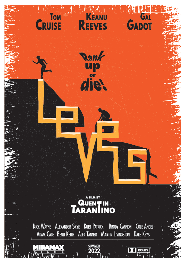
Do you think my last poster is a step to the right direction?
It’s getting closer to the wheelhouse.
Why are the names right aligned? Looks and reads awkwardly.
I don’t like the treatment to the text Rank Up or Die.
But it’s getting there.
Would you do a version - for kicks and giggles - without the grunge?
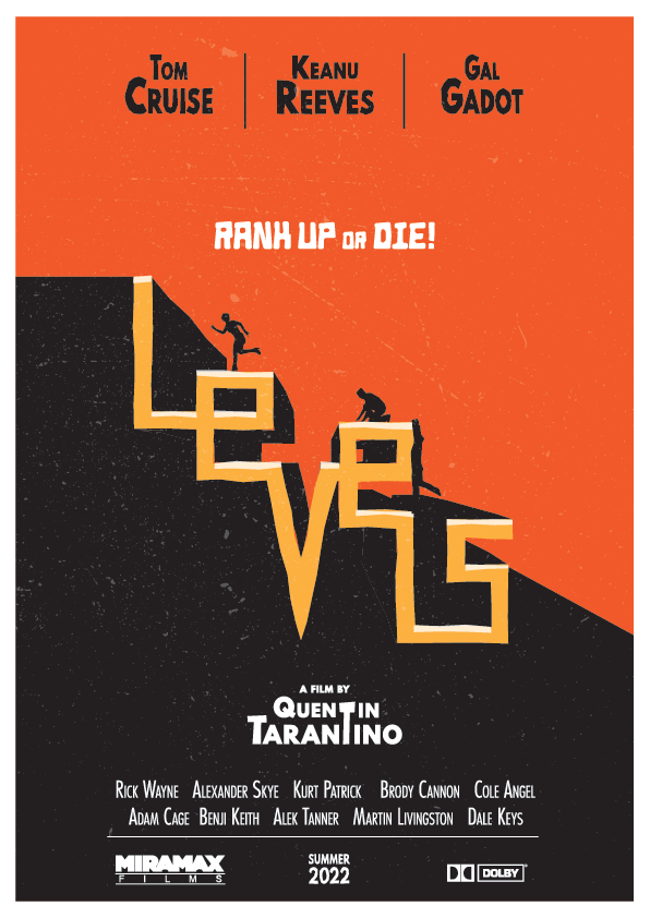
Here it is.
I also aligned names and surnames to center and changed the tagline style (not a keen fan of the font, though)
You don’t need to use so many fonts.
You’re losing style.
This really looks like a race to the top of some sort of levels tournament.
How they Rank Up is not clear - and how they die is not clear.
But does it need to show that?
Perhaps some terror within the poster would highlight the risk and rewards.
I guess what I’m saying is the movie poster is distracting from the fonts in use.
Pear it down even further.
Simplify.
Focus on the movie element.
How you can you show us in the imagery what the movie is about.
At the moment - if you take away ‘Rank Up or Die’ what does the movie say to you as to what it is about?
“Rank Up or Die” is superfluous, mostly because I see the intent after this many iterations. For the first-time onlooker, its place in the reading-order hierarchy might as well make it the movie title.
At best (that is, if it added value), it’s a tagline, and should not be read prior to the title. You’re making a focal point of a rather mediocre tagline idea that Tarantino’s publicity team would have scrapped on day one.