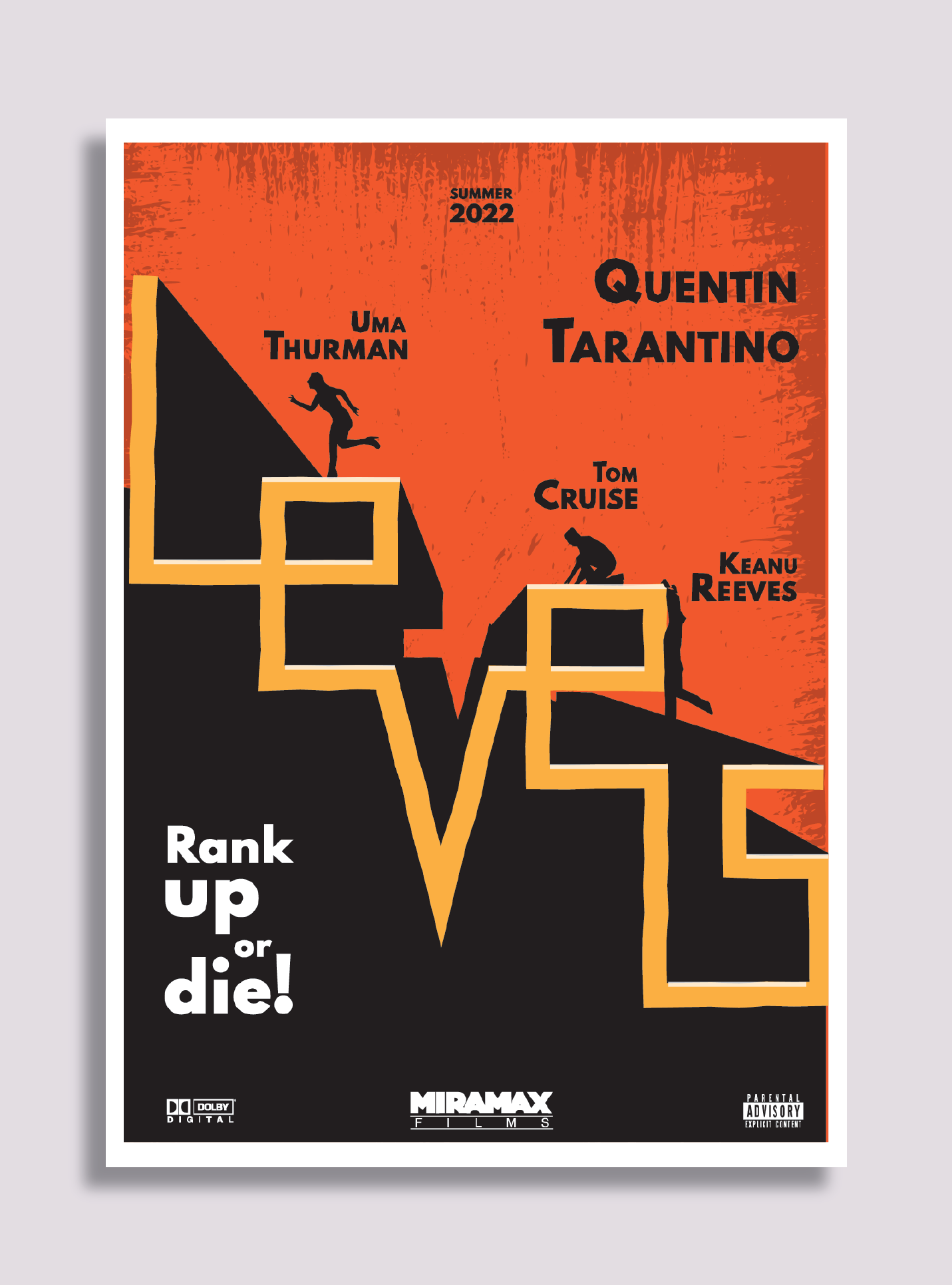
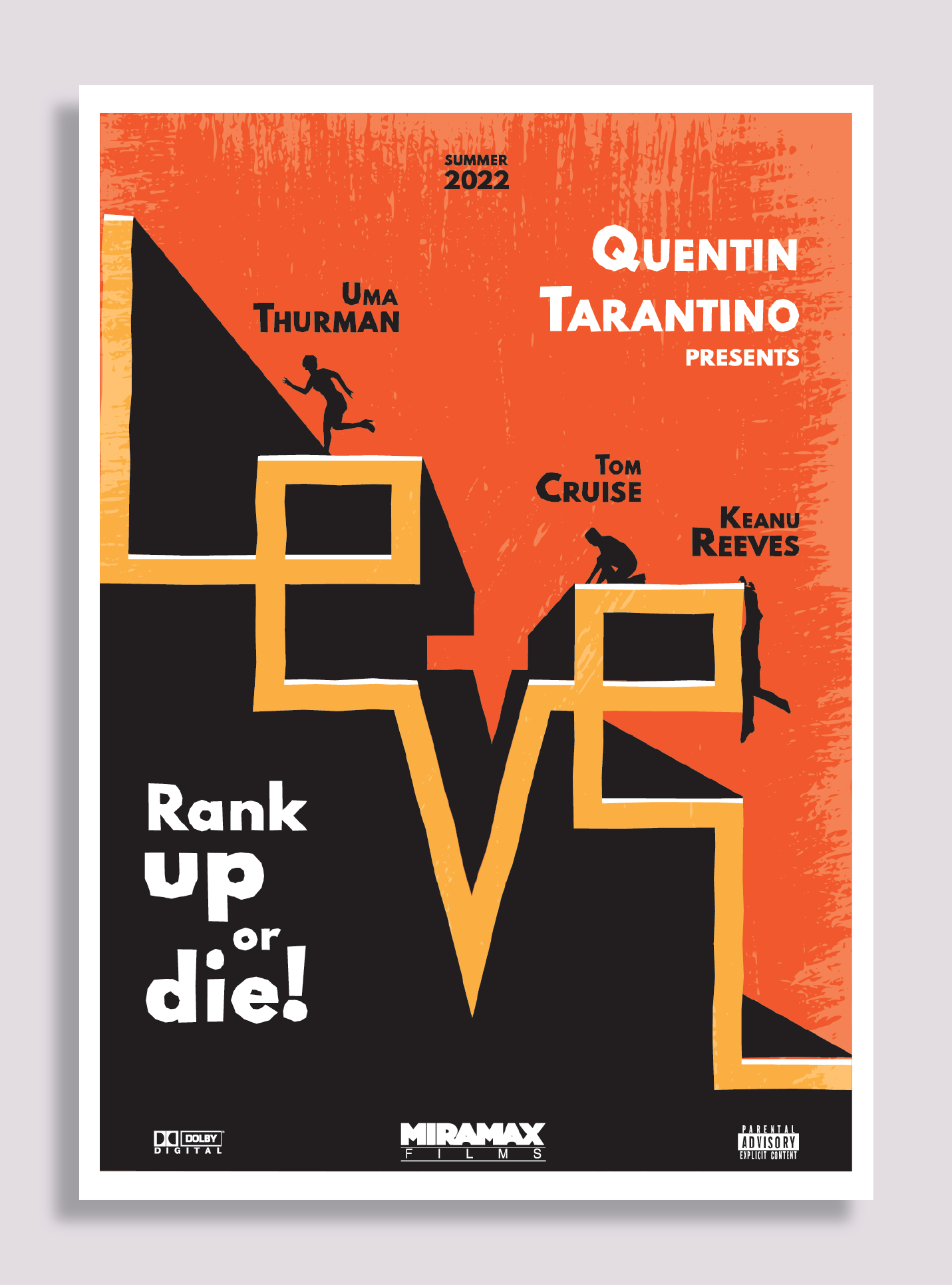
Hello again! I made a movie poster for an imaginary movie for a graphic design school project.
Any suggestions?
… and the name of the film is?
1 Like
It’s LEVELS
The poster has a nice look, but I couldn’t read the title either.
In addition, contractual arrangements with all the parties involved dictate the information hierarchy and positioning in movie and theater posters.
For example, Tom Cruise would likely insist on top billing for the movie. His contract would likely stipulate that his name appear first and in larger type than everyone else’s. His name probably wouldn’t appear beneath Uma Thurman’s.
If you look at an actual movie poster, you’ll see all the fine print at the bottom. It’s there for various legal reasons to give credit to people in whatever way is negotiated between the lawyers, agents, production companies, unions, and everyone else involved in making the movie.
My point is that making a movie poster look good is important, but looks take a back seat to all the legal stuff that must be incorporated in whatever way the contracts stipulate. In an imaginary poster, you can ignore all this kind of thing and design the poster any way you’d like. This is fine, but if you’re aiming for realism, I’d at least attempt to incorporate some of these must-have elements into the poster.
Thank you so much for these golden information.
Can you suggest any site to learn more about all these stuff I should add to a professional poster?
Finally, is the large scale that makes the title illegible?
To be honest, names were put randomly.
Any other suggestions/critique design-wise?
Thank you again.
I can’t suggest a site, but I have a couple of local theater companies as clients that put on various plays licensed from production companies. When I design their posters, I need to wade through all the legal requirements first.
Here’s the relevant part of the contract from the last one I designed that pertains to design of posters, ads, playbills, etc. Every play’s requirements are different, but there’s always some variation of the following. The same is true for movie posters.
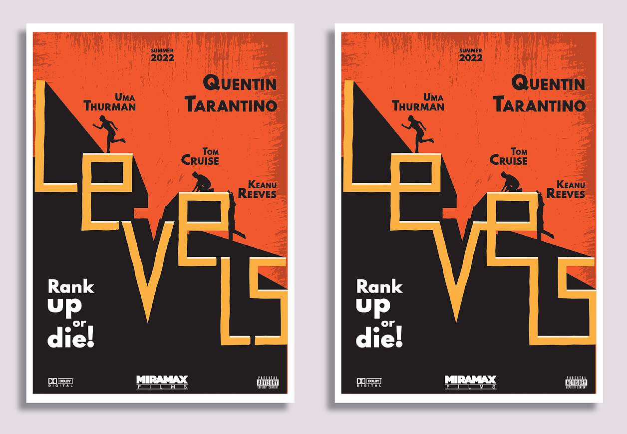
It might be easier to show you. I think the main legibility problem is that all the letters join together, which makes the L especially difficult to see. I’ve put some space between the letters. Do you think it’s more readable with spaces?
Even with the spaces, the title is still a little difficult to decipher. For example, it could just as easily read as LEVEL 5 instead of LEVELS.
I should reconsider the title , from Levels to Level, so the final S would not cause any problem.
In addition, the point of the V letter would be aligned to the center of the layout, making the composition more satisfying.
Thank you again for your time and all your valuable comments!
Ps. I had only three hours to conceive and make this poster, as it was an exam in my design school.
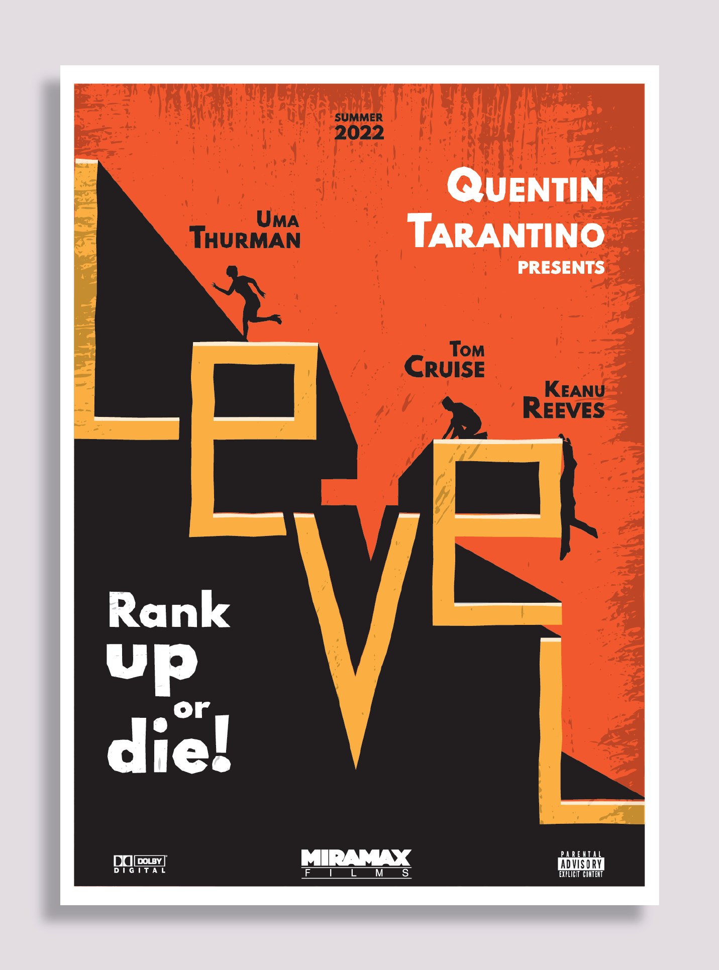
I did the changes you suggested, as well as I “renamed” the movie to LEVEL so the V is centered.
Is it better?
There’s a reason there’s a logic to movie poster design.

However, your poster gives me a feeling of 60’s-80’s dystopian
Vertigo
West Side Story
Anatomy of a murder
Clockwork Orange
But not on the same ‘level’ at all.
You’re on the right track - and I do like the poster - I go the Levels thing straight away.
I think it’s cool. But needs some work to bring it to the next ‘level’.
1 Like
Thank you for you kind words
So you prefer the “LEVELS” instead of “LEVEL” poster?
Should I keep Tarantino with white letters?
Do you agree with spaces between letters?
I don’t think it matters.
It’s not what is affecting the quality of the design.
You have a good concept. But the the hierarchy is wrong.
Research.
Study your own poster.
Identify the issues.
Rectify.
Repost.
That’s the kind of criticism Im looking for!
Please help me to improve.
Can you elaborate on hierarchy issues?
Maybe Rank up or Die is too big outweighing the other info?
Maybe the actor names are too small?
Should i put more emphasis on Tarantino’s name?
Study other movie posters.
It’s literally right in front of you.
Then go for it.
I’m telling you the hierarchy is wrong, compared to other posters.
I’m not going to tell you how I would like to see the poster.
I want you to go away and think about it, study it, and refine it.
That’s all the crit I can give.
Otherwise I might as well do the poster for you.
You’re on the right track. Keep going!
I think it is better as the plural. Level, singular, can mean the opposite of what you want
1 Like
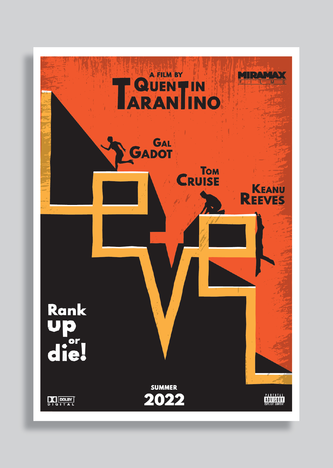
If you can change from “Levels” to “Level”, surely you can think up a whole different film title. I might think this is a film abut a manic carpenter.
Yup, I was going to point out that in the Real World, you can’t change the title of the movie, or the name of the company, or the ad copy or the corporate branding guides. This is what I hate about school projects like this. You should have to work with what you are given.
Did Uma Thurman get fired?
Critique-wise, it’s all been said. Certainly not bad for a 3 hour test.
Just a pity the text didn’t get the same treatment for all the cast.