What do you think?
1 Like
I don’t think you’ve given us near enough information to offer any meaningful critique.
1 Like
If you want a thoughtful answer, it helps to ask a thoughtful question.
1 Like
I’ll start.
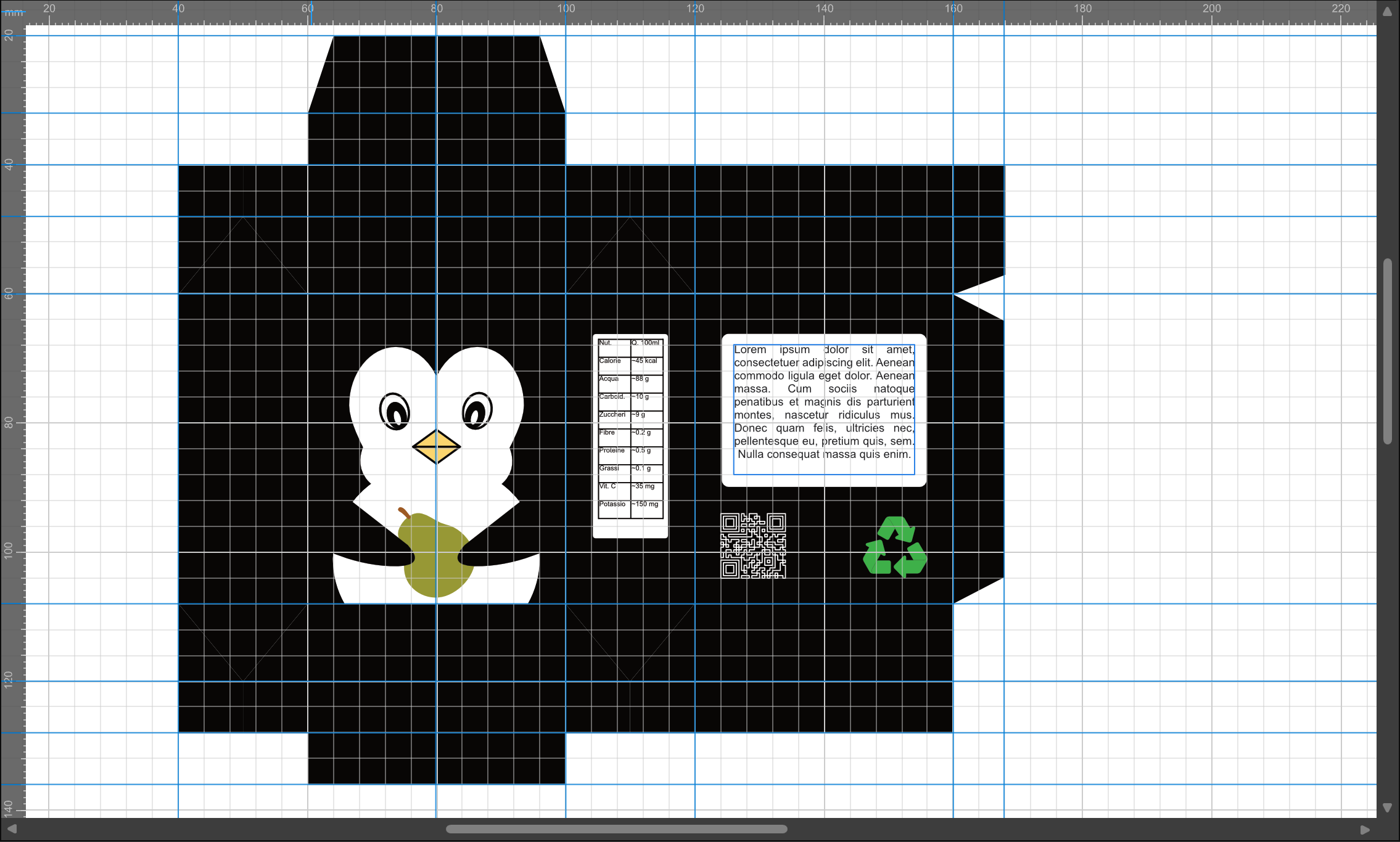
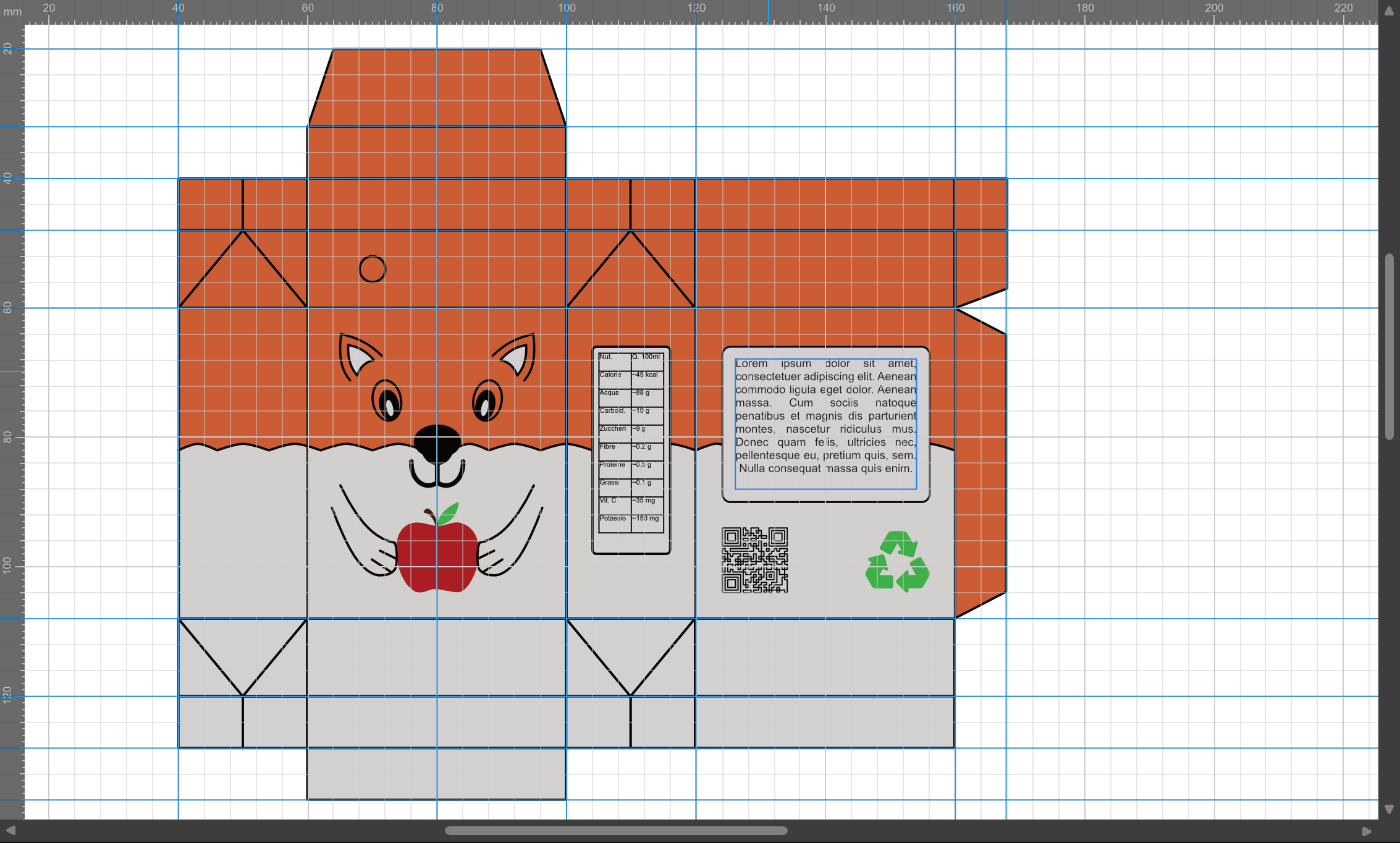
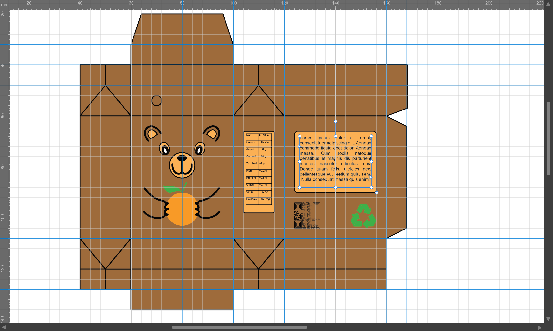
It’s difficult to tell exactly what each product is. I assume the Penguin is pear, the Fox is apple, and the Bear is orange, but that isn’t immediately obvious from the packaging.
The animal choices don’t seem to have any clear relationship to the fruit. Penguins are carnivores and aren’t associated with pears, so the connection feels arbitrary. The fox works a little better, as foxes are often linked with apples in folklore and nature. The bear is the weakest of the three for me, as bears are more commonly associated with honey than oranges. In fact, I wasn’t entirely sure whether it was holding an orange, a grapefruit, or something else.
The colour choices add to the confusion. Black isn’t a colour most people would associate with a pear product. Likewise, the brown bear combined with an orange fruit doesn’t immediately communicate “orange flavour”. Unusual colour choices can absolutely work, but they need stronger supporting cues. Milk, for example, rarely comes in white packaging, yet consumers instantly recognise it because all the other visual signals are clear.
The placeholder text also weakens the presentation. It feels awkward and unfinished. Even for a concept piece, it would have been relatively easy to source nutritional information and create realistic side-panel content. That would make the packaging feel far more convincing and help demonstrate how the design performs in a real-world setting.
My biggest issue is that the packaging doesn’t clearly communicate what the product actually is. Is it a fruit drink? A smoothie? A yoghurt? A snack? The illustrations are appealing, but they don’t provide enough information to establish the product category quickly. Good graphic design should reduce ambiguity and communicate clearly. When viewers are left guessing what they’re looking at, the design starts to move closer to art and interpretation than effective packaging design.
There are also some practical considerations. The QR code appears quite dense, but without knowing the carton dimensions it’s impossible to judge whether it would remain scannable at production size. Likewise, there doesn’t appear to be any indication of pack size or net contents, making it difficult to assess the design as a realistic consumer product.
Overall, the illustrations are charming and well executed, but the packaging doesn’t communicate enough information about the product itself. Attractive graphics can draw attention, but packaging ultimately has to tell consumers what the product is, what flavour it is, and why they should pick it up. At the moment, that message isn’t coming through clearly enough.
The other slight issue is a blank panel - this isn’t considered ‘consumer-friendly’ as it could look like vital information was missed in the printing or design, it’s always best to have information on all panels - for example, I have no idea what this product is - it could be medicinal, for sick children as nutrtional drinks or something like that - and in pharma regulatory settiings this wouldn’t be classed as ‘patient-friendly’.
Next steps
Make the product category immediately obvious. Consumers should know within seconds whether this is a juice, smoothie, yoghurt, nutritional drink, or something else.
Strengthen the connection between the fruit, the animal, and the colour palette so they work together rather than competing for attention.
Replace the placeholder text with realistic content to better demonstrate how the design would function in a real retail environment.
Ensure all panels contain meaningful information and contribute to the overall user experience.
Include practical packaging details such as net contents, nutritional information, and other elements that help establish scale, purpose, and credibility.
The illustrations themselves are appealing and have plenty of character. My suggestion would be to spend less time refining the artwork and more time refining the communication. The artwork already attracts attention; now the packaging needs to explain the product just as effectively.
I understand it’s difficult to recognize what the product represents, and in reality, the animals aren’t connected to the fruits; the choice is arbitrary. But if you think there’s a connection, then I’ll try to find it. (By the way, you understood correctly: the bear is holding an orange, the fox an apple, and the penguin a pear.) The product is supposed to be a fruit juice (for all three), but if it doesn’t sufficiently communicate its essence, I’ll try to improve.
Thank you so much for all the suggestions and criticisms. You’ve really helped me a lot, and thank you so much for your time.
It’s the packaging of a product, a fruit juice (3 flavors) and I would like to ask you what you think about it since it’s my first graphic design project, and it’s difficult for me to judge my own work.
This is my first graphic design project, it’s about the packaging of a product, a fruit juice, but my ability to see myself from the outside is very limited, so I would like to ask you if I managed to communicate my product well, if it’s well set up, if it’s awful or if it can be worked on.
It’s not that they have to have a connection or even colour coded to the produce.
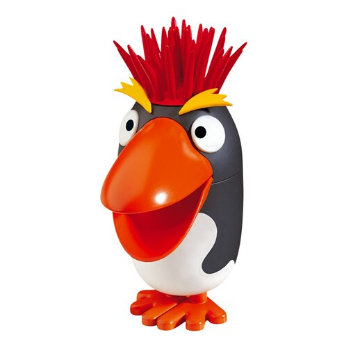
There’s plenty of fun animals like this one for icecream
Found this blog post
Thank you so much!
I think some people would find it unsettling sucking juice out of an animal.
In my opinion it would be better to make the carton a representation of the fruit which the carton contained.
1 Like
I would like to think that you at least considered the animal to be a part of your branding. That you did not in any way, well…maybe reconsider.
1 Like
Did you use powerpoint?
From my point of view, if you are practicing for making packaging then great! But I would not add this on your own portfolio, you have better to create more packaging real products and not with animals, for example (as a suggestion) make some packagings for food of pets (like dogs, cats or even birds) thatś an idea that i am thinking. Make some packagings with real products would be better for your portfolio,