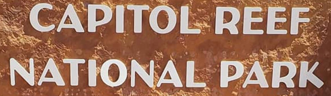
Does anyone know what typeface the following is? It’s similar to a face called City Boys or even Peignot, but it’s different. It has an Art Deco look to it, so perhaps it’s never been digitized.
I ran it through my usual sources and City Boys showed up as the closest match. Maybe RKK will come through. Worst case scenario, it wouldn’t be too tough to recreate — unless you need the entire alphabet.
This might be a stretch, but all NPS work is supposed to close out with a disk of final files supplied to the park. If this exists, they should have the file and possibly the font on a disk, or backed up somewhere. They may not know how to open it, but they should have it.
This is also weird because that is not an NPS brand typeface. That doesn’t often happen for the main park ID
Yeah, I sort of need the entire alphabet. I’m guessing that City Boys will work, though. It’s not for the park itself; it’s for a private foundation associated with the park and the surrounding communities.
Yeah, I was thinking about contacting the park, but my guess is they’ll refer me to an impenetrable bureaucratic maze in Washington — even if they have the files. I might need to do that, though. I don’t think it’s anything like an official typeface for them. It’s just part of their one-of-a-kind entrance sign that’s been there for decades, and everyone in the nearby communities recognizes.
You won’t have to go to Washington. There is a local NPS service center for the Western Parks, I think in Denver, but since we’ve only done one Park through that Center, I’ve forgotten the name of it. If it’s an old sign, your chances are slim to none on the Park having it. They lose stuff in a couple years, the number depending on how much staff turnover they have (and that can be unusually high as staff is always seeking the next pay grade.) It’s there, but filed away someplace safe. Unless it is really old as in pre-computer…
That’s good to know. Based on that information, I found some actual people to contact at the regional office in Denver. Thanks!
Hope it works out
![]()
Just seeing this as I had my little darling niece from early morning. Her Momma just picked her up ![]()
I get no time to be on the PC LOL ![]()
My best guess:
1 Like
That is really close. I’m amazed that you tracked it down and that it was an old official typeface of the NPS. I don’t know how you do it. Amazing! ![]()
1 Like
That is as close as I can find. I’ve searched all the hidden crevices I know of ![]()
I can’t pin down that R though ![]()
I exchanged emails with a person at the NPS Denver office. He said they don’t use the typeface any longer for much of anything other than to repair old historic signs, and that when that’s needed, they just have them fabricated from existing drawings.
Maybe this free font was just someone’s efforts to digitally mimic it without having access to exactly what all the letters look like. I can easily replicate the right R and clean up the rest.
1 Like
It’s probably why it’s titled that way then. A good effort. But what happened to that poor S? LOLOL ![]()
Yeah, that S is, well, ugly, as are all the numbers. The stroke weights aren’t consistent either, but with a few tweaks, it’ll be fine for what I need.
1 Like
Awesome!!
![]()
3 Likes
Fantastic! That’s a more refined version that will save me some trouble. Thank you! I don’t think I’ve ever heard of Terminal Design, but they have some interesting fonts for sale. ![]()
1 Like