Years ago I had a Squarespace website. It worked well, and I was making enough to justify the cost easily. I’ve been employed full time now for years and not used a website with any real intention for some time. A year ago I tried Adobe Portfolio. It was fine. Slightly cheaper than Squarespace, but this was a 2nd Adobe subscription alongside my work one. After a year I ended it.
I’ve recently been trying out Carrd. Now bear in mind, my life has changed a lot in recent years and every penny counts. Currently I’m using the free version but even the lowest paid version is 10x cheaper than anything else - and while I’m looking to get occasional freelance work on the side of my job, “free” and “almost free” is basically my price range.
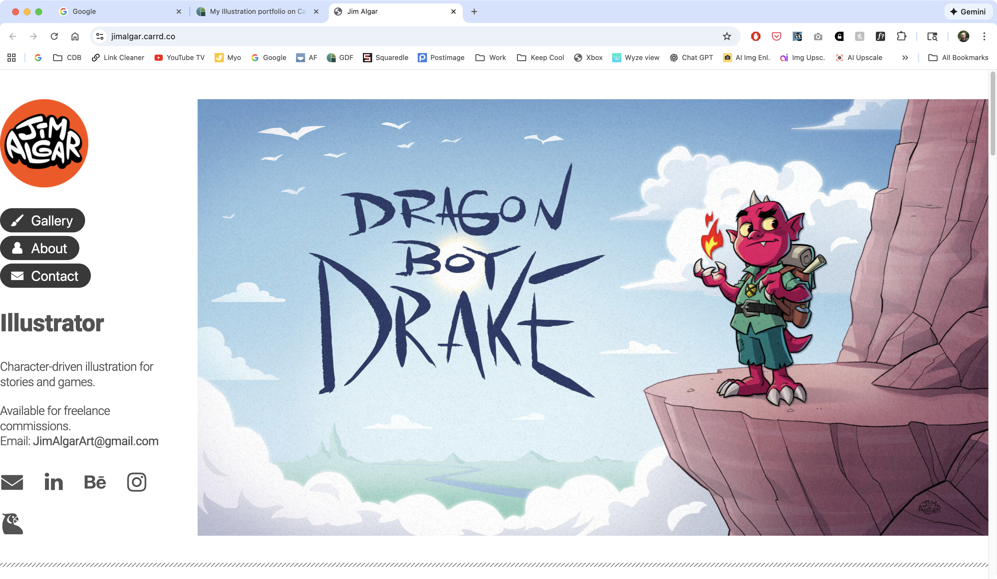
With that in mind, and aside from any helpful tips like “just use squarespace” or “use Wordpress” (no thank you, not today), I’d welcome some feedback on this simple one-pager I’ve put together for the purpose of giving people a clean, quick and easy look at my work to decide if I’d fit their project, without getting bogged down in multiple pages or hiding lots of work behind thumbnails. At work I have to be an art chameleon changing styles with every project, so I’d like my freelance jobs to fall more within “my” style, which is why that’s mostly what’s on display. I also can’t show anything from my current job.
Anyway, that’s enough waffle. TLDR - new site, any thoughts?
Overall it is clean and presentable. My biggest complaint is on desktop view there is no margin on the left-hand side of your page so all of your text is butting right up against the edge of the browser window making it look awkward.
Thanks, that’s interesting, I haven’t seen that behaviour on Desktop. Would you mind sharing any info like what browser you see this on? Are you on Mac, Windows or Linux?
Aside from critiquing the site itself, I just wanted to put a spanner in the works before you thought about going to the paid version.
I use software called Sitely (https://sitely.app) to build static, adaptive sites. It is real wysiwyg website building that allows you to build from scratch without having to touch code if you don’t want to. It is very easy to use and is as flexible, in terms of design layout, as you want. You can their use templates, but you can start with a blank page (my preferred option). You can import existing sites in, though they will need fiddling with. They keep the price low – around £60 for a perpetual licence.
For hosting, I use Ecohosting (UK-based and green). Inexpensive (around £10 (inc vat) a month and domain renewals are competitive), Their customer service is great too.
I know I sound like I have vested interests. I don’t. I just spent a long time looking for the right solution for me and I figure good companies should get a shout-out.
I see the same thing as @CraigB, and in multiple browsers. It happens only when the browser window is dragged between certain widths. I’ve never heard of Carrd and don’t know what kind of ability it provides to modify the HTML/CSS.
Without deciphering the code, which would cause my brain to rebel and PTSD to rear its ugly head, my first guess is that there’s a problem with the relevant CSS class not specifying left and right margin values for the top-level container div. A very cursory glance at the code leads me to suspect the CSS class might be named site-wrapper, but there’s probably more to it than that.
I doubt this has anything to do with the OS. It’s the browser that interprets the code. All the browsers I tested on my Mac show the same results. I also tested it in Windows using Chrome and saw the same.
At specific browser window width ranges, the content in the relevant div is pushed up against the left and right edges of the browser window. There should be CSS div margin or padding values to prevent it, or perhaps max-width (or something similar) values in the @media queries.
Thanks guys, good catch! I never saw it because I always view web pages maximised, but I was able to duplicate the issue when resizing the window on Windows using Brave.
It seems I had the website’s settings to have a set size for the page and zero margins either side; which looked fine full screen and on mobile but didn’t take in-between window sizes into consideration.
I’ve reversed that now, making the page maximum size with margins on each side, so it should look similar at full screen but be fixed at those in-between window sizes.
