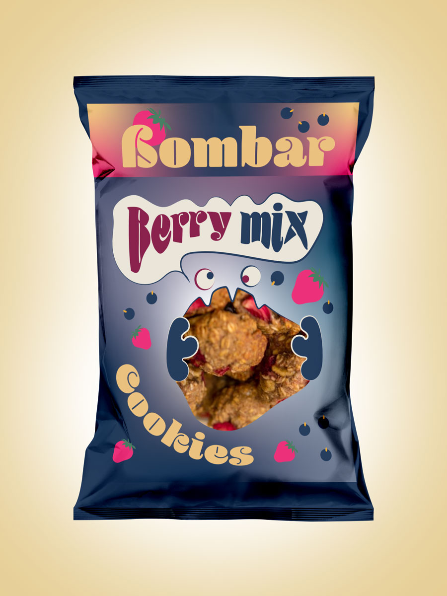
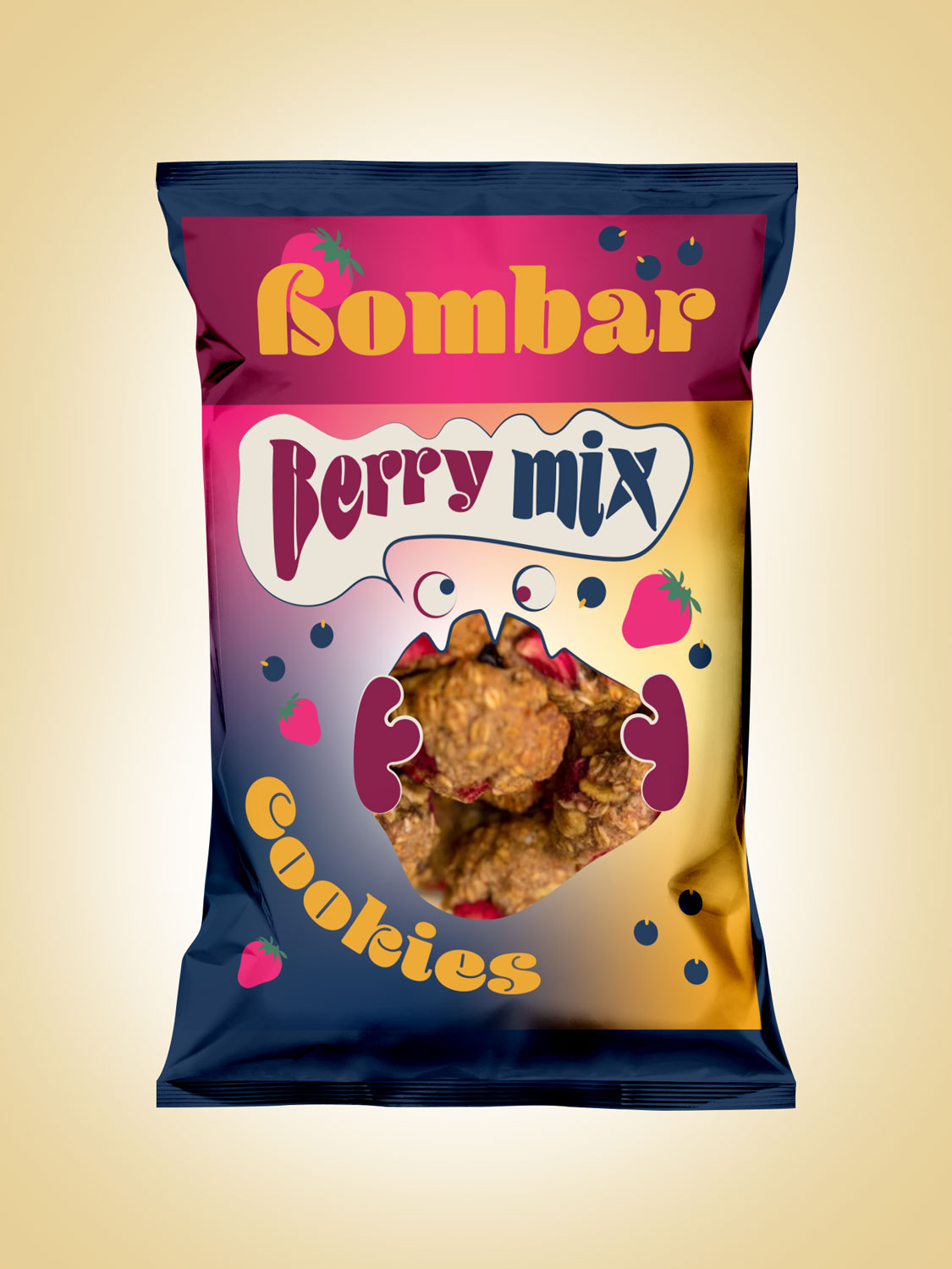
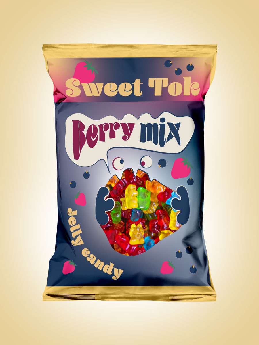
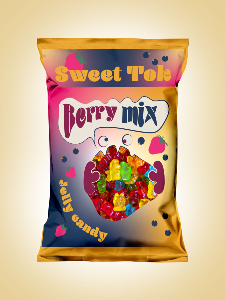
I made a new design, please tell me what do you think. Thank you
1 Like
They’re fun, colorful and attractive, but you haven’t supplied enough context about the problem for me to say whether they’re good solutions.
For example, if these cookies are being marketed as organic, healthy, and natural, the look is probably inappropriate, If they’re mostly quick snacks sold at a corner convenience store, the packaging might work nicely.
You’ve left out the details, though, which are usually necessary and need to be considered — size, price, weight, etc. They’re nice-looking mock-ups, though.
1 Like
Is this for an actual product, or is it just a design for school? If it is an actual product, be aware that the FDA (the U.S. Food & Drug Administration) has requirements for certain food products and you might want to check into that.
Thank you, very informative ![]()
Thank you, I made it for my portfolio (redesign of actiual product)
If it is a redesign of this company, (https://bombbar.ee/en/), you spelled the name incorrectly.
I am not a huge fan of the design I’m afraid. The colours make it look all very artificial – unless of course, they are very non-healthy, artificial snacks, then it works OK. For me, though, it neither says, fun food, or healthy snack. The colours and style look more like they are suited to gelatine sweets (candies) or crisps (potato chips) than biscuits (cookies). Think Haribo meets Lays/Doritos – that second part could be more to do with the choice of the actual packaging itself.
Just doesn’t sit right to my mind. That said, I have to add the caveat that I know nothing about the product, the company, or its intended market.
Thanks for you opinion!
1 Like
That sort of misses the point of design. Your job is to create appropriate packaging for the product you are given. It is putting the cart before the horse to design something and then change the product to suit that.
2 Likes
Yep, @sprout nailed it.
The fact that the packaging looks more appropriate for gummy candy rather than the cookies you originally intended it for tells me that no strategic thought went into this project in the first place. Without strategy, graphic design is merely decoration and developing an appropriate solution is nothing more than luck.
While your design is more appropriate for gummy candy than cookies, that doesn’t mean it’s good design. I’m not trying to be harsh or be a troll or whatever it is the young kids say these days, but this design really isn’t working — on many different levels. Package design should take weeks or months — not hours or days. This really looks like it was thrown together in an afternoon.
Delete all of these files and start again. I know you can do better.
Ok, thank you)