Hello Guys, Yesterday I make a “Personal Portfolio UI Design” . I do this design for my Practice.
I want to show you My New Design . And I want Feedback or Suggestions.
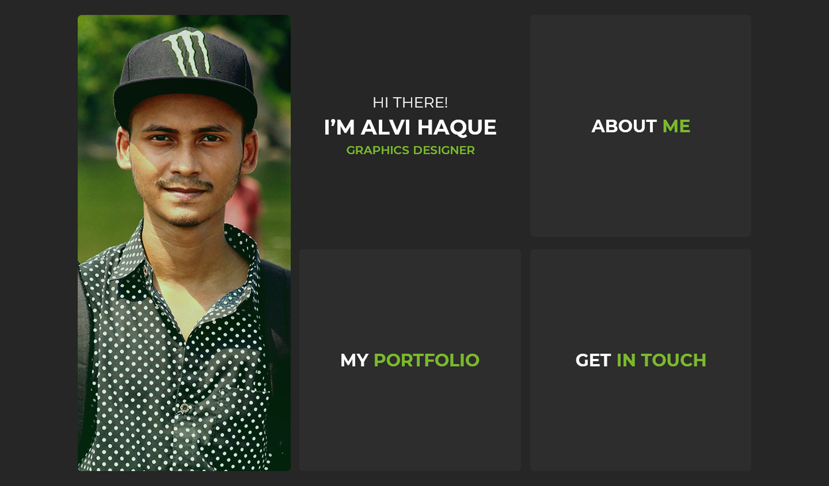
Let’s See -
Hi, Alvi. Welcome to the forum. Here are my thoughts on your personal portfolio.
– The color scheme is nice. Good job with that.
– Based on the screen captures, it looks like it would be simple to navigate.
– I’d rather see a logo repeated on each page than your portrait.
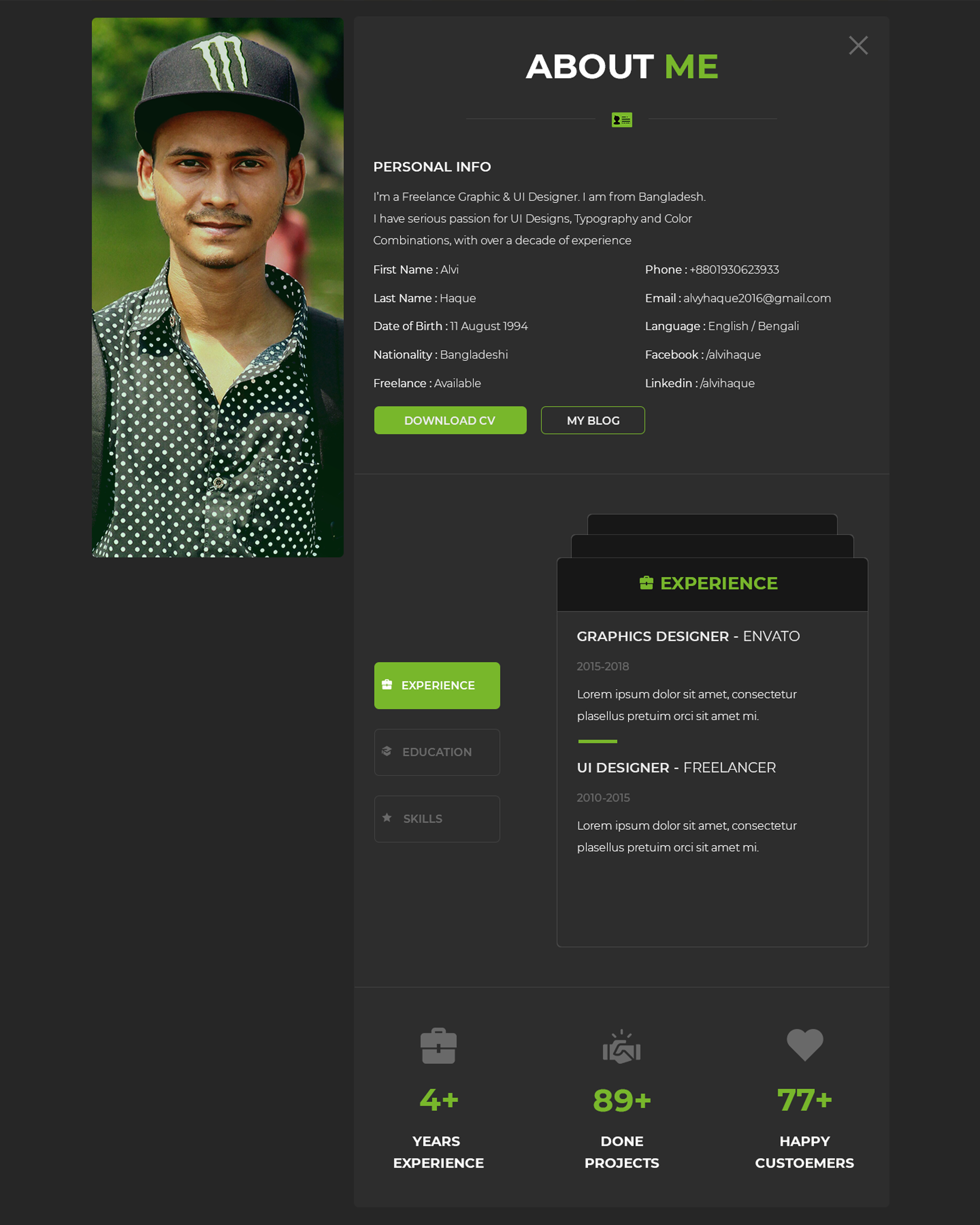
– If you want to include a portrait on the about me page, that’s fine, but you need a different portrait. There are a couple of things going on with your existing portrait that make it appear less than professional: the giant Monster logo on your hat, the harsh shadows, go with a solid color shirt without a pattern, the shirt looks like it’s being pulled to the right, there is a person in the background, and what appears to be backpack straps.
– You need to be more realistic with your about me page. At one point, you say you have over a decade of experience; in another place, you say you have 4+ years of experience. Given that you’re only 24, the “over a decade of experience” is a little tough to buy. Any work you were doing at 13 or 14 – while you might consider it to be foundational – is not professionally relevant.
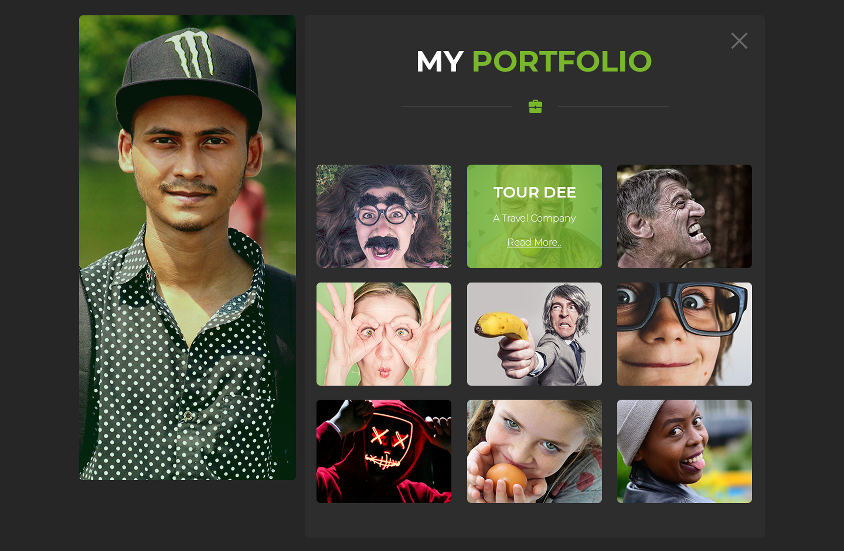
– The thumbnails in your portfolio section look like a bunch of stock images. I don’t really see any design work there.
– I’d suggest you have someone review the site for language / grammar / punctuation.
Thanks for your reply. 4 year experience or many texts here is demo texts. Picture also.. I just do this design for practice. I am learning, improving design skills.
Thank you very much for your reply.