Hello, this is my first post on this site, so I’d like to hear your opinions about my personal logo.
Graphically, it’s pretty nice, although I’m not sure the lightweight font holds up well enough. I’d challenge you on the all-lower-case too, except for the correlation with the lower case of the mark itself.
Our opinions on this could be much more substantive if you’d make more of an introduction and brief us on the nature of your identity, its purpose, the target market, and the personality you mean to convey with this.
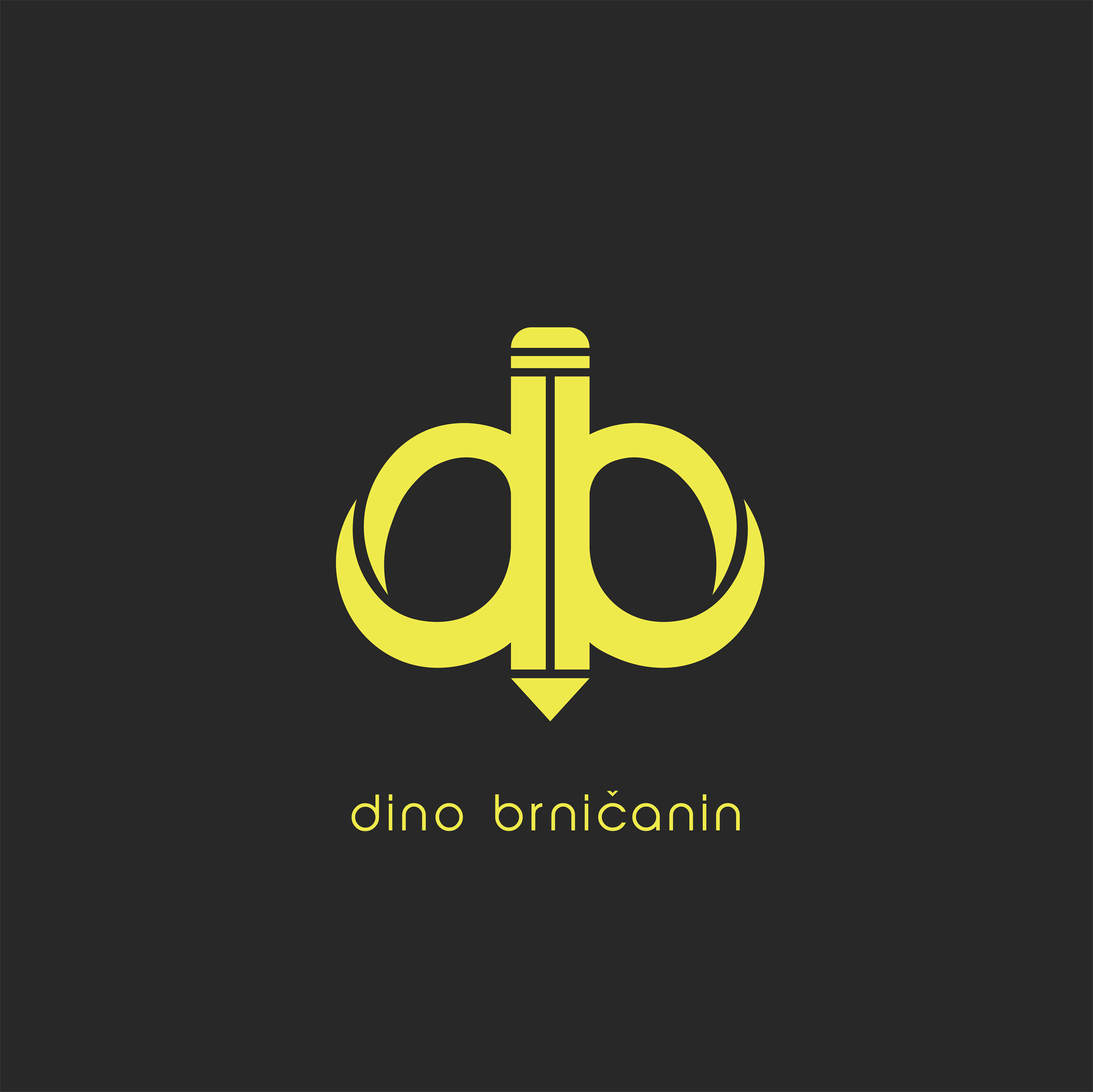
db always lends itself to an “easy” pairing. At first glance I immediately saw the pencil, but I also saw a bird with a beak (possible because of the yellow.) Sort fo see a scissors handle sort of thing … and overall, any pairing of a lowercase d and b so close together will have a phallic connotation as well.
There’s something odd about how the bottom of the d and b has a 3D sort of a look, while the remainder is very flat and 2D.
Something you have to consider when designing a logo is “What could other people perceive this as?” Not to sound offensive but some people could potentially see male private parts out of this logo.
Let me share one of my experiences I’ve had with this:
When I was in college we were doing a branding project. The task require us to select an existing company and update their logo and branding. I loving video games, chose GameStop for my company, who I thought had a generic logo. I tried to simplify it and make it more hip, so I developed a logo that read GSTOP. My professor was quick to educate me that some people may read the logo as GSPOT, which was something I didn’t see at all until it got brought to my attention. Lesson learned on my part and I scrapped the idea and developed a new solution.
It’s good to be aware of these things, although they may sound immature or silly. The last thing you want as a designer is your logo showing up in a Google search for biggest design fails.
1 Like
^ Because I am at times immature and silly…Yup, first thing I saw.
1 Like
Forget about the logic of being immature & silly … my mind is twisted … of course it’s the first thing I saw, plus a couple of others too!
And yes, I have several clients in the ‘modeling’ industry.
I’m not sure how the light weight font is working. I’d probably try something heavier.
While the logo is symmetrical itself, I’m not entirely convinced this is the best shape it should be. The twisting effect throws my eye off and I dont want to read it as balanced.
As a personal logo, I’m just guessing you do alot of sketches from looking at the logo. If that’s so do you have any sketches you made of this project?
I might not be quite as “immature and silly” since I didn’t notice what some others saw, but now that it’s mentioned, um, yeah.
Ignoring that, the “twisting effect,” as Billyjeanplxiv called it, throws the whole thing out of whack. The composition is flat and head-on, but the bowls on the b and d are inexplicably distorted in an odd sort of way that isn’t visually harmonious, logical or, as far as I can tell, meaningful.
“Torsion” comes to mind. And not in a good way…
1 Like
Maybe you had this in mind: there’s a medical condition known as testicular torsion.
Bingo.
I have to agree. The first thing I saw was also … y’know … NSFW. Maybe if you use capital letters?
Oh gosh…now it just hurts to look at.
I’m glad you said what I was thinking but was reluctant to say.
1 Like
Looks okay. But if your business is related to education or writing then it is relevant, otherwise you need to rethink.
Was actually not a bad concept, just unfortunate that it ended up looking like a penis. Back to the drawing board I say.
good logo design .
I don’t want to be a dick, but some people will see this design as penile.
1 Like