Names of colours

Am trying to learn the correct names for colours so I can sound more professional when describing them to clients.

Is there an industry standard for what colours are called and their respective HTML code or composition?

For example, the HTML colour code for Navy Blue is listed as #0A1172 here:

However HTML colour code for Navy Blue is listed as #000080 here:

Which one is correct (or is neither!)?

Or do you use something entirely different like Pantone colours?

Or am just wasting my time exploring colour this way?

It depends really.

Pantone colours are a specific ink mix - they reside in a different colour gamut, there is no exact CMYK, RGB, HEX or other match to them.
There are close approximations.

If you have a Pantone - this is used primarily in print. You have Coated and Uncoated. Both same Pantone references look completely different in Coated vs Uncoated or across different substrates.

A lot of people make a mistake of picking just a Coated version of the colour, and this Coated version relates to the paper stock - a coated stock, which is common on flyers, where uncoated would be common in letterheads etc.

But a Pantone Coated colour would look different on Uncoated paper and vice versa - so it’s importatnt to choose Pantone colours in relation to their Paper Stock.
You need to pick a Pantone Colour that will be used on Coated and usually a close match from the Pantone Uncoated range.

Similarly - you’ll need to pick a CMYK blend that is approximation for the Coated and Uncoated papers (2 separate mixes).

A lot of people don’t go into such details - but I can tell you first hand it makes a huge difference.

Our client came to us with a batch of Pantone Orange 021C printed business cards and Pantone 021C Letterheads and the colours didn’t match. We had to pick a different Uncoated Pantone for the uncoated paper that was closer to 021C…

I know … confusing right!

So there’s how the Pantone 021C and Pantone 021U look side by side - the vibrancy is totally gone.

image image

We got out the Coated books and the Uncoated books and picked a closer match to the Coated version - with more vibrancy.

Back to your question - do online colours have a naming convention.
No.

But what you pick for online vs print vs other substrates and display mediums - you do need to fine tune them especially where Brands of importance are concerned.

Coca Cola red is a very specific red, and they wouldn’t like their branding colour to be wrong across various devices and printed substrates.

Plus - what one screen displays as a colour can be different across different computers and devices.

It’s a hot mess - but colour is important.

2 Likes

I don’t do a lot of conventional print, only wide format. While Pantone may be a specific ink mix in plate printing, it is a mix of CMYK inks in Digital printing and the gamut can vary widely depending on the machine used.

Colors do not have names. Pantone may name their Textile colors-of-the-year but that’s about it. Just look at paint chips from different manufacturers next time you’re in a hardware store. The names of the same shades are completely arbitrary. Don’t buy into it for specifying color.

As for what to use in your files, use what your printer tells you to use. For 99% of the wide format work I do we only want Pantone Solid Coated colors if it matters to you that much. If you use an Uncoated swatch, we would have to call and ask if you intend for us to match the uncoated swatch, because as noted, they are usually not the same. But to Pantone, the two are the exact same ink mixes and the digital print rip does not always differentiate between the U and C color. Only when I’m ordering fabric prints from the EU does Uncoated come into the mix (which for me is once or twice in a year) so your location is a factor in what you have to know about color.

Sometimes you are not going to find an uncoated color to match your coated pick. Then you ahve to work with your printer to chart something close to what you want. Sometimes it’s achievable, sometimes not. Orange 021 is one of those colors that makes me shudder on seeing it. It’s a “Bright” that is hard to achieve in CMYK printing unless you are using one of the relatively rare CMYKOGV printers that actually include an orange inkstation.

A further help to you would be to get a Pantone Bridge. It will show you what Pantone colors look like when converted to CMYK in printing. Again, you can go through and find a better match and use those CMYK numbers.

But the biggest thing to keep in mind is that Pantone swatches are representations of Pantone inks on the two types of paper Pantone has chosen to make their swatch decks. All papers and other media take up ink in different ways that will alter the color. That’s where an experienced print partner will make all the difference in your final product.

3 Likes

Yes, you’re mostly wasting your time if you expect universal consistency regarding names of colors. For that matter, we can’t even agree on a universal way of spelling color (colour, colore, farbe, couleur, kolor, etc.).

Color is the brain’s way of interpreting wavelengths of electromagnetic radiation striking the retina’s photoreceptors in one’s eyes. Those photoreceptors are only sensitive to a small segment of the electromagnetic spectrum. We can’t see ultraviolet, for example, since those wavelengths lie just beyond the indigo blue that we can see. Some animals can see ultraviolet, but can’t see some of the wavelengths humans can see. Dogs, for example, can’t see red or green; they interpret those wavelengths as shades of gray. In humans as light becomes less intense, we lose our ability to differentiate colors, so at night we mostly see in shades of gray.

In other words, color is somewhat subjective — it’s our brain’s way of making sense of our surroundings by creating the illusion of colors it assigns to different wavelengths of light bouncing off objects. Color perception differs a little bit from one person to the next. People with red-green color blindness don’t see the same colors that I do, for example.

So considering the mushiness of how color is experienced, it’s not really possible to say this or that is a specific color without first defining some objective parameters by which the colors can be defined. These “color spaces” provide the structure in which specific colors can be named or numbered.

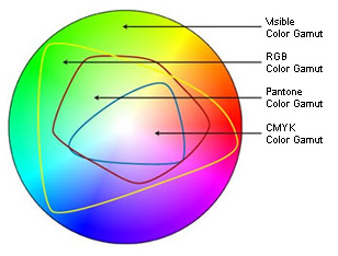
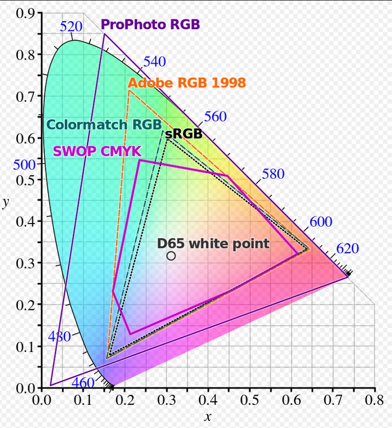
For example in the CMYK color space the number of colors in that space (the gamut) are defined by the percentages of each of the four process colors. In the RGB color space, the color gamut is larger and the colors can be defined by numerical values of the additive colors. In CSS, colors are defined numerically using a hexadecimal (base 16) number system. For some odd reason that I’ve never understood, the Worldwide Web Consortium also gives names to certain specific hexadecimal combinations that can be used in place of the hexadecimal numbers when writing CSS, Pantone has created their own list of colors (not really a color space) where all their color mixes are numbered according to their own system. Most every company that deals in colors (paint companies for example) name the colors they work with. Lots of other disciplines (physics, for example) have their own systems for defining colors in ways that makes sense to them.

So all this has been a long way of saying that color names and numbers mean very little outside the system in which they were designed to be used. For graphic designers, this typically means CMYK, RGB, Pantone, hexadecimal and, on occasion, other color systems specific to the job.

As a designer, if you’re working in print, you’ll likely be defining colors using CMYK or Pantone. If you’re working on a website, you’ll be using hexadecimal numbers to define colors. If you’re ordering vinyl or powder coatings, you’ll use color names that the manufacturers have assigned to their products. If you’re painting your studio walls, you’ll head down to, maybe, the Sherwin-Williams paint store and use their consumer-friendly names to order paint, which the paint technician will translate into a more complicated mixture of their base colors.

There is no universal color scheme where all the names and numbers match up across the board. If you’re trying to find one, you’re, like you said, wasting your time. Instead, learn to think and define colors within the color system best fitted to the job you’re working on.

3 Likes

I do a lot of brand packaging work and have a lot of experience picking colors across multiple mediums. As everyone has mentioned, there is no universal color matching system. There are different color systems established for nearly every application of color (on-screen, corrugates, metals, plastics, glass, food, etc), all with vastly different color gamuts and limitations.

The best thing you can do to manage color across all of different mediums is to learn how color works in each medium and be prepared retroactively change colors in your design. Anytime I am faced with a brand new color system I work to determine the following:

  1. Size of color gamut compared to others I know
  2. How color is mixed in this system and / or printing press.
  3. Inherent challenges and limitations in the process that can impact color.

That being said, Pantone Solid Coated is probably the most commonly used reference system out there. Even vendors that don’t use Pantone colors will have a solid coated book just due to how popular the book is. Its one of the most fundamental books to use to translate a color to someone you are not in the same room with.

1 Like

Are you meaning what physical names to give to colours when talking to clients. If so, you’ll tie yourself in knots with that one. The are a few common ones, but not many. Naming a colour is really just mnemonic. Some people will get it, some won’t.

For example if I say Teal Blue, most people will instantly have an idea of what that looks like. (There are no guarantees two people would be seeing the same colour though). However, if I say to someone in a client meeting, it’s like Barclays Blue. No-one in, say, France would have no clue, though almost every Brit would get it.

You can only really go with commonly understood names (often historically linked to paint colours); Rhodamine Red, Ochre, Burnt Sienna, etc, but they are only ever going to describe a very limited palette.

As far as I know, there is no complete, universally adopted nomenclature for colours. How could there be? You just have to be sensible about it.

As to looking professional; the most professional thing you can be is, clear. As long as you can describe something in such a way, as your client understands what you are trying to describe, using logical, clear references, then job done, I’d say.

1 Like

When discussing color in a particular job, we keep it to simple.
“The Red”
“The Light Blue”
“The Dark Blue”
“The Beige”
etc.

It’s all relative to the project and refers to only one possible color in the project palette. I might be talking to two different clients about two different projects but only using those color descriptors. If it gets much more complicated than that, words are often inadequate and we resort to a screenshot with the swatch palette open (“unused colors” removed and “colors used” added.) Because color mistakes in print cost people money. Could be you, could be me, but I try to avoid color mistakes whenever possible.

1 Like

It sounds to me like the consensus is not to try and get fancy with naming the colours, so won’t invest time to learn a long list of names for subtlely different colours!

Was not really expecting to learn about colour in print media, but that’s unexpectedly very insightful and I’m sure it will be useful. Had no idea there was even a coated or uncoated Pantone range that markedly different - that’s a trap for the young players!

Just want to say thanks so much for the responses - really appreciate it guys :beers:!

Well just to note that the Pantone Coated and Pantone Uncoated
The inks are the exact same - it’s just how they react on different coated vs uncoated paper.

It’s important not to use the same Pantone colour in coated and uncoated, as the colours aren’t the same across different substrates, in a lot of cases.

Same if you call a colour “Plutos Dark Blue” and you have set that as a Spot colour in your work - a printers RIP wouldn’t understand what “Plutos Dark Blue” is - as the RIP wouldn’t have a listing in it’s Colour Look Up Table (CLuT) to understand what way to interpret that colour - instead it could output it at any colour - yellow or pink or lime green.

When defining colours for print - especially using Spot Colours then Pantone is preferred. As the RIP would have CLuT - then it can interpret the meaning of that colour.

Think of it like this - you’re sending a file for translation for a different language. If you wanted a programme to change the English to say Urdu - you’d need to have a dictionary to 1) change the words - but more importantly 2) the grammar and context.

You can’t do a translation without both. So “Plutos Dark Blue” might be interpreted under 1 but without 2 it’s not going to make sense.

It’s different on the web and in other printing models - as @PrintDriver correctly pointed out in large format printing you can have CMYKOGV or printers printing in the PROPhoto RGB for large format.

Each is printing within gamuts that are tolerable to their presses.

For the internet, it’s the same principle. You can define your “Plutos Dark Blue” in the CSS (I take it?) and reference this every time want to use it. This way your website knows that every time you reference colour for “Plutos Dark Blue” it can pull that info from the CSS.

But if you didn’t have this - how would it know what Plutos Dark Blue was? You really need to have the relevant HEX or RGB values (whichever you prefer as they are the same colour model… and I’m sure someone will pull me up on that!)

Anyway - without a value assigned to your Colour - then how will a system know what colour it is if you have assigned an arbitrary name to it?

It’s easy with Pantone as they have CLuT built into the RIPs for printing. But you can’t use a Pantone Reference in Websites, as the website has no CLuT to reference what that Pantone Colour is.
Hence, Pantone give you the HEX/RGB values in the Pantone Breakdown.

You can show the client the piece on screen and say hey this is a proof - but the colour - you’ll need to reference your pantone book to get the exact printed colour - as onscreen is not the same as the printed colour.

Same goes for RGB/HEX vs CMYK vs Pantone.

They all reside in different gamuts, some overlapping gamuts, but mostly different.

img-gamut

Colour - it’s tough!

1 Like

Excellent post.
In addition to what Smurf2 wrote,
See the color gamut image attached below (from Wiki).
Using that, I like to point out too that:

  • the sRGB gamut that is used by most digital cameras and seems to be a favorite among a lot of stock houses is a lot tighter than the standard RGB gamut. May as well use CMYK.
  • The ProPhoto gamut is used when bringing photos in from RAW, but not even the RGB laser photo printers like the Lambda or Lightjet can reproduce the entire Prophoto gamut. They fall more within the Adobe RGB gamut and even then have trouble with some “brights” like tennis-ball-yellow and high-yellow-content reds.
  • The ProPhoto gamut is applied to RAW in order to provide the printer with the largest possible color gamut on which to apply their profiles. If they start with the lowest common denominator of a CMYK photo, you lose some of the better image quality these RGB printers can provide.
  • Once a photo is saved in CMYK and closed, you can NEVER get that color info back. Always save a copy.

1 Like

Depends on where you get it printed. If you use a “gang” press online type printsource, their idea of color correction may not necessarily be what it should be. In order for gang printers to offer you those low prices, they run EVERYTHING on only a few different papers and with an across the board profile. If you want color matching, suddenly those low prices no longer apply. The more you know, the more likely you are to get the result you want with that type of print vendor. If you go more custom with a local house, you are likely to pay a little more, but likely to get a little better quality. Beware of chains that just have “print services” as an adjunct or buy-in, as they tend to not pay enough to get anyone who particularly cares running their equipment. I went to one once and turned just in time to see a kid pouring Cyan toner into the Magenta pot. That was a bad day for several people I’m sure.

Again, the more you know up front, the better service you can offer your clients.

1 Like

I know it’s complex.

Colour theory and practice are different things!

Experience brings you the practice.

There’s a wonderful guy named Gordon Pritchard who wrote a brilliant blog.
Read and read and read

http://the-print-guide.blogspot.com/search/label/Spot%20Color

http://the-print-guide.blogspot.com/search/label/Color

(if you think what we wrote was confusing!)

2 Likes

Thanks for the Article link. The Photochromic Ink has an interesting effect when it is colourless but reacts differently in sunlight and office light.Would like to try that out in future.