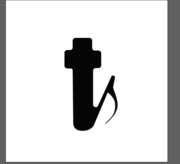
I need you to critique this Logo I created for an evangelical acapella group called “Transmetteur de la vérité” or “TV” I combined the letter ‘t’ and a musical note, the eighth note. The letter ‘t’ can also represent the cross of Jesus.
I’ve got “ts”.
Without your explanation, I would not have come up with TV. T and a musical note or T and a check mark, maybe. I like the idea of combing a T / cross / V / musical note, but I don’t think this is the solution. You need to spend some more time fleshing this out and come up with a dozen options on the combination.
This is not the idea that will get you paid.
Pivot.
I’m only seeing Ts.
Am not sure that a lone pictorial mark is the best solution for such a niche, specific group.
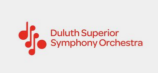
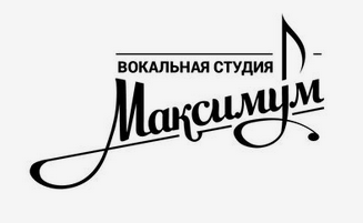
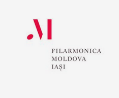
I had a look around at what other music groups were using for their logos and came up with some examples below:
Perhaps you could use the typography to communicate the feel of the group, through your choice of typeface, weight, tracking, the case like the examples above.
First ask yourself what is the group like? is it serious or informal? professional or ametuer? and use question like these to influence your design decisions.
Why an 8th note? Was it so you could include the flag to make it look more like a note? Unfortunately, the flag looks a bit like a spur, talon, or scythe graphed onto the t/cross. This causes it to look a bit menacing or satanic, which isn’t a look you want. Maybe a half note without the flag, which will still come across as a note due to the hollow head.
Or maybe ditch the idea of creating a V from the t/cross (I’m not sure it’ll work no matter how you make it) and simply use a quarter note with a crossbar at the top to combine the t, cross, and the note.
I think you might be trying to combine too many ideas into one logo: a T, a cross, a V, and a musical note.
I understand why the V is important, though, since vérité is arguably the most important word in the name. Both the T and V are symmetrical letters, so maybe they could overlap.
Whatever you create, I think it should be more refined, classy, and suggestive of the personality of evangelical music than the heavier more corporate-looking direction of the logo you created. The examples @pluto suggested are good examples with personalities that fit within their niche.
I agree with @Just-B. The presented design hints at being musically aligned, but cross iconography is completely lost. Referencing some of the examples @pluto has shown, it seems that most groups rely heavily on their wordmark and the logo serves more to make the musical connection. I think you should consider presenting the logo and wordmark as a unified logo. Sometimes reading the name of the organization makes me look back at the logo and see the musical elements.
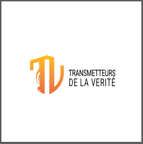
I’d like to thank you all very much for your feedback, it’s helped me a lot. I’ve made a lot of changes to the logo. take a look, what do you think?
This is better to see as a whole. I don’t speak French, but I think roughly translated the name is Transmitters of Truth, or something similar. I don’t believe the group’s name hints at the musical connection, but that is alright.
Your new icon doesn’t help with making the connection either. The G clef that’s hiding behind the T looks as if is a mistake, rather than an intentional choice. I would encourage you to check out other musical symbols and play around with ideas outside of the group’s initials. The icon doesn’t need to be fully musical or religious but just needs to hint at these.
Sorry, this is not it, either. To my eye, the symbol looks like a shield rather than a TV, and the font seems to be neither an appropriate choice or particularly well set.
Once again, I read “TL”.
Am with @SurfPark in that it’s an improvement, however it needs more refinement.
I think it’s good that you make the type uppercase as it feel serious, however the choice of a condensened san-serif typeface makes it feel modern and kinda corporate, is this the feeling you were going for?
Regarding the monorgam, its much heavier than the type and I think you’re trying to cram too many ideas into it. Just pick one idea and do that well, rather combining a shield + TV + Musical notes. The mark doesn’t need to be litteral, its all about the way it makes you feel.
Also, why did you choose the orange gradient, is it of cultural significance or just an arbortrary decision?
This topic was automatically closed 365 days after the last reply. New replies are no longer allowed.
