Hi everyone, right now im studying individual project and my theme is Recycling, i made 3 posters with the same style so the audiece can easy recognize my pj but sadly my teacher didn’t like my design much.
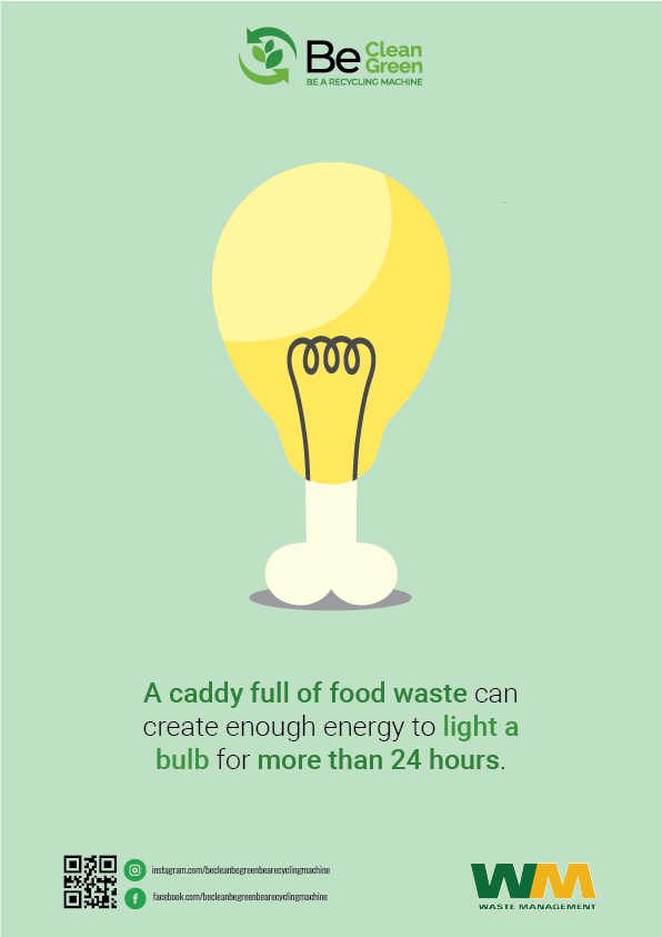
She said the poster need to be as simple as possible. the image must be clean, strong, attractive and it shows all the meaning of the whole poster. (she hates the light bulb the most btw)
Here is mine, please give me some advice so i can make it better. Thank you very much !
CellphoneS
I can see why she hates the lighbulb the most. LOL! (yikes)
Change your line breaks ie
A caddy full of food waste
Can create enough energy to
Light a bulb
for more than
24 hours
I’m not sure where you got your specs from or in what way this energy is saved, but it seems kinda bogus at first glance and likely a turn off.
These are all boring and static. You need to prompt the action of recycling in some manner.
2 Likes
Why does the lightbulb have testicles?
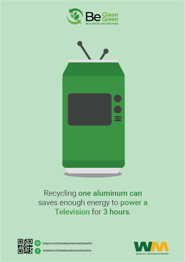
I’ve never seen a tv like that.
3 Likes
Never thought I’d have to say this - but lightbulbs don’t have testicles.
Also.. Is that TV from the 1960’s???
Better graphics - more call to action - better copy - better line breaks.
Have done - not enough to critique seriously.
1 Like

I understand that this concept is mostly about ‘subversion of expectations’ or perhaps better phrased -a visual play on similar shapes.
That being said, I completely missed it the first 3-4 times I looked at it.
I just saw:
a weird green… laundry-thing that has antenna for some reason?
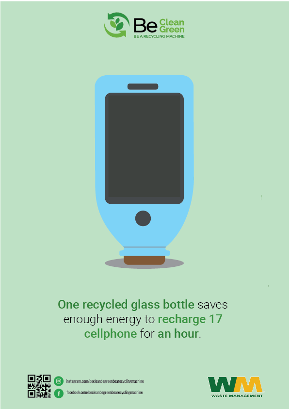
a weird blue thing with a phone screen in it…?
a lightbulb
I think if the art wasn’t so ‘google material’ flat, perhaps I would have caught onto the idea immediately.
The flat-design of the can does not speak ‘soda can’ to me at all. It’s just a green rectangle at a glance.
The glass bottle did not register as a glass bottle because it’s upside down.
The chicken leg/dumstick bulb has way too much ‘light bulb’ and not nearly enough recognizable ‘drumstick’ going on.
I think really fancy photomanipulations to blend easily ‘at-a-glance’ recognizable objects together would make a little more sense:
a TV screen into a generic sodacan image
a generic touchscreen/buttons into the face of a glass bottle image
a fried chicken drumstick with some sort of transparent-ish effect allowing the viewer to see the glowing incandescent filament
Disclaimer: I am not, nor have I ever considered myself a “designer” or an “artist” in the sense that I am in any way whatsoever a professional and thus probably unqualified to offer valid criticism.
1 Like
I want to like these a lot more than I actually do like them.
I like that you tried to combine two different objects to come up with a distinct graphic, but the execution of the idea is the issue.
The TV looks like a 1950s TV. I get it, but a bunch of young people might not. The glass bottle, which is a little tough to make out, comes off like an old-timey medicine bottle with a cork stopper. Again, not everyone is going to get that. And, clearly, everyone didn’t see the chicken/turkey leg.
Unfortunately, I don’t think there is anything you can do to salvage these. You had a good idea, one that was worth exploring, but not the right solution. So I’d say it’s back to the drawing board on this.
1 Like
Your idea of combining a television with an aluminum can and a bottle with a cell phone is clever. Unfortunately, even though it’s clever, the idea isn’t working very well because blending the objects together creates some awkward images. The object(s) beneath the light bulb, for example, are open to an interpretation that I don’t think you meant. Coming up with good ideas is easy. Getting those good ideas to work well is often very difficult.
Beyond the awkward illustrations, the purpose of the posters isn’t immediately obvious. In addition to the text beneath the illustrations, a large headline at the top could work to quickly communicate that the poster is about recycling.
1 Like
I think I get what you are going for … but it needs to be tightened up a bit
TV - Soda can
Cellphone - Bottle
Light bulb - Chicken leg
I would say keep working on it. It’s quite clever.
1 Like
Zoomed right over my head. Completely.
I would distinguish between clever and literal.
Do a modern tv with a staff l soda can.
Do a cell phone made out of bottles. Or work it in better.
Food waste is more than bones, so food waste high up, filters into light bulb, light room and scenarios unfolds
1 Like
the first thing I thought was “IT TAKES BALLS TO RECYCLE!”
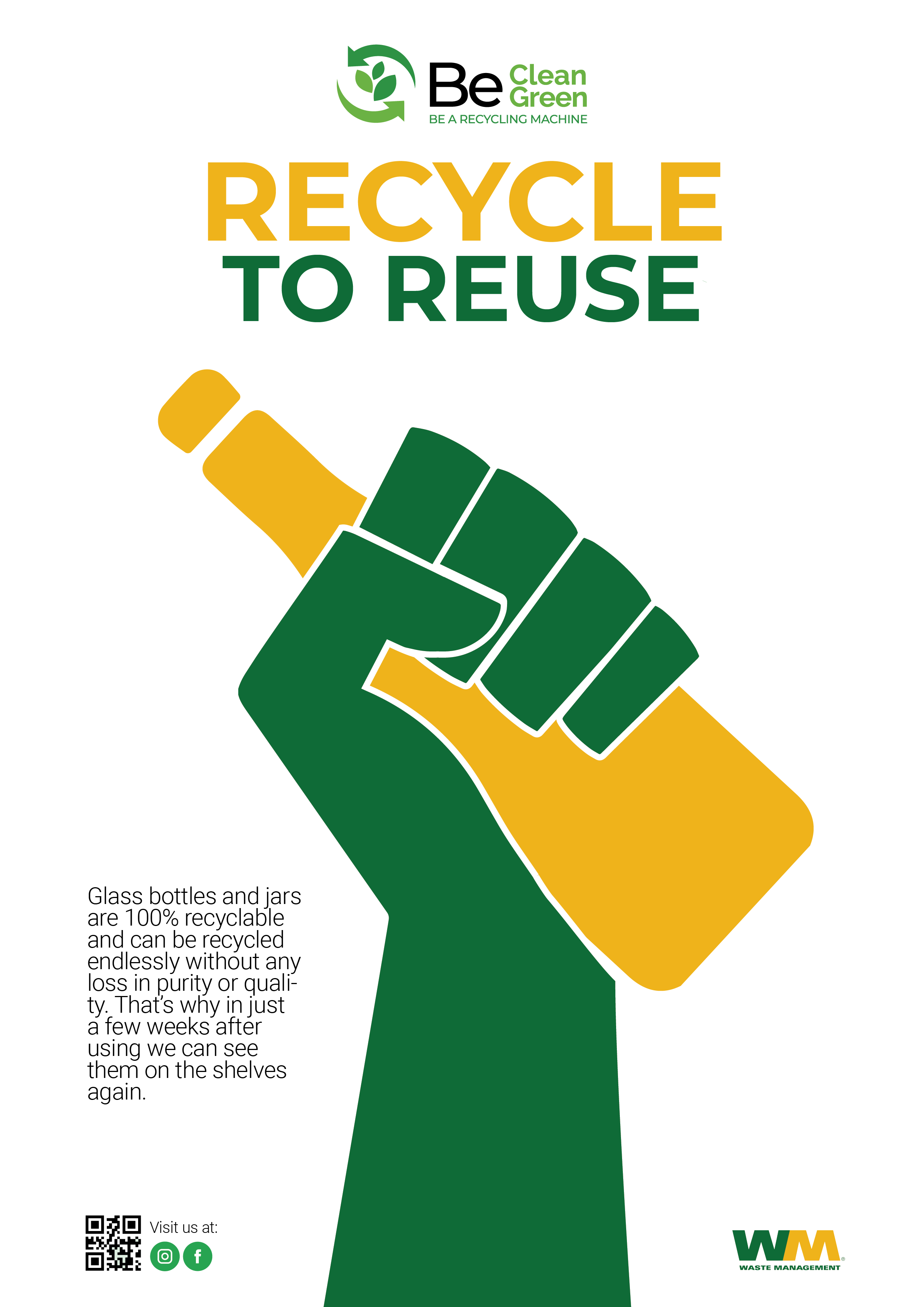
ty for the advice, since it’s hard to combine all of that so I decided to make other posters. Do you have any advice for this ? somehow I felt it was kinda boring but I don’t find any suitable effects for it.

These are better. They’re more straightforward, communicate better, and are not subject to misinterpretation.
I suggest increasing the leading on the block of text and turning off hyphenation. I might also try using a heavier typeface for that block of text. I would also tighten up the writing to make it more concise.
1 Like
We Can Recycle - nice
This works cos of the Recycle in the header.
it doesn’t work here
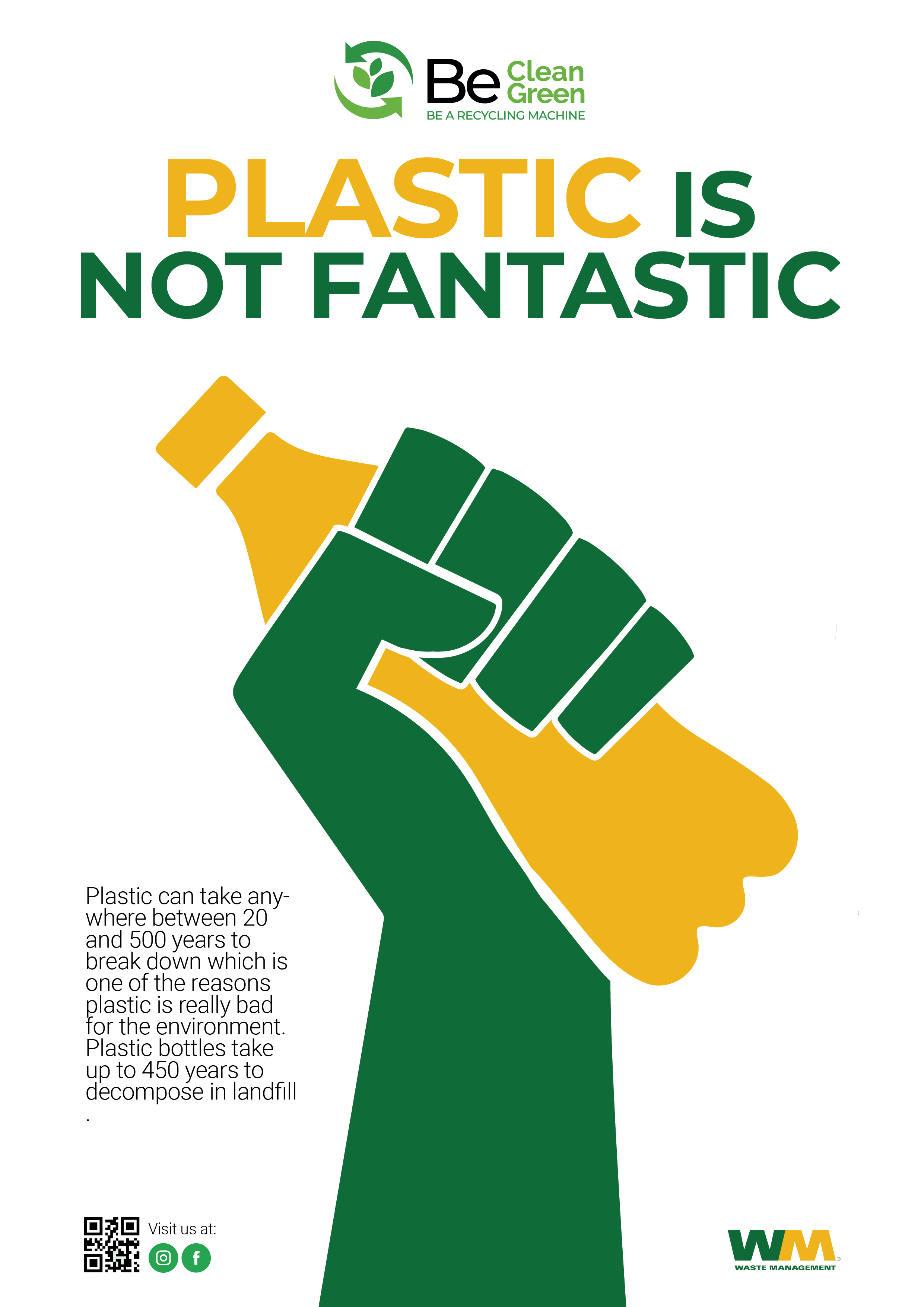
Plastic is not fantastic
Not a fan of this one
- Maybe ‘Recycle Plastic and Feel Fantastic’
Third one
Think it needs to say
Glass and Bottles - RECYCLE & REUSE
Overall
The log at the top is not legible - and it has a nice message - Be a Recycling Machine is very small text and hard to read.
As mentioned already - drop the hyphenation.
Text needs to be more legible - so stronger typeface, larger and loosen the leading.
And if all the paragraphs end with a full stop - then they all should have it.
1 Like
ty so much
you are such a big helper!
actually, the box at the top is the symbol of the campaign so my teacher doesn’t want it to be bigger
any ty so much for the advice ! I really appreciate it.
sr i got lagged and suddenly sent it twice ![]()
![]()
![]()
This topic was automatically closed 365 days after the last reply. New replies are no longer allowed.