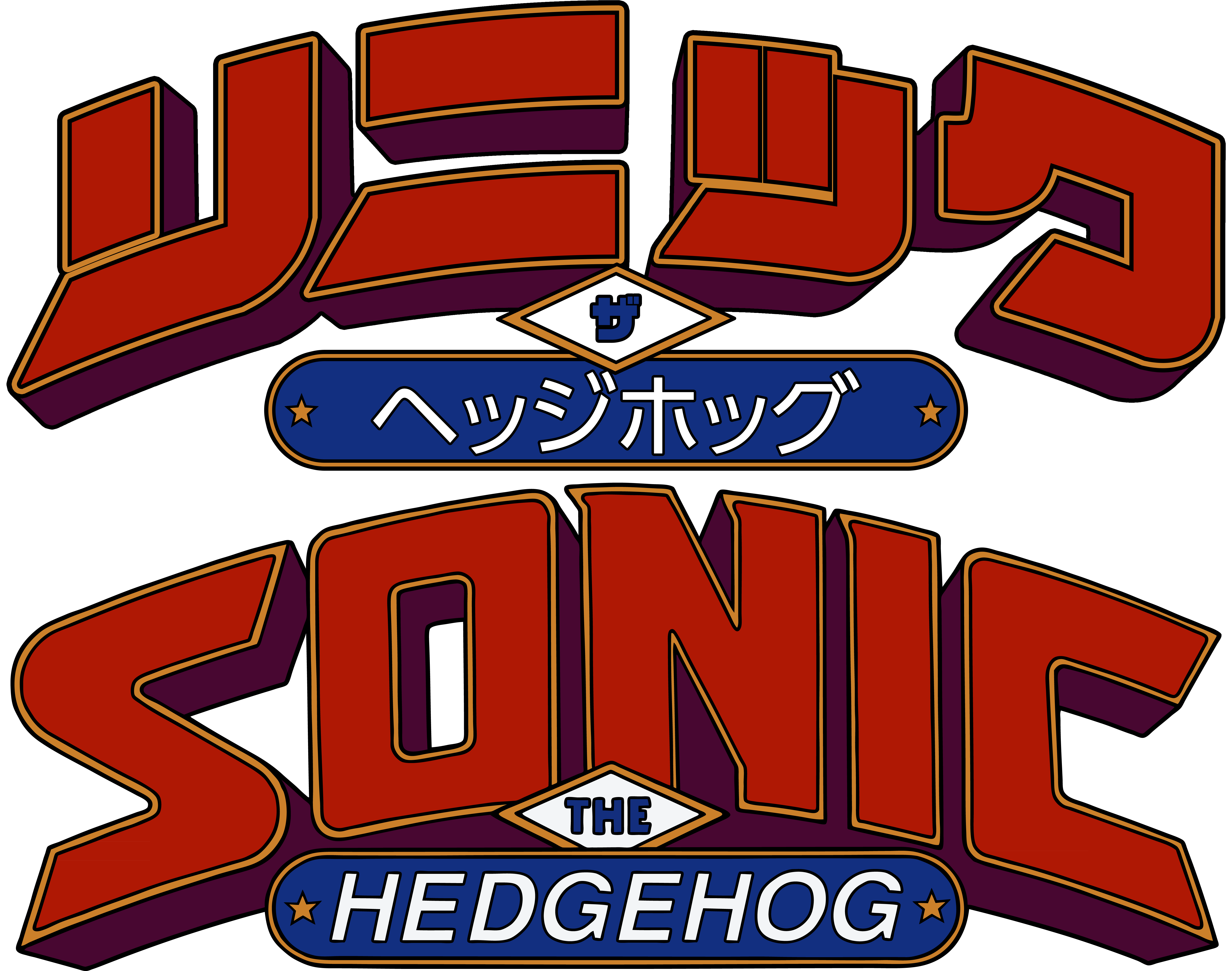
Looking for advice and feed back on how to make the drop shadow look similar to the bottom logo without making it look awkward. I easily make drop shadow effect I just don’t know the best way to draw it.
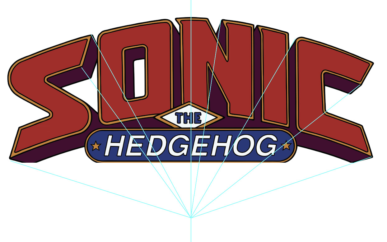
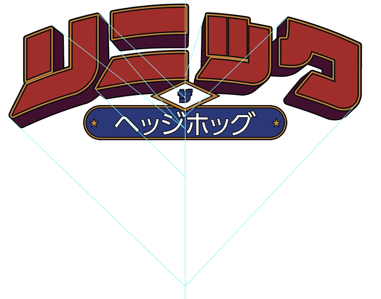
This the current drop shadow, I tried drawing a number different ways but the drop shadow either looks off or not as dynamic as the original due to the purple drop shadow not not converging in the middle as cleanly
Other than the uneven spacing in the middle of the second character, the drop shadow on your work looks fine. I think the reason you’re unhappy with it and don’t feel it looks as good as the lower sample is due to the word itself — the shape of the characters, how the characters fit together, and the negative space created.
Make your drop shadow a little deeper and shallower (see for comparison the lower left bottom of the S)
Then move your Hedgehog badge up so it is similarly spaced to the lower version.
Assume that they filled in the purple drop shadow under the Hedgehog badge to avoid awkward gaps.
Then bring your Hedgehog badge to the front so it covers the diamond shape as shown in the bottom logo.