"I have an assignment to redesign the packaging of Jägermeister liquor along with 3 different deer logos that I created earlier. I know these designs are not yet complete, but I still hope for some advice from everyone. Thank you! ( i dont have real products so i used mockup)
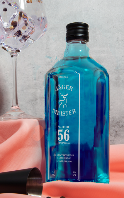
This is just a mockup, so it will have different colors. I will use the original Jägermeister bottle for this design along with raised decal printing.
Flat design for both
First Option
– I like the type, layout, and deer illustration.
– Not crazy about the blue color. It makes it look like mouth wash or blue curacao.
– If this were a real world assignment, the client might have something to say about splitting their name into two words. While it visually looks nice, this wouldn’t fly in the real world.
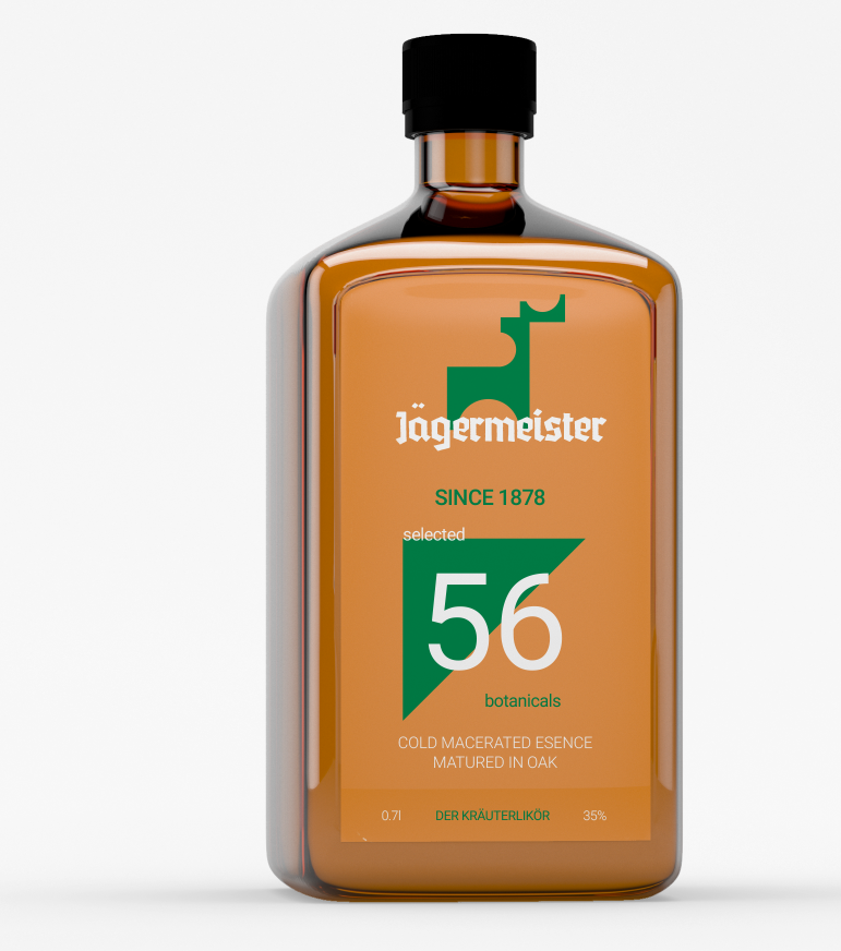
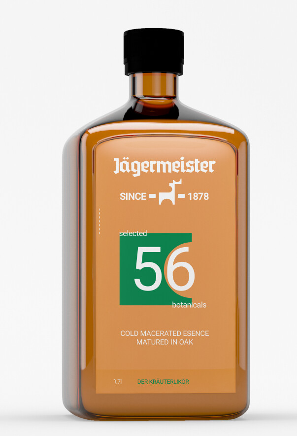
Second Option
– My very first thought is that the green triangle and 56 are too overwhelming. Scale that back to put more visual weight on the deer and Jagermeister.
– I like the first deer better, but this deer works okay in the overall design. Maybe look at tweaking the proportions of the deer to the type.
– Bring the two dots over the “a” down some. I’d close that gap by at least 50% of what’s there, now. Maybe more.
– Overall, the type is a bit flat on this one.
– I don’t think you need to trash this direction altogether, but it needs some tweaking.
This assignment is one where I might have ended up arguing with the instructor.
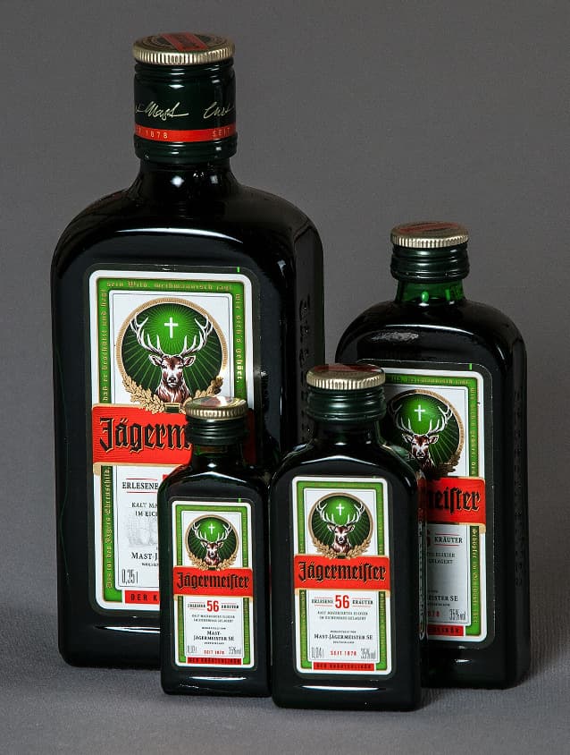
Jägermeister is an established brand of liqueur with a rich history. The existing packaging and logo (below) could certainly use some judicious tweaks, but a complete redo would squander many millions of dollars (or Euros) of brand equity.
By the way, Jâgermeister is a liqueur, not a wine.
noo sir xD, its just an assignment to teach us how to feel. The deer not the logo, its the “signal”. This subject called technick and process. Later when we study packaging, it will be more serious and we have to dig down their history, they targeted custumer,…
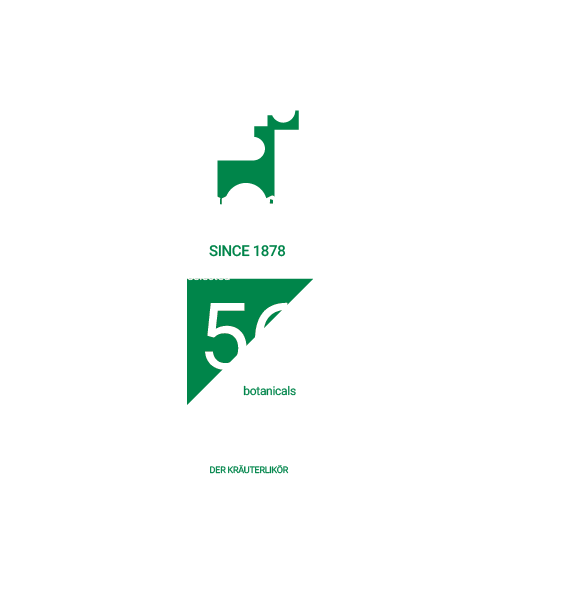
Regarding the initial design, I planned to use a Bombay Sapphire bottle, so I set the mockup bottle color as sky blue. When I decided to print it for real, I intend to use nail polish to add a bit of gold shimmer to make it sparkle a little. While waiting for everyone’s advice, I revised the design below with the second concept. The instructor didn’t want me to use the deer as a replacement for the logo; it’s just a signal in the design. So, I made the deer smaller and made the number 56 more prominent. Additionally, I also changed the triangular shape.