New to the forums. I’m helping a friend with a logo design. I’m not the best but enjoy attempting. The logo is suppose to say FSA but I’m having a hard time incorporating the S. What do ya’ll think?
Before even going into this being FSA or not, when you say logo, what do you mean? Is this an avatar for a gaming server or similar? Is it a monogram? Or is it really a logo for some kind of business adventure your friend plans to open?
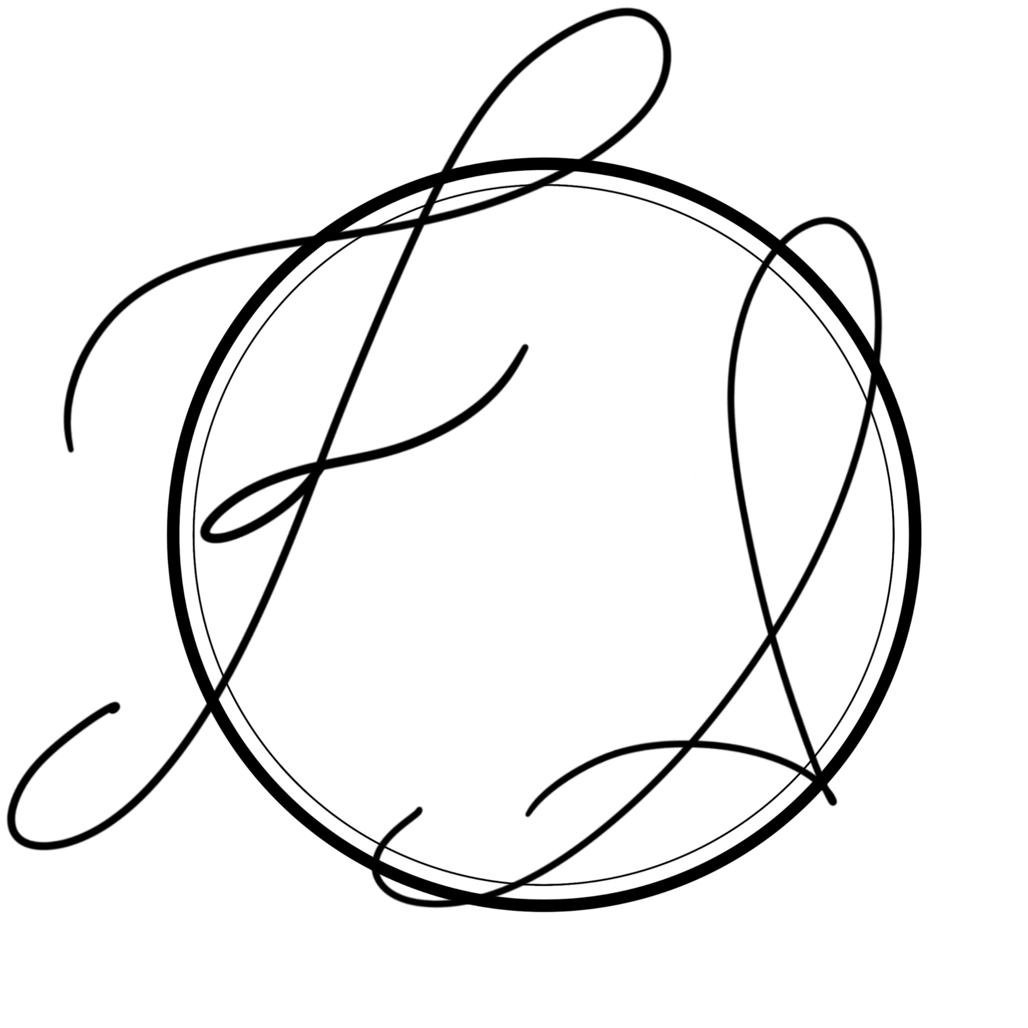
As a logo it is problematic in several ways, but most notably, the use of skinny hairline strokes, like the one inside the circle. Why the circle at all if you are going to break the plane so drastically?
It looks like it’s missing the middle letter. While blank space can be nice, too much looks like a mistake. Does the F stand alone while the S and A are combined into one letter? Why?
3 Likes
It could be that there isn’t an organic way to incorporate the S. If that’s the case, you can try to force it, but it will look forced, or you can explore a different solution. Don’t get locked into the mindset that what you’re working on is the only possible solution.
1 Like
Hmm…I suppose it really isn’t a logo. It’s for a friends Instagram page, so I guess an avatar lol. And as far as the graphic design feedback itself; I do not know lol. I don’t know graphic design well enough to think about “breaking the plane” or even know what it means. I appreciate your feedback honestly. This is just something I scribbled thinking it looked cool to me.
I think you’re right. I haven’t done anything close to drawing in years and felt kind of proud of myself how the F came out lol and I guess I’m holding onto it simply because of that. I’ll try to venture and do other things as well. Thank you.
I’d suggest having a look at other monograms and see how calligraphic lettering works.
If I am being brutally honest, it doesn’t hang together at all well and the letter forms themselves are pretty crudely executed with very little dynamic to them.
The inner circular line is so thin that it will all but disappear below a certain size. I am not trying to be cruel, but there is little point sugar-coating it.
In itself, this is not a bad thing. We all have to start somewhere. I think you just need to learn a lot more before doing live work, especially if it is paid.
The more you learn, the more you practice, the better you’ll get.
Good luck and keep at it.
Thank you. I have a lot to learn that’s for sure lol. I appreciate the honesty. It’s free work my friend just gave me something fun to work on during my spare time. I understand the feedback on the inner circle. Makes sense. I don’t even know why I have either circle there at all other than it seemed like the thing to do lol. Thanks again.
Everything you include should be there for a reason. If not, lose it.
The circle, per se, is not problematic, in fact, it is the only thing holding it together at the moment. It’s the thickness of line that’s the issue at the moment. I’d leave the outer circle and simply drop the inner one. Perhaps even thicken it up a bit, but only once you’ve sorted the lettering out.
For now, I’d suggest putting it to one side and go investigate how calligraphic letters are created. Their shape, dynamics and pace are formed by the angle of the brush or pen. Once you understand this, you’ll see, in a second, why what you’ve done doesn’t work. Look at the basics, then look at people like Luca Barcelona and Seb Lester. They are both different, stylistically, but are both stunningly good and level to aim for – even though most of us mere mortals will get nowhere near!
Hope this helps.