Hello, I joined this forum so that I could get some critical feedback. My assignment is very lacking and I would love to hear what you all have to say so that I can improve. There are two designs that need to be assessed by the questions following. These are the questions I was told to ask all you lovely people:
Does the design meet the objectives of the design brief?
Does the size and position of each element achieve balance and focus on the advertisement?
Does the typeface selected suit the product and the objectives of the brief?
Does the design of the advertisement attract the reader to the focal point and is it easy to read?
Does the advertisement meet legal and ethical requirements?
Below is the assignment brief and the photos:
We are relaunching our range of cheese burgers in Australia. We are seeking to commission a graphic designer to develop new PRINT ADVERTISING for our CHEESE BURGER RANGE . The advertisement will appear on the back cover of national magazines.
The advertisement should reflect the affordability of the cheese burger and that there are healthy options that can be chosen such as salads or smoothies to accompany the burger. As well the advertisement should emphasise the legendary combination of the beef, onion, pickle, tomato sauce, mustard and cheese that is always so popular.
The specifications of the advertisement and mandatory requirements are as follows:
McDonalds logo must be present
McDonalds Australia website
CMYK colour space
300 dpi
5mm bleed
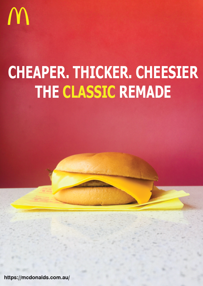
Design 1:
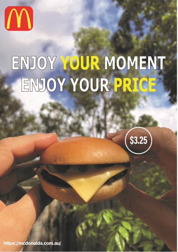
Design 2: