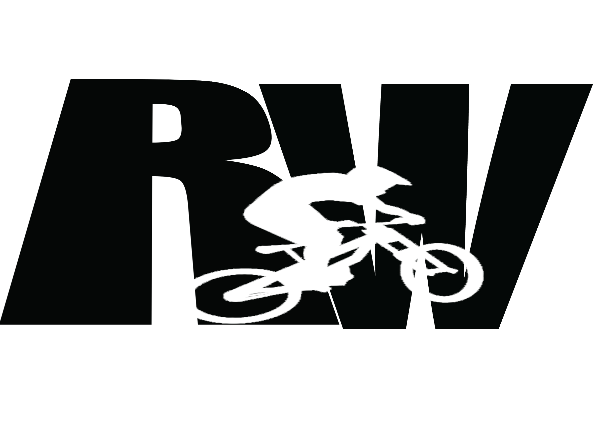
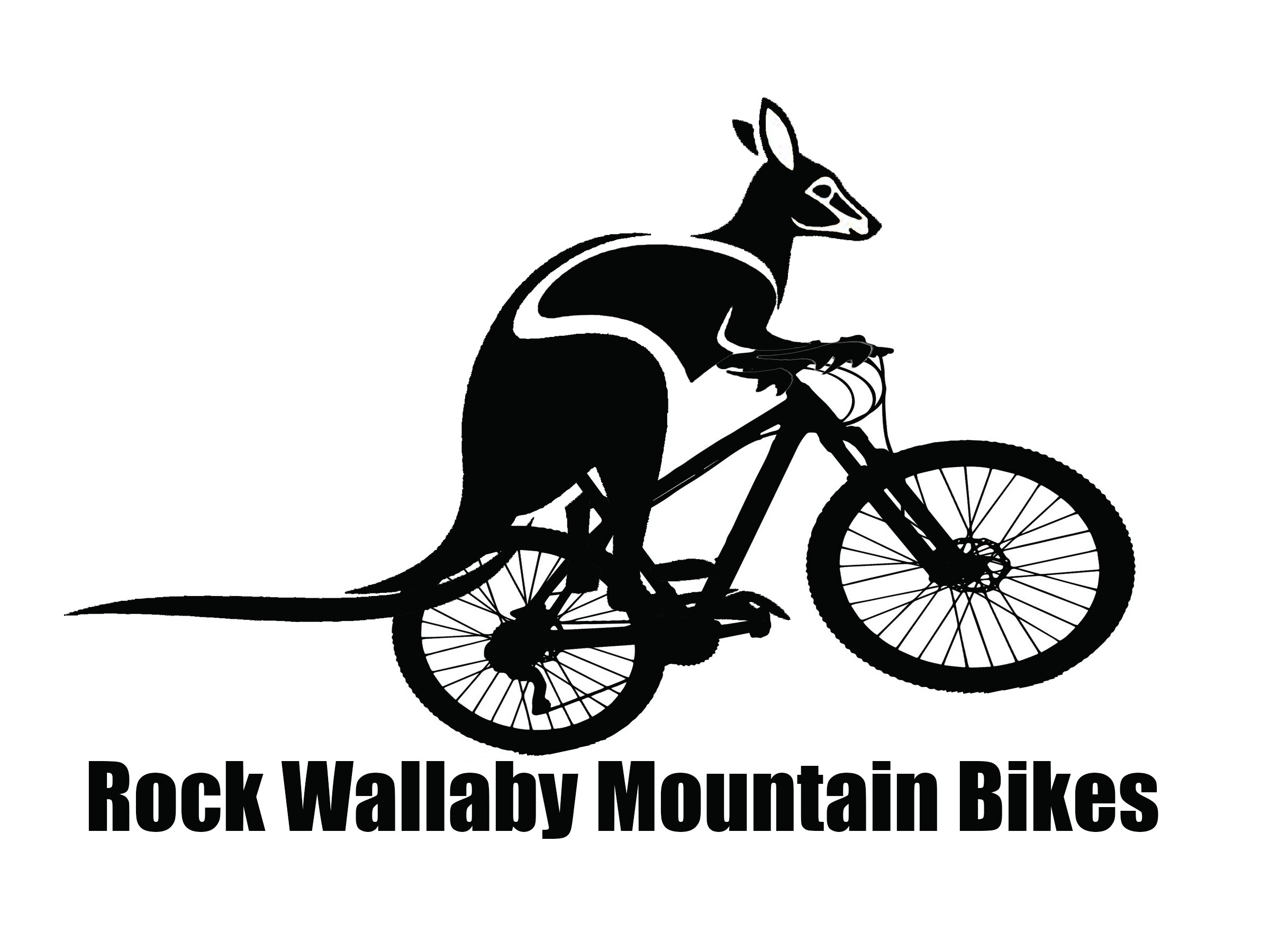
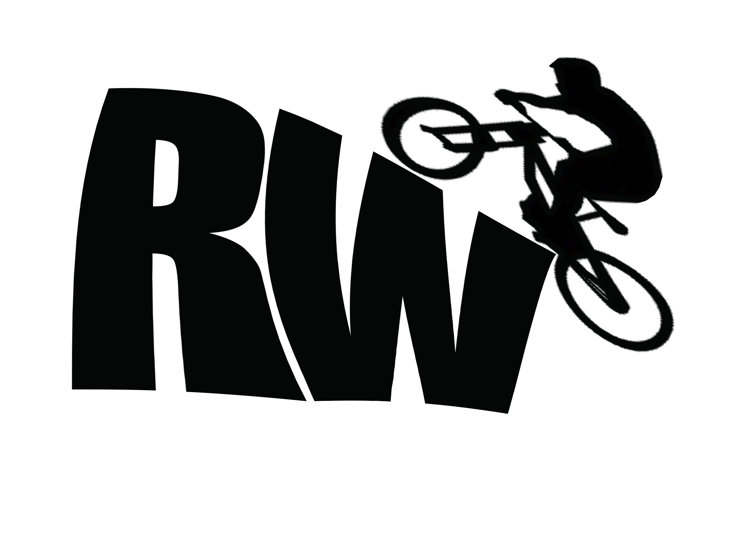
I am a student taking up Certificate III in Design and one task is to make a logo for a client (Rock Wallaby Mountain Bikes) where some of the requirements include: Clean, simple design, one colour only, should appeal to young men (15 – 30) as this is their biggest customer base.
I came up with 3 possible designs:
I would appreciate for some feedback please.
Also I am considering making the logo colored blue (any shade of blue) is the color appropriate?
I don’t want to sound mean, but firstly I think you’re being too litteral with your design.
Just becuase the logo it’s for a mountain bike and the brand name includes the word “Wallaby,” or “Rock” doesn’t mean you need to show these things in the logo, its too complex to be practical.
If I were you, this is where I would start - I would look at what asetheticis popular with this demographic in the action sports industry and I would look to emulate that.
I also think you need to give some consideration to how the logo will be displayed on the bike.
Typically the mountain bike logos I’ve seen tend to be compressed vertically and stretched horizonatally, this is (presumably) so they can fit onto either the down tube or top tube of the bike and still be prominant:
Does this company manufacture bikes or is it a store that sells bikes? That makes a difference — partially for the reasons @Pluto already listed.
First, I can’t think of many good mountain bike shop (or manufacturer) logos. Most take the obvious approach, which rarely works well: they draw a picture of their product. You’ve done exactly that as @Pluto already pointed out.
The creative brief mentions clean and simple, yet your logos are quite complicated. Think of how logos are used; often they’re used very small. and details, such as spokes on a bicycle or a wallaby’s eyes will turn into an illegible blur.
Another thing to consider is that logos are always used in the context of layouts that also contain other visual elements. A logo on a brochure, for example, will need to work well with all the photos, graphics, and text. Even a simple business card with a logo contains lines of type. The best logos are those that can fit in with all the ways a logo might be used from a brochure to an app icon, to a sign on the front of a building, to being embroidered on a hat or screen printed on a t-shirt. Keeping the logo clean and simple makes it work well across a wide variety of uses.
There’s a bike shop here in Utah (U.S.) that I like to go to. I think they have a nice, simple logo. The shop is called Red Rock Bicycle Co. I’ve attached it below. The logo is nothing but a simplified bicycle gear with an R in the middle. It’s clean, modern, simple, outdoorsy, a bit rugged, adaptable, and gets the job done. Even the red color makes sense considering the name of the bike shop.
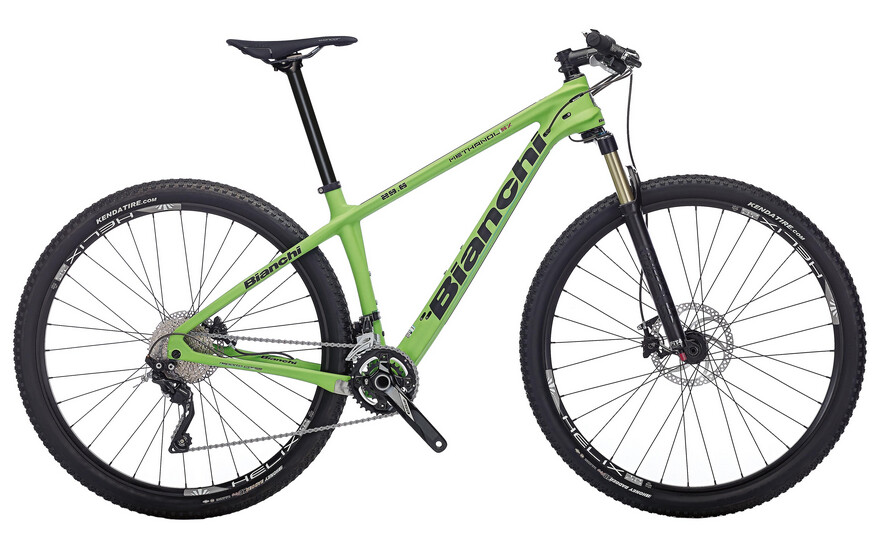
You have received some excellent feedback, and I have little to add. If the assignment is for a bike manufacturer rather than a bike shop, here are some of the brands you’re going to be competing against. Check them out and see how your work compares to them.
One other point … that’s looks like a Kangaroo not a Wallaby. Their max height is about 3 feet on average. They would look like a toddler on that bike ..not an adult