Hey,
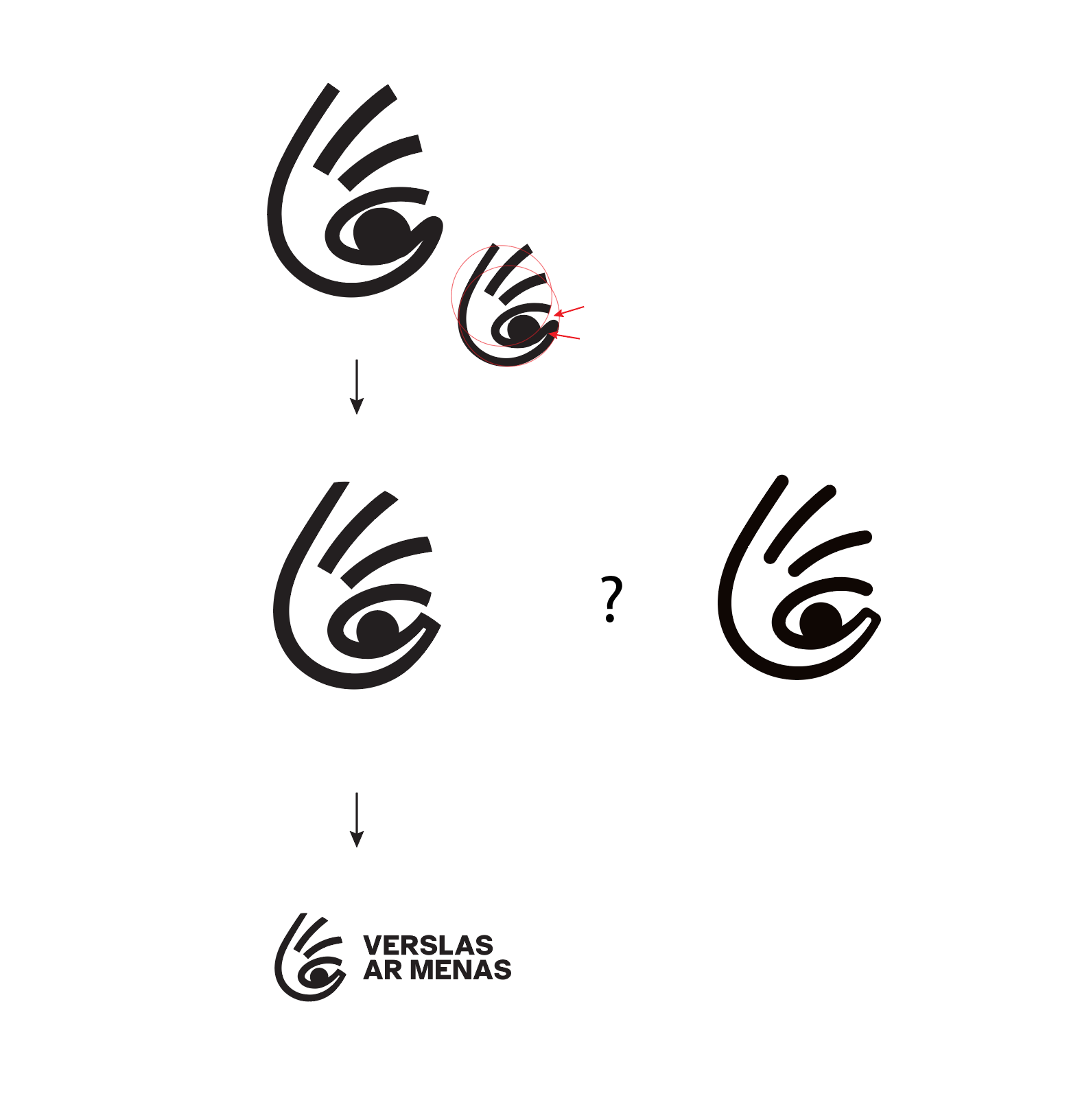
I’m stuck on this logo design for a social business that supports people with visual impairments. I have the concept and idea, but the issue seems to be technical (I think???).
I’ve done what feels like a million trials—sharp edges, soft edges, thicker lines, thinner lines, rotating it, putting it on a grid, drawing it by the golden ratio—you name it. But I still feel like something is off.
In the example, I’ve included the sketch version, the adjusted versions (with sharp or soft edges?), and the version with text. I’ve marked the main pain points I’m struggling with:
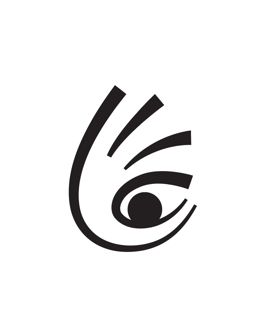
The thumb and index finger: Their directions are different, which makes that area look weird and messy. I can’t separate them because the client wants one continuous line connecting the pinky and the thumb. Even, tho, that did not fix anything also. This line also forms the shape of an eye, which is central to the concept. It also has problems with the negative space forming inside…
Symbol vs. font: I feel the symbol would look more organic with soft lines, but the text (font already chosen by the client) is sharp-edged and corporate. The font was designed specifically for people with visual impairments. Using soft lines for the symbol alongside a sharp-edged font feels a bit inconsistent, doesn’t it?
Overall balance: The logo seems out of balance overall. I’ve tried centering and balancing it, but it doesn’t seem to work with this concept of a hand forming an eye. It looks even worse when placed in a circle (I tried that too).
Maybe someone can see what I cannot? Any thoughts or advice?
Thanks in advance!