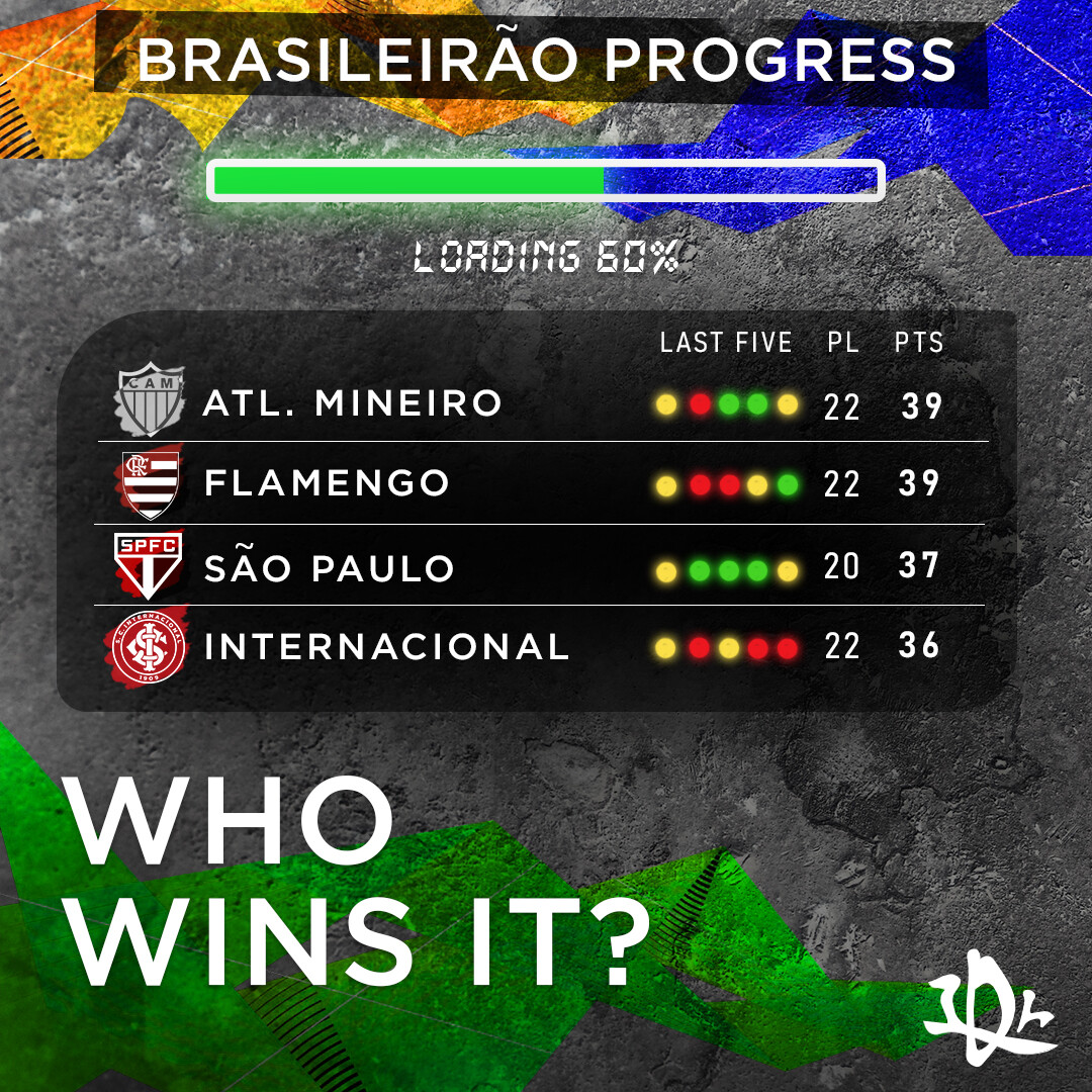
This is a design I made for my IG account about football news. The Brasileirao is the top flight league of Brazilian football and half of the season has been played. I would appreciate your feedback. Be harsh.
As said in my previous “need feedback” post, I am posting the final version of the design that I had requested feedback for. By the way, I believe it got quite better due to your suggestions.
I’ll try to fix the issue that the headline/caption does not blend well with the rest of the design, it should improve the design as a whole a lot. Thanks for the feedback
I suspect everything you did was on purpose. I can’t speak for Smurf2, but whether on purpose or not, it looks like a mistake.
I have a personal rule of thumb or precept that I’ve never mentioned, but if I had to name it, it might be The Rule of Ambiguities.
Those things caught midway between looking intentional and not are typically seen as mistakes. In the case of your Brazil headline, if you want it to be crooked, make it unambiguously crooked, not stuck in the middle ground of being neither quite straight or noticeably crooked.