What is the context? Where will people see it? Is it interactive? You’ve asked a question, but I see no way for people to respond with an answer. Can they what? Win? Why is there a loading bar on something so simple? The letters in CAN THEY are awkwardly spaced apart — why? What is the little signature thing down in the right-hand corner.
It seems as like you’ve spent a lot of time on how it looks, which is fine (it does look nice), but you seem to have paid less attention to the user experience of it needing to be clear and make intuitive sense. Then again, as someone in the U.S. who has no interest in sports whatsoever, I’m not your target audience. Maybe this is all perfectly understandable to your audience. Even to me, though, it is clean and legible, which is great.
I just looked up Sky Bet and realized this is some sort of betting thing. In graphic design, you can’t assume that viewers know all the ins and outs of what they’re seeing. Your target audience might very well be people who use Sky Bet to bet on sports teams, and everything might be obvious to them. However, you posted what you made here, to a target audience who might have no clue what you’ve made then asked for a critique.
I’m not even sure what I’m looking at.
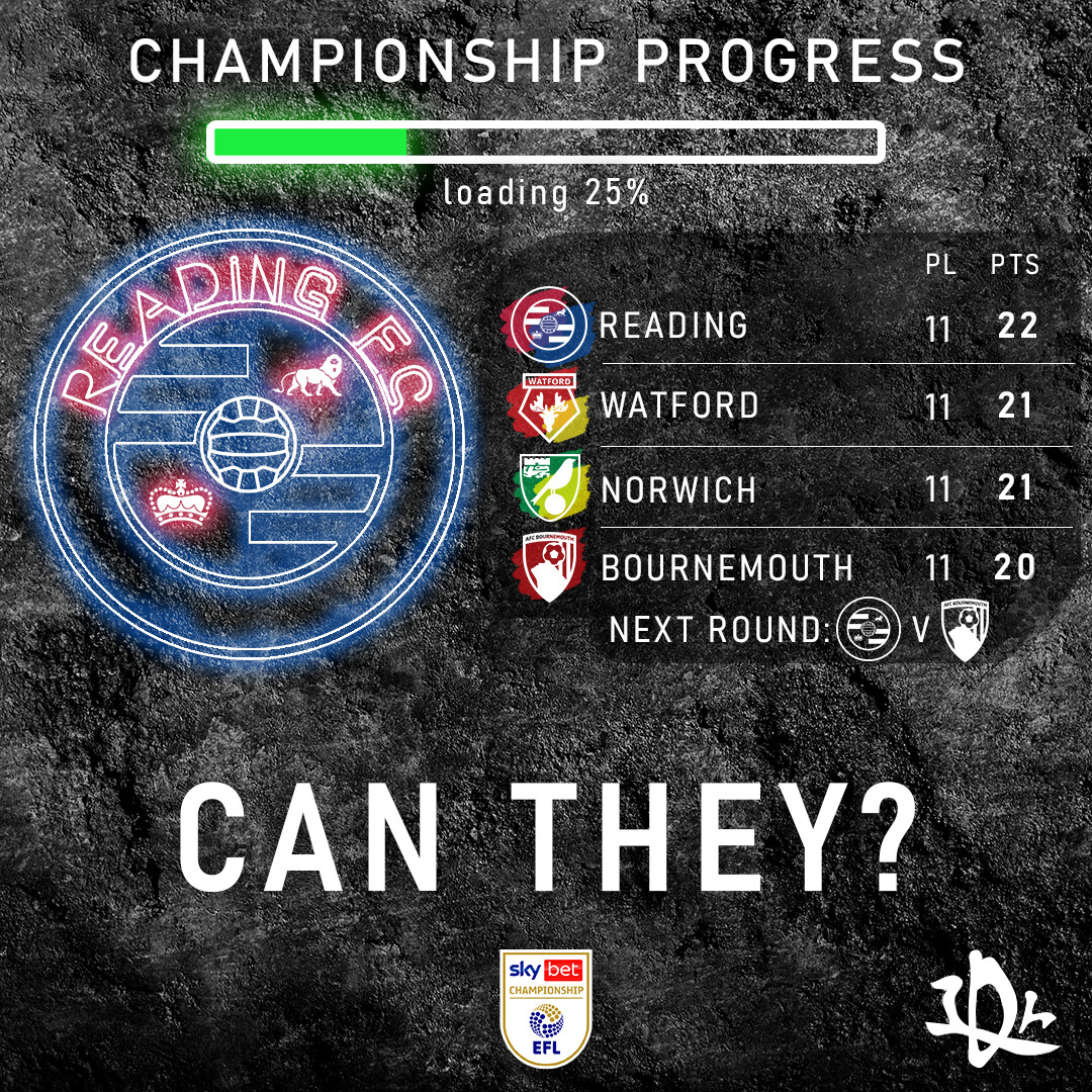
Hi, appreciate the response and feedback. You’re right, many can be missing the context here and it is my fault. The design is for my IG page specialized in football news. That signature on the right is my personal logo and the context is that the team “Reading F.C” is on top of the league “Sky bet championship” (England’s second division) but they have lost three games in a row. Obviously that last thing would be included in the epigraph but all the other stuff I said is supposedly known by the people who are watching the IG post.
I’m really struggling to find a sports graphic design forum so as to speak and receive some sort of feedback from sport graphic designers. If you can help me in some way I’d thank you a lot
I don’t think you need a sports designer. Graphic Designers in my experience design for many different clients. Some may specialize but the foundation and rules they apply are the same throughout.
Figure out your hierarchy and what you’re trying to say. It may be known to people that follow that page but if it came up in an organic search and someone was looking to understand what was going on they may be turned away if the message isn’t clear.
I’d spend a little more time working on the typography and composition. A lot of university sports times have designs like this. I’d check out some of their pages to see how they are displaying scorecards. Find some insipration.
Thanks man, I’ll try that, appreciate the help and advice, also, do you think it’s going to be okay if I post (from time to time) my designs so gd like you and Just-B give me some feedback. I will start adding some context though haha
Yea, we are always happy to give feedback here.
1 Like
On the smaller crest, you have left the text off it, where the others have it.
Do you support Reading? Why? I feel sorry for you mate! Ha ha!
The “Cant They?” is the only part I have a problem with, It’s not aesthetic or the same/style as the rest, it sticks out like a sore thumb.
Next Round: it’s clear enough but still ambiguous what crests are on show, I know it’s Reading, but versus who? I can’t discern what crest that is.
The only clue is that it is Bournemouth as per the crest above.
Can’t really think of a reason for a progress bar, I only ever see something like that in gaming, not something like this.
Overall, it’s nice, pleasant, and easy to understand, but it needs some cleaning and sorting out inconsistencies.
1 Like
Thanks a lot for the feedback.
I’m not a Reading fan haha, I’m from Argentina (I support Lanús). I really need to fix the “Can they?” issue, as you said It’s not blending well with the rest of the design, I’ll try some things and then post the final version altogether with another new design on my next “need feedback” post haha, I’m glad I found this forum really
1 Like
I love it just as it is. “Can They?” is the headline so it has it’s proper prominence. Bournemouth play Reading away in the next game, 2 points behind with 3 points for a win. Can they win and move from 4th to top of the league is the message. All the info is there for the people who would be interested in this. The loading bar - 11 games of 44 played.
1 Like