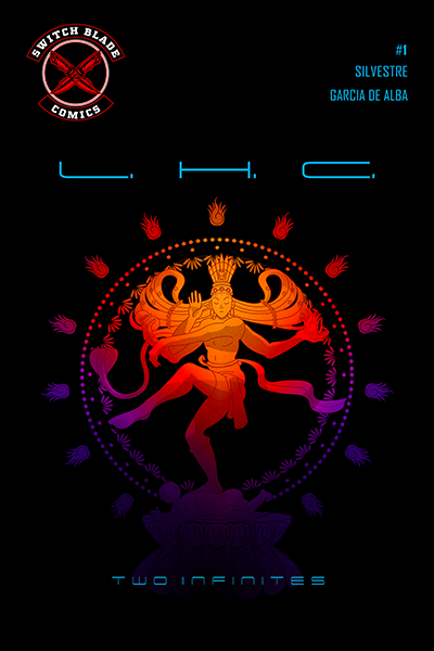
Hi everyone! I’d like your thoughts on this comic cover. The thing is I want the logo to be this size, and cannot seem to find a suitable place for everything else because of this. Any help will be greatly appreciated!
Well I think Switchblade is all one word. No harm, just looks odd. But it’s ok.
Two infinites is barely legible.
Where did you get images? Did you draw them?
A bit more context would be great.
I’m not sure how much, if any, control you have over the logo, but you’ll always be fighting with it if it needs to be that large and prominent. Magazines typically get around the problem by designing the publication’s nameplate to fit the top portion of the layout, whereas your logo wasn’t designed with the cover shape and dimensions in mind. Instead, it’s more of a traditional logo shape rather than a nameplate. In other words, you’re wanting a logo to serve a similar function as a nameplate, but it doesn’t, likely never will and will always be a bit of spacing and positioning awkwardness when used as a dominant element on the cover.
Your actual nameplate or title — TWO INFINITIES — ends up being tucked away almost illegibly in an almost tertiary position at the bottom of the page.
In addition to that, it’s a prominent circle because of both its size and its position, which competes with, rather than complements, the big, circular artwork on the page. But you already know all that.
If it were up to me, I’d use the logo more like a logo (smaller and unobtrusively tucked away) then come up with another, more visually, compatible way of branding the book as a Switchblade (why two words?) comic.
You’ve got what I’ve always called a bacon and chocolate or, maybe, a chicken ripple ice cream problem (to quote Neil Diamond) — two ingredients that, on their own are just fine, but can’t easily be used together in an appetizing recipe. Rather than force incompatible ingredients into a mixture of this sort, it’s typically best to change the recipe.
For what it’s worth, I really like the color combinations and how they contrast with the black background. The dark purple on the bottom is too close in value to the black background, however, and seems to disappear. I’d likely lighten up that purple a bit so that it didn’t come so uncomfortably close to disappearing.
1 Like
Are you able simplify the Switchblade logo a bit and maybe make it monochrome, @xoxdid ? If so, you’d be able to reduce the size without it loosing much of it’s prominence. Another benefit would be that a simpler monochrome logo would also be more easily compatible with other cover background colours - if you run into problems with a mostly black background already, just imagine how it would clash with a busy colourful background.
Is this a printed comic or a digital comic?
Have you looked at how logos are dealt with on other comics?
I’m guessing your comic series name is L.H.C. and the little words at the bottom are the story line in play in this issue. Nothing in the world would make me pick this up out of a rack as I’m completely unfamiliar with the work, the initials in the title are meaningless and the art would be mostly hidden by the front holder of the rack. Your logo does nothing to fix that.
If it is digital, think about how it will be viewed on a standard phone screen and what will be legible (or rather, not) at that size. Also, I’ve seen online comics with a splash page for the publisher logo, with the comics a choice of options under that.
Thank you so much for your reply. Indeed, I do not have any control over the logo, and do agree that it should be smaller… Additionally, I really like that you pointed out the competing of the circular shapes. I was not aware of that, and for that and the rest, thank you!
Hello!
It will be printed, and unfortunately I only have control over the artwork and the arangement of the elements. I have been further constrained by the size of the logo and do not know how to proceed…
Thank your for your feedback regarding the rack! I did not account for that at all, thanks!
I agree Ovoao, unfortunately I cannot touch a hair on the logo XD
Thanks for replying, your feedback is useful nonetheless!
Hi Smurf2!
I am illustrating the comic for the client, as well as the cover. The artwork was done by myself, and I’m responsible for all the colors, fonts, and arrangement of the elements, except the logo. The logo has to be just like that, and in that size. Unfortunately the change in size was a last minute thing, and I am not willing to redo the cover. I was looking for a miraculous workaround, but it seems we all here agree that is next to impossible :B
I’m an illustrator, so my design knowledge is scant. That’s why I got surprised at the visual competition between the circles ![]()
I like it.
1 Like
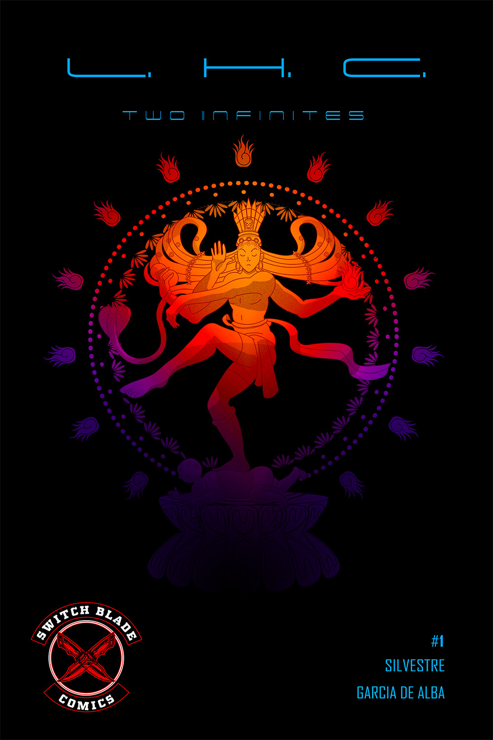
The arrangement is better, but that font is illegible. You will never see that across a visually noisy shop. At very least, use a bolder weight and take the full points out between the three letters. They are redundant and distracting.
I’m curious what L.H.C. stands for. Too bad it isn’t an online thing. It’ll never be in a rack in my comic shop (mostly cuz it’s a collectors’ shop with limited new lines) but I’d be intrigued enough to pick it up.
Let me start by saying this. I am not your target market. I’m not into comics as an adult, and I wasn’t into them as a kid. I don’t even care for the Marvel and DC movies. So take my comments with a grain of salt.
To my eye, this isn’t meshing at all. The main art has an Eastern, organic feel; and the type has a Western, electronic feel. If that’s done on purpose, great; but I can’t help but feel you have four different elements (headline block, Eastern art, Switch Blade logo, and block of type in the lower right corner) that are arranged but aren’t really a cohesive whole design. Again, I know nothing about comics or LHC or Two Infinites.
If you’re keeping this layout, I think the type could use some fine tuning. I’d like to see a little more space between the L H C letters and the periods. They seem pretty tight as-is. Is the block of type in the lower right corner 3 different things or one thing? Right now, with the generous leading, it looks more like a list than a single thought. If it’s supposed to be a single thought, I’d tighten the leading or look at different (or no) line breaks.
Yeah…
The mix is intentional, although I do get your meaning, especially betwwen the contrast between organic and electronic. It maybe a little to late to make it coherent in regards to this, but I am curious as to how it would turn out, so I’ll think about it. I also get and agree with what your telling me about the list, so I’ll see to it. Overall great feedback, thanks Steve_O!
Really awesome. The colors that you have used and made it so realistic is amazing. The cover itself looks mysterious and people will definitely take a look at the content. The way the cover is representing the concept of the main comic is great. It is very important that the cover speaks about the content inside rather than a completely different theme of art in the cover and a different story inside.
General disclaimer - I love the neon aesthetic, so I might be a little biased in your favor. I like where you’re going, but I do agree with the general consensus that you should make the header a heavier font. In particular, if that’s the name of the series, you might want to make a custom title line graphic, rather than just using a stock font. I don’t know how comfortable you are with typography/calligraphy/general font design, but I think it’d be worth the time investment if you can come up with something that unifies your two themes even more that could be re-used on future editions for easy recognition.
OH - and a note from something I’ve learned in printing the neon aesthetic, make sure you get a test print before you finalize - I’ve seldom seen a bigger disparity between screen and print appearance than when working with the high-contrast of neons and blacks, especially purples and blues. If you’re doing a standard 4-Color print, you’ll definitely want to review a physical proof.
I think that the font of the phrase “two infinites” is not very legible. I like the color of the main image but I feel that the colors of text and logo do not quite match with the rest. Maybe consider following a different color palette for the logo and text.
Good luck! ![]()