Yes and no.
Sometimes it helps to think in terms of something analogous that provides distance from the immediate problem while still being relevant to picking apart and analyzing the problem. So let’s say this is a printed booklet instead of a website.
A single, consistent color scheme used throughout a booklet can help visually unify the entire booklet into a single design instead of a series of independent and unrelated pages. This is good. However, there are several ways to do this, and it could but doesn’t necessarily require using exactly the same color scheme on every page.
For example, all righthand pages might have a conservative white background and understated layout. All the lefthand pages, however, might be built around very vivid colors — all of them different. In this example, the varying color scheme is unified by the consistent rhythm of all the righthand pages being white and all the lefthand pages being radically different but consistent with all the other lefthand pages in their use of wildly different colors. Here, it’s the consistent back-and-forth rhythm of color usage that unifies the booklet. Compromise this rhythm by mixing up the pages and the entire booklet would lose its consistency and devolve into an incoherent amalgamation of color randomness.
With this example in mind, a single color scheme on a website is one common way to help unify the look of a website, but it’s not the only way. The website’s design can also be unified by consistent use of other design techniques as well. My point is that there needs to be something that pulls everything together into a unified whole whether it’s consistent use of or consistently varied use of a background color or something else altogether.
In your specific situation, if the pages logically and consistently jump back and forth between two separate but visually related color schemes, it could work (as long as it serves a purpose and doesn’t risk being visually jarring or confusing to the viewer). Similarly, if the header element area on every page uses one color scheme, but everything else further down on the pages uses a related but analogous color scheme, that could work too.
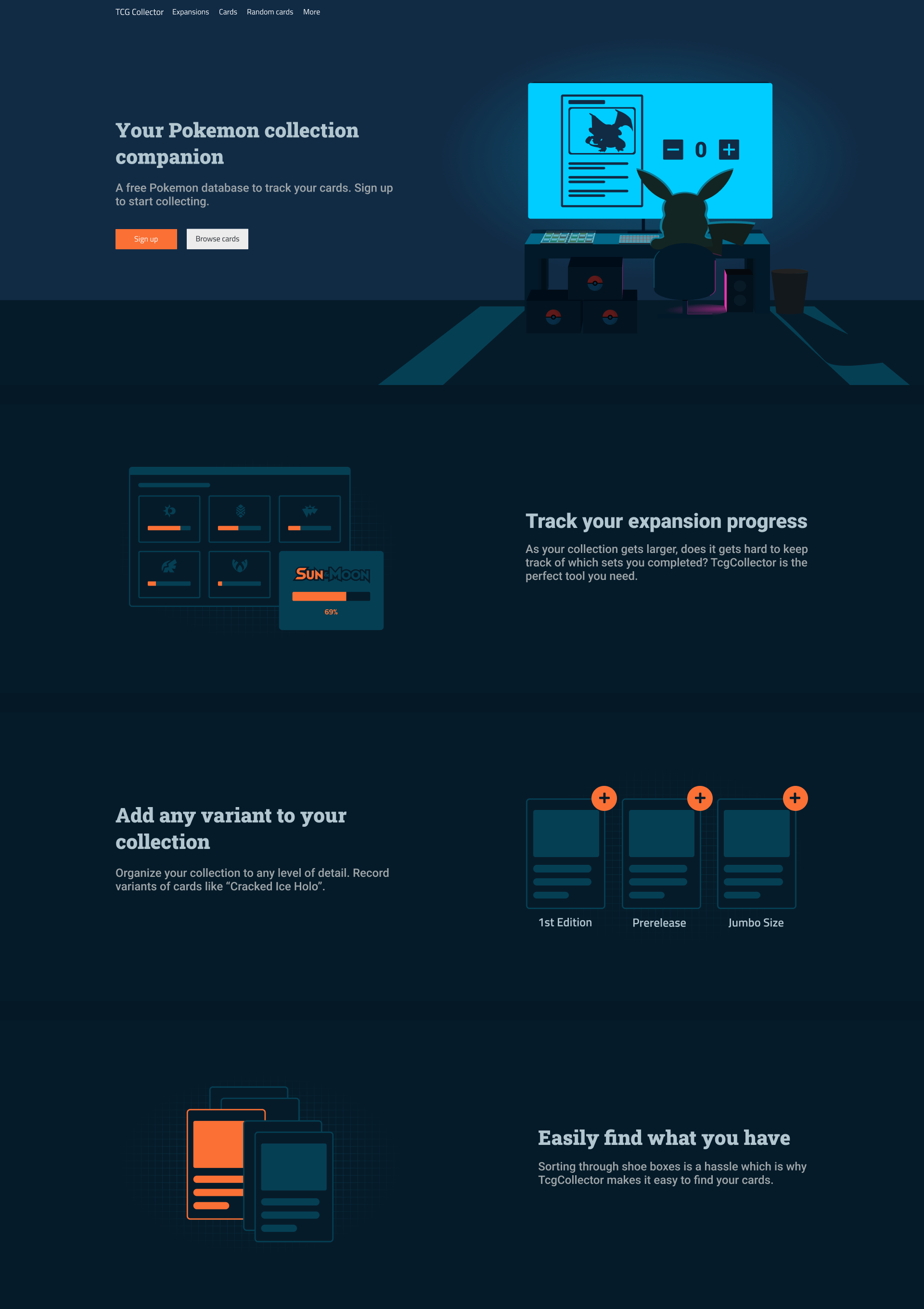
Part of my answer would just be repeating what I’ve already written, but in addition, I’m reading between the lines and thinking that you might prefer the dark, moody background and that your client isn’t sold on it.
As I’ve already pointed out, as long as it’s done logically and consistency, there are ways to use both color schemes throughout the web site.
However, I’m sort of agreeing with what I’m assuming is one of your client’s unspoken concerns — the dark background isn’t really working because it’s just too dark and creates a mood that doesn’t fit the subject matter. Can you articulate a reason why a website about Pokemon collections should have the look of a darkened theater instead of something a bit more bright, airy and sunny? Is it possible that your preference for one over the other isn’t based so much on what’s appropriate for the website but is, instead, a reflection of your own personal tastes?
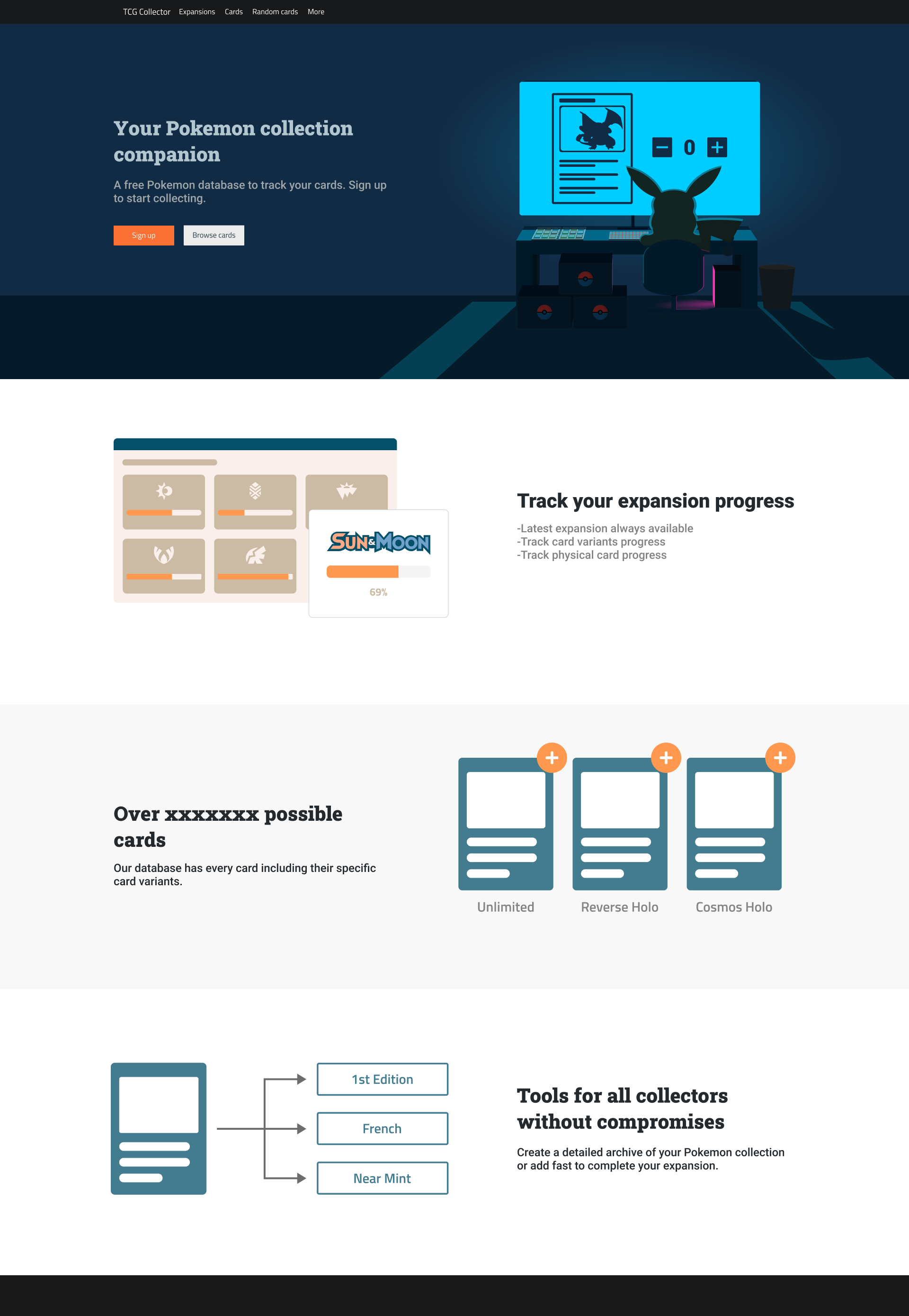
It looks conservative and informational rather than fun, exciting or game-like, but I don’t think the white background places limitations on making it “pop out more,” as you put it.
Instead, I think you might be relying on the dark background to provide the personality you want, and that you’re at a loss on how to create a similar personality on white background using techniques that work on a dark background.
I think the answer could possibly be to think through the problem from the viewpoint of designing a fun, cheery, playful, sunny website instead of thinking in terms of how to transfer what works in a dark layout and trying to make it work on a light one. Is it possible that you’ve locked yourself into one mindset? If so, maybe it would help to step back a ways and look through some brighter examples of websites, books, magazines, booklets, etc. Maybe reorienting your thinking in ways more conducive to light and airy rather than dark and moody could help.