I started a fake project in which I designed 10 posters, these are 10 off them.

If you like them then good - they’re fake projects, no brief, no goals, no branding.
It is what it is.
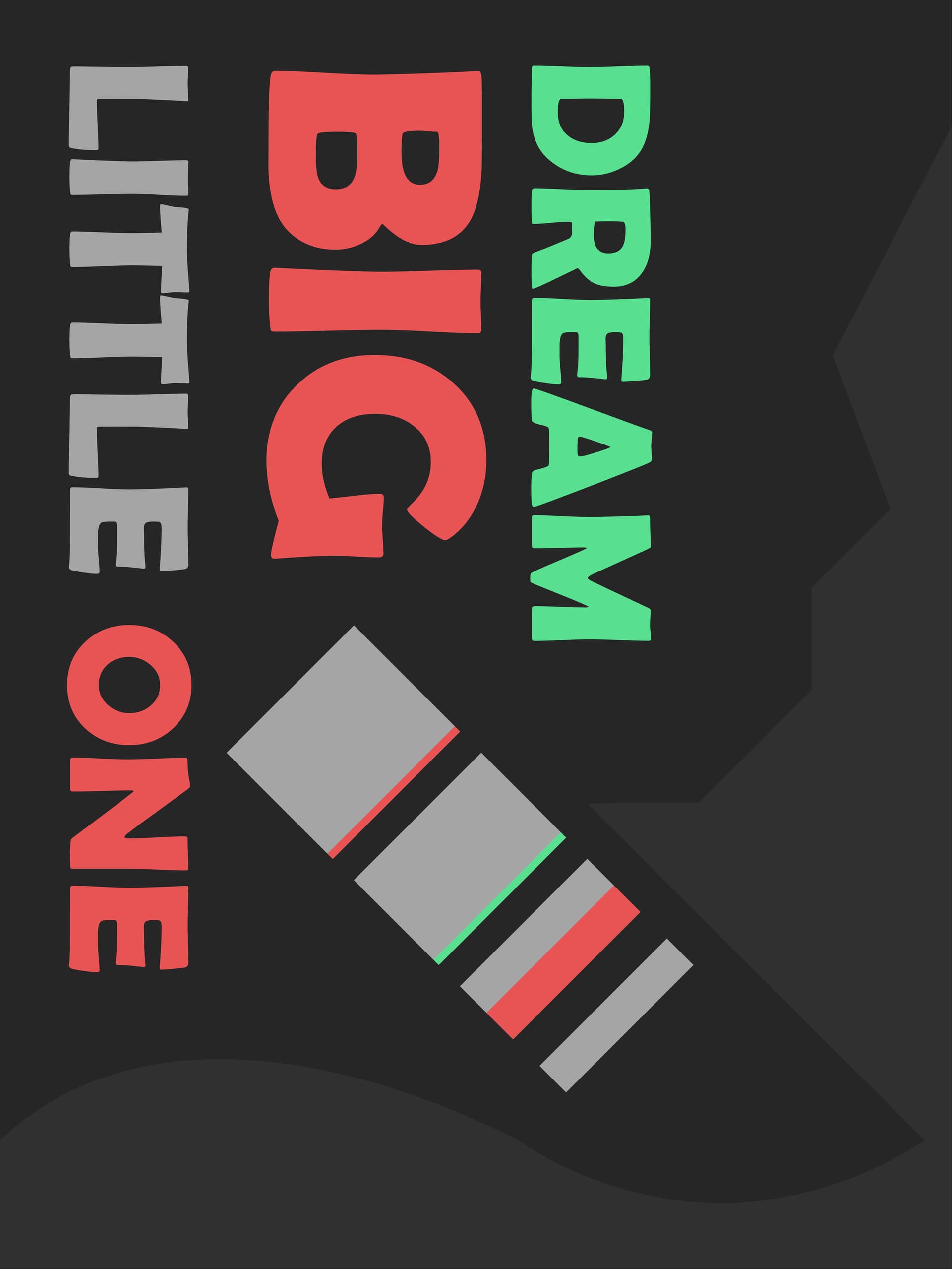
No idea what the first one is about
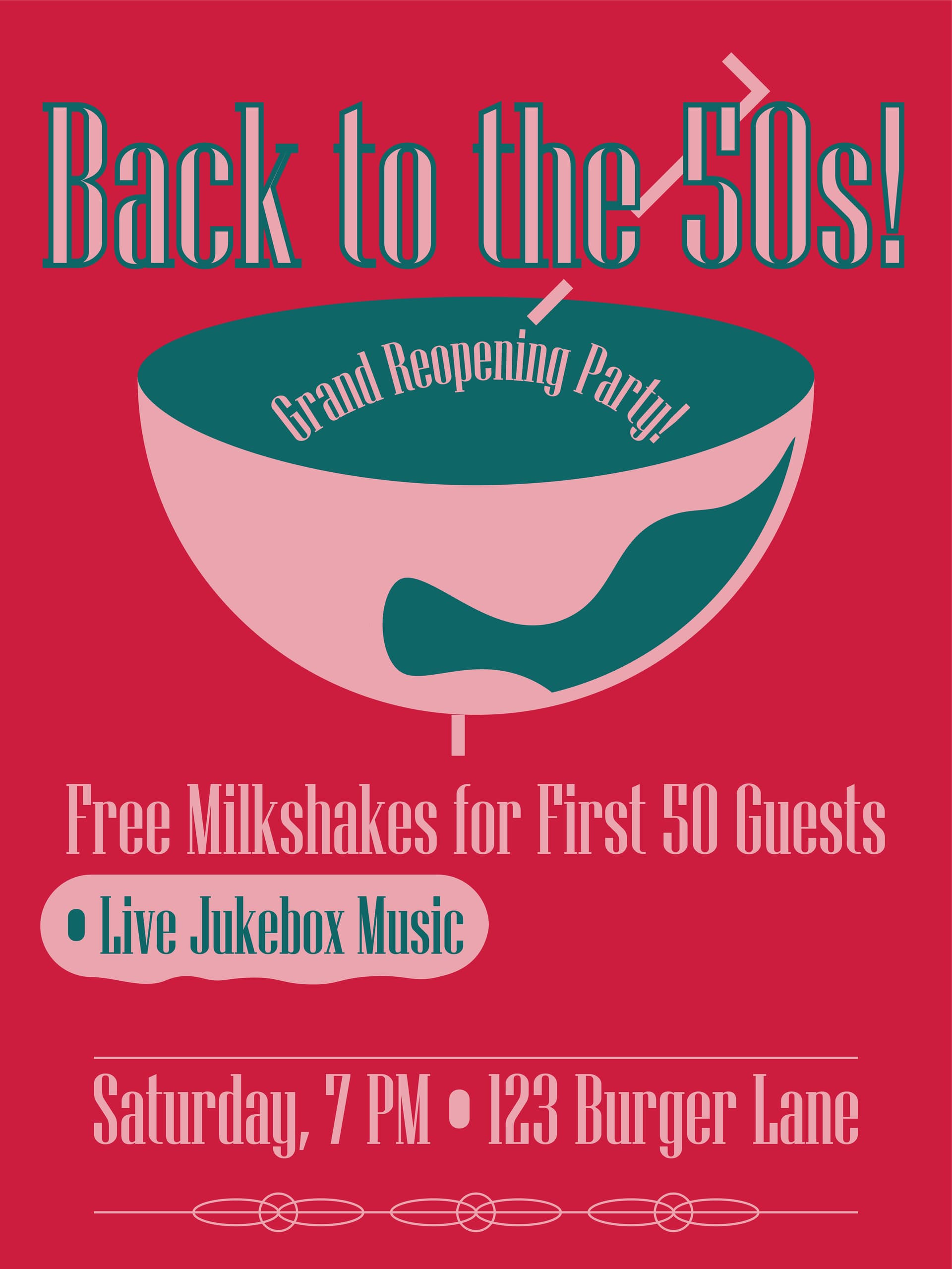
2nd one - no company name - what’s a ‘Live Jukebox’? People get into the jukebox and play music?
No pricing - no info - no website
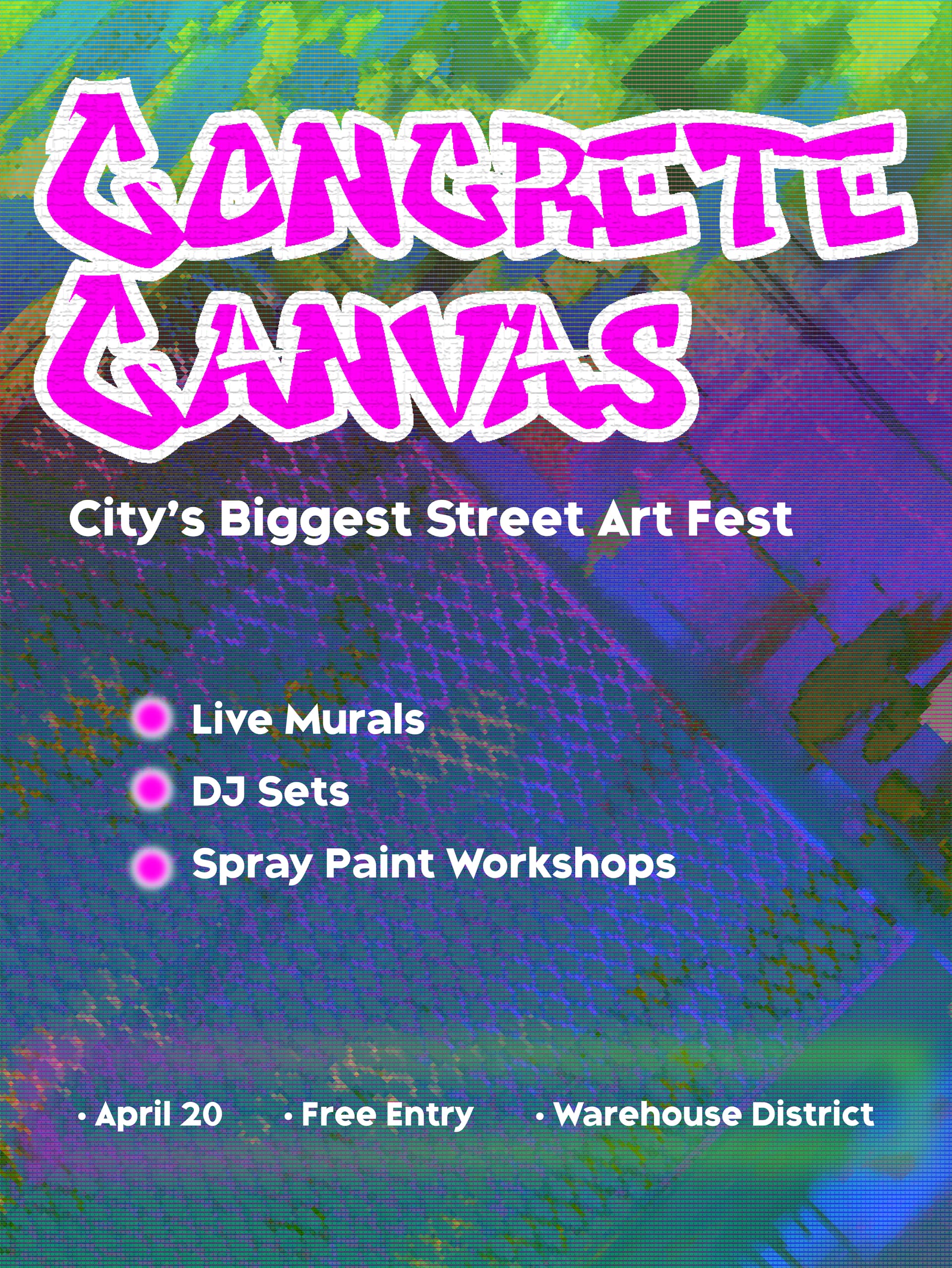
3rd one - dates and information are too small
4th - not good - so many issues - no company - no idea what products - why would it be boxing day sale and website ‘boxingsale’ - are you selling boxing day specials, boxing sport, boxes???
Just all wishy washy with not really any direction or coherence and key information missing or too small on all of them.
If you’re making fake projects then fine.
But they don’t and won’t hold up under real world scrutiny.
3 Likes
In my own opinion, there is something you should care, some of these designs are using “shine colors”. What I mean is, when you use camera with a flash people don’t like it because some people have a sensitive eyes and too much shine is bad for them. I would suggest not use shine colors because some people may not like it, try to use something dark or less shine because even if you like it and other people may not like it or even avoid it.
Not enough info. Target audience?
The first one is probably an ‘inspirational poster’? If so, if you like it, it’s fine.
The second one - the title “back to the 50s”, outlining the letters in that fashion makes them illegible. The font is illegible for body copy as well. A poster has only a few seconds to relay its info. Simplify.
What is a “Live” Jukebox? “Authentic” maybe, but not live.
The third one, probably the most successful of the lot even though Concrete Canvas is pretty close to unreadable.
The fourth - as my GD professor used to so, “Do Over.” Again your outlining choices don’t work. Upto is not one word. Distorted why? Don’t add crap for decoration. Pen squiggles serve no purpose.
These images make no sense.
I have no idea what the first one is for.
The second one doesn’t list the name of the company sponsoring whatever event this grand reopening is for. I don’t know what the image in the middle is. It looks like a goblet or a glass of some kind, but it’s not a milkshake glass. There’s no such thing as live jukebox music; jukebox music is recorded.
The third one makes some sense, but the headline isn’t easily legible. What city? Where’s the warehouse district? A spray paint workshop? Is this an ad for a festival intended to vandalize concrete with graffiti? Seriously!
The fourth one does not list the company’s name. Upto is two words, not one. Why did you draw those squiggly lines?
I’m very sorry to give such negative feedback, but it’s clear you have no formal training in design.
1 Like
Do you mean the fluorescent colors? The pink and the green?
We won’t even talk about getting those to print without paying for a spot plate.
2 Likes
Yes exaclty Print Driver, I just offered my opinion as a client (like tihe user). I just learned this from UX Design (some people are just sensitive to fluorescent colors).
Those people woulda never made it out of the 1960s, LOL!
Fluorescent colors have their place. But they are special inks. I can’t print them in Wide Format as there is absolutely no way to get them using CMYKOGV. I’ve read of a machine with custom pots, but I don’t know anyone that runs one. Setup charges aren’t good for the ROI, LOL.
2 Likes
Well there is some information here as you can see : Fluorescent colors are loud and can be tricky to use and combine: here’s how to do it gently, and here’s a link : https://medium.com/design-bootcamp/fluorescent-colors-are-loud-and-can-be-tricky-to-use-and-combine-heres-how-to-do-it-gently-37c6c454a8f8 :slight_smile. This something I have learned not something that I invented !
Oh, they’re loud alright. They are even louder under blacklight, LOL. (UV Lamp fixture)
Well aware of what combines. ![]()
-Says the guy born in the 60s who had day-glo posters and a blacklight in his room as a kid.
Where I work now, we’ve even done a full educational exhibit that used day-glo vinyls and fluorescent edge-light acrylics in wonderful UV lit ways.
This stuff is fun
These photos don’t do it justice.
2 Likes
This topic was automatically closed 365 days after the last reply. New replies are no longer allowed.