"We’re organizing a futuristic music + art experience called Sonic Bloom, and we’d like you to design a feature poster entirely in Adobe Illustrator. This is a creative spotlight piece—we want something unique, technically strong, and visually striking that pushes your design boundaries.
This is NOT a standard poster. We’re treating this as an artwork-meets-advertisement, and it will be the main visual for the entire campaign."
How much you getting paid?
Or is this one of those fake brief things?
No call to action?
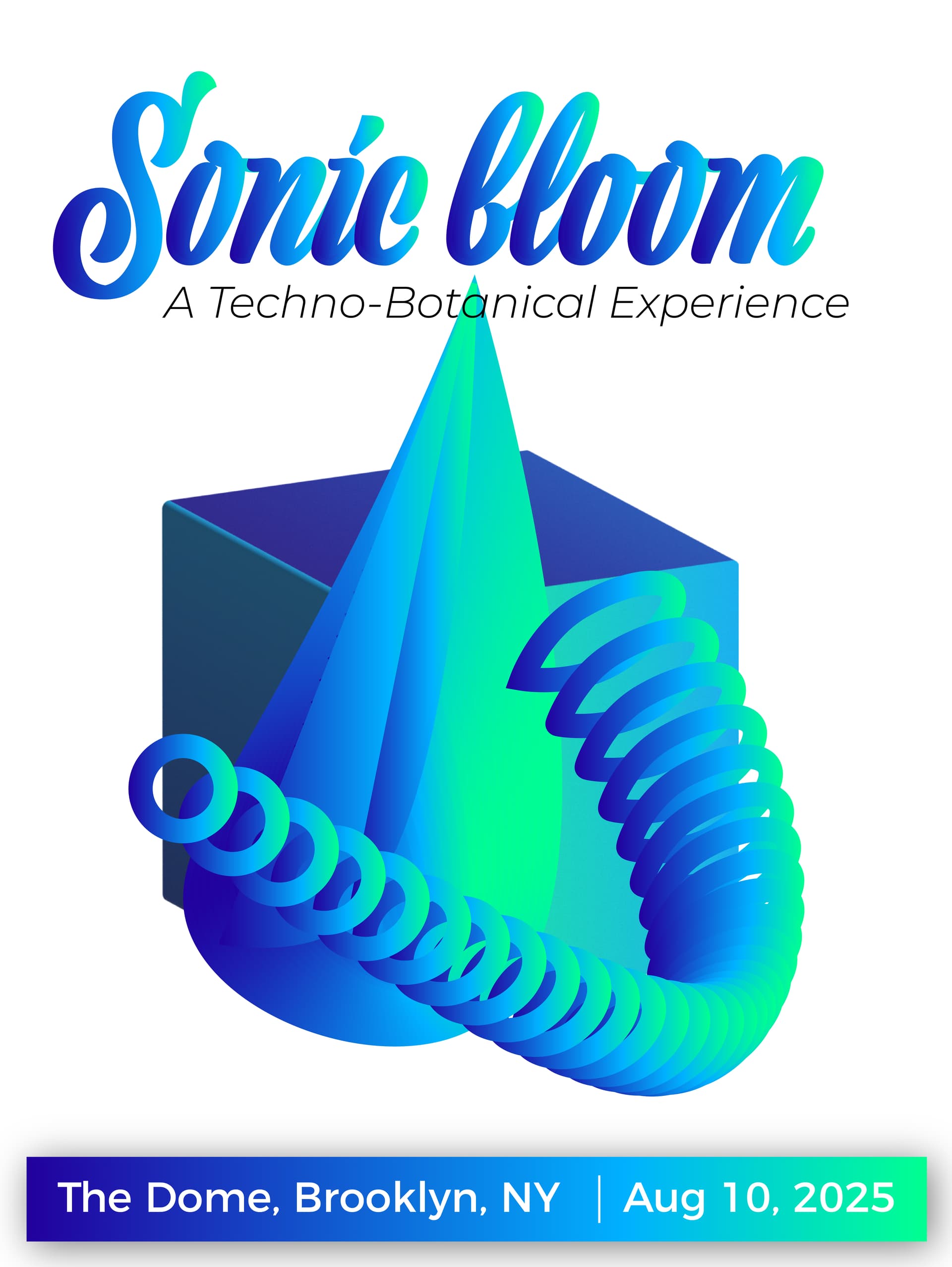
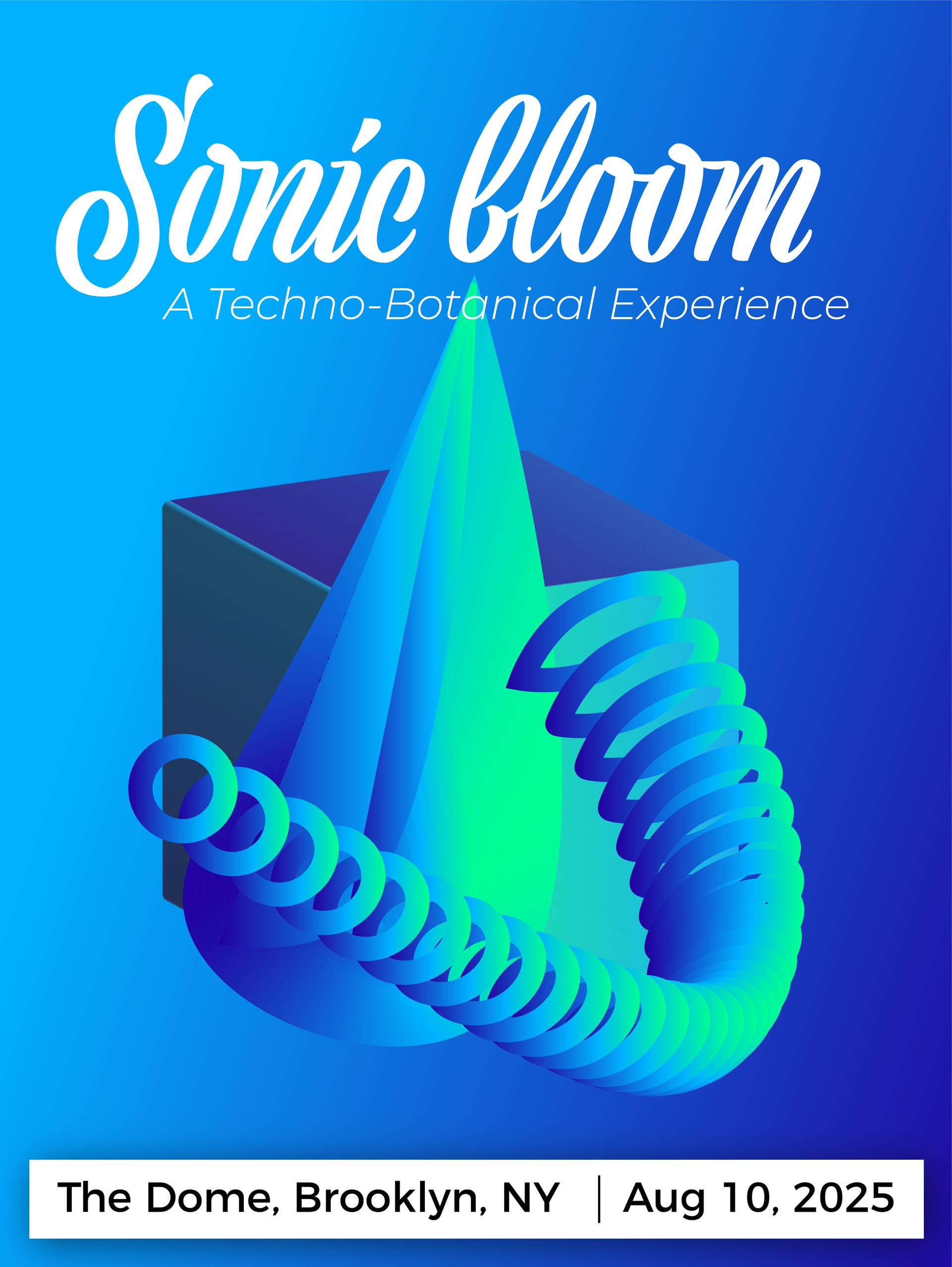
The title text is easier to read on the second one. The gradient on the first one causes eyes to lose tracking on the cursive text.
You do know there is a good percentage of folks these days who are in their 20s that can’t read cursive text. If they are your target demographic, you may want to reconsider (sad to say.)
Sticking with the second one, you have an unnecessary interaction between the leaf and the tag line. The tag is already losing ground due to its skinniness.
The leaf looks more like a cone and there is some weirdness going on at the base of it. No stem?
The sonic boom circles (right?) I get what you are trying to do. It seems like it’s too much and too random.
The address, kinda stark change there. Maybe it’s needed. Maybe not.
Overall you are using some pretty standard tools in illustrator and relying far too much on gradients.
If this is the Main Visual for this campaign, you need to think more in logo terms, readily recognizable for this event and not muddied with extraneous stuff that doesn’t add much to the message.
Is it unique? sure
Is it technically strong? pretty standard effects.
Is it visually striking? Matter of opinion, but not so much