I was given a nice vector logo from a new mechanic starting up. The problem is this little bit he added himself that is not vector and of course he doesn’t know what font he did it in. I’m trying to blow it up to an 8x4 sign and will need to vectorize or type this. After running through all the matching sites I’m aware of, I’m not finding one that has this G M E or S in the same font. Thanks if you can help me out.
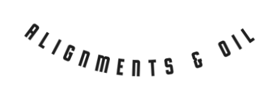
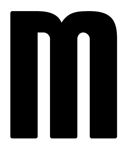
Just-B is right: at 8 feet wide, an auto-trace of a small raster image will show every wobble, especially on those tall, straight stems. Redrawing is the cleaner route, and you already have most of what you need in the sample itself.
Work from the existing letters as your template rather than hunting for the exact font. The vertical strokes, the flat tops and the stroke weight are consistent across the sample, so you can build the missing characters from parts you already have: the straight stems from the I, L and N, and the curved shoulders from the O and S. Keep one stem as your master measurement and match its width and height on every new letter, or the redraw will look patched together.
Two things that will save you time: first, straighten the arch before you redraw, so you are working on a flat baseline and then re-apply the curve to the finished vector text; and second, ask the client whether the sign shop or whoever made the original still has the artwork file, since that added text may have come from a template rather than a retail font. If the matching sites could not find the G, M, E or S together, it may simply not be a standard font, in which case a careful redraw is not a fallback, it is the correct finish for a sign this size.
1 Like
Thank you both for the input. What I meant was I would have to vector it. I’ve been tracing logos for over 20 years since my first job setting up screen print art. I’ve just found it best to identify a font (if there is one) as clients invariably ask for additional text in “whatever the one in the logo is”.
1 Like
That makes total sense, and thanks for clarifying — with 20 years of tracing logos, you clearly know the difference between a quick trace and a proper redraw. And you’re right about the follow-up problem: clients almost always come back wanting extra text in “whatever the one in the logo is,” which is exactly when having the letters redrawn properly pays off.
If you do end up redrawing it, keeping that finished version as your master set for the client should make those later additions a lot easier, even if the original never turns out to be a standard font.
2 Likes