With whom we haven’t talked yet, my name is Anastacia, I am from Russia, Moscow, working as a brand-manager in a company who produces reclaimed barn wood and products from it.
So!
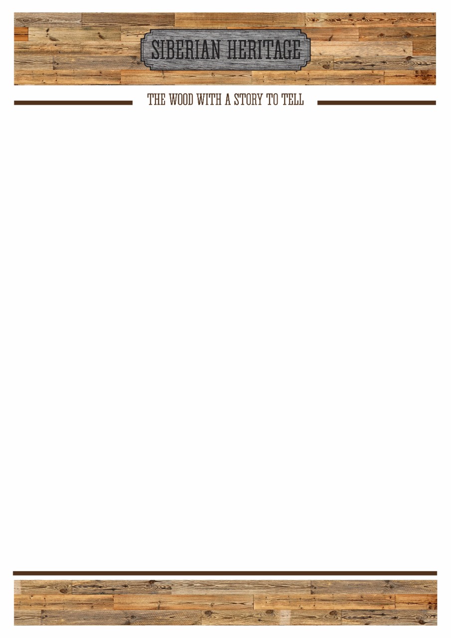
First of all, I want to say thank you to everyone who participated in our conversation a month ago. It was about our brand name and each of you helped us so much that you couldn’t realise. Based on your comments and vision, we have chosen a perfect name for us and our reclaimed barn wood production - “Siberian heritage”. It tells enough, in our opinion.
And, what is now?
To make a long story short, we are thinking about the shape and the color of the future logo.
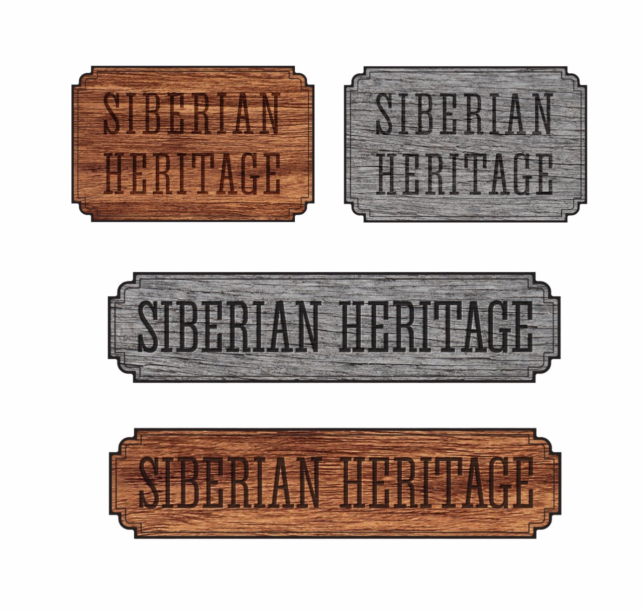
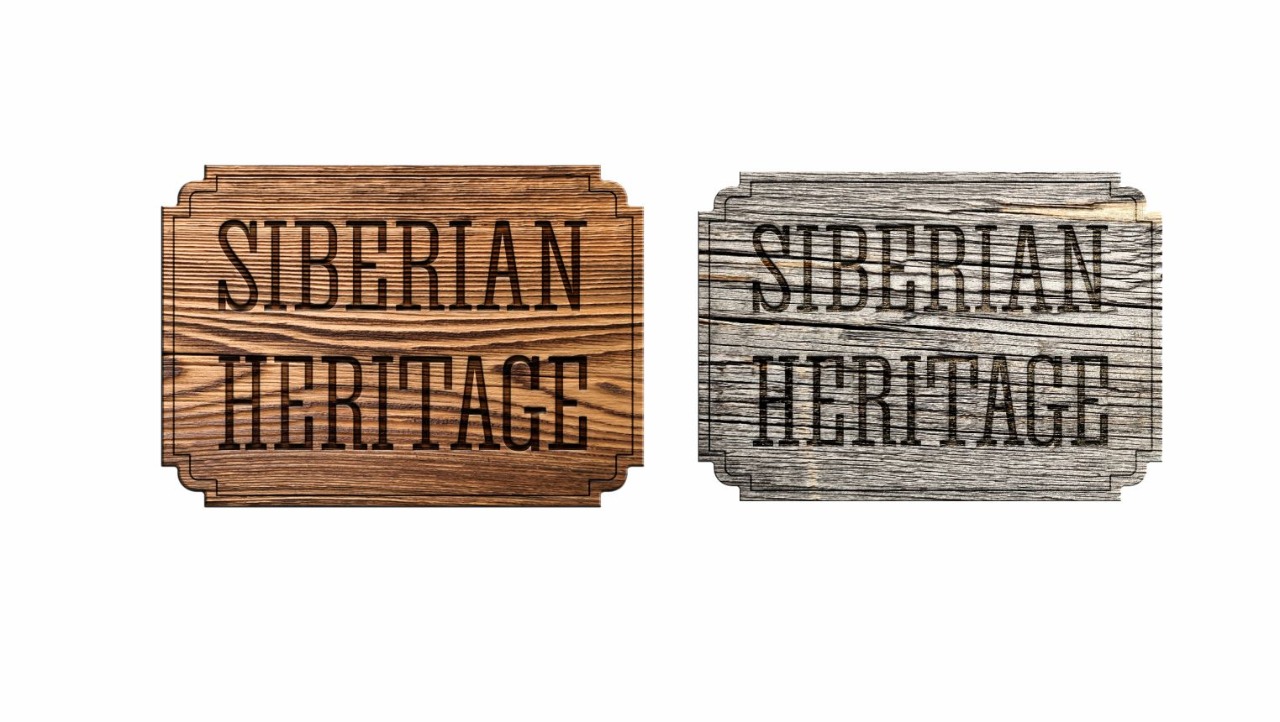
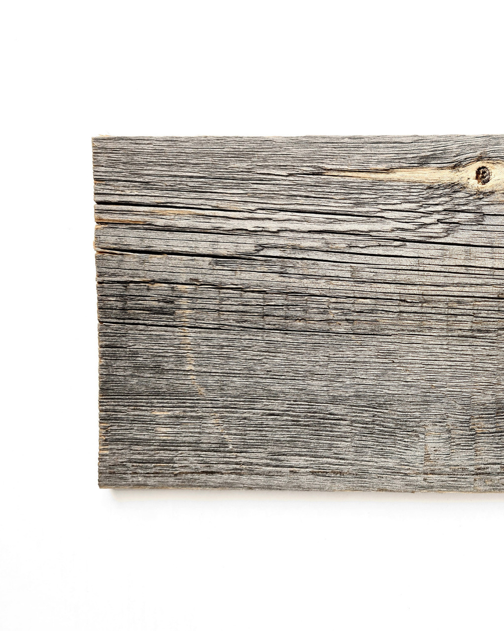
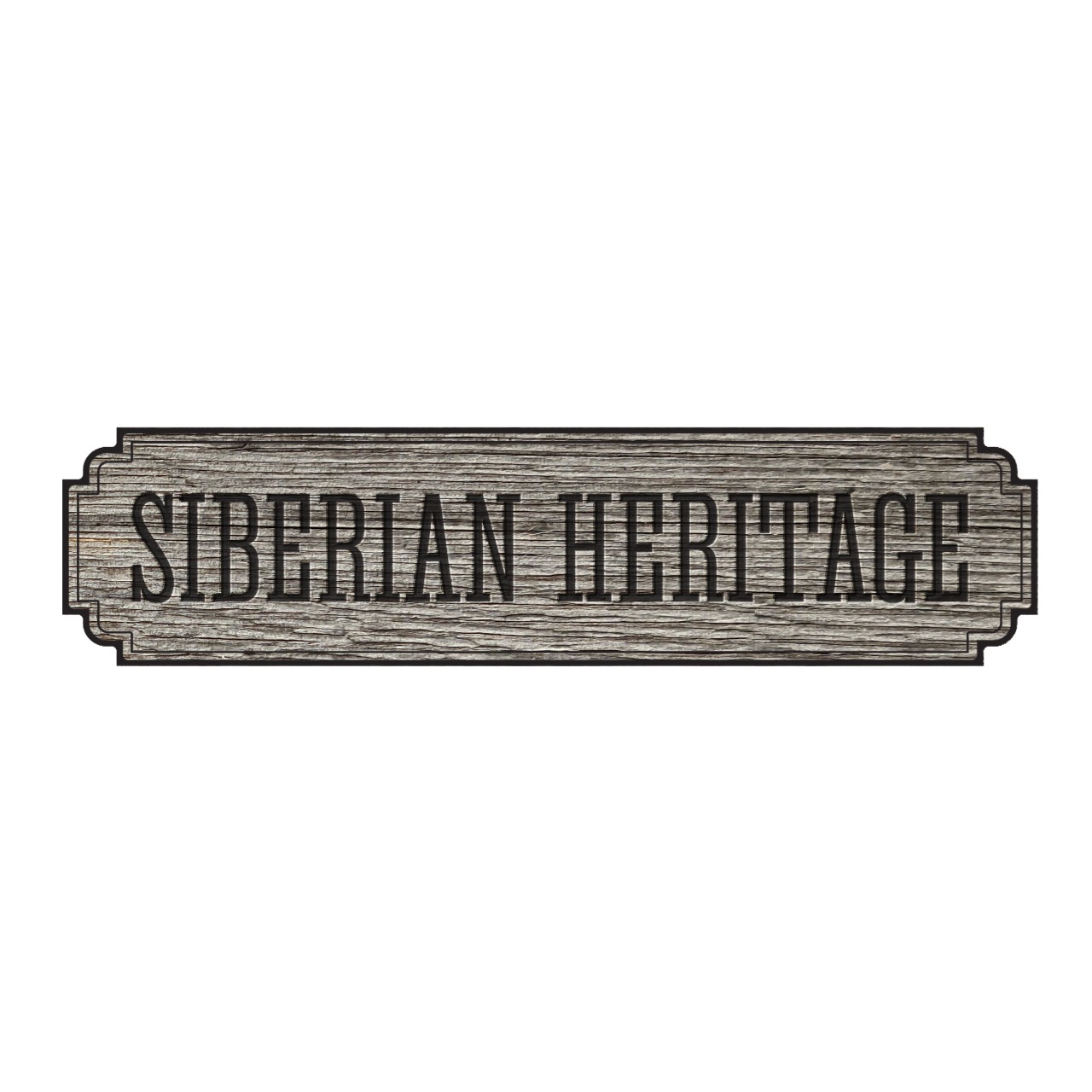
We want to have a logo with out real wood texture as a background and place the name of the company on it, and that’s it.
And the questions are:
what color do you prefer more - natural brown or authentic grey (the textures are uploaded below)? We reeeeally like the combination, but it seems impossible to have both brown and grey in logo, so we need to decide.
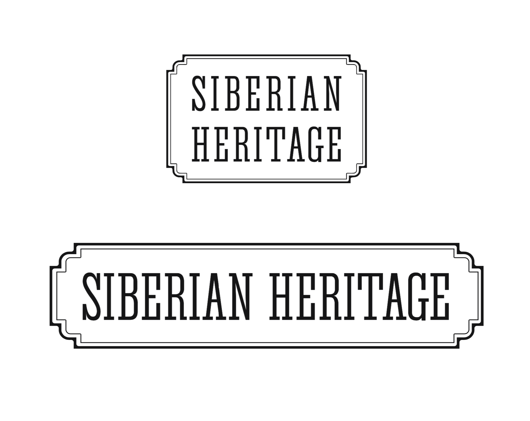
what shape, do you think, looks more comfortable in reading and more gorgeous in looking at it - both words in one line or one word in one line and we have two lines in the logo? (examples are also pinned)
or maybe you have some other ideas for our situation, and I am all ears to hear that! So be free to reveal all your concepts and thoughts about our brand image.
As for me, I like the union of the authentic grey and the shape of two words in one line. However, we do have a real battle in this field at work aaaand we don’t have an idea how you, real Americans, think, because what we think it’s not so important as you do. And we are here to ask for your help and professional view.
The use of wood texture in the logo will not prove an effective choice. It mitigates readability and will present all kinds of reproduction challenges. I’d say the plaque shape(s)s will also work against it in many potential applications. I’m sorry but these ideas would not make it past my sketch pad.
Having a photo / raster file / Photoshop file for a logo is not the best practice. If you plan to proceed with this approach, it would be wise to work up a black and white version of the logo in vector art. Think about how the logo would look if it was embroidered onto a shirt or silkscreened in one color or burned into the bottom of a piece of furniture.
Assuming you’re going to proceed with this direction, here are my answers to your questions.
Personally, I prefer the weathered gray color. However, my understanding is that interior design trends are moving away from gray and “greige” (a blend between gray and beige) to warmer colors. So you may be better off going with the warmer wood tone.
As to one line of type or two lines, I say “yes.” By that I mean it is perfectly acceptable these days to have a primary and secondary version of a logo. This is personal preference, but I prefer the horizontal version to the vertical version.
As they stand right now, there is a legibility issue. There isn’t enough contrast between the type and the background to make the type easy and fast to read. I’d work on that. This is exasperated in the samples that are more to the bottom of your post where the wood grain is more pronounced.
I like that you place the logo on a wooden background, @Anastasiya, but I agree with the others that the wooden plaque idea does not work so well. I mean, in actual application would you then slap an actual wooden plaque or a plastic sticker of a wood photo on real wood? Both seems a bit weird to me.
Anyway, here’s my suggestion: How about conceptualizing your logo as if it’s being applied on wood with a branding iron?
I think it looks noisy, less distinctive, and ‘amateur’.
But, even if I did favor its aesthetic, the function of a logo is not to look rich and interesting; it’s brand recognition…in a variety of applications; at tiny sizes and huge, embroidered, photocopied, and faxed, up close and at long distance, static and in motion, etc., etc. The wood grain works against just about every one of those.
To answer your question simply: I wouldn’t recomend having a background texture to your logo, as @RedKittieKat pointed out, it creates issues of legibility due to the lack of contrast. I would also caution you against it for the reason @HotButton mentioned around its limitations in versitility in reproduction.
Out of interest, what type of person is your intended target audience in America?
Hi Anastasiya, the final black and white vector is your logo. It can be reproduced in virtually any medium. This is the logo you would have screen printed on a pen or engraved on an award. It’s a solid, clean logo and I like it a lot.
Nothing says you can’t bling it up when circumstances call for it though. Used in a full color brochure adding a wood background could look great. Just make sure you watch the contrast and that the text is clear.
The bottom black and white versions are more appropriate for a logo. Weathered barn wood imagery can and should be used in the branding, but doing so with the logo, will pose legibility and reproduction problems that are best avoided.
Even so, the logo doesn’t really look Siberian to me. It looks more reminiscent of the 19th Century American West, which is Ironic given the name “Siberian Heritage.”
From your posts a few weeks back, I understand your reservations about being too tightly tied to Russian themes and how that might be a possible hinderance to sales in foreign markets. I disagree to an extent, but even so, maybe the typography could lean a bit more in the direction of a toned-down, weathered, outdoors constructivism. This might give it more of a vaguely Siberian look — at least to your non-Russian target audience. I’m not suggesting any kind of hokey pseudo-Cyrillic type treatment or something that looks like a 1930s Soviet poster, but I am suggesting a look that matches up to foreigners’ preconceptions of an exotic, extraordinary and remote Siberia rather than Wyoming cowboys.
I’m assuming, based on your previous posts, that the target audience is mostly a non-Russian export market. If I’m wrong about that and if you’re branding for a domestic Russian market, everything I said above is probably inappropriate — except the black and white logo being more practical than one with a weathered-wood background.
I can’t agree with you more. Before your and other guys’ explanation I did think that the texture logo is richer. Now I see in a different way… Moreover, there are so many brands with the history who had a black-and-white logo (like Chanel, Nike, Calvin Klein, Adidas, WWF, Apple at last…)). The simplier a logo, the more it can say and the purer it looks like.
I had another topic about a month ago, you can read that to understand about us more
However, I can tell you that we want to enter the American market and we are starting from Amazon (our first container swims to your port in two weeks). After Amazon there are several other marketplaces for us to start with, and after that we want to sell our wood not only for interior design, but for all purposes in all market and selling destinations. We want the Americans to have a touch of the Russians love inside their homes. We don’t have any doubts that we can be friends and have trustworthy relationships with each other. So, something like that
Yes, exactly. I agree with you completely. To have one black-and-white logo as the main one, but to transform it in many ways according to the situation we are in. I appreciate your help a lot!
You are such a helper. OMG. I want to quote every word of your comment and give it all to our team. Thank you very much.
Yes, you are right. We have the Russian logo that works for our mentality, and we wanted to have the right one for the American market. That’s why I am here
That’s great that you already have some ideas where you’re going to sell your product.
I guess that main thrust of my question though is what does your ideal customer look like, and are you sure your marketing strategy and branding is going to connect with that client?
Quick assessment:
-grain is too strong, interferes with text readability.
-Authenticty and legacy are the themes and the old style signs are appropriate but I find them too generic looking to standout.
-A keyline should be replaced with a 3D effect of milling, indicating the shaping of the sign.
-A hand hewn look and feel will connote a “genuine article” concept, in line with the tagline “The wood with a story to tell”
-None of these are ready to even judge for the qualities the product is intended to provide.
-Search Google>images>antique-Old West-cowboy-business-signs for some inspiration
-Consider another font that is less clean, less modern.