Hi there again, guys :))
Those who don’t know me - my name is Anastacia, I am from Russia, work as a development manager in a Siberian company that sells reclaimed barn wood.
So, strict to the point.
The last time we were chatting about our positioning you helped A LOT and gave so much information what we’re still operating and adapting to our business strategy.
Thank you all who participated for that.
Now we’ve faced another challenge.
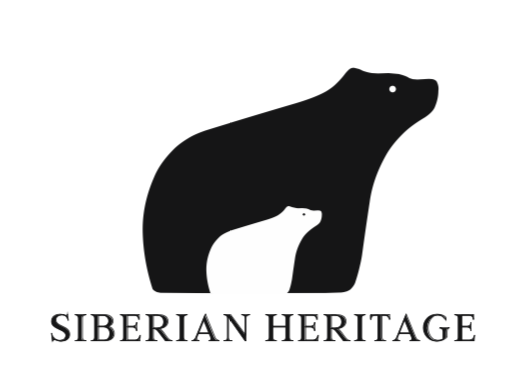
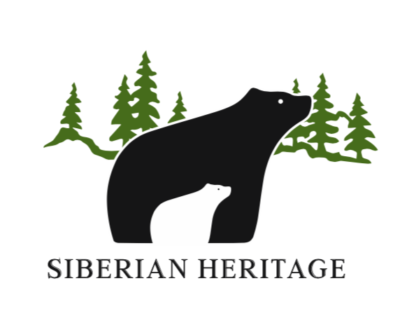
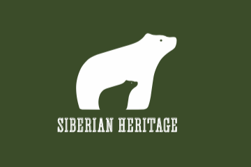
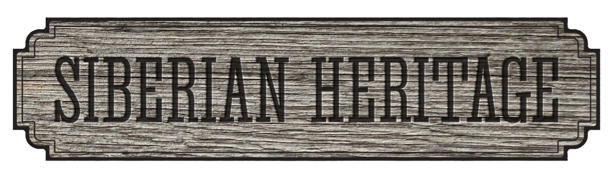
According to your words we… decided to change a logo ![]()
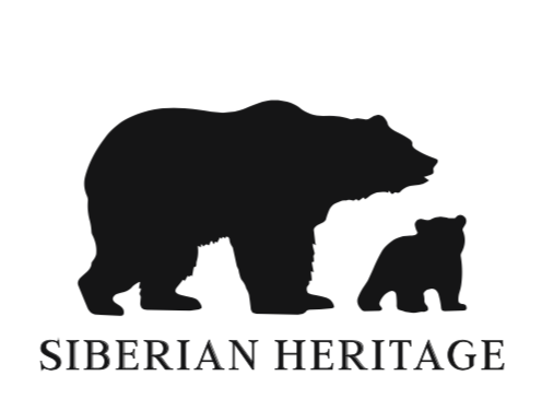
![]()
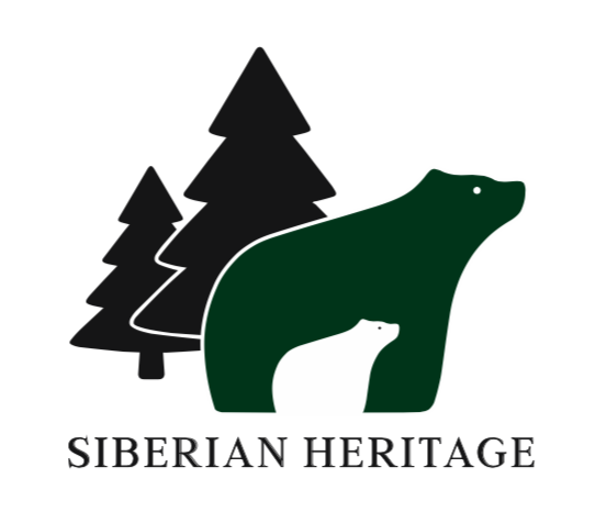
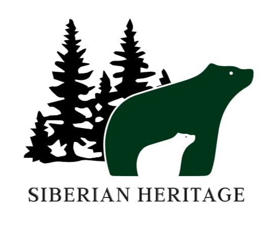
![]() . Again)))))
. Again)))))
So, we expect our future logo to have these main features:
- A bear. Particularly, a bear and a little bear because we’re the family brand, we appreciate family values and we known that here, in the U.S. you follow these values too.
- A pine. We thought of having a forest on a logo because most of our barn buildings are situated in forest areas. Some logos that I’ve pinned don’t have pine, it’b so great of you take a look at them and write what you think - with pine or without. Or maybe with something else…
- And of course, the print. This barn print that we had in our previous logo is more American than Russian, and one graphic designer give us advice to create a logo in one style, both the logo itself and the print.
I’m pinning all our good variations of logo below and really looking forward to hearing all honest and professional opinions from you. We’ve worked a lot this month and now we’re so eager to get the feedback from your point of view and how we will be met at the American market with this logo.
Take care all