Hey guys, herewith my brief:
Design Brief
To design a NEW UPDATED logo for IKEA
IKEA has reviewed its branding and identity through an independent consulting company and as a result of the findings has decided to rebrand the logo and some secondary associated elements, letterhead, business card and email signature.
You have been commissioned to complete this design brief.
Non-negotiables
• Secondary elements to be included in the brief of letterhead, business card, email signature.
• Must include the tagline in secondary elements of ‘design for real living’.
• To represent through your design a successful company that has a long and proud history and a very strong identity internationally as a furniture and homewares company that provides value for money and innovative modern design.
• Where possible, promote IKEA as an affordable product for the general population.
• To promote a business with an international reputation for providing value for money homewares and furniture.
• To create a design that will appeal to an international target audience of single people and families often living in apartments and small houses.
• To target individuals who are looking for affordable and modern furniture and homewares.
• The design must work well both online, through social media and the website, as well as offline through promotional materials.
• The design must be simple, elegant, clean, and minimal to reflect the IKEA marketing ethos : ”simple, modern, affordable”.
• The design must not be too loud, busy, or cluttered.
• Where possible the design should promote the following words: modern, innovative design, affordable, international, stylish.
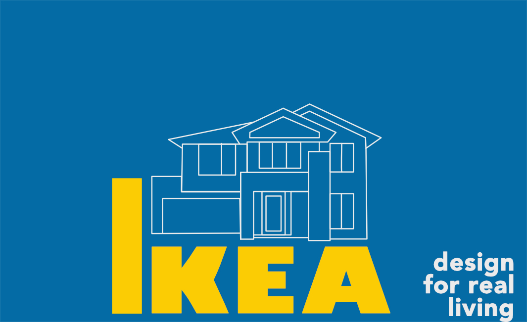
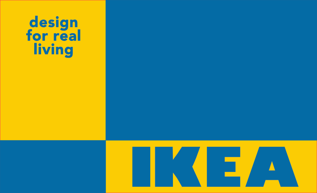
The brief is a mouthful, but yeah, these are my final two designs out of about 12 I worked on. I did not want to touch the colours as Ikea is Swedish and the Swedish culture forms the basis of the whole company (down to their meatballs!). It is also one of the most recognised colour combinations so literally did not want to mess with it - maybe a bit pathetic and not very exciting but there you have it.
- So this one I used the cross style of the flag, but the boxes also represent the different rooms in your house that you want to use their products in. Golden Ratio attempted…
- This one works towards the construction/ design of your home by using their products (blueprint background with the design sketch).