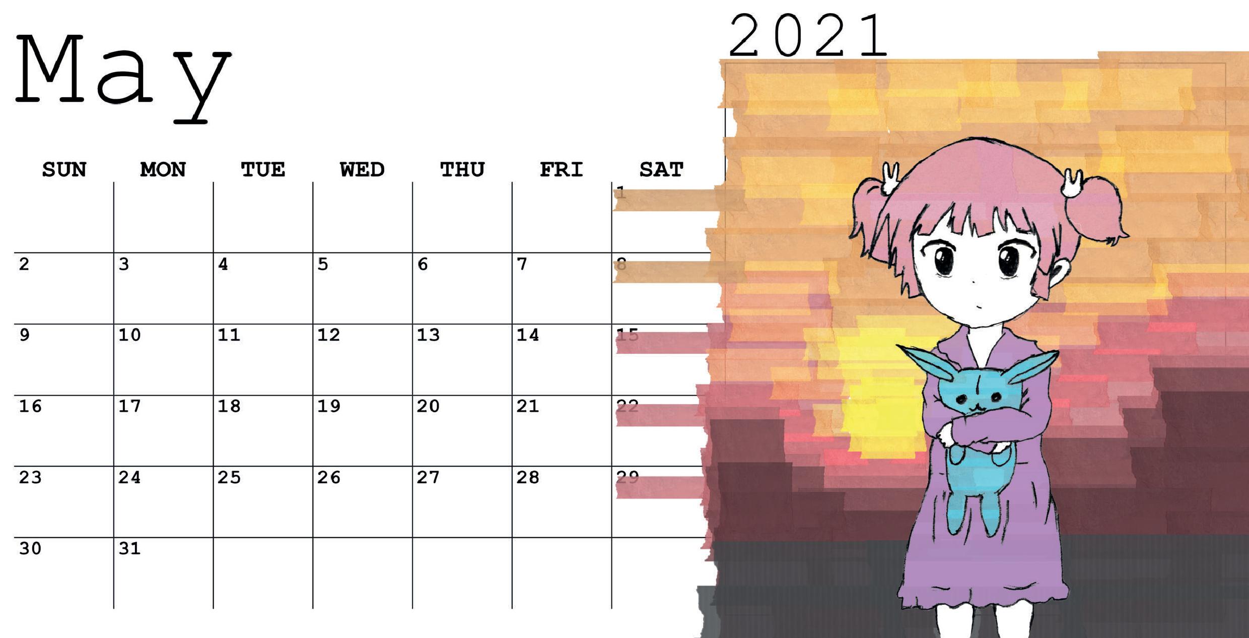
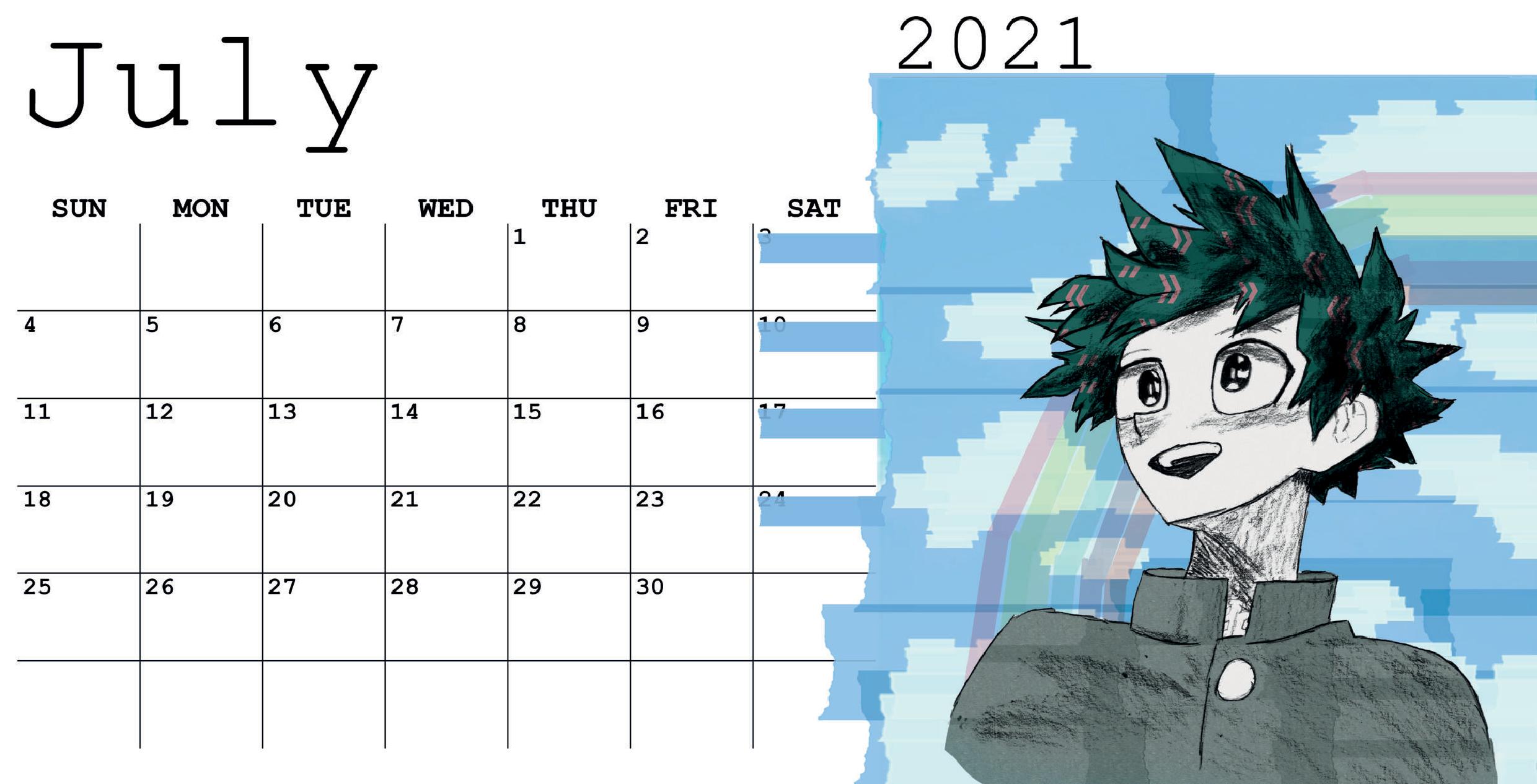
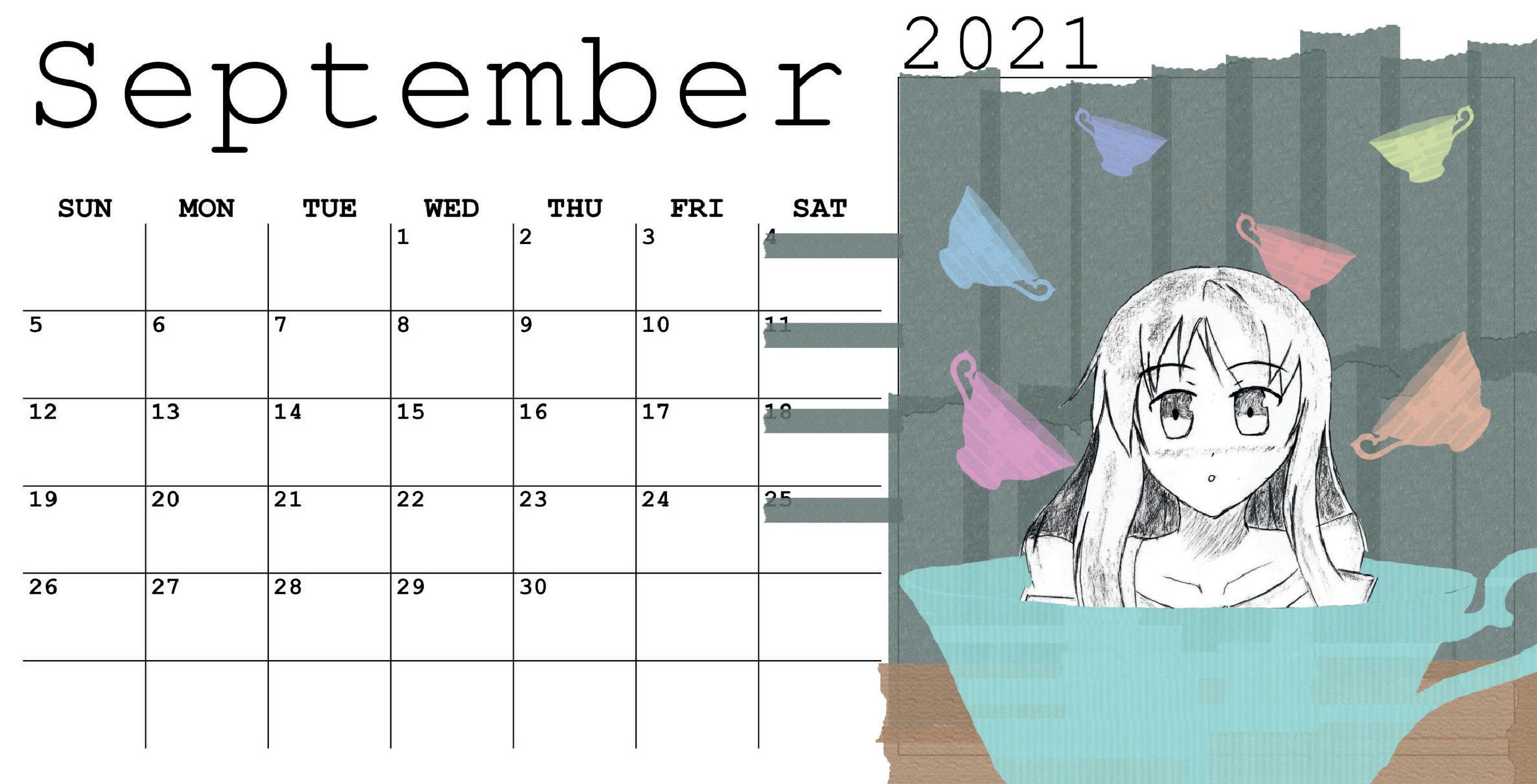
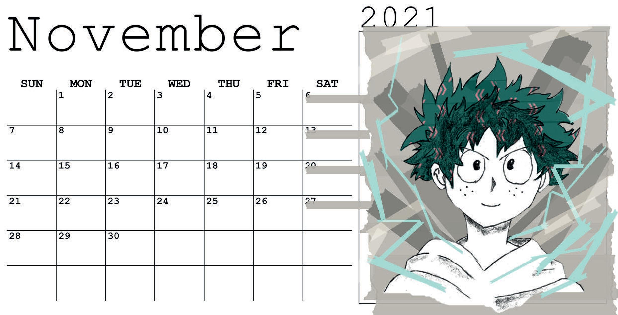
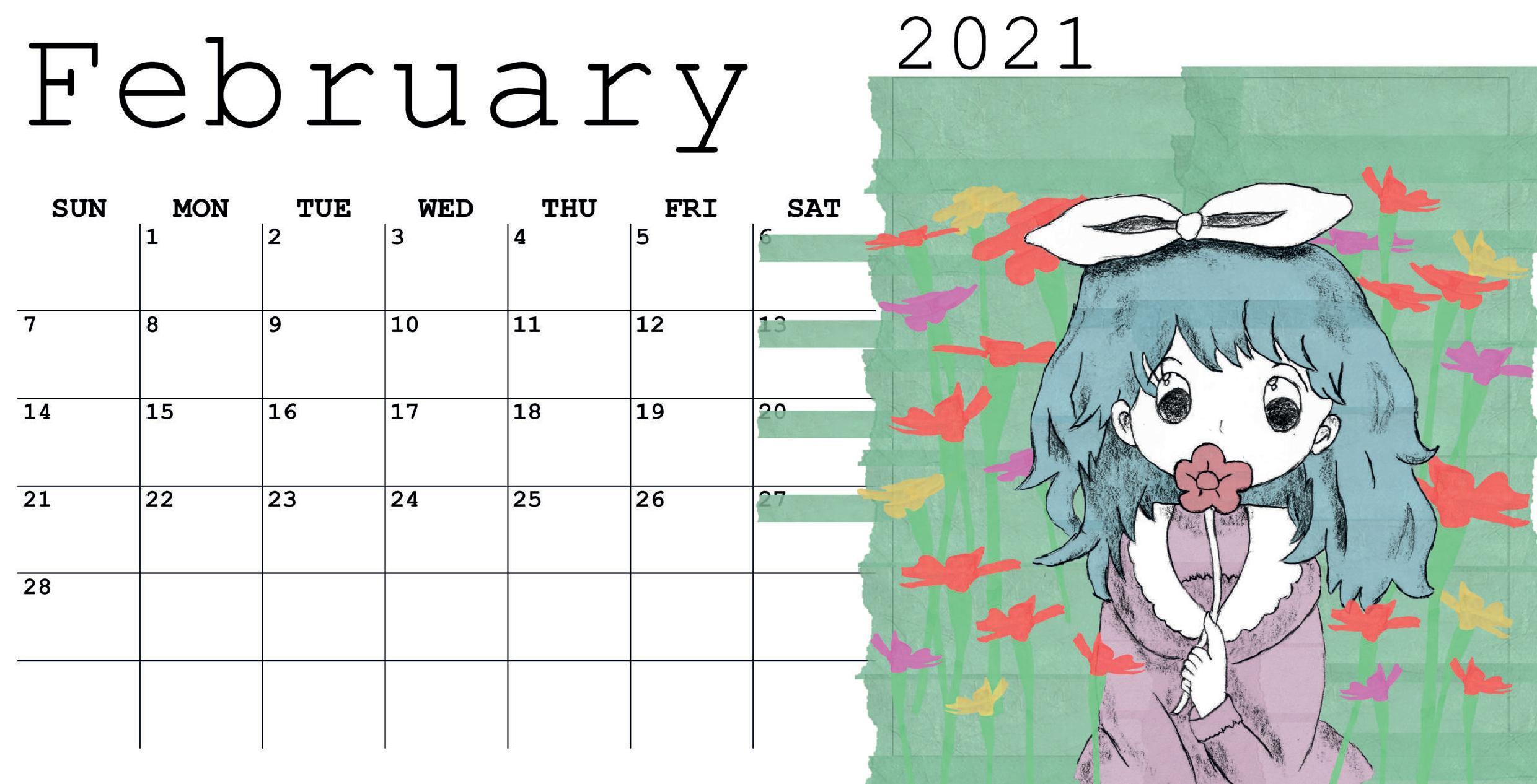
hey I need help with this design I redesign it a lot but I still don’t like it any help will be appreciated but I have 1 thing I can’t change the drawing and background because that this is an anime colander scrapbook feel (i really need help with the layout)
The trouble with Courier is that it always looks like a mistake, as in the right font not being there so Courier was substituted. It’s also a monospaced font with awkward inconsistencies in the kerning and the letterforms that were necessary to make each glyph take up exactly the same amount of horizontal space. It’s an OK typeface for writing code, but as a good typeface for printed work, no. If you want a DIY look, use a good handwriting typeface.
but my teacher always said that handwriting typeface need to be handwriting and not be a font coz the latter respite and its look not real like that latter A look the same all the time but thx for the idea I will try handwriting no font for more dit look
Yeah, that’s sort of a purist viewpoint and I’ve made that same argument myself — especially for short bits of text, like in a logo. I rarely use handwriting typefaces myself, but they’ve become very popular. Even though they’re imitation handwriting, they can work out quite well in the right situations where a casual, spontaneous and friendly DYI look is needed. Besides, not everyone has the best handwriting, so these kinds of fonts can be a workaround for that.
I’m a little perplexed. Am I looking at the calendar as is, that is, each panel is a flat page? … and how is the calendar constructed, top flipped, or side flipped? Or stand alone cards?
each panel is a flat page and top flipped
the colour bars r coz the teacher wander for me to add something more than just the art and I didn’t want to add more think like more text or holidays( i know make my life easier lass work )
Don’t add more to add more.
Certainly don’t add more in the laziest way possible.
It’s okay to tell the teacher they are on crack, too. In a nice way of course.
Ahhh, I didn’t really consider that this is a student project designed to make an instructor happy. Teachers are sort of like clients. One can make a great argument, but in the end it’s the teacher who gives the grade and the client who pays the bills.
In this instance, if the instructor dislikes handwriting fonts, it might be safest not to use one. Then again, the best teachers will respect a good, well-reasoned alternative point of view.