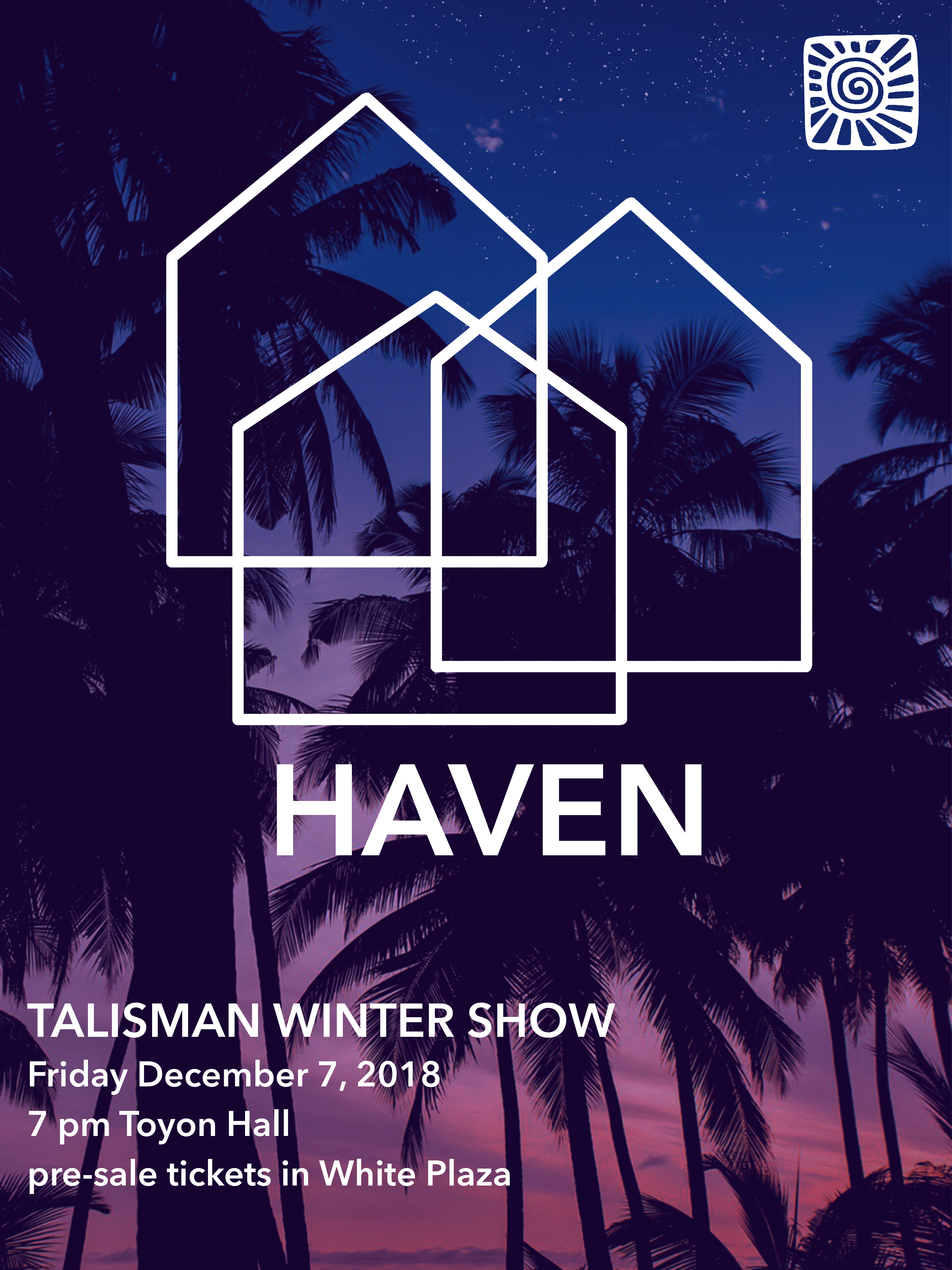
The show theme is “HAVEN” and so I tried to put that into imagery
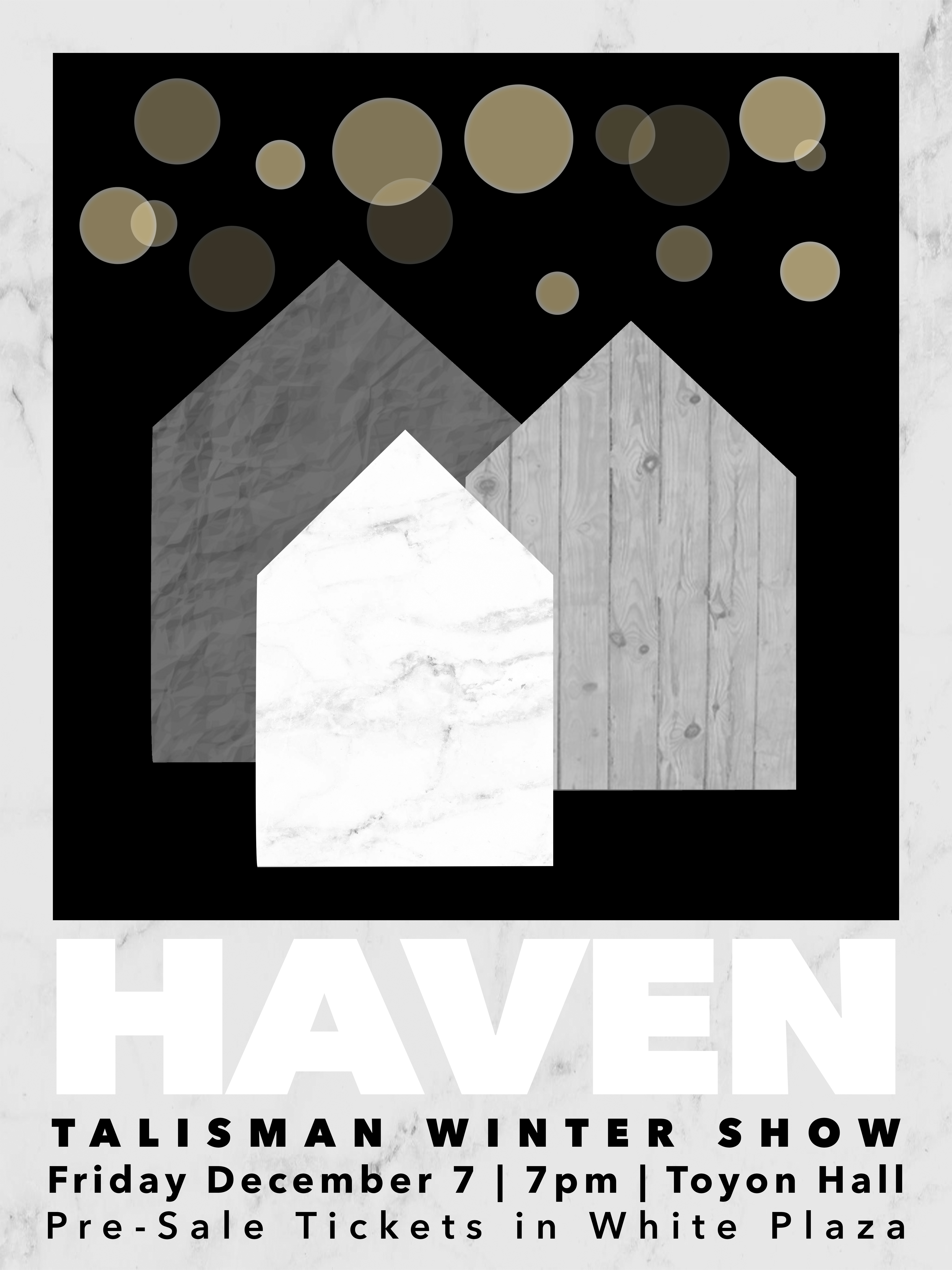
The white header is hard to read on the background of light gray.
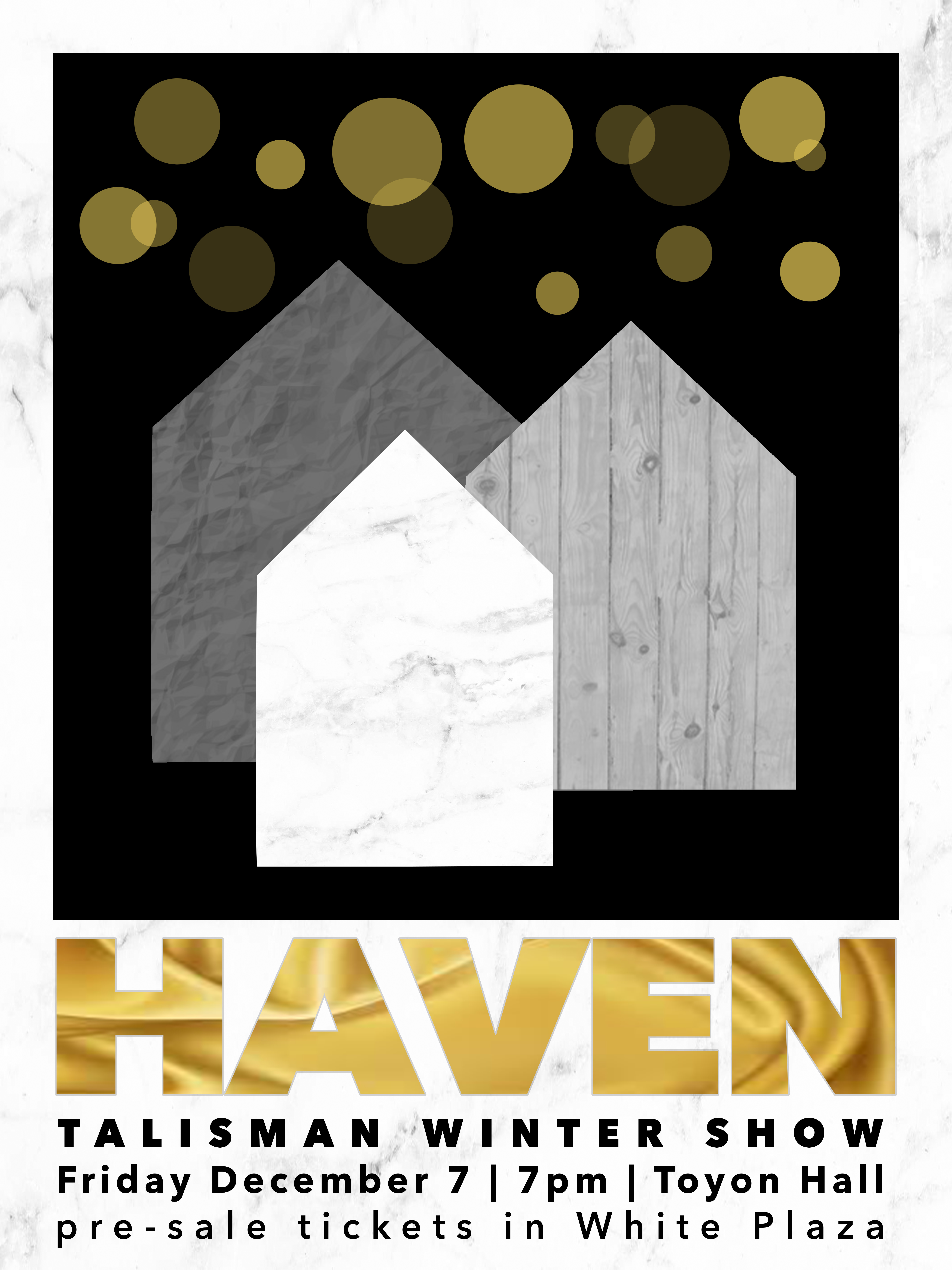
I prefer the top image with gold header.
See if you can use any texture related to the show.
Because it’s a bit too much texture going on in the poster.
Otherwise, I like your concept. Good job.
One word.
Hierarchy.
If I saw this while walking down the street or on a bulletin board, I’d have no idea what it was for or about.
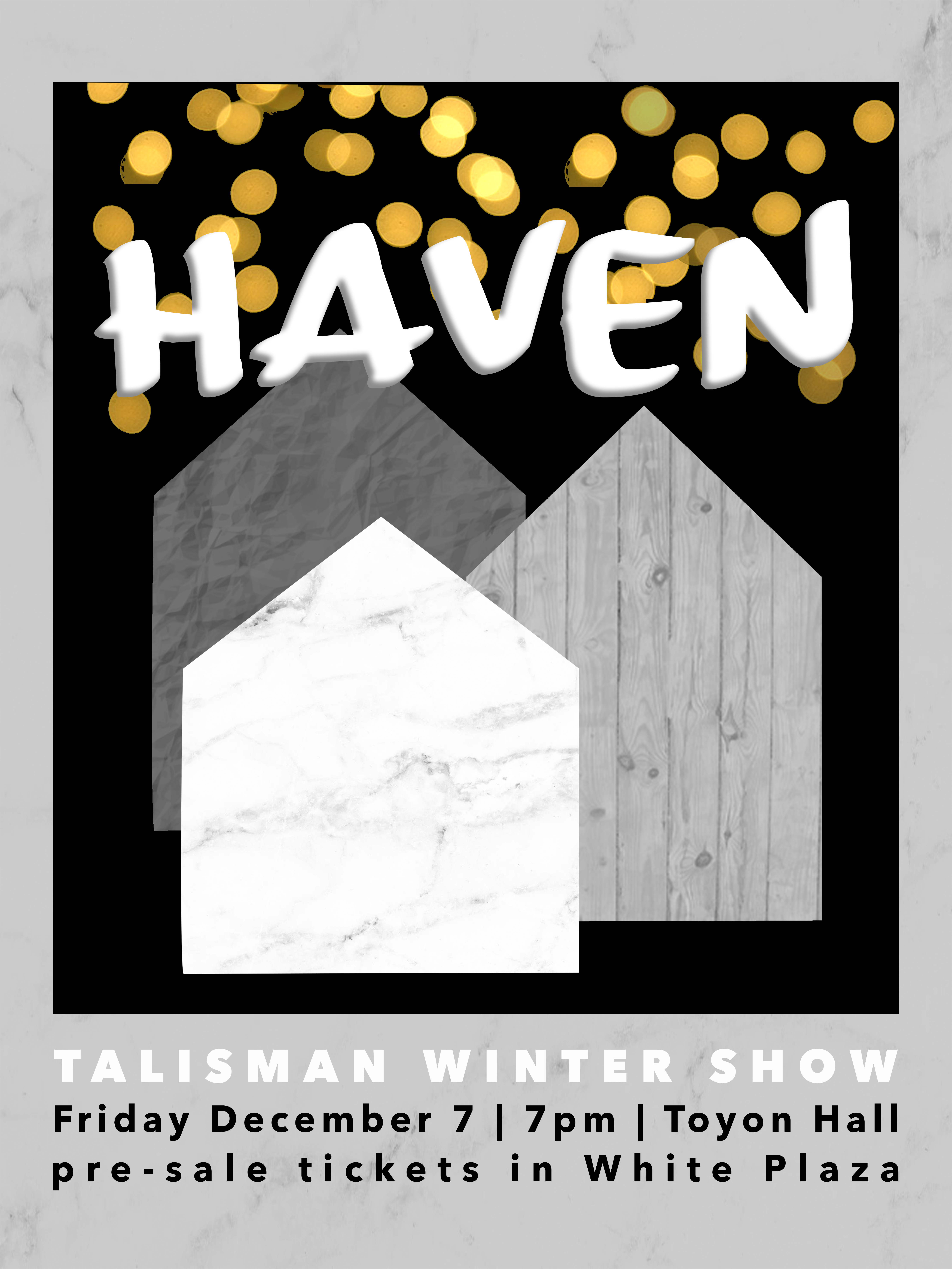
Thank you all for your honest input. I redid the title and added a bit of visual hierarchy. Students on campus know “Talisman” means “A Cappella” so they’ll understand its a concert, my focus is making this flyer more attractive and capturing, and leaving room for curiousity