I need some suggestions on display typography. I have the word ‘Electric,’ and I’m unsure how to design it to capture that ‘electric’ vibe. I’ve attempted a few layouts, but they appear chaotic and lack coherence. The task requires using techniques like extending, rotating, establishing rhythm, creating motion, etc., from an existing font. Can anyone help me?
I like what you’ve done on an aesthetic level — especially the second and third ones.
However, I’m not sure they effectively communicate the “electric” vibe you’re after, assuming you’re going after an electric shock.
Without drawing and posting my own ideas (which the forum rules frown upon), it’s difficult to describe what I might do differently.
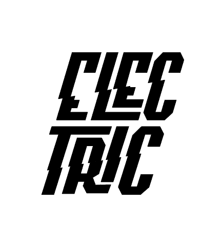
If it were me, I’d probably try to type the word and then slice up the letters just a little to suggest they were being jolted by an electric current. Again, though, without drawing them myself, I’m unsure if that or another idea would work.
I dunno, maybe I’d just google “electric fonts” for inspiration?
Or maybe it’s a better idea if you don’t.
There are way too many ideas there and finding one you come up with yourself is probably better.
It sounds like you’re only allowed to use characters in a font, no illustration, correct? Don’t forget about special characters.
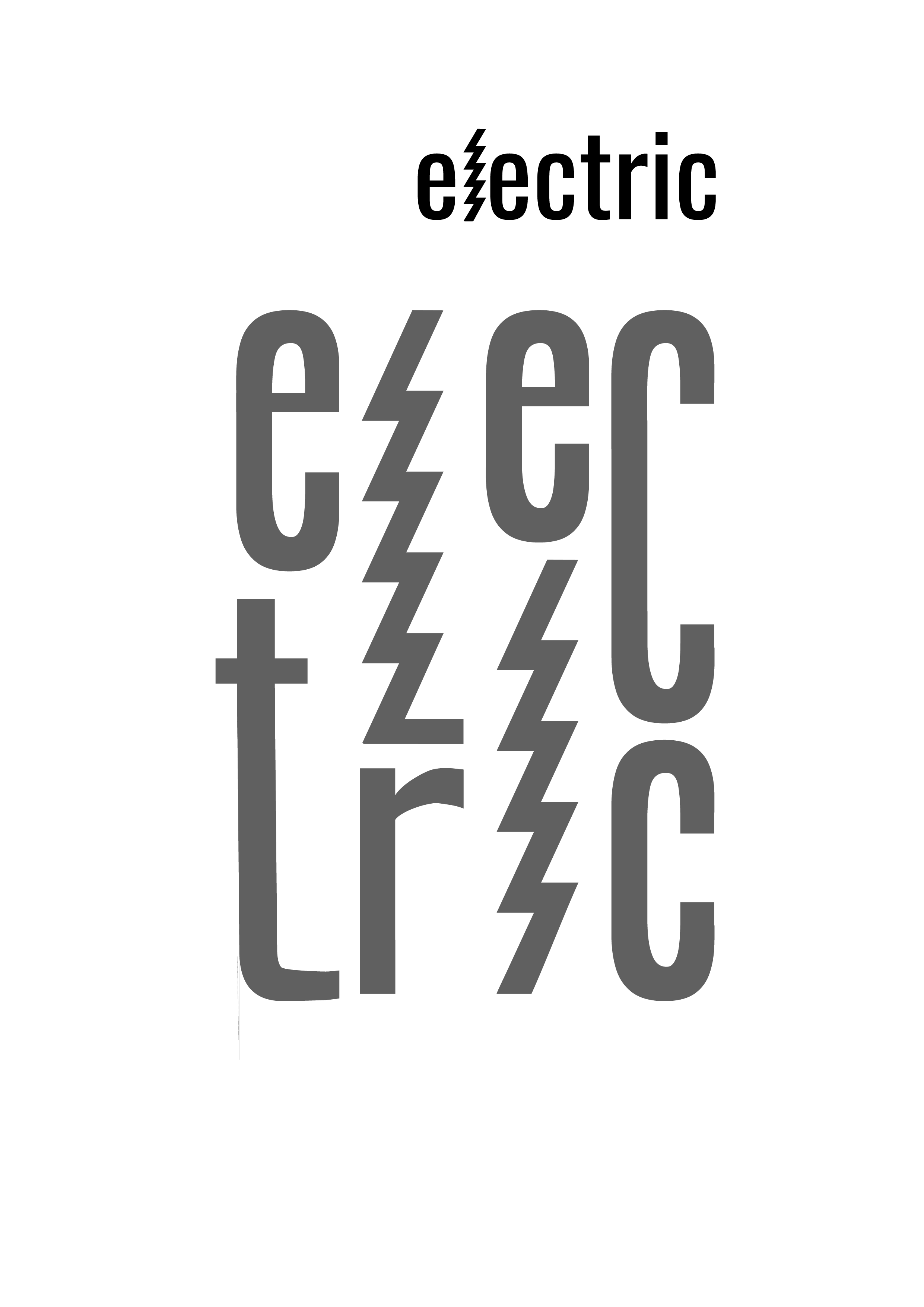
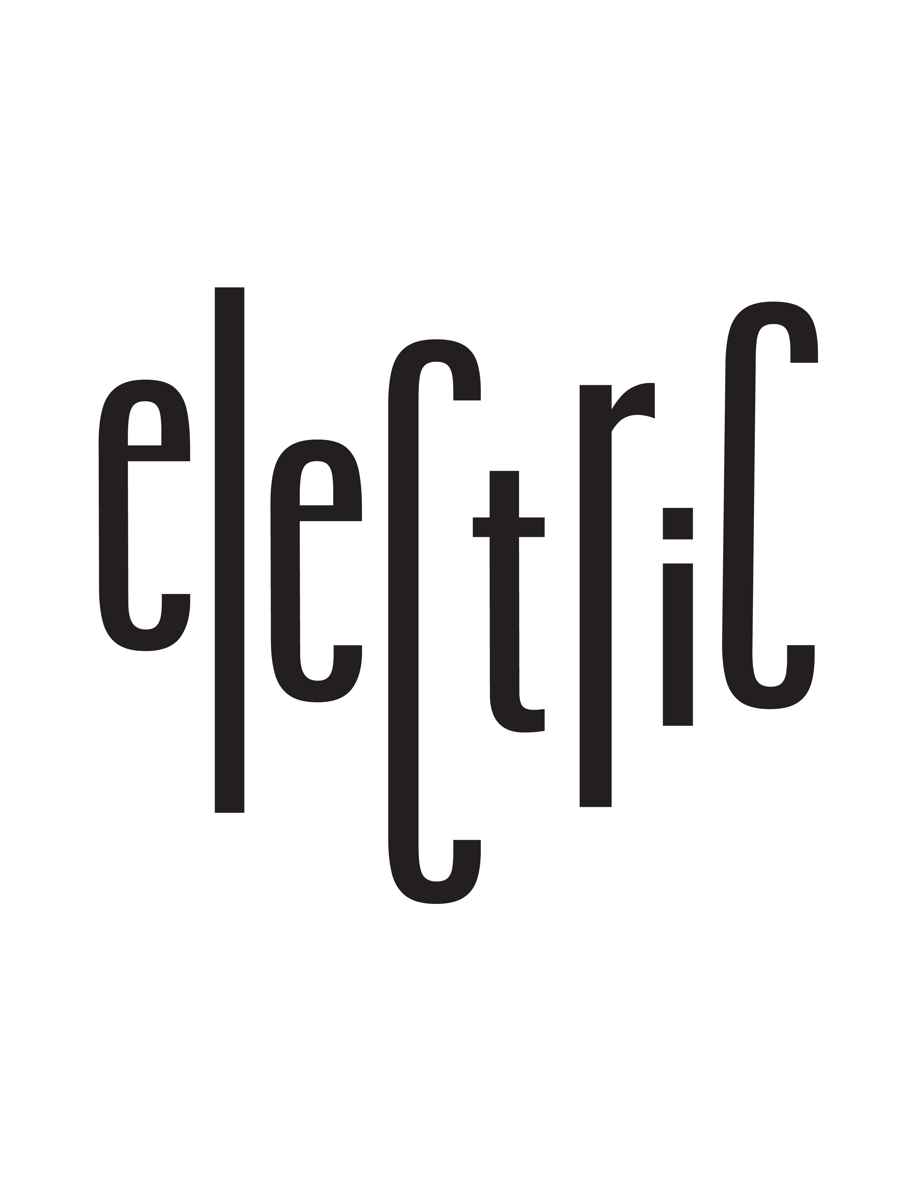
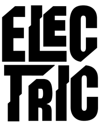
I also tried cutting diagonally across the letters, but the instructor mentioned that it didn’t meet the criteria for the readability and legibility in typography.
and here are my reference

no illustration, can only use some techniques to change the letters
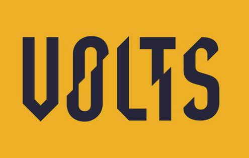
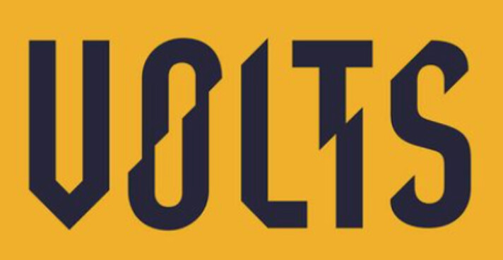
The "VOLTS“ reference seems to work best. Stays legible while having a clear electric feel. Maybe use a font like Anton or DIN Condensed all uppercase with vertical lines but do an “elecric“ style only to some letters like maybe t and i in the style of "VOLT"s T. Maybe also cut off a bit at the Cs in the style of “VOLT“s S. First C bottom right. Second C top left. Maybe also top left on the Es. I hope this isn’t too detailed to break forum rules.
1 Like
I can’t read your instructor’s mind, but you’re creating unnecessary legibility problems by starting out with unusual typefaces and then applying electric effects to them.
If it were me, I would use a straightforward, easy-to-read typeface as the starting point and then change it only as much as might be necessary to suggest electricity. As @Joe pointed out, The VOLTS example does this quite well.
1 Like
I think where Steve-O was going was to suggest that a glyph might be a legit loophole here, it was my first thought too. I love the treasures you find in there, heck you might even find a lightning bolt.
I had this same project in typography class. I bet everyone did, I might have to start a thread to share those.
1 Like
I also remember facing this same project in school. I don’t remember the solution I came up with, what it looked like, or the grade I got, but I remember being frustrated by it.
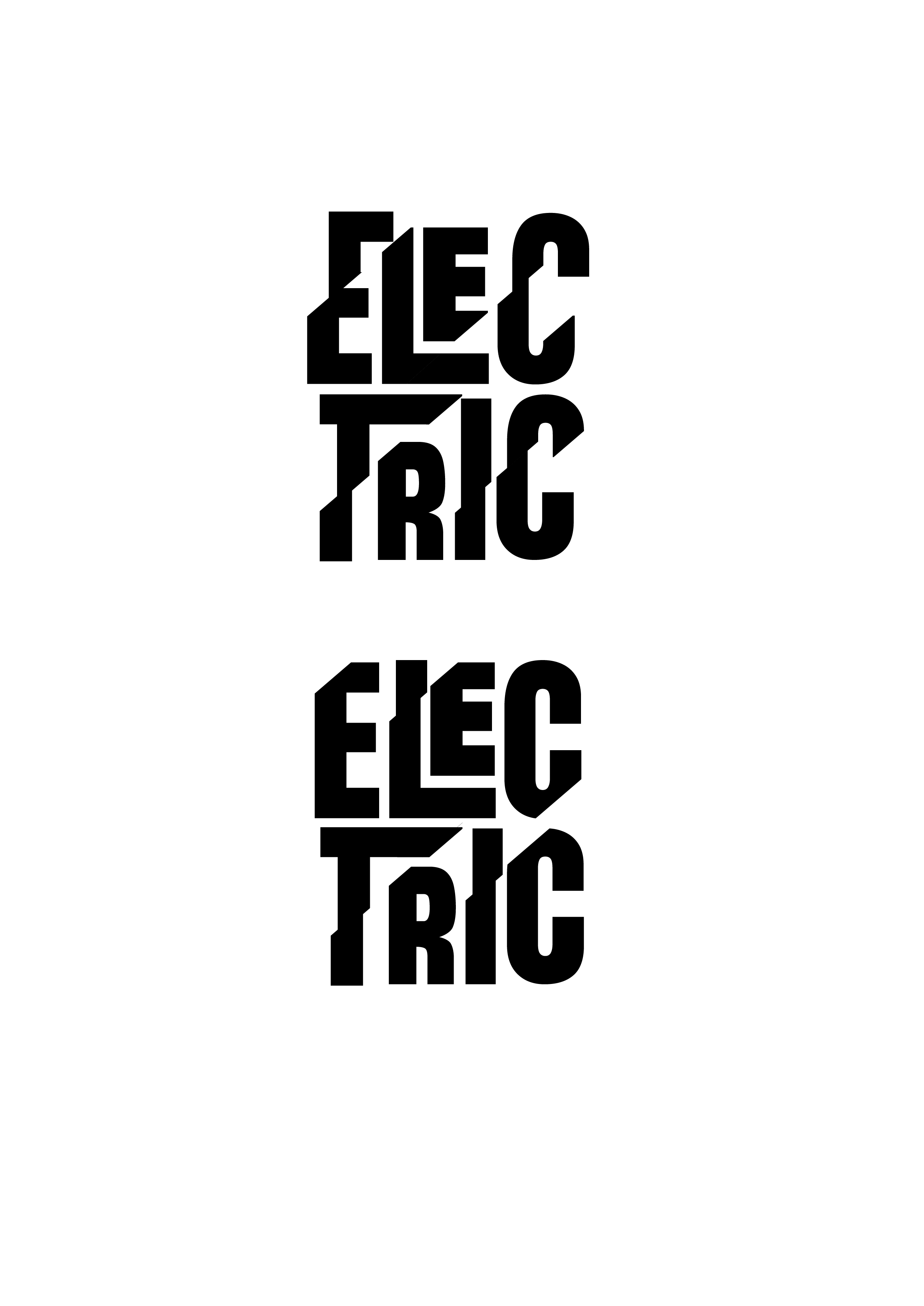
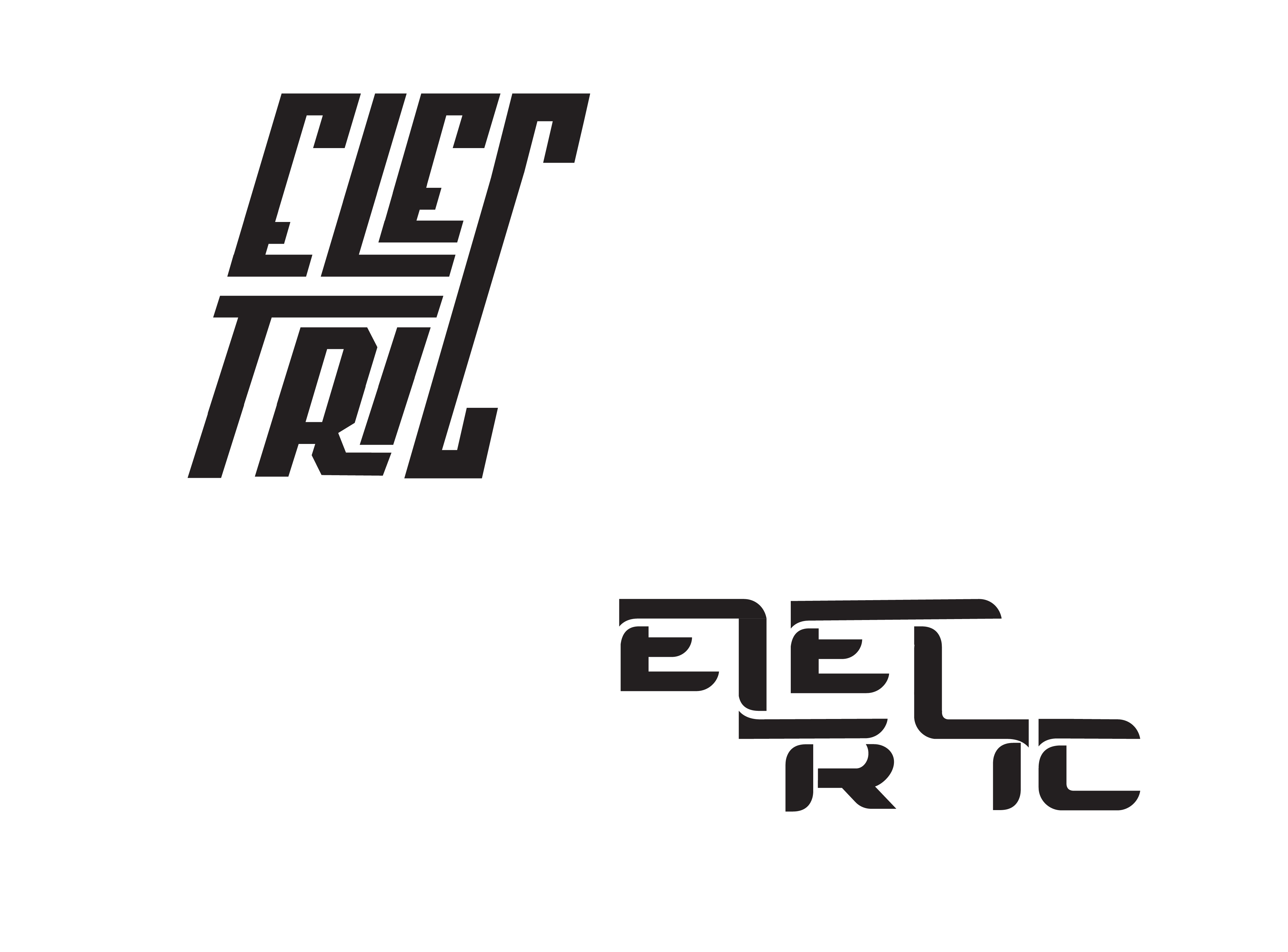
In your latest example, you’ve taken a straightforward typeface and done multiple things with it that have nothing to do with giving it an “electric vibe.” You seem fixated on breaking the word in two, stacking the letters, and varying their sizes.
The following is simple, clean, focused, straightforward, and easy to read.
Your latest idea below is a jumble of ideas that isn’t simple, clean, focused, straightforward, and is not as easy to read.
2 Likes
Am with @Just-B, all of your design decisions should have a reason behind them.
Why did you split the word and stack it or make some characters bigger and smaller than others?
These decisions all negatively affect the legibility of word and I’m not sure they they really create a feeling of the word “electric.”
Design is all about the way something makes you feel.
A word like electric seems very straightforward on the surface, however there are many ways this word can be interpreted that have dramatically different meanings:
For example you could talk about someone being electric in their sports performance because they bring a lot of energy and intensity or you could talk about electric in the sense of curcuit boards and computer chips - The visualization of these two definitions will look totally different.
Decide what feeling you want to create and use your knowledge of typography and deisgn fundementals to create a visual representation of that.
For example if you wanted to represent athletic energy, you could do some of the following:
- Use a bold or black san-serif typeface, uppercase - because these are sleek and powerful
- Use italics or oblique type to create a sense of movement
- Set the tracking tight, not so much that it affects the legibility, but tight enough to create a feeling of tension
- Repeat the type all over the page (if that’s allowed within the parememters of the assignment) to create a feeling of intensity
Hope this helps mate, good luck with your assignment ![]()
3 Likes