Hi everyone, I need help with this poster. I tried to redesign a lot but it still doesn’t satisfy me . Can you guys help me to make this poster better ? Where should i need to change ?
1 Like
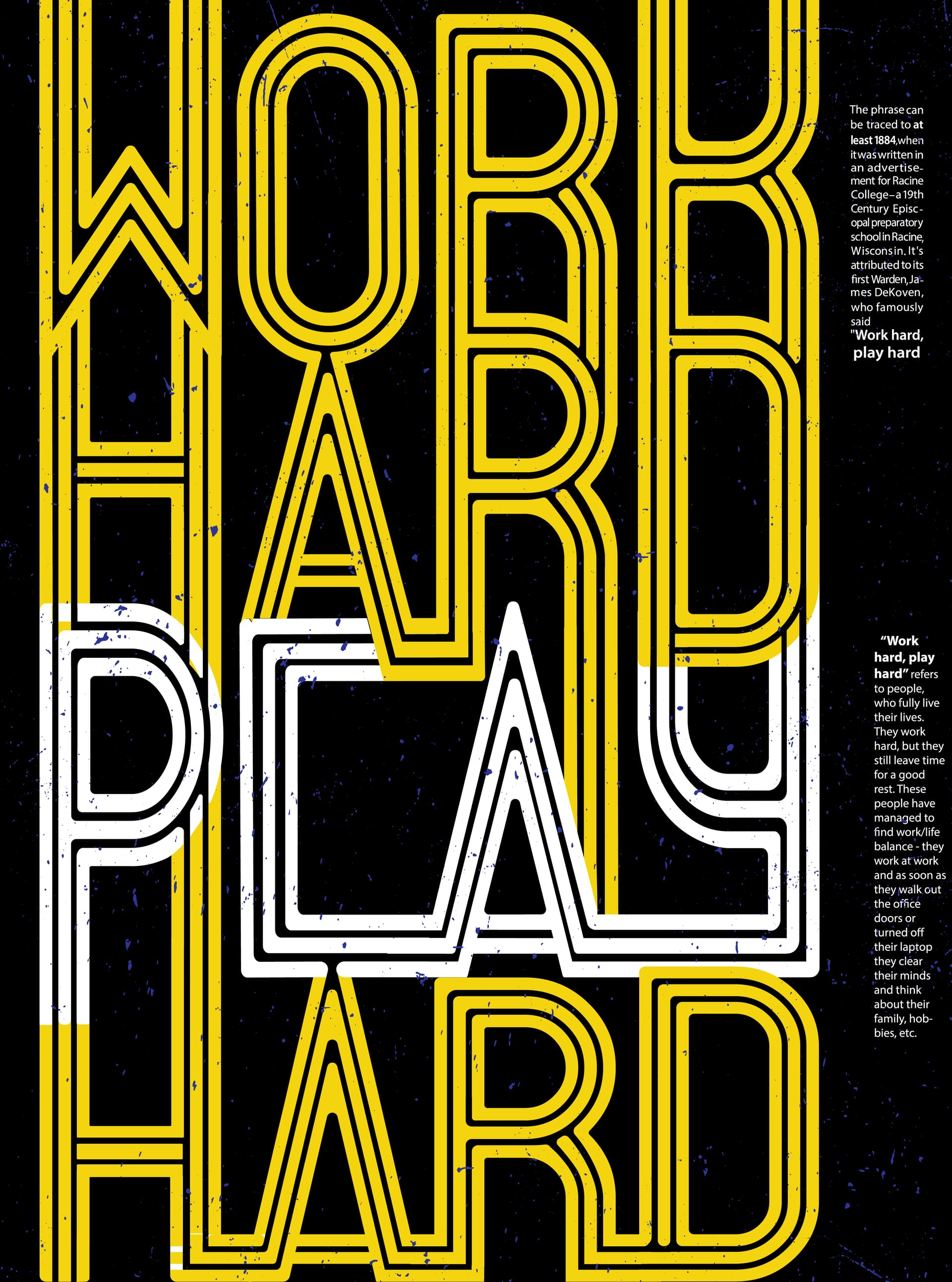
Your L in PLAY looks like a C. That doesn’t read well at all in an already hard to read format.
All that type in the right column? Why is it there? Way too much babble, type too small to be reversed on black, column too narrow, and too many hyphens.
The strokes in the letters A are closer together than all the others.
Some odd choices of necessity on color in the intersection of P and H. Why arent these two letters treated like the Y of Play?
Nitpicking, two stray white blocks in the lower H.
Mind your safety. Cutting is never exact. You will lose part of the bottom strokes of the lower HARD and the two wordy blocks are too close to the right edge.
2 Likes
thank you so much ![]()
This topic was automatically closed 365 days after the last reply. New replies are no longer allowed.