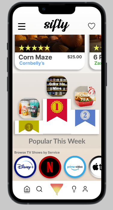
Hey guys! I’m new to this so hopefully I’m not breaking any rules here. I’m helping design the interface for the landing page of a decision making app and need some input on the top of the charts design for most popular visits on the app. Right now we have a podium but I feel it could be reimagined or improved. Happy to accept any and all input.
Maybe it’s just me and my disinterest in sports that use podiums and gold, silver, and bronze medals that obscured my recognition of them. When it comes to ribbons, I’ve always thought of a blue ribbon as first place, red as second, and white as third.
If it were me, I’d probably ditch the confusing visual metaphors and simply place them in order as 1st, 2nd, and 3rd.