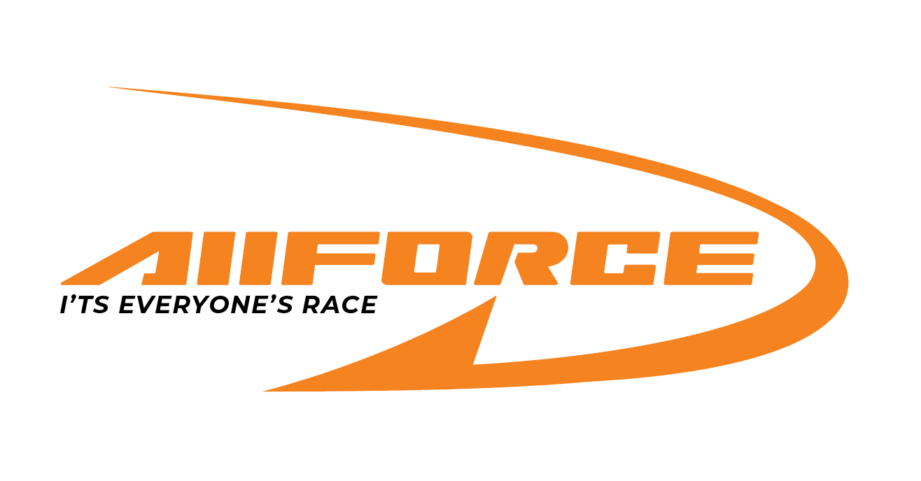
So for my first logo submission I decided to go for a supplements & vitamins brand.
My teacher told me that my direction for the logo is excellent especially where the “R” meets the arrow symmetrically, although it needs some improvement.
He pointed out that the arrow is too long and resembles a fish hook, he also mentioned that the leading might be uneven.
I need some advice how to solve these problems…
I don’t know what you mean by uneven leading. The only leading in the composition is the space between the logo type and the tag line. Maybe you’re meaning uneven letter spacing instead — although I don’t see that as a huge problem.
Yes, it does look like a fish hook, but I didn’t notice that until you mentioned it.
The alignment of the slant of the R matching up with the slant of the hook is nice. However, the other letters need to also be drawn to match that slant.
The F and the E appear wider than the other letters.
These kinds of swooping logos were popular back in the 1980s and '90s — Nike’s logo, for example. This isn’t necessarily a bad thing, but it does give it something of a retro look.
Being the only black object in the composition, the tagline draws way too much attention to itself.
The most obvious big problem, however, is that in the word it’s, you’ve placed the apostrophe in the wrong place.
Some good points already posted. I agree about the fishhook. It dominates the logo. That can be a good thing but I think it’s too heavy. Also the curve seems awkward to me. Could be the inconsistent width of the shape.
Comes up pretty much on the first page of a Nutrition Supplement Logo search.
To be fair, the student may have done some research and got this one caught in their subconscious without knowing it, maybe.
One more thing I’ll add… To me it reads “AIIFORCE” not “ALLFORCE”. If you are going to combine capitals and lowercase in one word like that you need to do something that differentiates them.
It didn’t even occur to me that it might say ALLFORCE since it reads as AIIFORCE. Cosmo’s right, if it is ALLFORCE, you definitely can’t use lowercase Ls that look like uppercase Is.
To be honest, the logo is quite good. You have brilliantly focused on the color ad made it eye catching. The only thing that will create problem is the the logo is not compact. Try to make it compact so that you can use it anywhere and print it anywhere.