I am aiming towards something that looks modern, yet doesn’t look out of place for a thesis. I can’t quite put words to it but the upper and lower areas look off to me. Maybe it is the font type and size or it might be the way everything is located. Any ideas or feedback would be greatly appreciated.
My experience with theses is that schools often have quite rigid guidelines on just how they’re supposed to be designed — right down to margins, typefaces and point sizes. Without knowing those guidelines, I’m hesitant to offer an opinion.
I will say, though, that I like what you’ve done. I don’t share your concerns about the upper and lower areas looking off.
Could you elaborate a little? I’m not quite sure what you don’t like about the hierarchy.
Actually this is my first design. In fact, I’m not really familiar to graphic design. I was simply looking for a forum were I could submit my work and ask people about feedback or advice and I just happened to stumble upon this forum.
We weren’t imposed any specific rules. We were just told to put our title, name, class and some additional information on the cover and that was about it. I think the main struggle for me here is the location of the different sections. The image divides the page in two sections, but how I should format my text in those areas is the main question.
Basically if you were to rank the importance of each piece by how important it is, then scale and place them accordingly. For example, 1 being most important—the subsequent numbers being less important:
1.title
2.illustration
3.name/class ID/teacher name
4.Etc.,
I’m trying to think of how to explain it as laymen as possible. But it may just confuse you more. It may be best to do a google search about. Hierarchy in graphic design layout.
It needs to have an academic look, which it already has. As I mentioned, I don’t see the problems you’re describing. I’m not really seeing the two sections as much as I’m seeing three of them: 1) the top down to the headline, 2) the headline down to the bottom of the insect, and 3) everything below that.
All things considered, I think it’s fine. If it were me, I might experiment with using a sans-serif for the small type, but that’s just my inclination. I would also likely experiment with lining up the flush left type and letting the small logo hang out to the side into the margin.
Sparrow is seeing a problem with hierarchy, but I’m not really bothered by that. I don’t mind the small type being all the same size and placed in the three corners. The main focal point seems clear to me — the insect and the title. I think we’re all seeing slightly different issues, which often means things are probably fine. Otherwise, we’d all be pointing to the same noticeable problem.
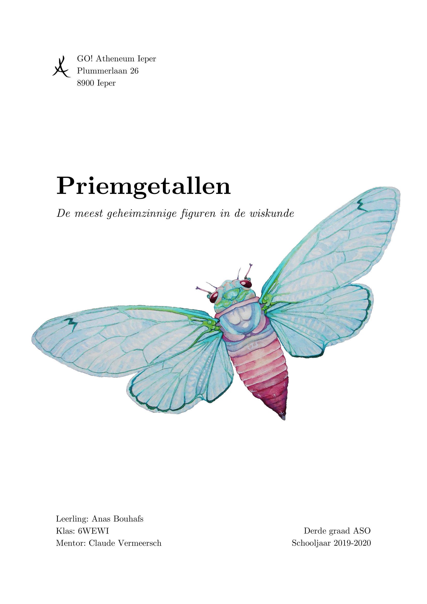
I like the illustration, but what is that flying insect anyway? A moth? Is there some relevance it has to the subject matter? In addition, given that the thesis apparently delves into mathematics, the simple, academic look seems completely appropriate.
I tried using a sans-serif font for the smaller type, but being honest I think it looks weird, since my entire thesis is written in a serif font. I’ve considered your advice to let the small logo hang out to the side of the margin and I think it looks better now.
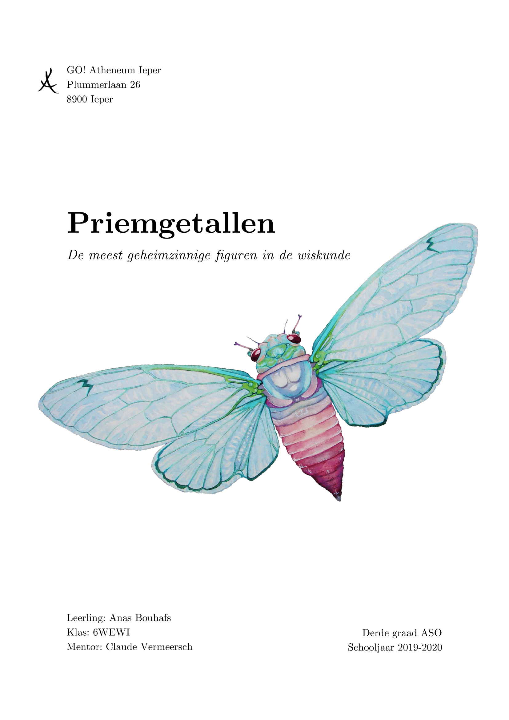
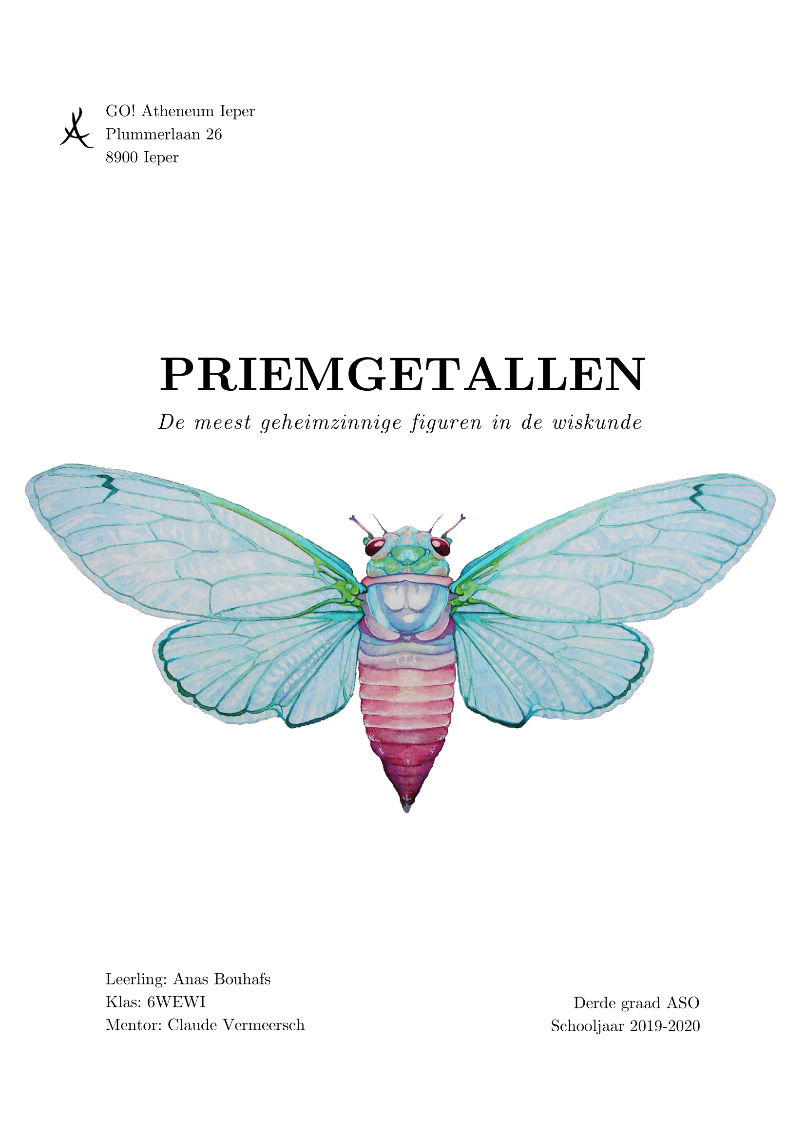
I’ve also experienced a little with the location of the illustration and the use of upper and lower case in my title. Those are the two variants I’ve gotten so far:
That insect on the cover is called a cicade. In my thesis I’m discussing prime numbers and their applications, and cicades have the amazing property to emerge from their underground habitats after a prime number of years (e.g., 7, 13 or 17 years). Hence the illustration.
I’m not generally a fan of completely symmetrical compositions, but I still like the last one, which might even address Sprout’s concerns. I hate sounding like a broken record, but I think they’re all good. If I had to chose, I’d likely go with one of your last two.
Yes, matching the interior pages of the thesis is important. I agree, I’d stick with the serif type if you’ve consistently used it throughout the thesis.
I like the first option you posted more than the two alternate versions with the bug and headline centered. The latter look too static.
Given what it is and that you are not a designer, this isn’t a bad effort.
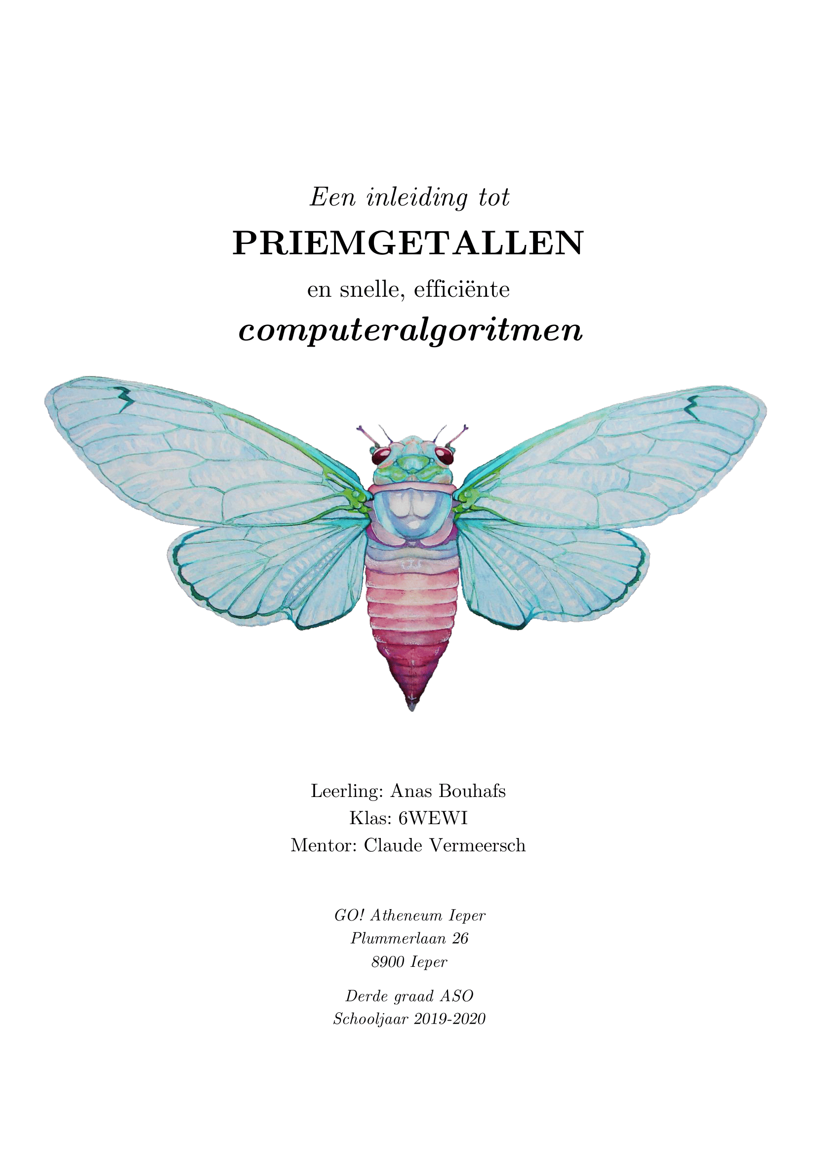
Try putting a line break (soft return) before the word “figuren.” I think “wiskunde” is running too close to the wing and causing tension.
After that change, increase the size of the headline and subhead about 40%, leaving the position of the upper left of “Priemgetallen” where it is. This will cause the type to nest into the bug illustration and the two will become one visual element instead of competing like they do, now.