I am a neophyte in logo design and I would like your opinion on my logo and especially on its composition (size balance, text). The company name is Keybox Productions but only Keybox is usually used.
The company is active in the event industry. I enclose the old logo that I tried to revitalize while keeping its sobriety. I’d like to know your opinion on this already
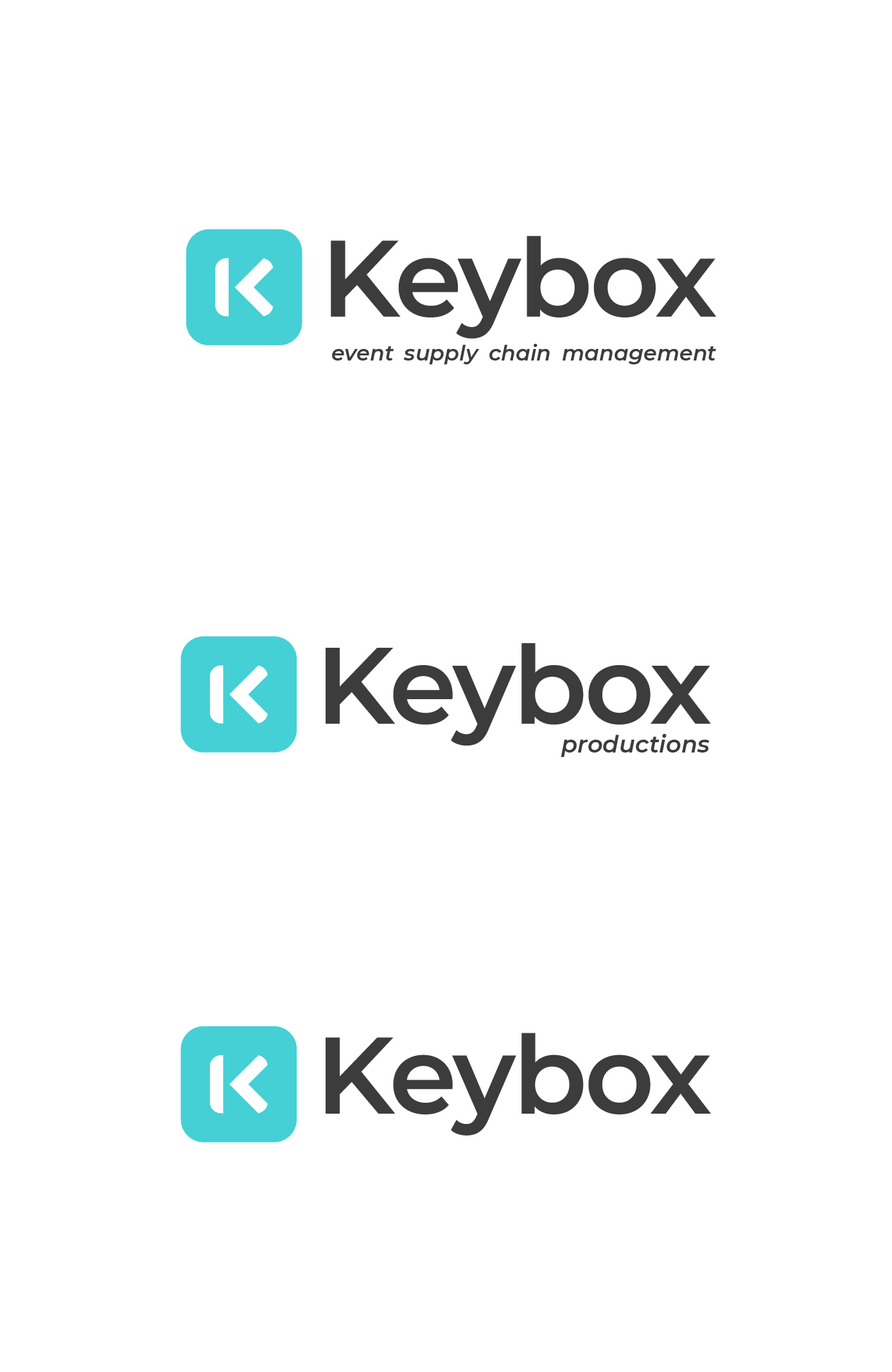
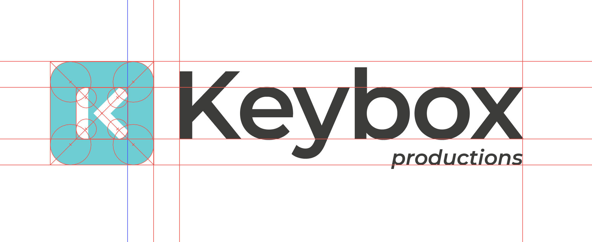
My more specific question concerns the alignment and balance between the monogram and the text. I enclose an overview of the markers used. I have aligned the monogram to the x height but visually, I have the impression that the text is too high. Especially in the version without “productions”. What do you think?
Also, the tail of the Y prevents me from easily placing the baseline without it being too low. Do you have any tips on how to solve this problem?
Finally, what do you think of these different compositions? Is it enough if I only select 2?
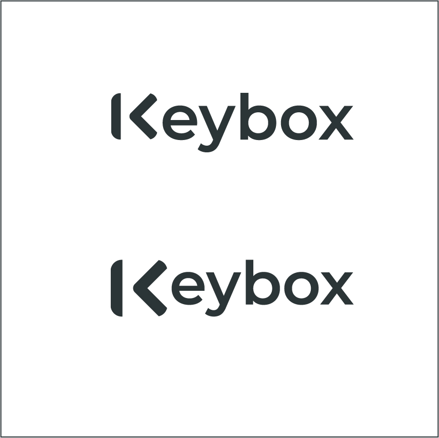
Personally, I would avoid the horizontal lockup — partially for the reasons you mentioned and also because it’s a little awkward having the K within the logo being immediately followed by another K in Keybox. It almost reads K Keybox.
If you do go with the horizontal arrangement, the word Productions helps balance the layout. (I’d avoid italics, though.) As you’ve noticed, even though you’re aligning the x-height to the K in the logo, it looks wrong because the visual weight of the ascenders is bulkier than the weight of the single y descender. Adding Productions places more weight at the bottom, bringing the arrangement back into equilibrium.
It might be obvious — perhaps too obvious — but why not put a key in the box instead of the K? I’m not really suggesting just slapping an image of a key into the box and calling it good, but the name Keybox does suggest visual references that you’re not exploiting.
Unfortunately, I didn’t choose the name. I’m working on it to practice and to please a friend at the same time
My first idea was also to come up with a different idea than the K in a square as a monogram but the guy wanted to keep it. I also couldn’t put the logo in capital letters to even out the height. That is why I am appealing to your advice on balancing.
Thanks Just-B for your opinion ! Indeed the repetition of the K poses a problem that the original logo did not have, but to the prejudice of its legibility. That’s why I took it out.
Do you think the horizontal arrangement is better like this (same size for both K), if we forgot the K Keybox effect ?
Yeah, that does work better. It no longer looks vertically unbalanced. That repeating K in the same line still strikes me as an issue, but I might be making it out to be more problematic than it is.