HI everyone!
My name is Amanda and I’m a student. I need some help with a logo i am working on for a factitional. brand. My professor likes the black and white image whitch was the 1st design I did but i fell out of love with it when it redered horribly reversed (looked scary). I fell that the esign looks like a studen’t work. This is something I’d liek to add to my portfolio some day. Now, I made a new logo and tool a different approach. I loved this logo up until my last class where my professor heavily criticized it. He said to ask others to get their opinions. Not to ask for sympathy but, this made me sad as I just lost my father who was my inspiration and by best friend who also was an amazing graphic designer. I wish three fold that i could have a crit with him one last time but unfortunatly that is over. Can anyone help me? My professor has nothing positive to say.
Project: Create a brand identity for “La Terra Dolce” a grain company that makes cereals, bakeing products, granola, and etc. We can take this company and give it life. I choose to do a children’s line of cereals, some granola bars, and a trail mix.
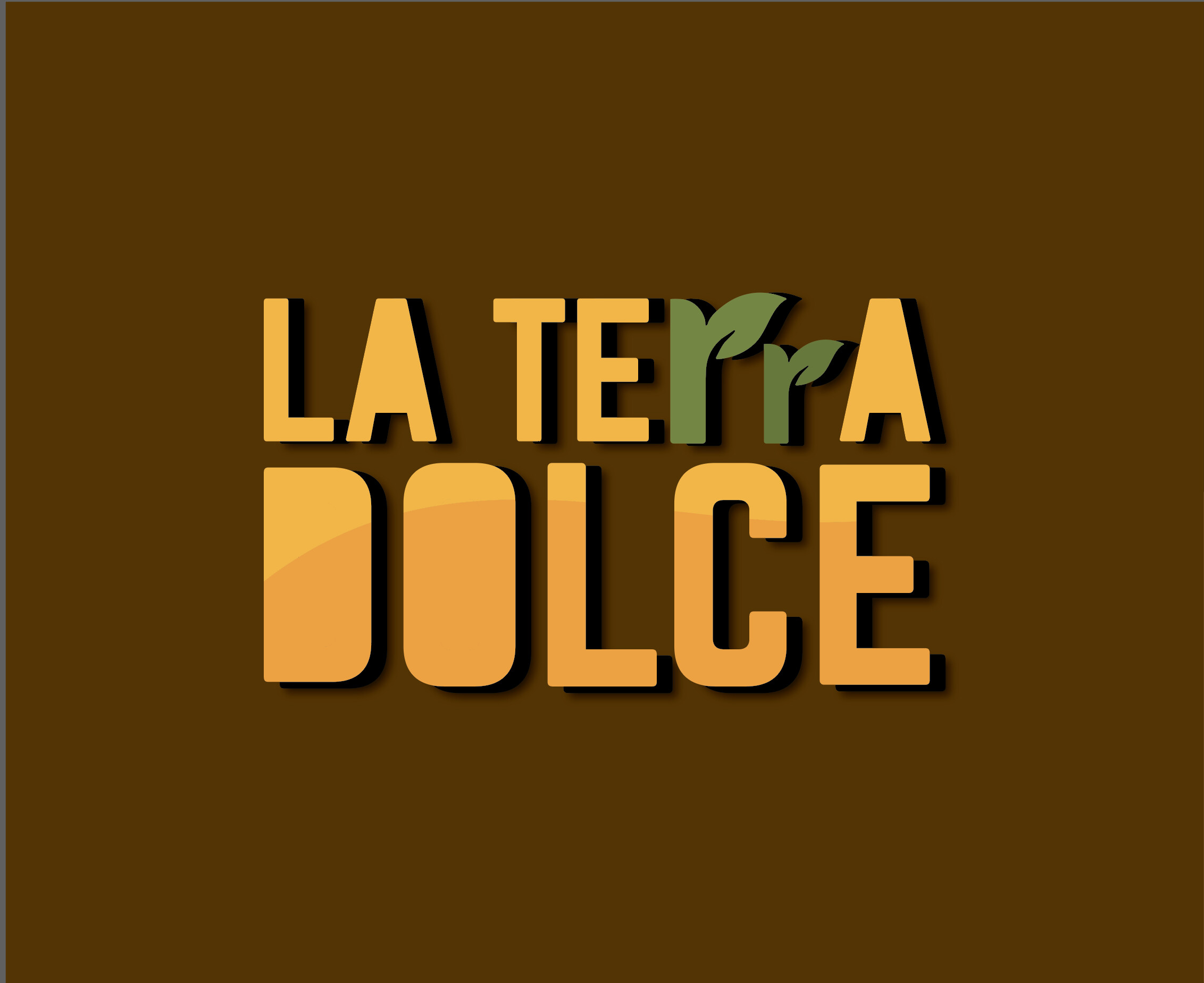
You’ve put more time and effort into perfecting and cleaning up the second version, but I agree with your professor. There’s a concept in your first one that’s missing in the second example.
Your effort to make the two r’s look like plants isn’t appropriate for a grain company — grain plants (wheat, barley, oats, etc.) are grasses. They don’t have leaves that look like that.
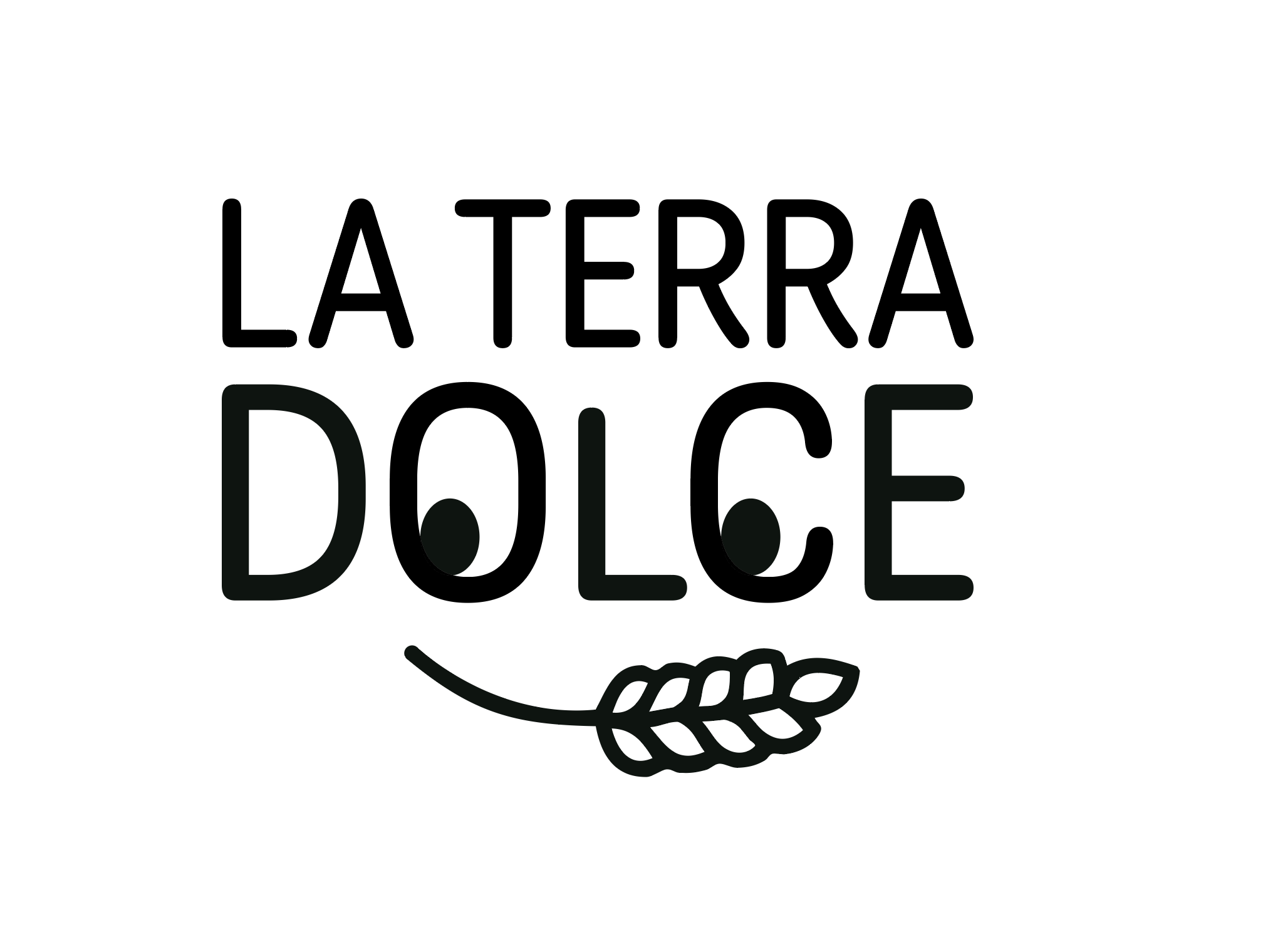
Removing the counters from the letters comes across as gratuitous and without an apparent reason that ties that decision to the company.
If it were me, I’d use a different typeface. I would move the L further down, so it looked more like a nose, and I would make sure the grain plant was centered. There are lots of other little details that I think could improve it, but I’d need to sketch them out myself, which I suggest that you do.
OK, you’ve put some effort into it, and it’s better than the first go-round. Good job.
However, La Terra Dolce means The Sweet Land in Italian, as I’m sure you already know. Does this new version suggest a serious business that grows healthy grains on beautiful sunny farmland? Or does it have a casual party vibe? Maybe it needs to have more of an outdoors environmental personality? You tell me. What do you think?
In addition, your professor might want to also know what the logo will look like in just black and white (no grayscale).
Don’t get discouraged; you’re a student and still learning. There is no single best solution. As long as you’re soaking everything in and moving forward, you’re on the right track. And I’m absolutely certain your father would be pleased with the progress you’re making in school. We were all students at one time.
By the way, it gets slow on this forum after work and on weekends. You’ll get feedback from other professionals and students but it might take two or three days.
I still like the first design the most, but myself, I’d avoid the quirky face. See what you could do with the wheat or a kernel—and in a single color. Be it in the bowl of the O or D. I’d also try to keep the weights of the line similar to the type.
Technically you could even make this more rustic too. There is a lot of opportunity to play and be flexible to learn the in and outs of a good logo.