You’ve taken just one graphic design class, right?
If so, you shouldn’t be beating yourself up over what you’ve shown above. As you said, they might not be professional quality, but for student work, they’re far from the worst I’ve seen. For what it’s worth, years ago, when I enrolled in my university’s design program, I had never taken any kind of graphics class and knew absolutely nothing about it. Like you, I found most of the students in the class already had some experience, so I found myself really scrambling to catch up.
Generally, and based only on your three examples, your weak spot appears to be typography. It’s almost as though, you’re just picking typefaces at random and plugging them in.
From bottom to top:
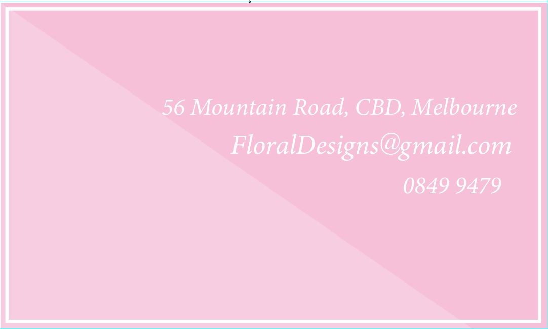
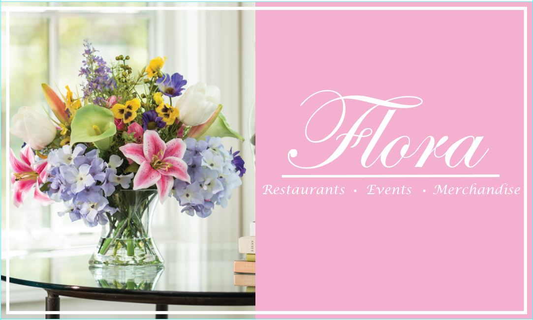
The Flora layout shows some sensitivity to typography. You’ve realized that type conveys an emotional quality that needs to match qualities in the layouts in which it appears, so you picked a typeface that does this. However, white on pink is awfully anemic. The lack of contrast interferes with the legibility, but probably not fatally so.
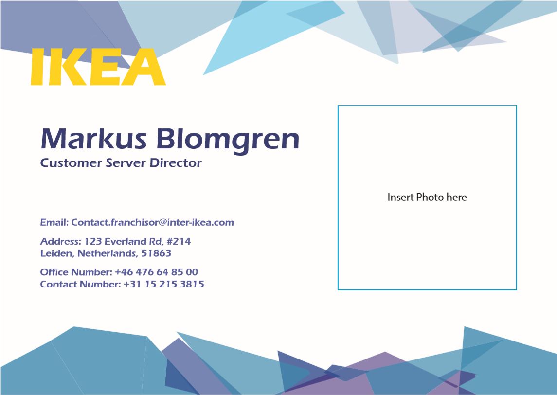
Your choice of Eras on the Ikea piece is interesting. It’s a typeface that was popular in the 1980s which makes it look somewhat retro. I’m guessing that was not intentional. There’s also the matter of it not matching IKEA’s branding, which, in real life, would be a huge problem, but I don’t know what you class assignment might have been. The jagged glass shard-like shapes appear to be gratuitous, in that you were just trying to jazz things up a bit. The “insert photo here” box is a bit odd. Why didn’t you just insert a photo. The flush-left type doesn’t align with the IKEA logo. Even so, the layout is relatively clean and restrained, hierarchical and business-like, which again shows some sensitivity.
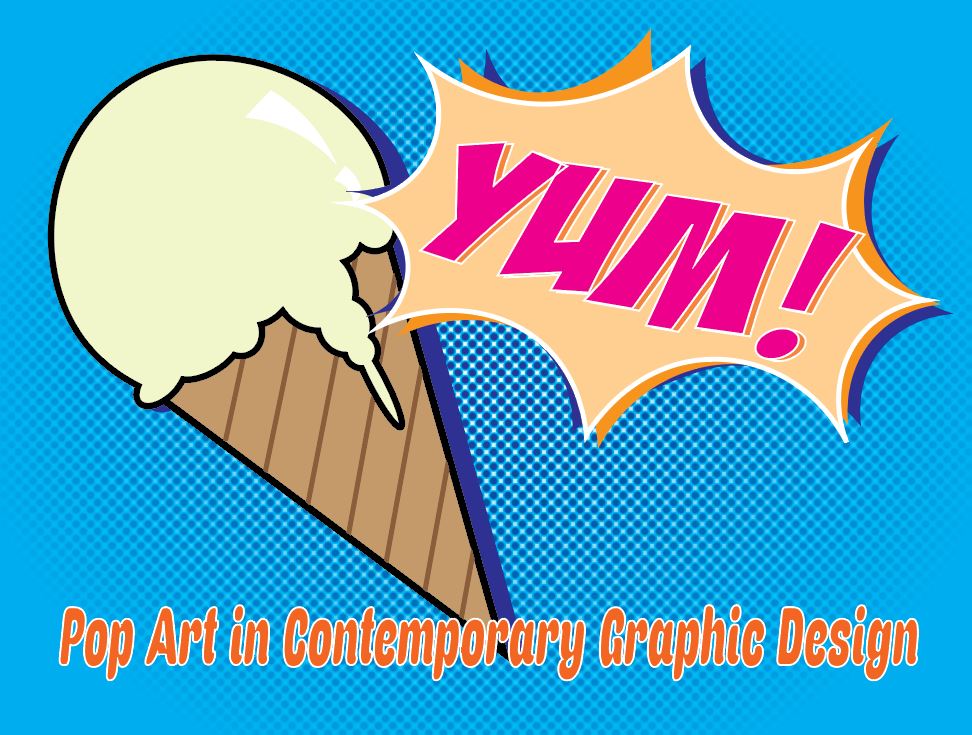
The Pop Art piece is more illustrative and interesting, but misses the mark a little if you were really trying to imitate Pop Art from the early 1960s. Did you study it carefully before launching into? Outlined type rarely works well when the outline is used to make up for a lack of contrast between the type and the background — fixing the underlying problem is a far better solution. The condensed, italic type at the bottom is, well, atrocious. You seem to have an affinity for italic type, which is generally (but not always) best used to only highlight something. Italic type introduces an angle into most layouts that is typically at odds with the rest of the composition.
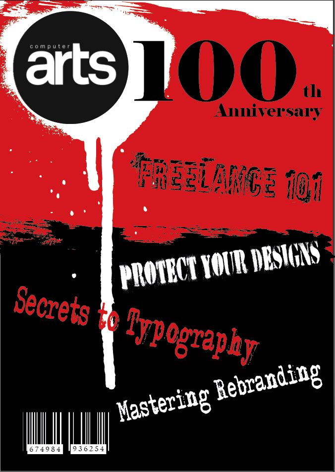
The top piece is, what, a magazine cover? You were going for a grungy sort of look, which again, like Eras, is not especially in style. There’s nothing inherently wrong with a distressed look, but what’s its purpose in this layout? How does that look reinforce the subject matter? White-on-black barcodes will not scan correctly with many barcode readers. Your type appears haphazard with the exception of an attempt to maintain the grunge look. Again, this shows some sensitivity in that you were intentional about it. Still, you seemingly had no idea what to do with the type, so you just sort of tossed in into the layout in random ways to fill up the space. Even good layouts designed to look random and distressed are labored over. A truly accidental look is rarely an accident.
In general, there are some nice things going on in the layouts. It shows that you really are thinking through the problems in a direction that you can develop further with practice and critical analysis. You should definitely work on your typographic skills. Confining yourself to working with only a small handful of typefaces is usually the way to go. After, aggggh, 40 year in this profession now, I could easily get by with, maybe, four or five different typefaces 90% of the time, which isn’t at all unusual for more experienced designers to say.