I’ve been using League Gothic and Bebas Neue and getting really negative feedback about them. Thanks.
I don’t think it’s the typeface as much as it is how you’re using the typeface.
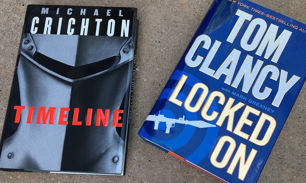
Lots of best sellers use roughly the same style of type as yours. I’m not a big fan of the Clancy/Greaney book cover (or the book itself), but I just quickly pulled these out of my library to demonstrate how the advice you’re receiving from others isn’t necessarily good advice.
When people without good design vocabularies are asked to critique a design, they’re often good at identifying general things that don’t look quite right, but they usually misidentify the specific cause of the problem. If something about the typography bothers them, they’ll often say, it’s the typeface, when in reality, it’s often not the typeface causing the problem — just how the typeface has been used.
That said, there are plenty of other typefaces that would likely work just as well, but a condensed, sans-serif with some no-nonsense tension, like the ones you’ve chosen, is not a bad face for an action thriller book. You just need to use these kinds of typefaces (or any other, for that matter) with a good deal of sensitivity, otherwise the the result is just plain, ordinary words typed out on the keyboard and left as is instead of integrating into the design.
1 Like
Very good, Just-B. Thank you for sharing your expertise. I had done a little research and seen that League Gothic and Bebas Neue were both considered good fonts for the action/adventure/thriller genre, so I was a little bewildered by the crits that the font wasn’t working. You have, eloquently, described why. From now on I will pay more attention to effectively placing and integrating the fonts into the entirety of the cover design.