So I have this client that I am creating a logo for. I have their logo designed in a black and white vector format at the moment. However, this client wants the logo to look like a 3D Wooden Viking Shield and I’m stumped on how to bring my 2D logo to life. I’ve tried photoshopping wooden textures into it but everything I do seems to fall flat. I’m not sure if anyone can recommend any tips/tools/programs to use to help? (I have the entire Adobe Suite & procreate).
Is the client looking for something more on the stylistic end or more on the photo-realistic end?
How will the logo be used?
Potentially, at least, it doesn’t sound too difficult – but I haven’t seen the logo. My inclination would be to do as much of it in AI as possible. At least create the shield shape, work the logo, and add the shaded shapes to give the impression of a debossed (or carved) area. Then you can apply textures – either with a raster file or you can find wood texture vectors at some place like Shutterstock.
I’d first educate your client that a fully rendered logo is limited in application purposes. Unless this is strictly for a gamer sig, having a logo that is simplified and limited in colors (no gradients) would be the first choice for the lock down. That’s the logo that gets used in print, signage, screen print, embroidery, etc. After that, if they want to bling it, then go all out with the raster imagery.
Without some clarification it is hard to give more info or feedback. Most of the replies are assuming you are referring to a traditional logo. But, hypothetically if you were referring to a smartphone App “logo” or a smartphone game logo, then going more 3-D IMO would be appropriate.
Here are some tips for designing your wooden-looking logo.
• It should be unique from competitors’ logos.
• Your logo should be a cohesive unit; all the parts working together in harmony.
• It should be easy to understand, even from far away.
• It can be used in many different sizes and mediums.
• Your logo should clearly represent your business and possibly your industry.
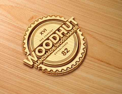
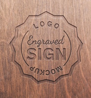
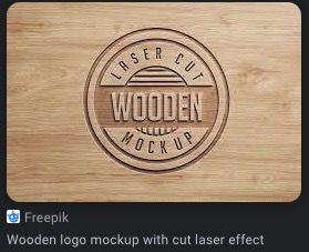
Since this got resurrected, I had a look around at imagery on the web for wooden logos. Had a good laugh at the ‘mockups’ available. Some of those are in no way physically possible at the scale shown,
the engraved ones neglect the fact that engraving machines create fillets on inside angles (router bits are round, you aren’t going to get those sharp outside points or square ended elements,)
and others, like the ‘laser etched’ wooden logo, LOL, obviously that artist has never used a laser to cut wood. A laser is more like a very expensive woodburning kit. The knockouts are…burned in. This is just wrong.