Hello guys, I’m a junior UI/UX designer and just recently I’ve been asked to create the website for RealSpyApps. This is my best and the large project thus far, could you give me any pointers on how I could improve? I’m still a junior designer and looking for all possible feedback. I’ve spent a lot of time on this client
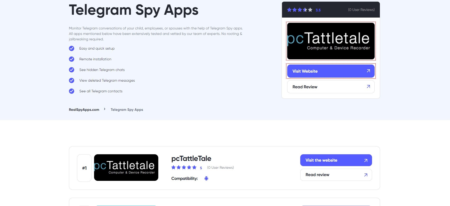
‘Monitor Telegram conversations of your child, employees or spouses…’
Despite the somewhat dubious ethics (and, in some cases, legality) of all this, the text is littered with grammatical and syntactical errors. It’s also not particularly interestingly written with some odd changes of tense from first to third person in one paragraph. Use of plural vs singular is also woefully inconsistent / wrong in almost every case I saw.
I assume it is client-supplied copy. If so, I’d suggest they get a mother-tongue editor to go over it. I am assuming you client is Russian, given the name of the dummy reviewer and the address bar on the mobile version.
I have to say, alarm bells are ringing fairly loudly right now. Personally, I would turn this job down, but that’s a matter for your own moral compass.
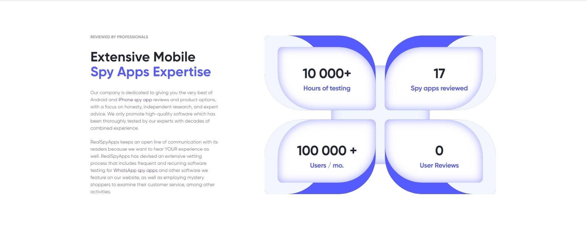
As to the design of it, in all honesty, there’s not a lot to comment on. It is all fairly bland and not a lot of design going on really. The only part with any sort of personality is the four-panel diagram (text alignment and positioning needs attention) and this seems overkill for fairly uninteresting data, given the lack of design used everywhere else. The main colour is a bit of an odd choice to my mind, too.
Can I ask; have you studied design and/or worked in the industry to gain experience, or are you self-taught?