Hey, I’m doing a student project for class involving rebranding a real local restaurant.
The goal is to give the restaurant a new identity by modifying the name, logo, and then later environmental branding.
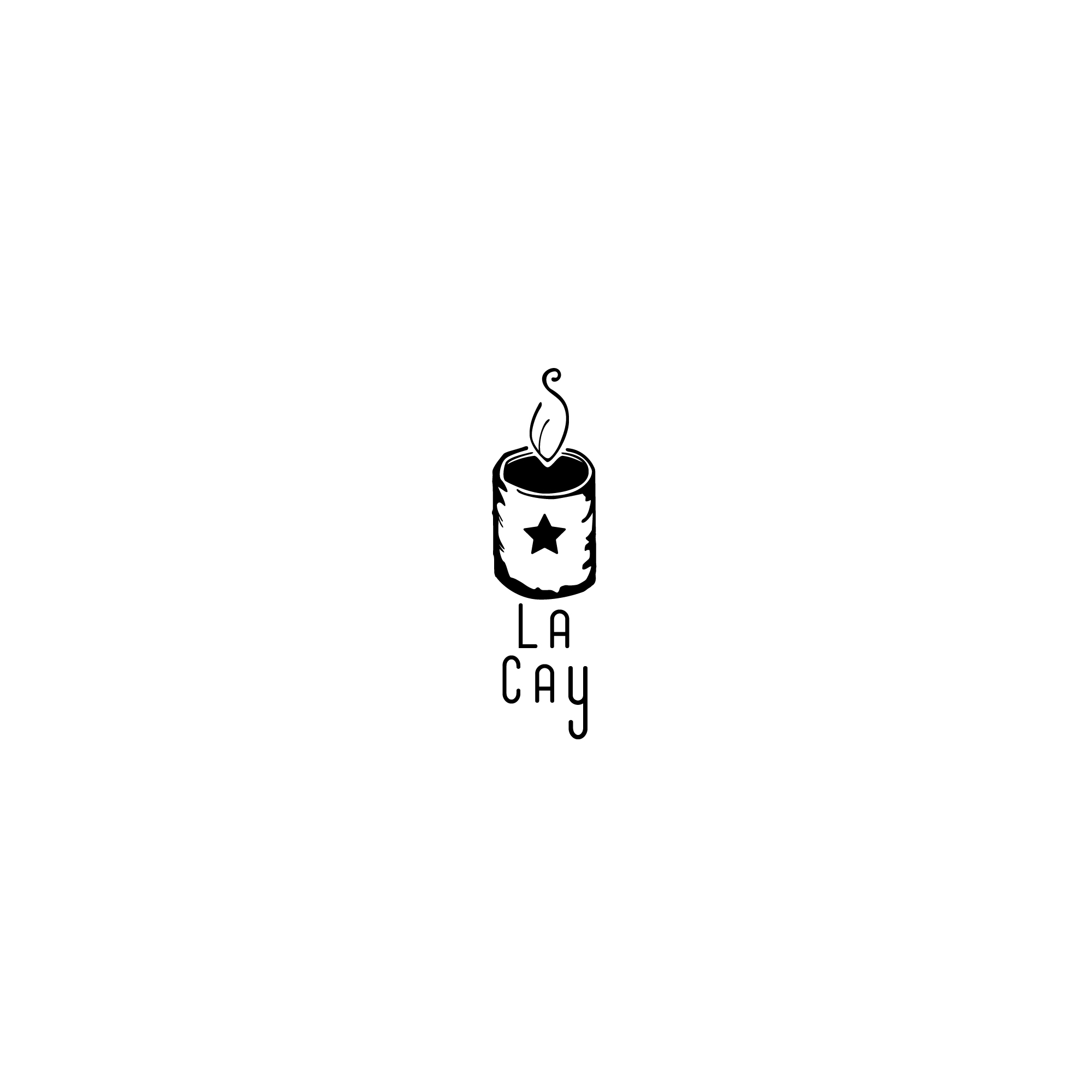
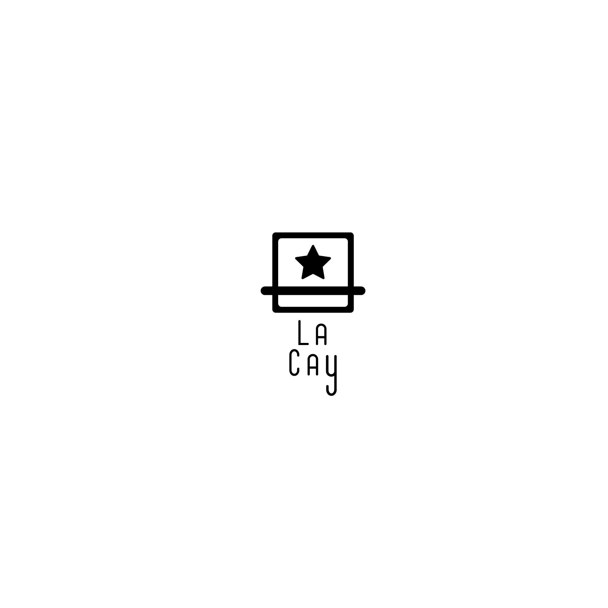
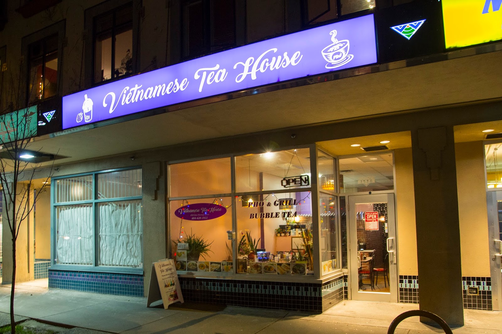
The restaurant is Called Vietnamese Tea House in Vancouver B.C. I changed the name to La Cay which means “Leaf” in Vietnamese (based on google translate). It is a local restaurant providing fresh authentic Vietnamese Food and Drinks in a working class neighbourhood call Hastings-Sunrise. Based on my research I am trying to build a health based, modern, authentic, fast-casual or fast-fine restaurant (one that doesn’t take too long for someone to eat there).
I made 2 different logo designs, any critique would be appreciated.
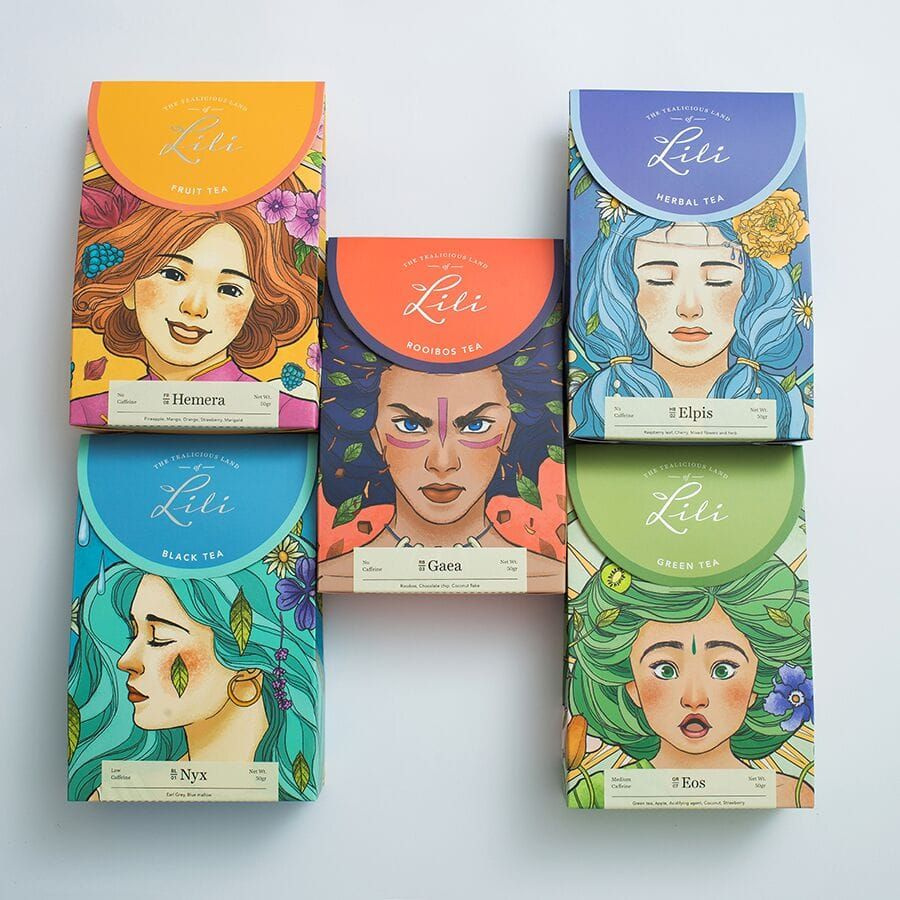
I’m Vietnamese  hope my comment could help you. I prefer the 1st one but I think you should go with some hand writing font to make it look more softer and more aesthetic. The icon, a tea cup might be a better option, cause we don’t drink tea with a can lol :))) Here’s the Vietnamese tea brand I did work with. Hope you have more idea.
1 Like
Hey thanks for the reply. I considered going with a cursive font but felt that it would give off a feel of fine-dining rather than casual and as my target audience heavily focus’ on working class/busy people who don’t have time due to their busy schedule I felt that a rounded sans-serif typeface would look more appealing and modern.
The target audience I researched was:
-
Male and Females ages 18-24 University students at UBC, SFU, BCIT or Art Institute Vancouver Downtown Campus. All Ethnicities. Low to Medium Income, student loans, or allowance from parents. All relationship status. Busy university students that live in the area or along Hastings Street. Not enough time in their busy schedule to cook, therefore, they eat out. Looking for a cheap, healthy, tasty establishment that doesn’t take too long to prepare their meal; takeout or Dine-in. English speaking or international students with english as a second language. Interests include travel, exercise, foodie.
-
Male and Females ages 24-35 working class individuals that work or live in the area. All ethnicities. Medium to high income. All relationship status. Workers who are starting out at new careers and jobs and on a busy schedule and, therefore, do not have the time to prepare their own meals, are looking for a nice place to eat, or are taking clients/friends/co-workers out for dinner. Looking for a cheap, healthy, tasty establishment that doesn’t take too long to prepare their meal; takeout or Dine-in. Interests include health and wellbeing, yoga, finance, fitness, foodie, travel, business.
-
Males and Females ages 35 - 60 upper middle to upper class individuals with high disposable income. All relationship status. In leadership positions in their industry and looking for a health conscious place to eat or to try something new. May work or live in the area. Interests include travel, fitness, health and wellbeing, liberal, politics, finances.
P.S that package design looks great btw.
What they apparently aren’t teaching you is that a “rebrand” usually consists of some sort of continuity with the old brand. Otherwise, you are starting a whole new brand, from scratch. To totally change the name and logo of a somewhat established brick and mortar, especially a smaller one? May as well close and reopen.
Trying to re-establish the current following with a whole new approach might even be a bad idea. Is your target audience research about what is frequenting the place now? Or is it the dream clientele of the owners? Because you have quite the eclectic range there. The trick is to cross over current clientele into the new rebranded business while adding appeal to others, with the MAIN goal of increasing the business bottom line.
Thanks for the reply!
The Vietnamese Tea house is a small family owned place that doesn’t see much business. They’re one of those businesses that has a bit of a hodge podge design currently and I believed they needed a new brand. The original brand they had was a royal kind purple and Vietnamese Tea House written in cursive. Since they served food and not just tea and moreover had a homestyle cooking feel rather then fine dining I believed that a new brand was necessary.
The new brand La Cay tried to take its history and the history of the neighbourhood into account too. La Cay means leaf which has relation to tea and the logos I designs have that similar connection. One being a tea cup the other being a simplified version of a Vietnamese drip coffee device. La Cay also encompasses the idea of Hasting-Sunrise area historically being a resort town and give homage to the origins of the food Vietnam which has tropical origins.
The clientele I picked was based on research into the current trending direction of the food industry in Vancouver and it’s relation to Vietnamese food. In Vancouver Vietnamese food is considered one of the least popular types of ethnic food, however has a health conscious, fresh and easily prepared status attached to it (things like pho, fresh rolls can usually be prepared pretty easily). Based on UBC research (a prestigious university here) current trends in Vancouver for those who eat out consistently tend to be looking for fast-casual or fast-fine kind of dining due to the increase in workload in many jobs and studies since they do not have time. Also those with disposable income. Current trends are for healthy eating out and environmentally conscious stores.
Off-subject a bit, but another thing to consider is that businesses routinely perform Google searches to read what people are saying about them. Google ranks this forum pretty high, so the likelihood the Vietnamese Tea House will see this is reasonably high too. If you’re OK with that, it’s not problem — just something I’m pointing out. Hey, maybe they’ll like your work enough to hire you for some freelance. 
Lol, that would make my day! but I don’t think anyone is gonna be hiring while Covid is destroying the economy. 
Then again, if they have the finances to pull through, now would be a savvy time to bump up their image and position themselves for a rebound once this is over.
Lovely packaging. If you designed that, great job.