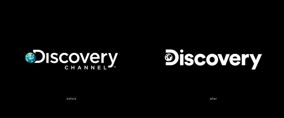
The new on-air logo features a spinning globe inside the letter D. The static image shows every continent, reiterating the company’s presence all over the world.

See the logo in action in this video below:

The new on-air logo features a spinning globe inside the letter D. The static image shows every continent, reiterating the company’s presence all over the world.
See the logo in action in this video below:
I kinda like it
The positioning of the globe inside the counter of the D looks awkward to me.
Yes. It gives me a very uneasy to the point of nausea.
The small version in the first image in particular makes me feel really anxious.
These inappropriate visceral reactions to layout and typography were really difficult for my subordinates to deal with when I was in a design management role.
Hopefully they never want that in real-world signage…
Cutting every continent on the globe, in intricate detail, is something I dislike doing. Maybe “dislike” isn’t a strong enough word for it.
The old one with the blue globe looks better to me because the globe approximates the size of the lower case letters. The new one, the globe is just plain too small. It loses detail too easily, considering they have every goshdarn detail on there. LOL (in a weeping sort of way.)
I mentioned this here several months ago, but I recently had a client who wanted their logo to be a globe with all the continents. As bad as that was, they insisted that all the oceans be composed of word clouds containing words and phrases that had special significance to the scope of work they did.
No matter how hard I tried, I could not talk them out of this horrible idea. When their business cards were printed some of the words were literally so tiny that they couldn’t even be deciphered with a magnifying glass. For that matter, none of the words were readable at that size.
It was easily the worst, most unusable logo I’ve ever done — and one of the most time-consuming. There were nearly 300 words in this thing. They paid me, though, for every one of those hours I spent on this jigsaw puzzle of a logo. It made sort of a cool-looking wall poster, but as a logo, uggggh.
It’s surprising how often people want to use an image of all the continents for some display, event or other. We groan audibly when “that file” (a stock vector everyone seems to use) comes in for a project. Looks great printed small. Enlarged though it has a serious case of the jaggies. We do have a cleaner version we offer to buy for them. Otherwise, we find a way to “just print it.”
I prefer the previous logo, I don’t like its new logo.