Context
Define the brand strategy and identity for newly-independent FOX, reimagining the future of TV and launching a culture- defining, cross-platform entertainment brand built for a new generation of fans.
Strategy
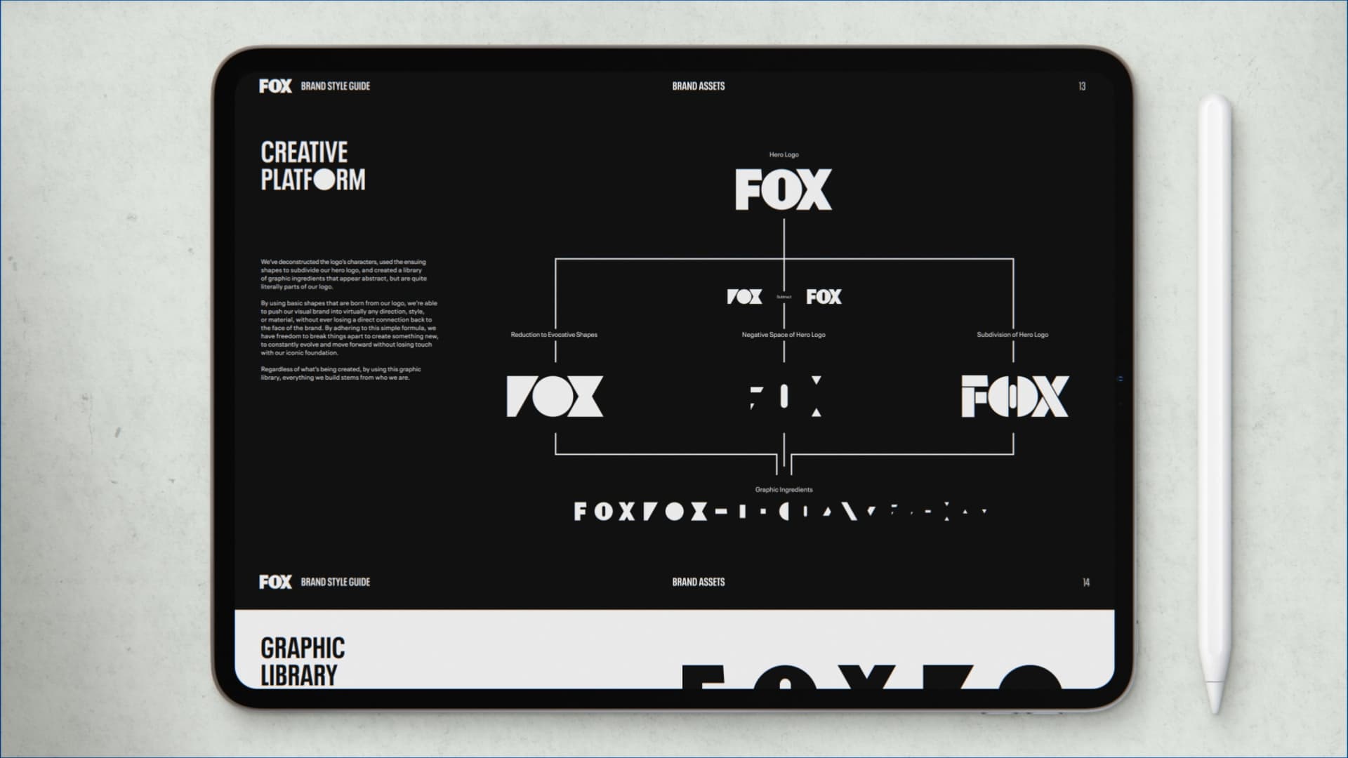
Champion FOX’s bold legacy of risk-taking with a new positioning and design system that empowers the brand to create breakthrough entertainment that breaks through popular culture.
Solution
Launch FOX Entertainment as a bold new challenger brand, delivering robust systems for messaging, tone of voice, design, and animation across every on-air, digital and IRL touchpoint.
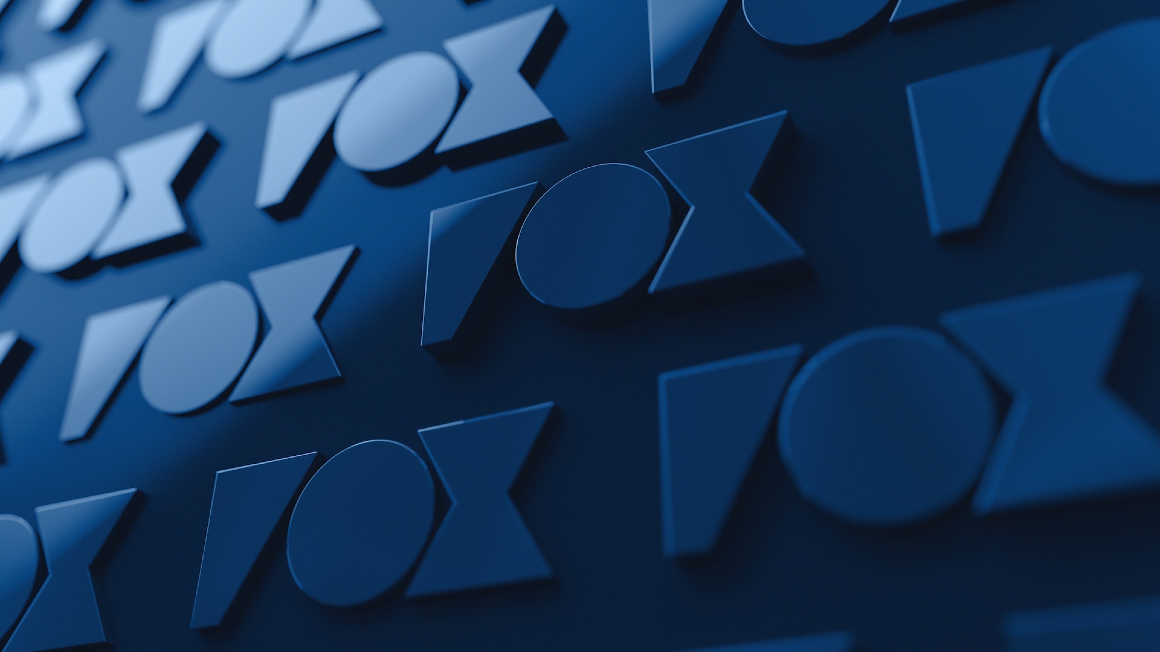
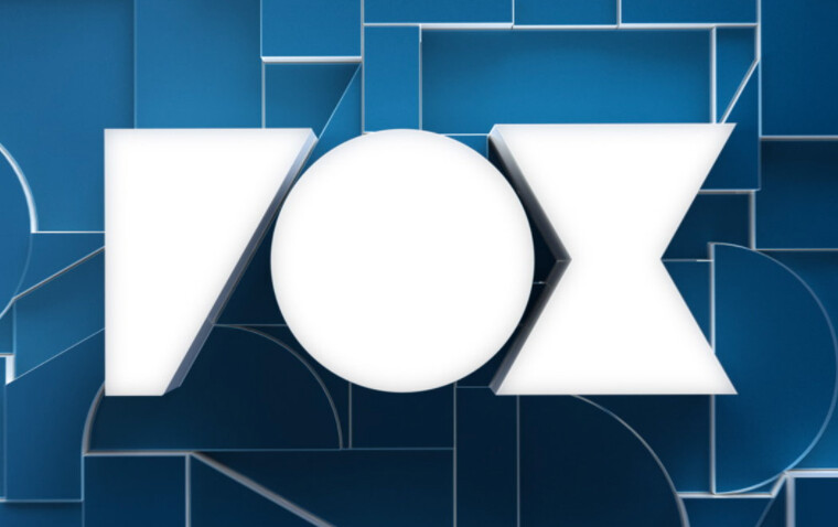
Had I not known in advance I would have also though VOX or ROX or maybe even POX.
Reddit had a big thread on this 2 years ago and I can’t find anywhere that it’s actually being used. It was made by a company named Trollbäck. Could this be one of those strange parody things that gets footing but doesn’t actually exist?
Had to take my post down.
I believe this is a parody cuz the stacking in the step-and-repeat is um… just wrong.
Once you ‘see’ it, you will know what I mean.
Actually I can say with pretty much certainty this is not happening.
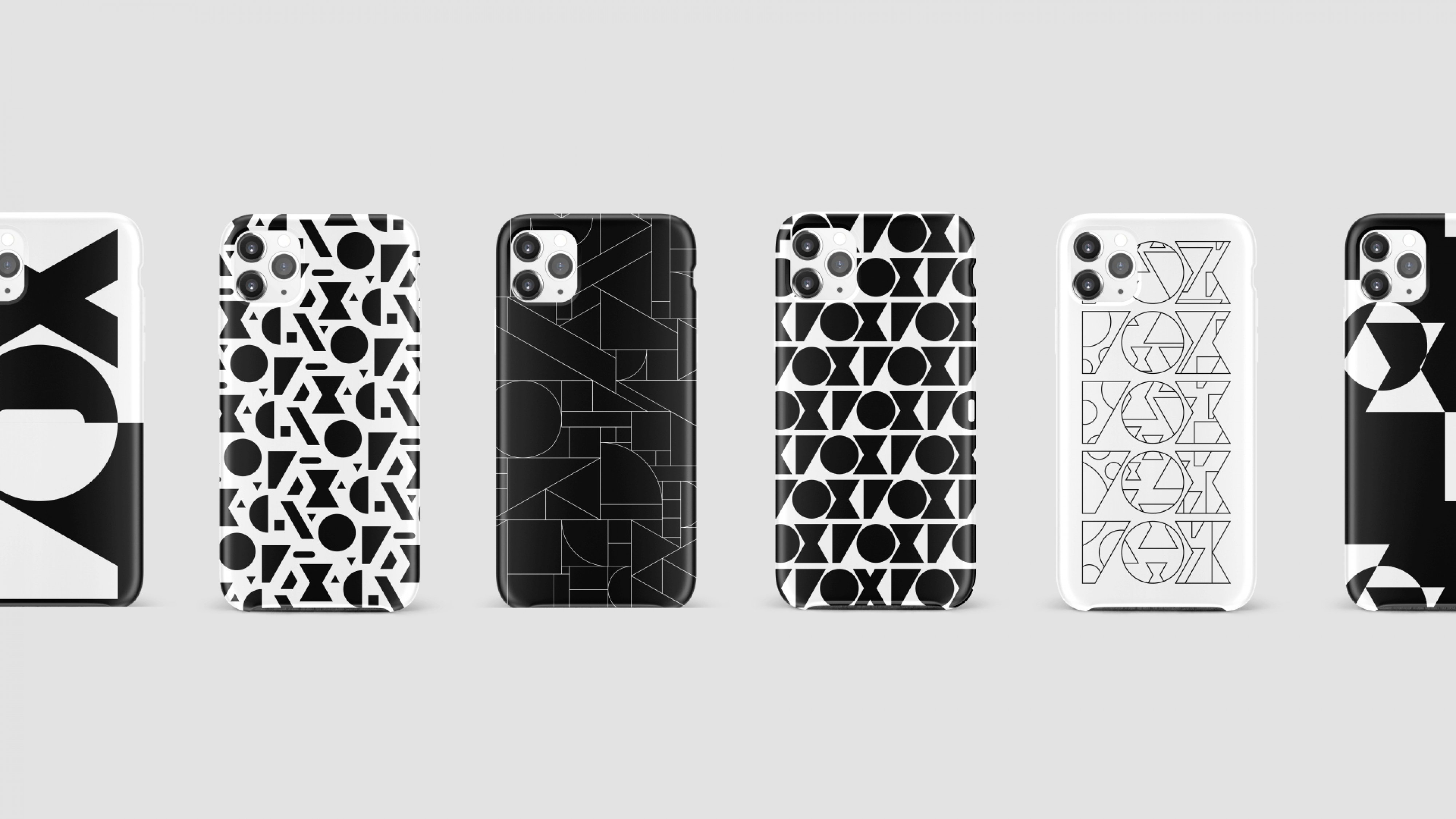
I mean, I don’t dislike the aesthetic direction, but, legibility aside, I don’t think it does what they want it to do. It gives off Hollywood, runway, almost art deco sensibilities with it’s sharp minimalism. Their intent to “break through popular culture” doesn’t come across - to me, it looks more like an attempt to buddy up to pop culture styles. The mockups showing phone cases really broke any credence to that claim for me.
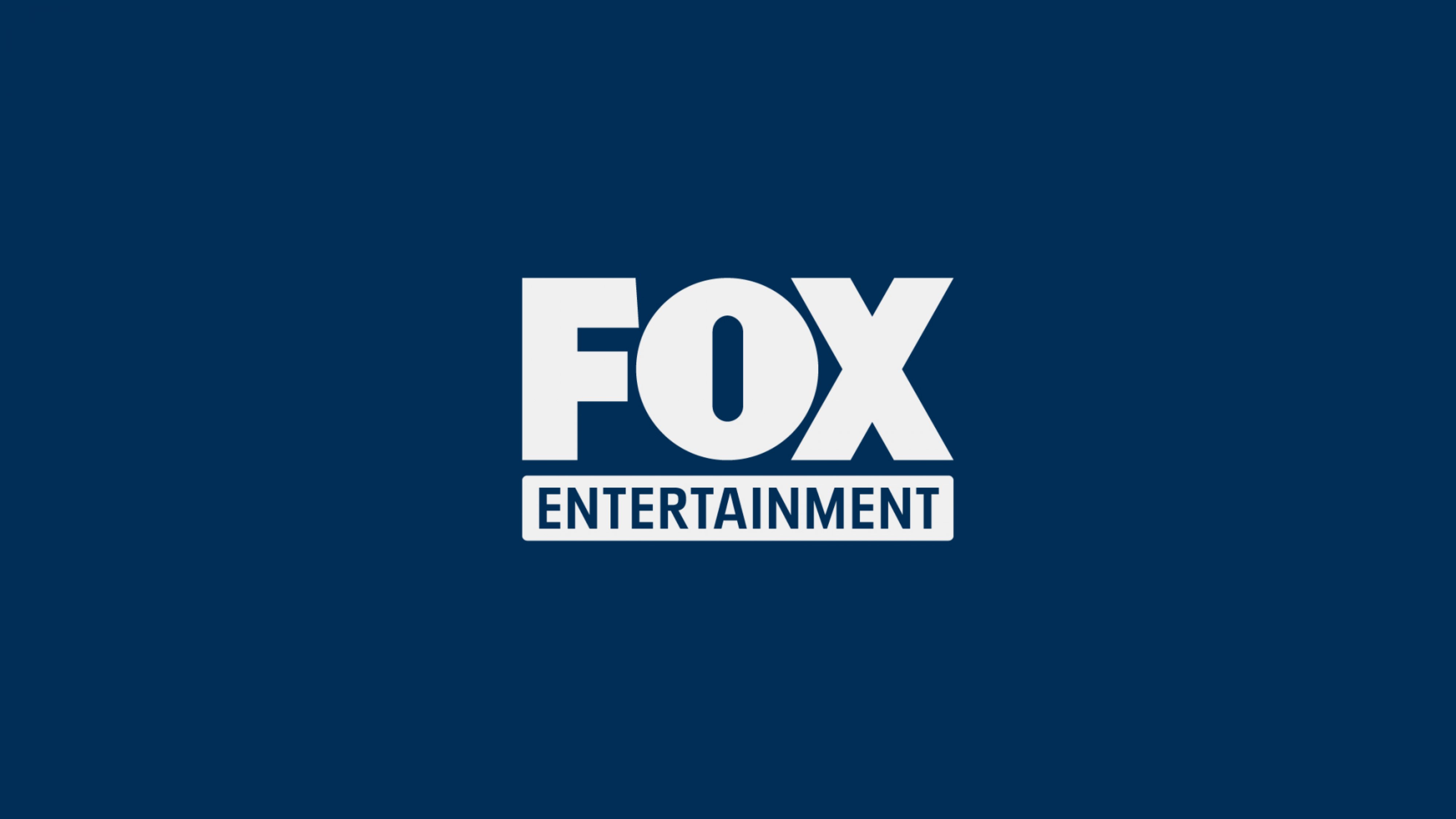
This is the current Fox Entertainment logo. Note: the reference to “previous design” is not the one above but a very similar version of the current logo shown on the Logopedia website.
That same thing has always bothered me too. It’s an unfortunate combination of letters that are kerned too tightly. Not only does the O not extend below the baseline, it doesn’t extend above the cap height — the most amateurish of typographic mistakes.
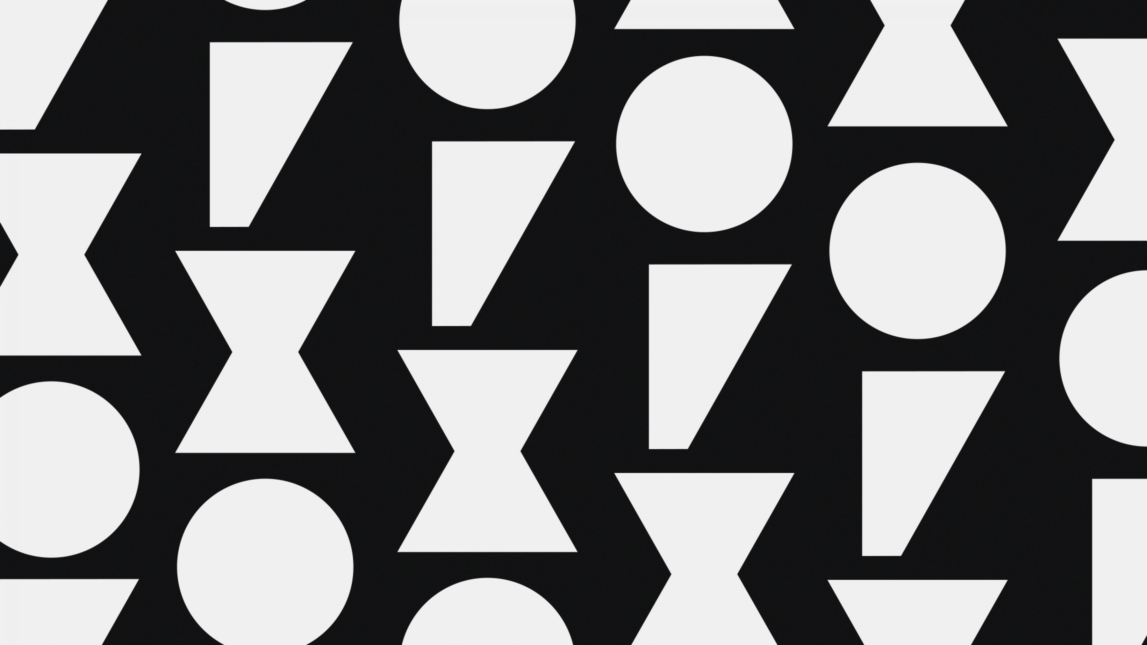
Whether letters in a typeface, individual letters in a logo, or an arrangement of geometric shapes, the same optical illusions occur. Several of those commonly encountered optical illusions exist in the Fox logoype, but none were dealt with, which is what you see when you notice it looks weird.