Do what you love!


I always think of sugar and leather when i see or hear that company.
well 2000 is the century of minimalism so that logo is perfect.
i still do not understand the Brooklyn nets sad excuse for their logo either.
1 Like
Damn, that wouldn’t have made it past my preliminary sketch page.
2 Likes
I don’t hate it but seriously ANYTHING was better.
2 Likes
Why don’t they just cut out the playful bs and just use a penis and boobs.
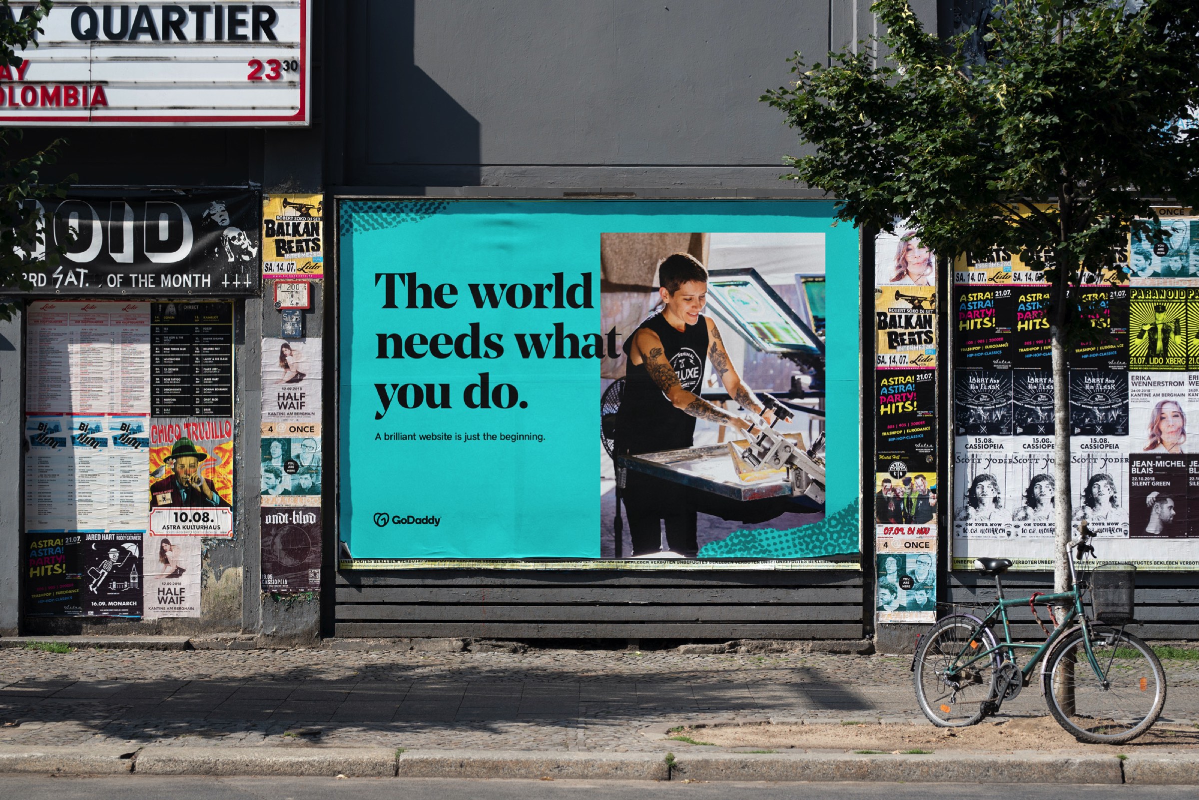
So are their days of advertising their domain services with bikini clad women a thing of the past? Nice to see them grow up.
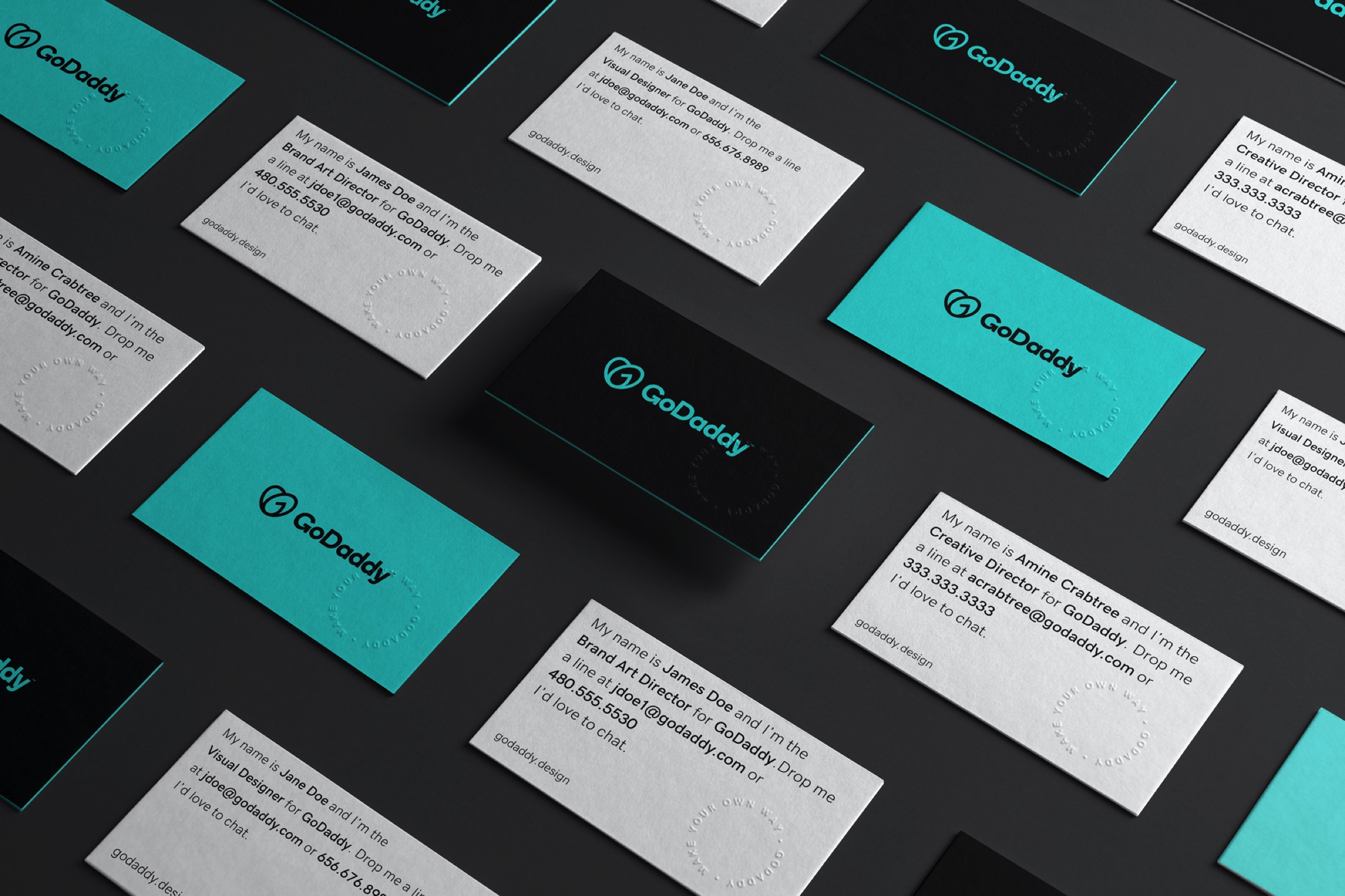
The new logo is meh. Not terrible, but not anything special either. Doesn’t say website services, but it’s not like a logo needs to bash me over the head with the company’s purpose in order for it to be successful.
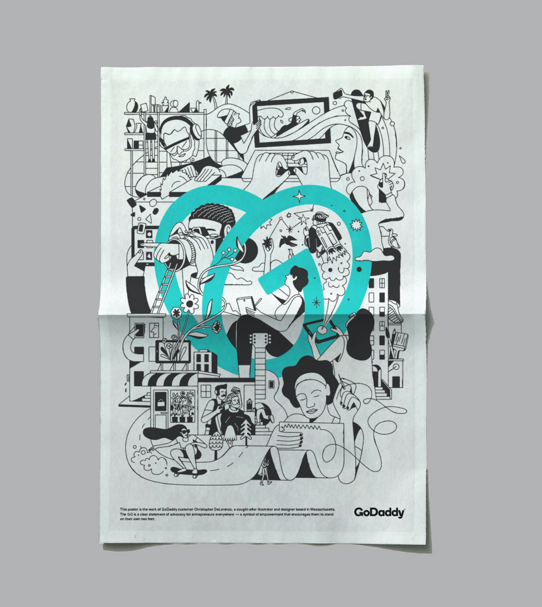
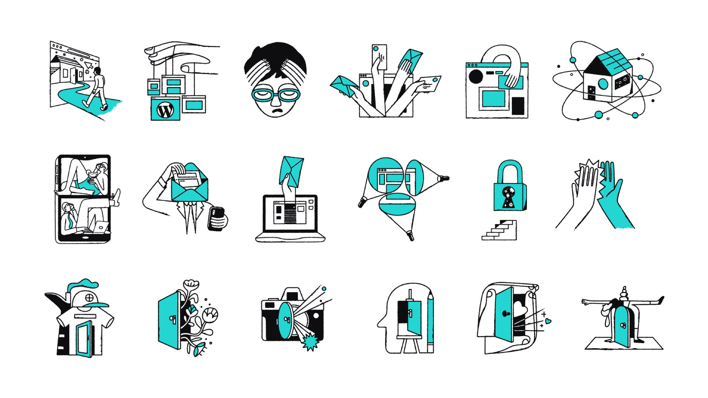
The 3D illustration in some of the branding reminds me of the Wallace and Gromit style of stop motion animation. Not praise or criticism, just an observation.
i need to find a host once i’m finished with my new website.
why i will look for something besides GoDaddy is beyond me, just they might be too big?
Yeah, I was wondering about this too. GoDaddy has never been what I’d call a classy company known for its good taste. I always attributed this to their founder, Bob Parsons. If I remember right, he’s no longer involved on a daily basis with the company, so maybe the new management finally decided the old image and sexist marketing was a liability.
I found a link to some of their NSFW commercials — several of them featuring race car driver Danica Patrick in various states of undress.
https://www.golfdigest.com/story/an-unofficial-ranking-of-the-most-nsfw-godaddy-commercials-ever
I always thought it was a shame she lowered herself to that level. For a woman to prove herself in what’s been traditionally a very manly sport then reduce herself to using sex appeal to sell something really lessened my respect for her.
2 Likes
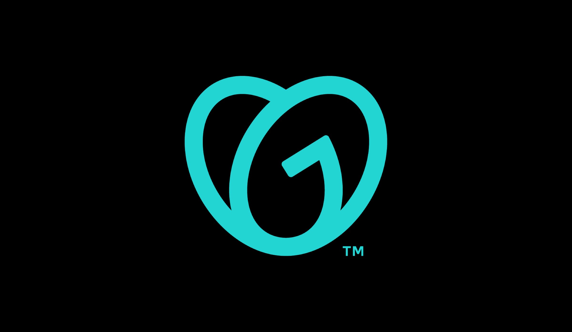
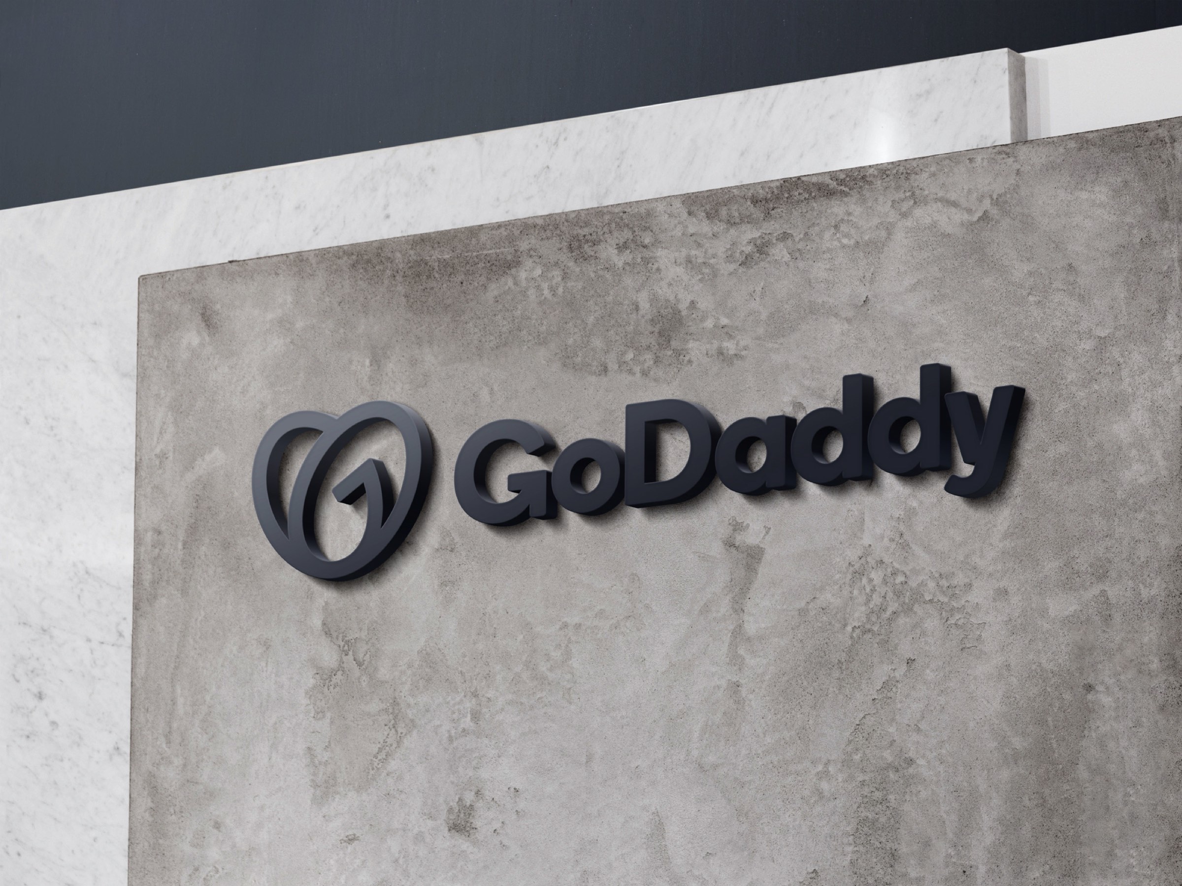
Looks like eggs in a nest, ie fertility, females, motherhood etc, not the other sex - daddies..
I see a pair of flip flops (you know, beach shoes).
When I really examine it, I see the G. But the G isn’t the same as the G in the word mark part of the logo, so it doesn’t connect very well for me. And is the heart supposed to be “GO” (which doesn’t make a ton of sense to me) or is it supposed to be “GD” for GoDaddy (which it isn’t)?
It’s a nice mark, but doesn’t work for the brand or with the text, IMO.
My thoughts exactly. She fought so hard to break the stereotypes of what women are capable of doing and then slide right back into the common smut angle. Disappointing to say the least.
I have friends who know her and apparently she’s really nice but dumb as any male athlete lol.