Google seems to be in the process of redesigning and unifying the appearance of all their miscellaneous app icons and logos. Any opinions?
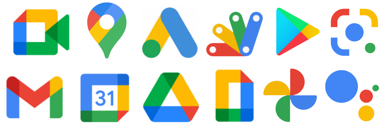
They seem to be consistently running on a unified theme. I don’t dislike them.
I almost said something about this … It’s taking me a bit to get use to the gigantic M animation when I go to Gmail lol ![]()
I guess everyone is going for the round look again including Facebook.
… Not a fan ![]()
I think they look fine, but I see a big usability problem with them. When I’m searching through the apps on my phone or tablet, they all look the same without enough distinguishing characteristics for me to readily tell one apart from another. Since I have a tendency to locate apps based on their colors, that strategy no longer works with these icons.
1 Like
That’s my problem. If I’m on my phone .. I had no problem picking out the pointy M .. now they look like the same color wheel from a distance.
My eyes suck! lol ![]()