Hello, I am quite new to graphic and am trying my best to learn.
Generated this brief from goodbrief
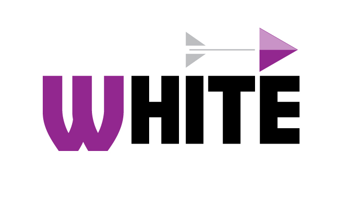
I built the logo based off of these key words provided within the brief.
- open-source
- bravery
- male audience
For bravery I used the icon of an arrow, which in my mind works in concert to create a masculine feel as well, hopefully. I dont really know thats why Im here. Lol.
The feather and arrowhead share the same shape. Arrowhead is a play button since this is a video service. Splitting the feather with the shaft of the arrow was my attempt at trying to convey an open-source environment and breakthrough tech.
Used a sturdier font because in my head that’s conveys a masculine feature.
Let me know what you think. Im really trying to get better and am lacking in the resource of having critiques. I hope this forum is the solutio. To this problem.
Cannot post second image so brief is detailed below.
From GOODBRIEF
DESIGN BRIEF
Company Name:
White
Company Description:
We are a company that inspires new ways to watch movies by combining open-source software with a friendly face. Our main product is a website that you can use on the go and implements our groundbreaking technology. Our target audience is men. We want to convey a sense of bravery, while at the same time being old-fashioned.
Job Description
You must create a logo using the information given in this brief. They would prefer a combination mark that uses the color purple. The logo will be printed on the side of vehicles. Take into account the company’s values and preferences, and make sure it will work for the planned use-cases.
Deadline
3 days