Until recently, Hudson Square was the neighborhood in Manhattan that everyone visited, but no one knew the name of. It’s situated between three of the city’s hottest neighborhoods, Soho, Tribeca, and the West Village, yet no one seemed to know they were in Hudson Square when they were there.
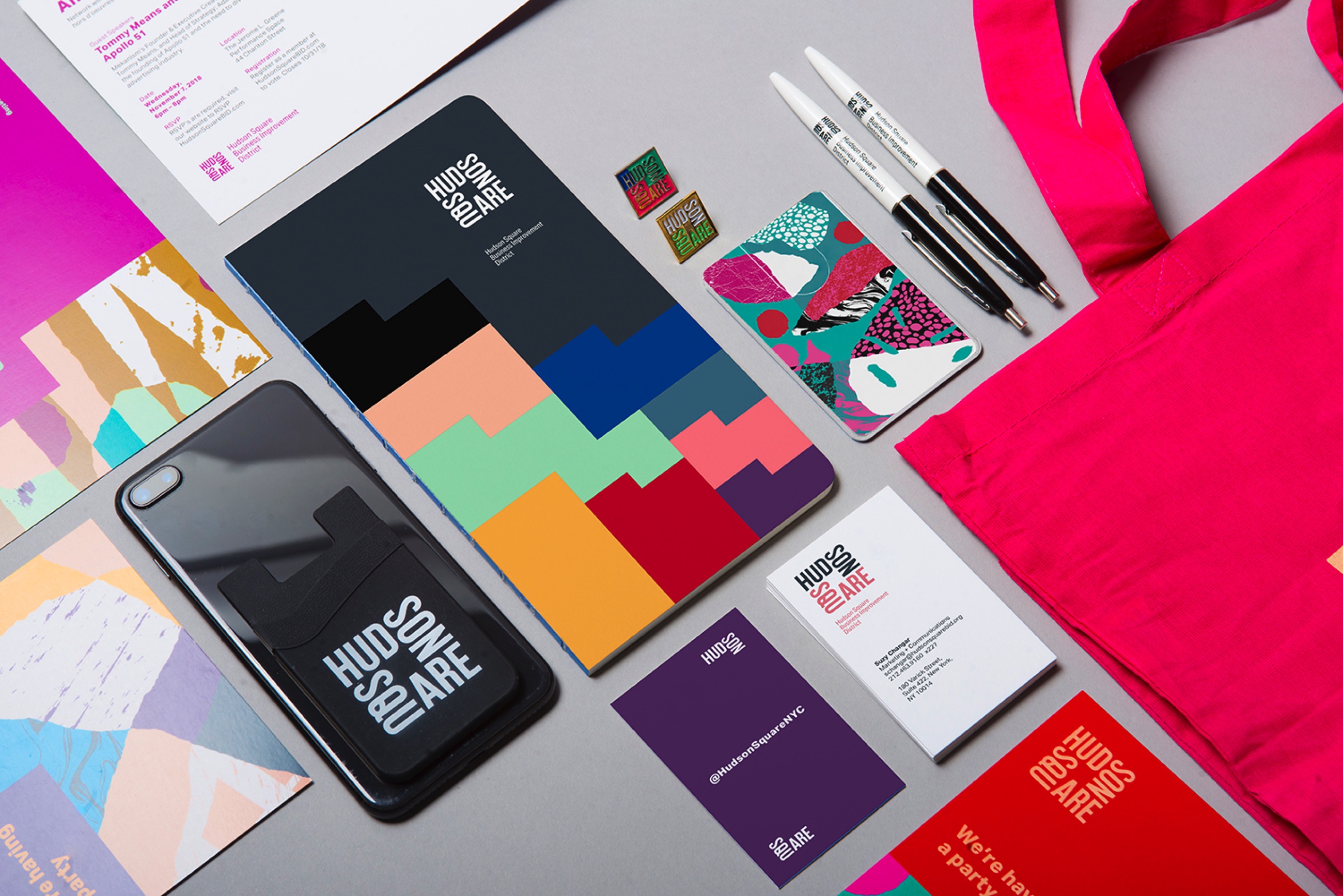
Applied was brought on to tackle this problem. We saw the potential in this special piece of New York and wanted to make sure it claimed its rightful place on the map. We understood how the history of the neighborhood’s printing industry inspired its innovative and creative tenants today, and we wanted to create an identity system that reflected this unique relationship. The neighborhood stands apart from those that surround it because things are still made here. Objects and ideas are born and cultivated here. There is no more mistaking Hudson Square for anything other than what it is: a place for those on the creating edge. Standing tall amongst its neighbors, Hudson Square has claimed its rightful place.
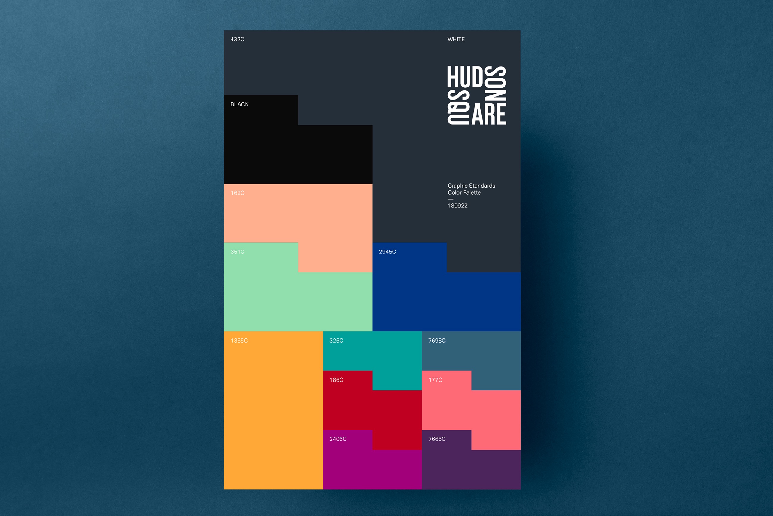
The color-changing graphic there at the top is seizure inducing.
I guess I’m becoming a bit jaded and tired of being treated with presentations that look like they are aimed at 5th graders. I get that Hudson Square is an art district, but do you want to be associated with a crayon box assortment of colors to represent your field? Maybe it’s an appealing visual for the visitor demographic? I dunno. Might be missing something here.
I like it too. It’s bold, contemporary and will do what they want it to do — provide a strong, difficult-to-ignore identity to a place that lots of people pass through but have mostly overlooked.
“Contemporary” is a very fleeting condition. It tends to go out of style very quickly. Like Avacado Green kitchens and butterfly chairs.
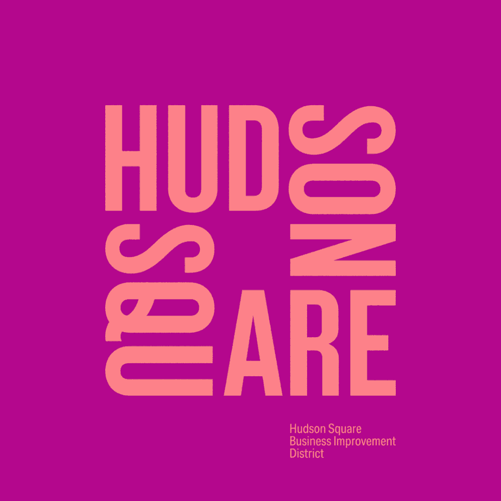
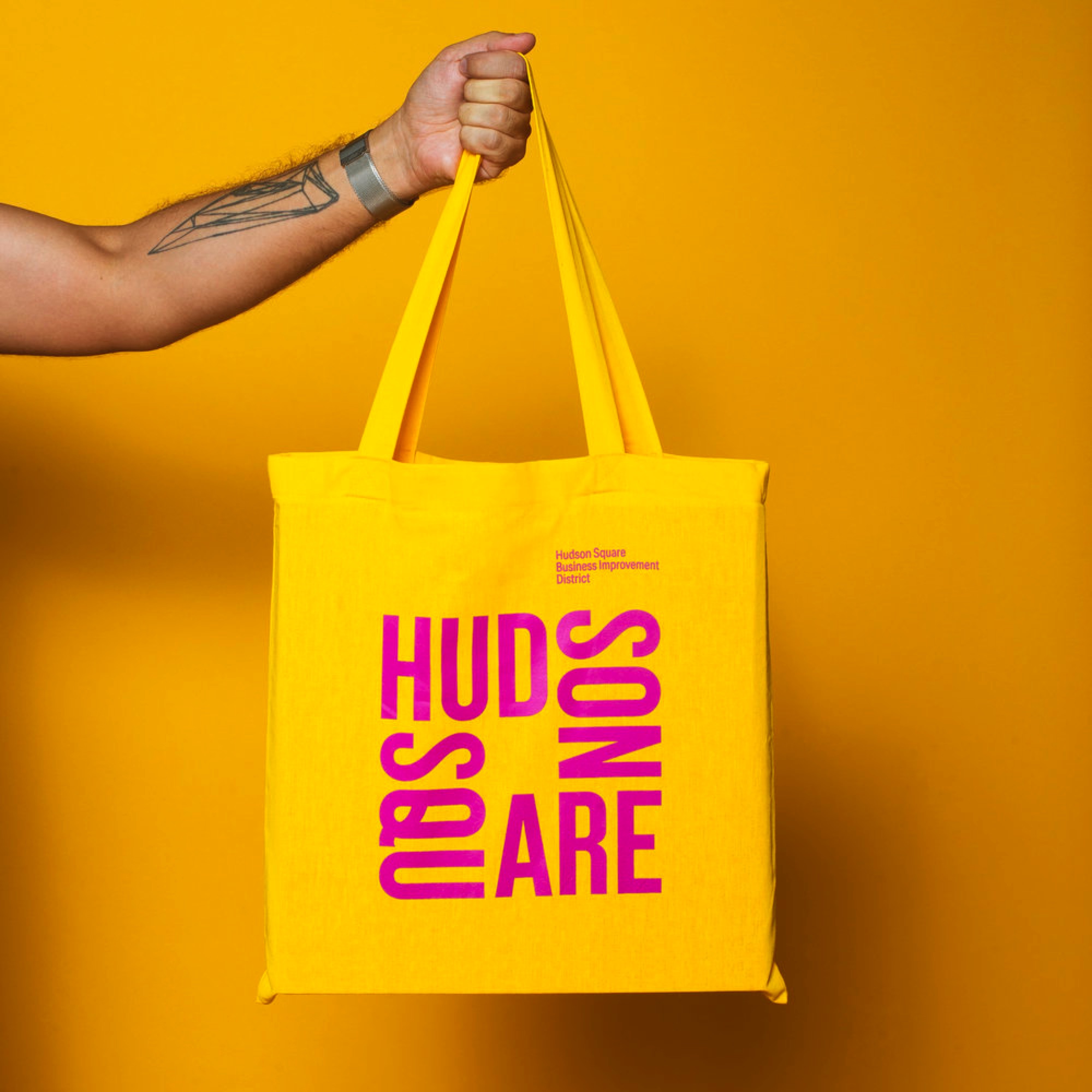
Does anyone else see this as Hud Son Are? The think the density of the Q is making that part of the word vanish.
I do enjoy an experiential branding project. There’s some fun stuff here. I just can’t quite get past the motif I guess.
That depends on one’s definition of contemporary. Your definition might be closer to what I would call a fad or a trend.
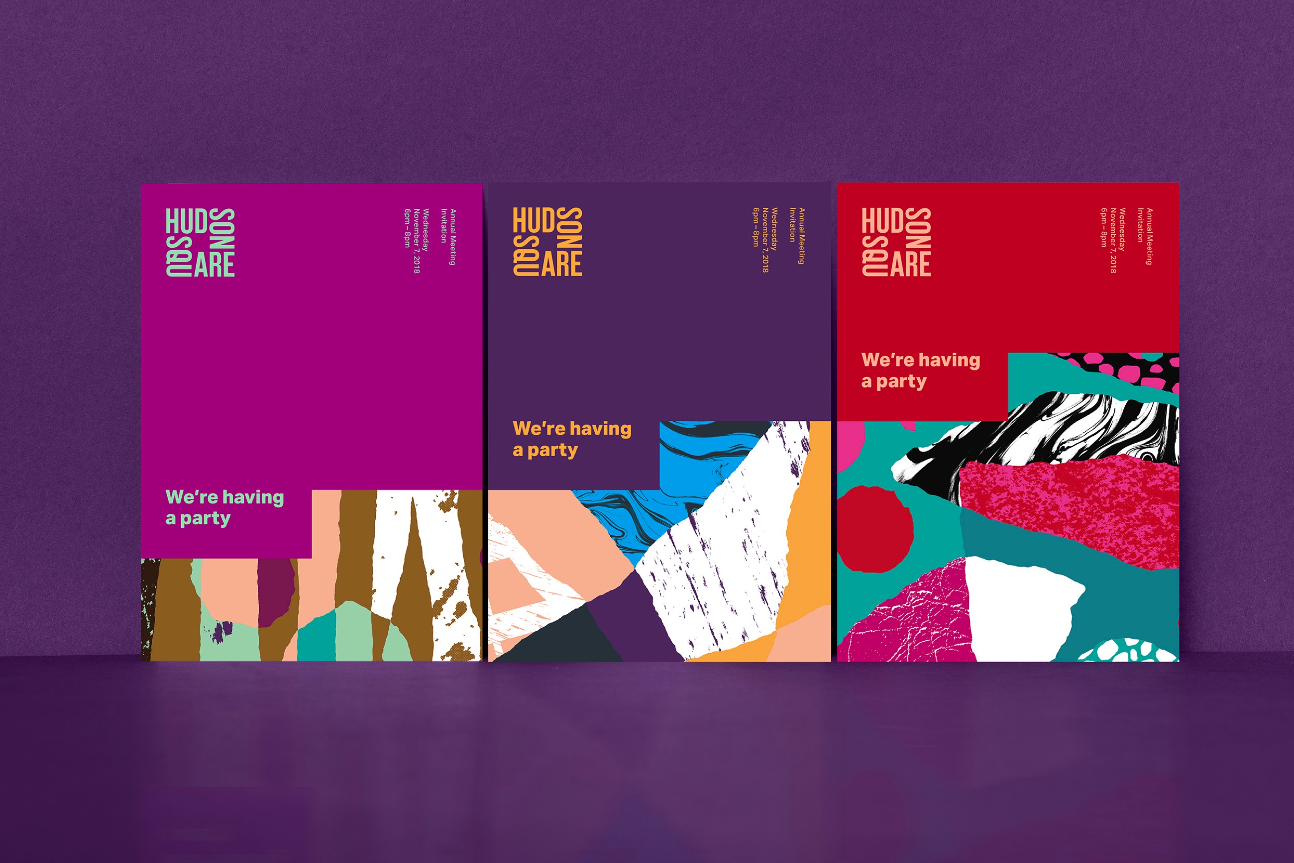
Anyway, this is a busy part of Manhattan that’s never really had much of an identity other than being a place between other better-known neighborhoods. So one way to give something old a new identity is to dress it up in attention-getting clothing that looks fresh and new.
Ten or 15 years from now, I doubt the neighborhood business group that started this will be still be using the trendy colors and shapes they picked for this campaign, and the logo might have receded into people’s memories, but the one thing that just might stick from all the attention brought to it this year, is that this neighborhood has a name — Hudson Square.
Another thing is this part of the city used to be called the Print District, and it still has lots of small ad agencies and design studios. It seems appropriate for its visual identity to lean a bit heavy on an evolving contemporary trendiness.
That’s part of my point. It’s going for trendy when the area actually does have a history. Nothing here is relevant to that history, nor does it really stand out as any different from something trendy going on in any other area of the city.
The branding campaign seems more about the transformation of the present than a reflection of history. It was sponsored by the Hudson Square Business Improvement District. Here’s the lead paragraph from their LinkedIn page:
"Launched in July 2009, the Hudson Square Business Improvement District is completing the neighborhood’s transformation into a major creative hub that is home to more than 40,000 people working in advertising, design media, communications, technology and other creative businesses."
This group wants to create a vibrant, trendy business climate for the neighborhood more favorable to the creative-oriented businesses that dominate the neighborhood today. I doubt that a transformative campaign built around the neighborhood’s past would be the most effective solution.
You can transform the present without completely forgetting about the history.
Just not seeing it here.
But I suppose if it appeals to the current demographic in the area, it is what it is.
I’ve done a few fitouts in those trendy shared creative spaces the last few years though, and while all of them are “creative” spaces, they presented themselves completely as high-end, Adult Professional, not 5th Grade Playroom. After all, they have to appeal to their clients’ demographics, who most likely aren’t fellow creatives.
I always wonder about how much effort goes into these types of branding presentations. Personally, if I was paying an agency to develop my brand, I’d be a bit put off by how many paid man-hours went into making just the presentation.
I guess I am a bit biased though…I really despise creating presentations for designs I’ve made.
Yeah, I’m not seeing much of a tie in with the past either given their statement about some kind of continuity with the old print district and what it’s become.
I don’t know much about the area other than what I’ve read (not from New York City). A little research suggests it’s sort of a tenuous connection since these print shops mostly serviced the day-to-day boilerplate business needs of Wall Street and Lower Manhattan. So I’m assuming lots of business documents and reports, which doesn’t exactly sound like the cradle for today’s supposed trendy creativity in the area. I’m not too sure the history of the neighborhood is all memorable.
I have no idea where the current creative businesses get most of their clients. If it’s still the same old businesses that once kept the printers in business, you might be right — the trendy, colorful image might not be appropriate. I would think, however, they thought that through, but I don’t know.
This whole bright, colorful approach seems to be a fairly broad-based trend that’s crept up on us over the past few years. In my own work from 5–10 years ago, I was using lots of organic colors, textures and shapes. I’m unsure of the reason, but I’ve noticed I don’t do a lot of that any longer and most of my work tends to look brighter, bolder, flatter, airy, more colorful and more geometric. I was thumbing through the last CA Design Annual yesterday and noticed much the same thing. I’m totally fine with it.