Pentagram has designed a new brand identity for the illustrated book publisher Thames & Hudson.
The publisher’s name reflects the international nature of its business and comes from the primary rivers in London (the Thames) and New York (the Hudson). Founded in 1942 by Walter and Eva Neurath, with the aim of making the world of art accessible to everyone, Thames & Hudson is still a family-owned business with over 2,000 books in print. Its hugely successful pocket-sized ‘World of Art’ series was launched in 1958 and now spans over 300 titles and will be relaunched to coincide with the new identity; and its extensive list features everything from high-end art and fashion titles, to children’s books.
The new identity needed to modernise, but also to recognise the publisher’s history and unique position within the publishing community. It also needed to work across a wide range of applications in print and digital, and at a broad range of sizes, from book spines to banners.
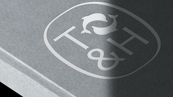
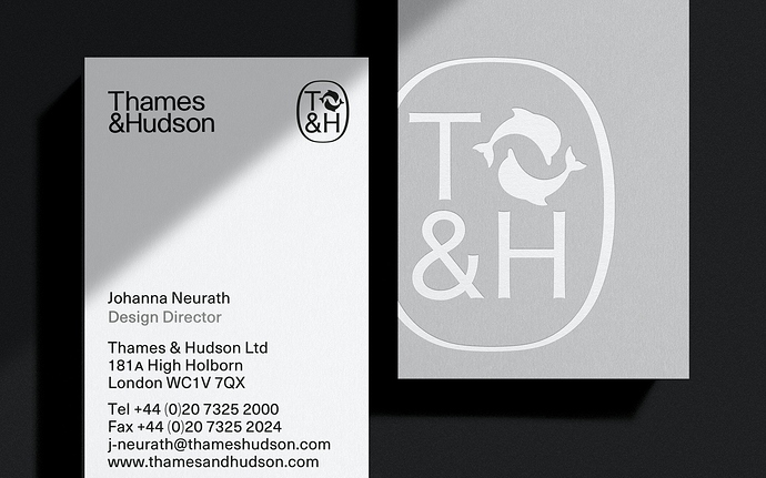
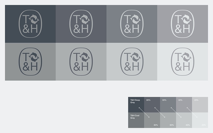
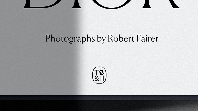
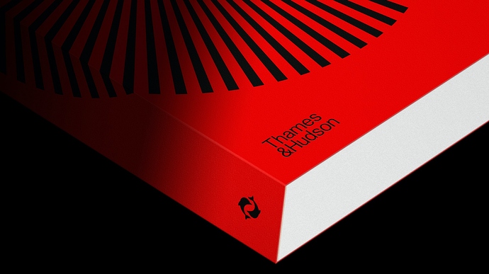
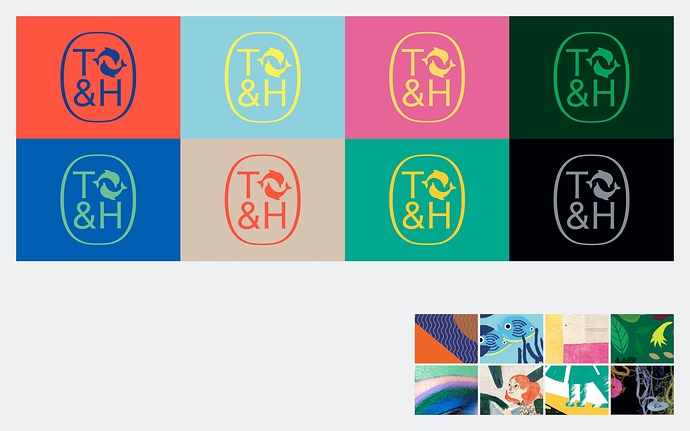
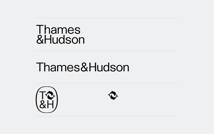
The team researched previous incarnations of the publisher’s logo and looked at how it was applied. A new wordmark was created, as well as a new cartouche, which is a modernised reworking of the original Thames & Hudson cartouche. The new cartouche contains a T&H monogram built from the team’s new bespoke logotype typography, locked up with the publisher’s existing dolphins symbol.
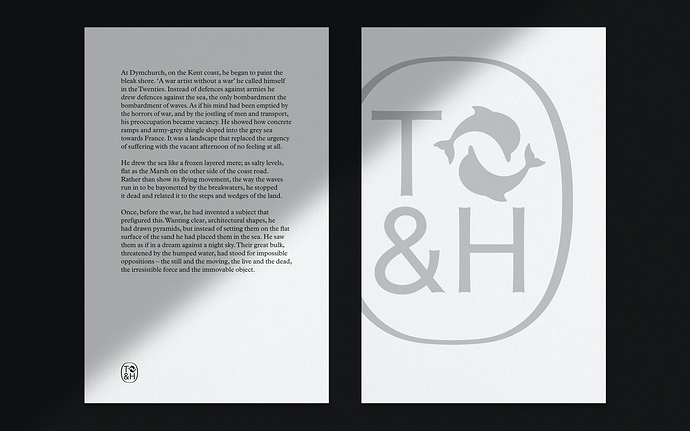
As the most complete visual shorthand of the brand, the cartouche can be used alone or in place of the logotype and symbol – it appears on sales and marketing materials, on the website masthead, on the title pages of books and embossed on hardcover binding cases.
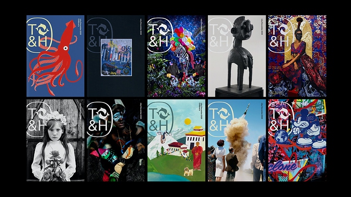
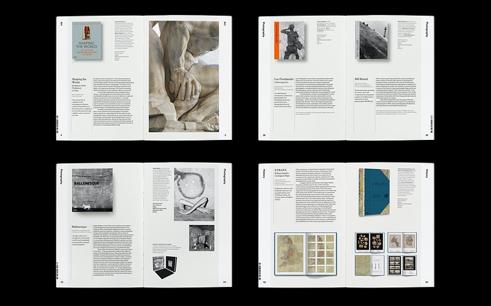
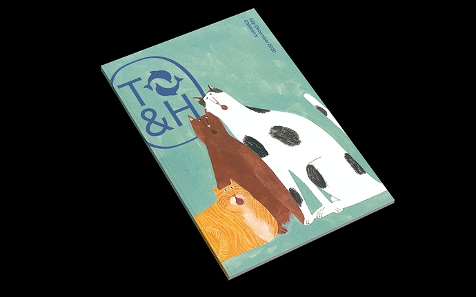
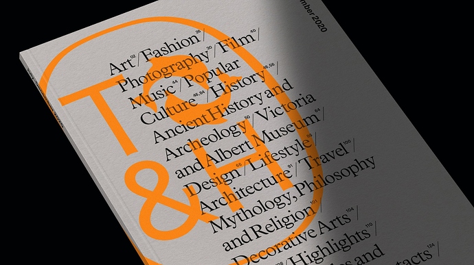
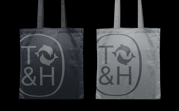
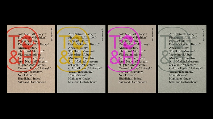
The new cartouche also appears on banners and carrier bags, as well as the cover of the publisher’s biannual catalogue which the team also redesigned. Chosen for its bookish qualities, Plantain is used for the catalogue’s body copy, with
Neue Haas Unica employed as a supplementary information typeface. Covers feature an off-centre version of the cartouche, combined with imagery or bold typography and a smaller non-standard format was chosen.
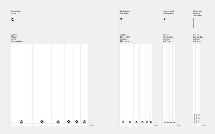
To ensure consistency and clarity, three sizes of the dolphins symbol were defined to use across the vast majority of spine sizes. The dolphins symbol is always centre aligned and sits on a 9mm baseline, which gives a consistent look when the books are placed together on a shelf. For very narrow spines (below 7mm) the single-line logotype is used in place of the dolphins symbol.
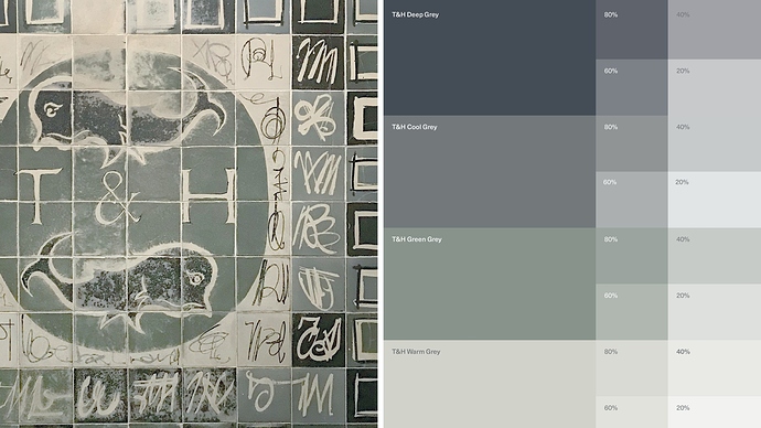
Inspired by an original mosaic which can be found at the publisher’s London office, the neutral yet sophisticated colour palette of cool and warm greys acts as a foil to the colourful book covers.
Pentagram’s new identity subtly references Thames & Hudson’s rich heritage, while positioning it as a forward-thinking, global publisher of the highest quality illustrated books. Via
