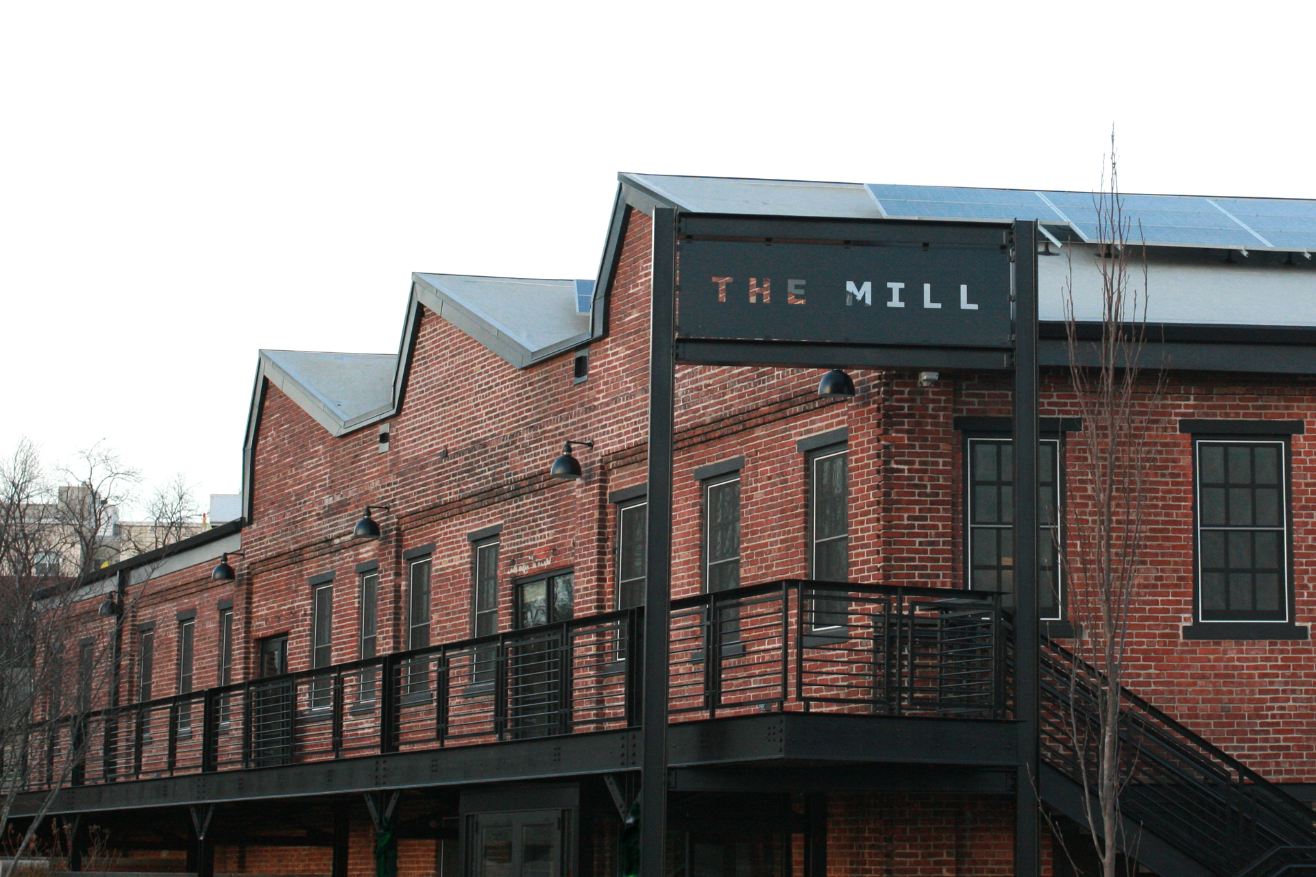
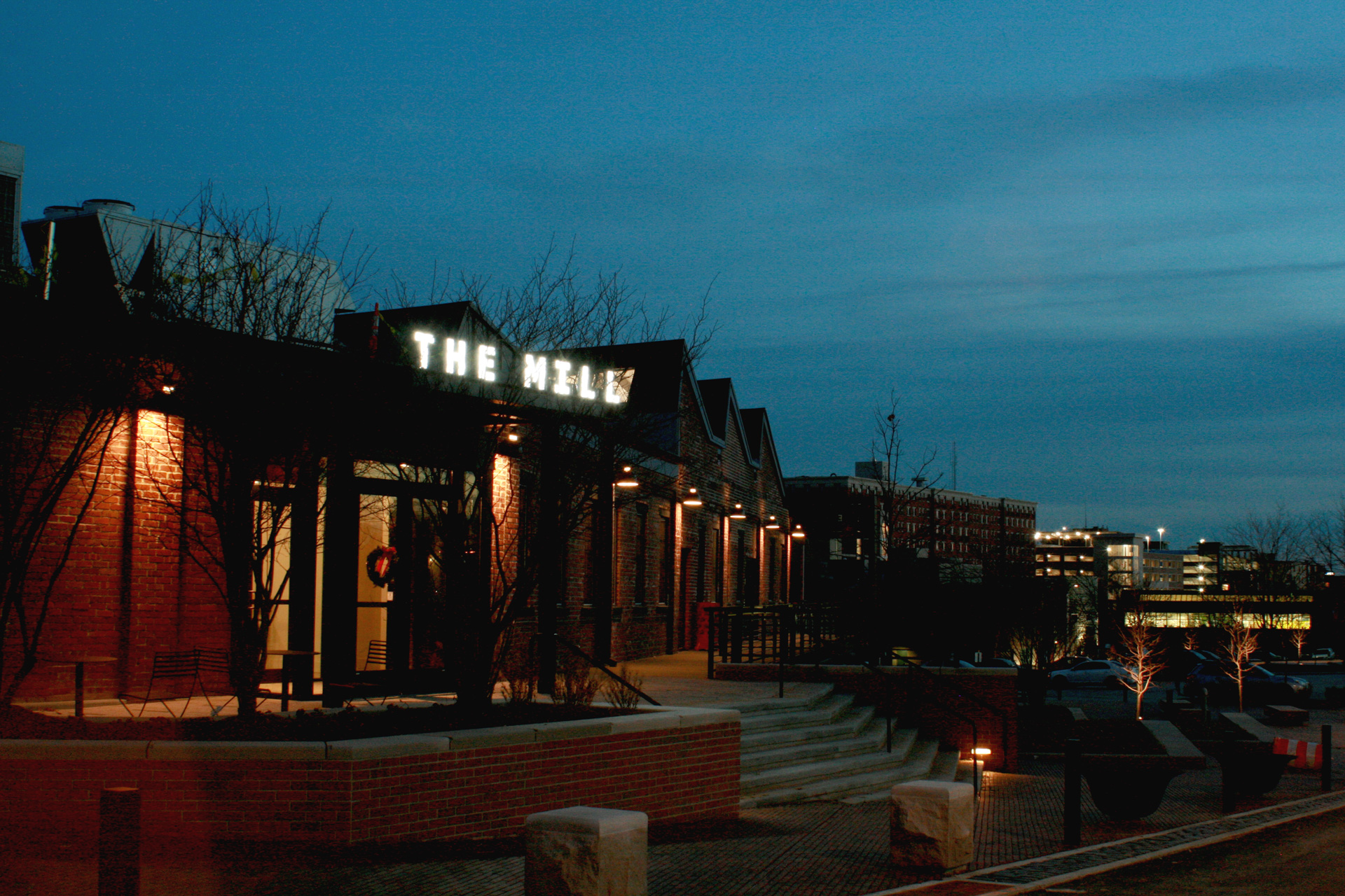
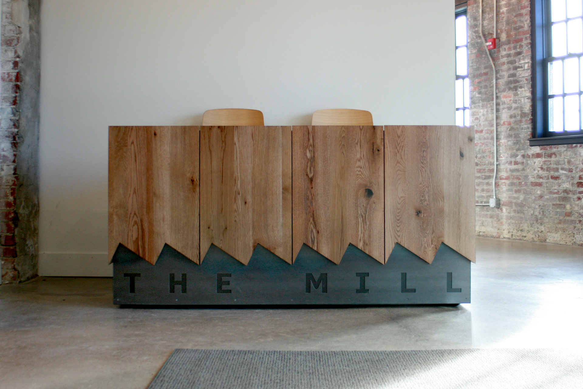
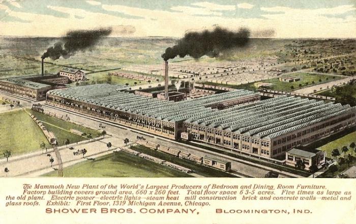
Established in 2018, The Mill (officially Dimension Mill Inc.) is a coworking and business incubator space in Bloomington, IN, operating as a nonprofit organization. Its mission is to “build the infrastructure that technology and innovation entrepreneurs need to be successful” and prompt them to “launch and accelerate companies to create jobs and increase wages.” The Mill is housed in a stunning 19,000-square-foot, 103-year-old renovated building that used to be part of the Showers Brothers Company’s massive plant and now accommodates dozens of members on temporary and dedicated desks, private offices, and shared conference rooms as well as opening its doors to the public for community-building, skills-focused seminars, and educational and member-driven events every month. We started working on their identity at the start of 2018 when the building was still being gutted and were thrilled to have been part of this effort leading to The Mill’s launch in October 2018. Via: BrandNew
Hm.
Works well, yet I hate it.
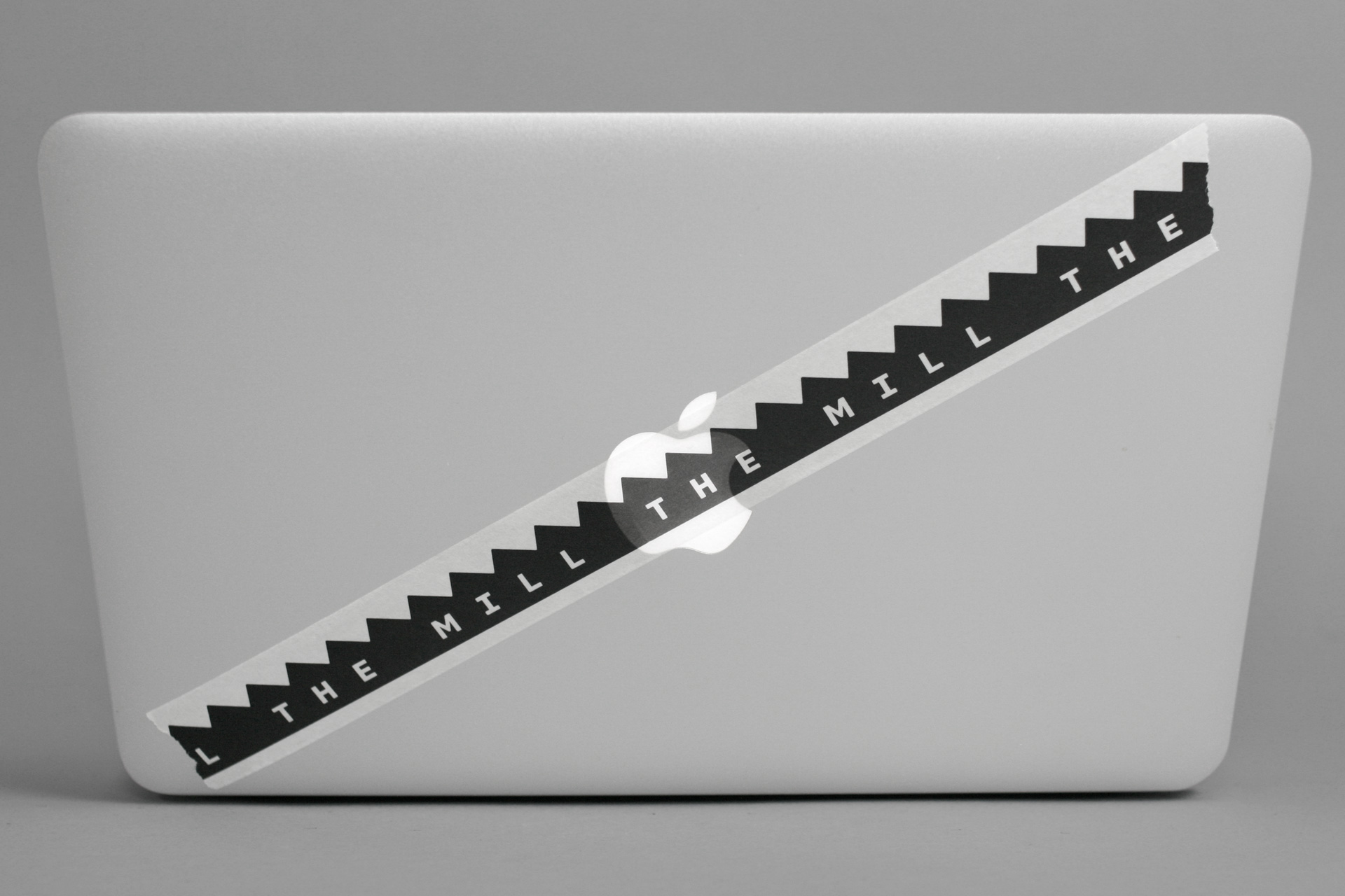
I’m a little surprised by the mockup in which it obscures the Apple logo.
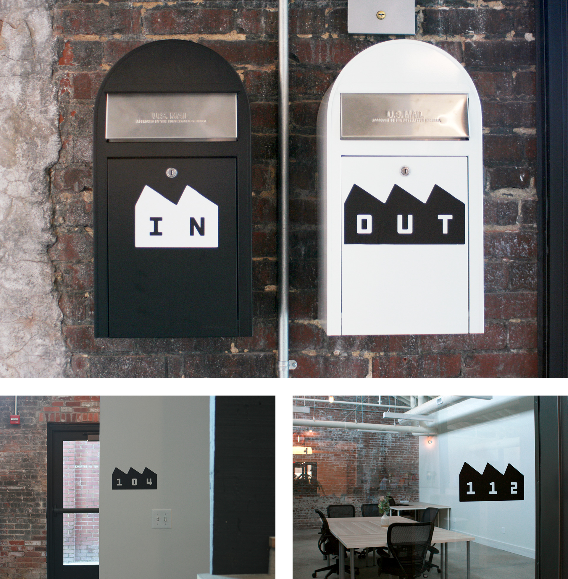
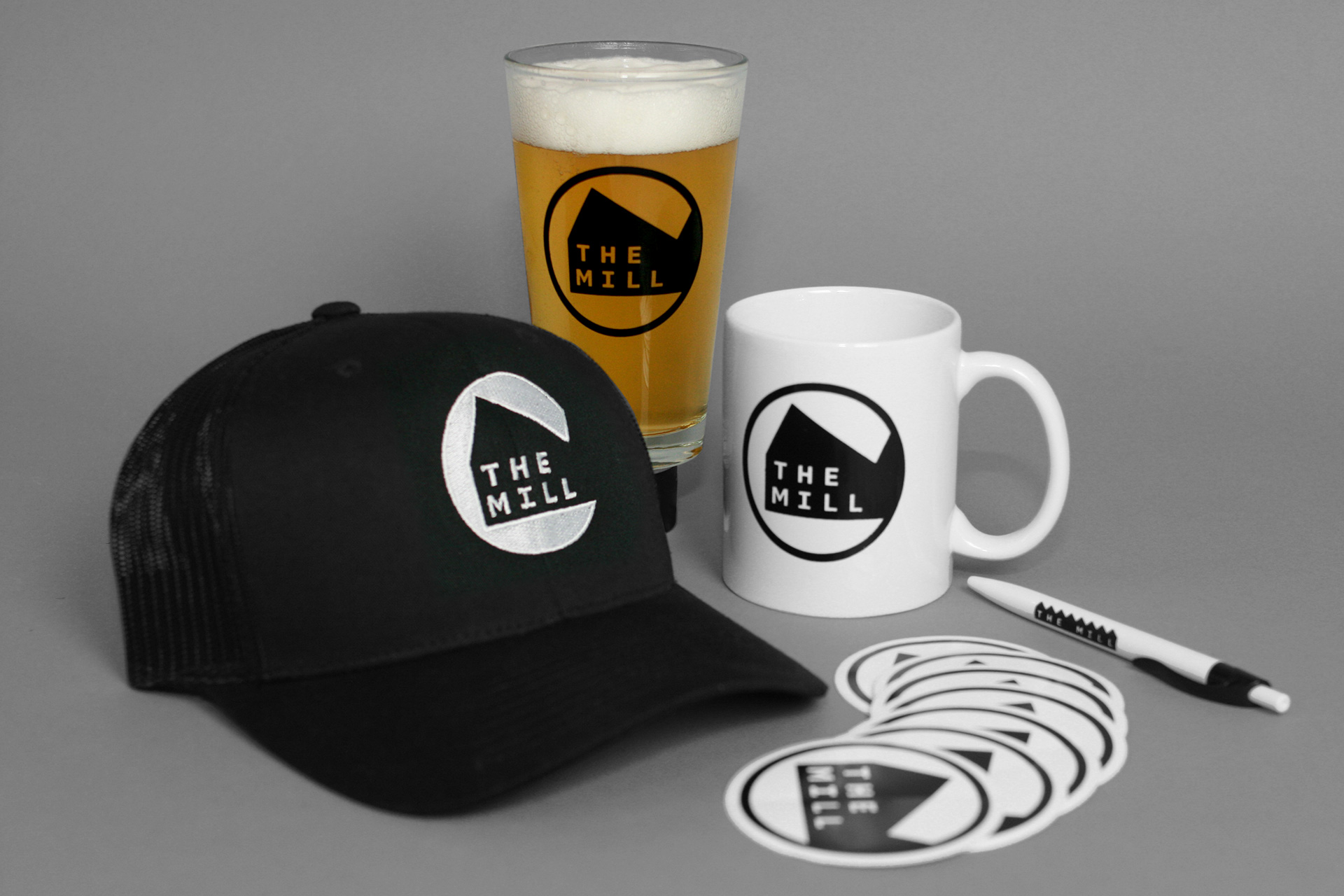
I really like the stacked version logo in the circle and the metal signage on the building.
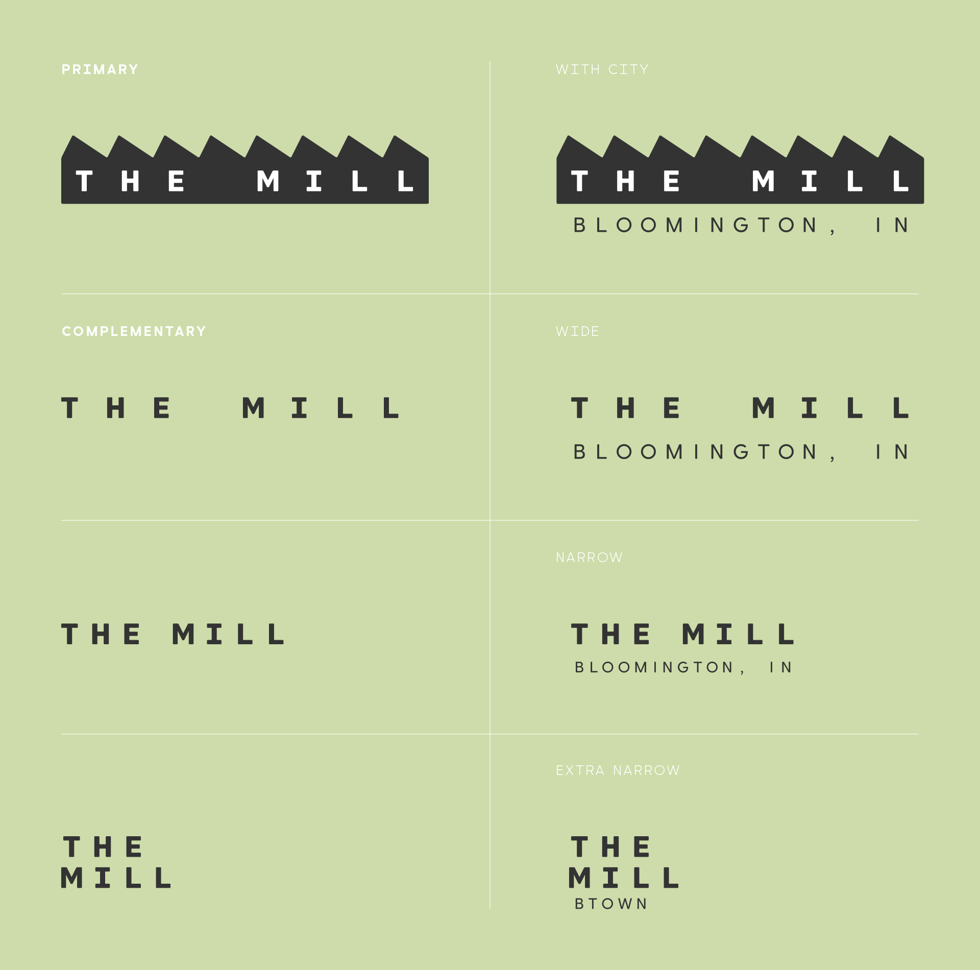
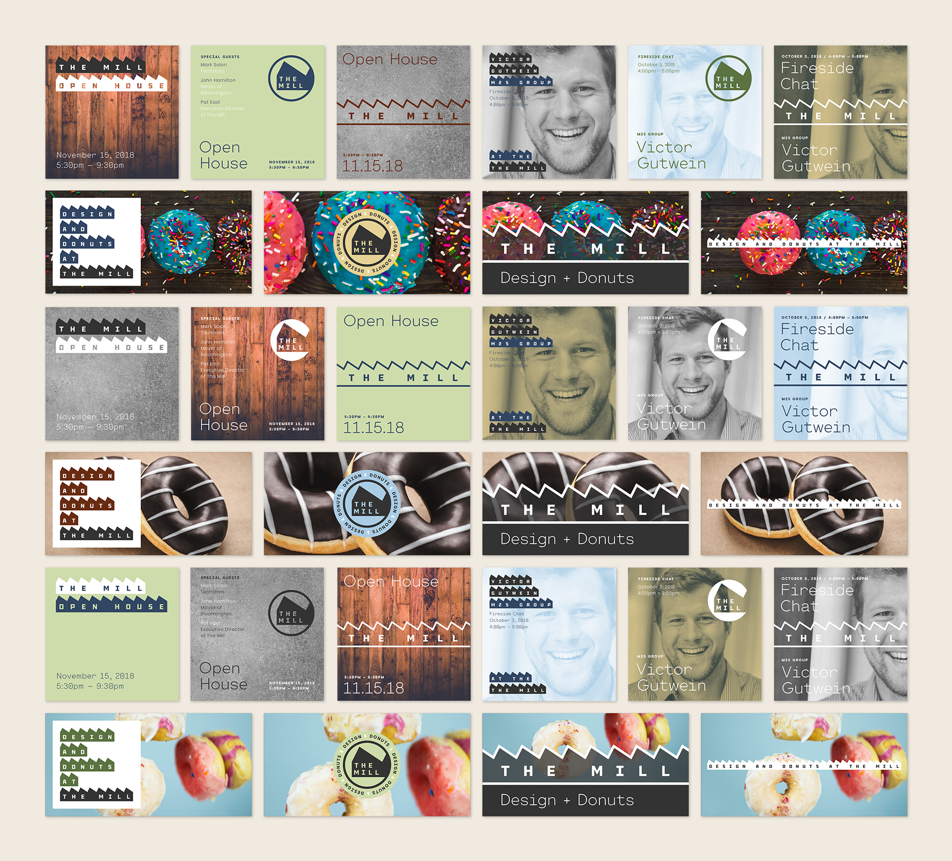
But carrying the sawtooth throughout is way overkill and visually overpowering. 18,000sf doesn’t seem to be large enough space for such a heavily formed motif.
It’s a clever and unusual idea, that I think I’m liking, but I’m not quite sure.
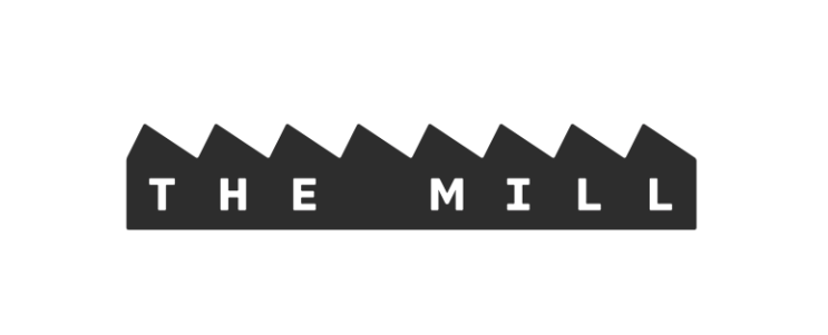
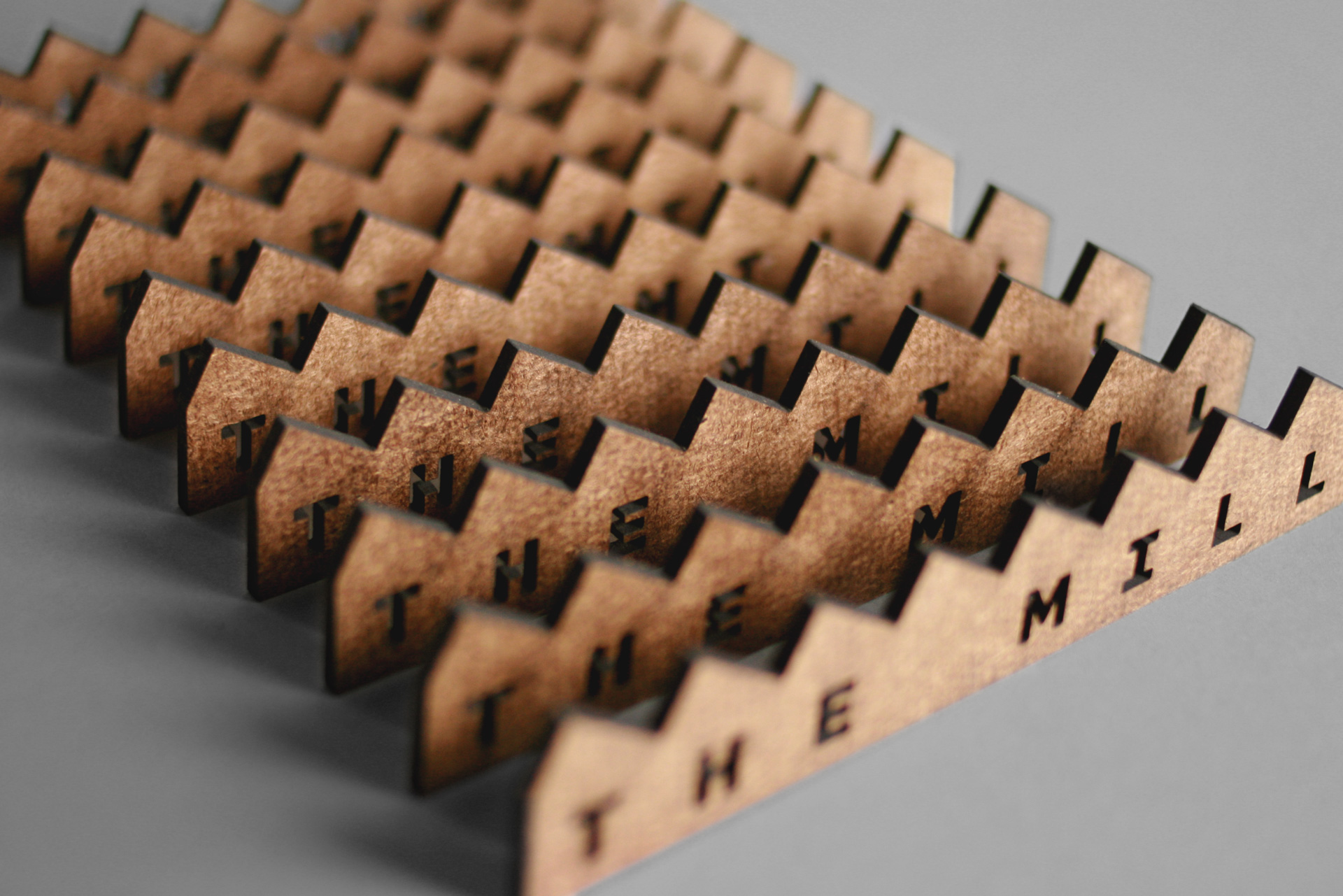
I really like the idea of getting away from the traditional approach of a single symbol or logo representing a company and, instead, using a series of similar, recognizable elements to create the brand. It’s more work to do it that way and it requires a whole lot more day-to-day supervision to ensure its continued success, but I like the approach.
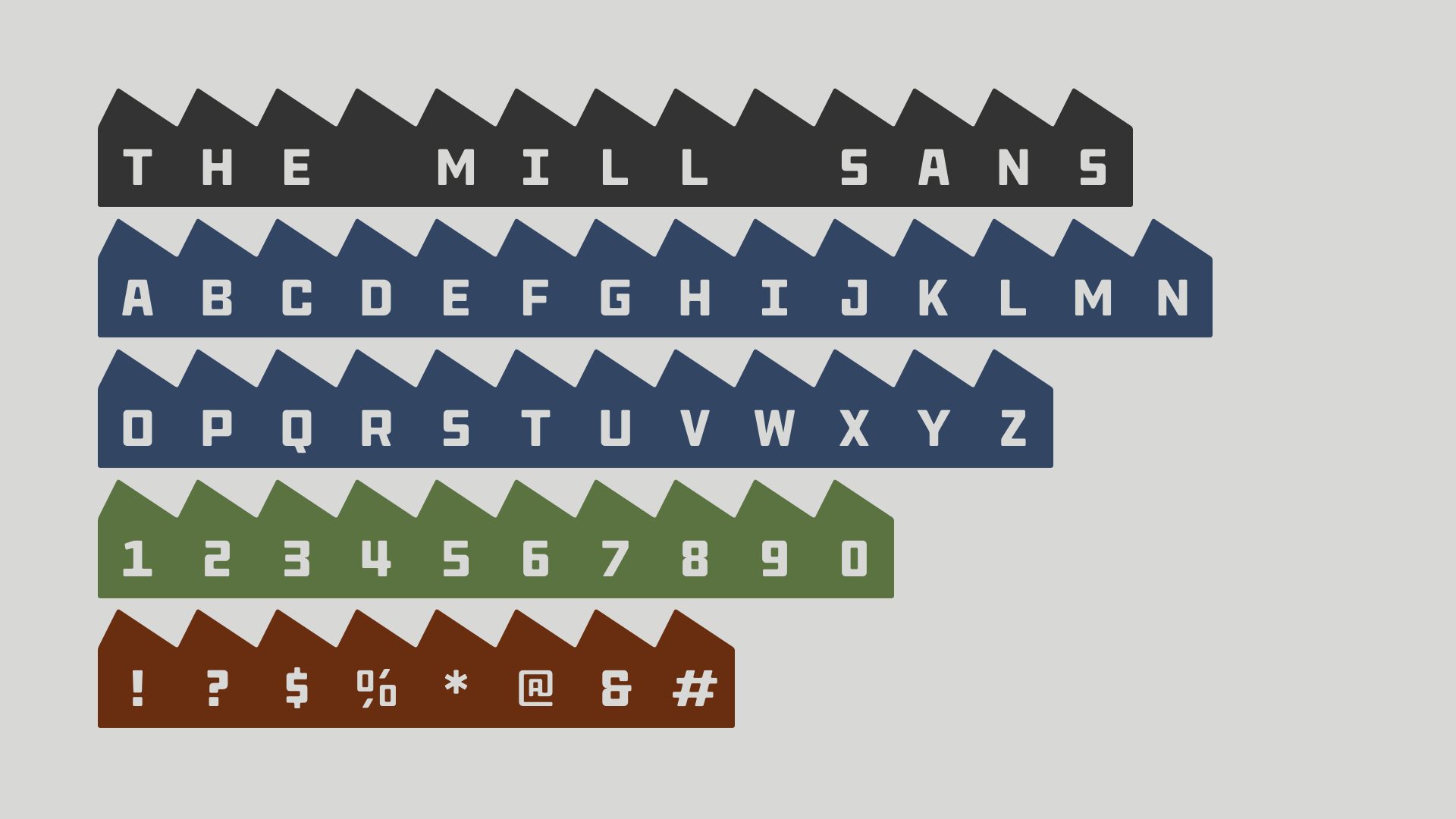
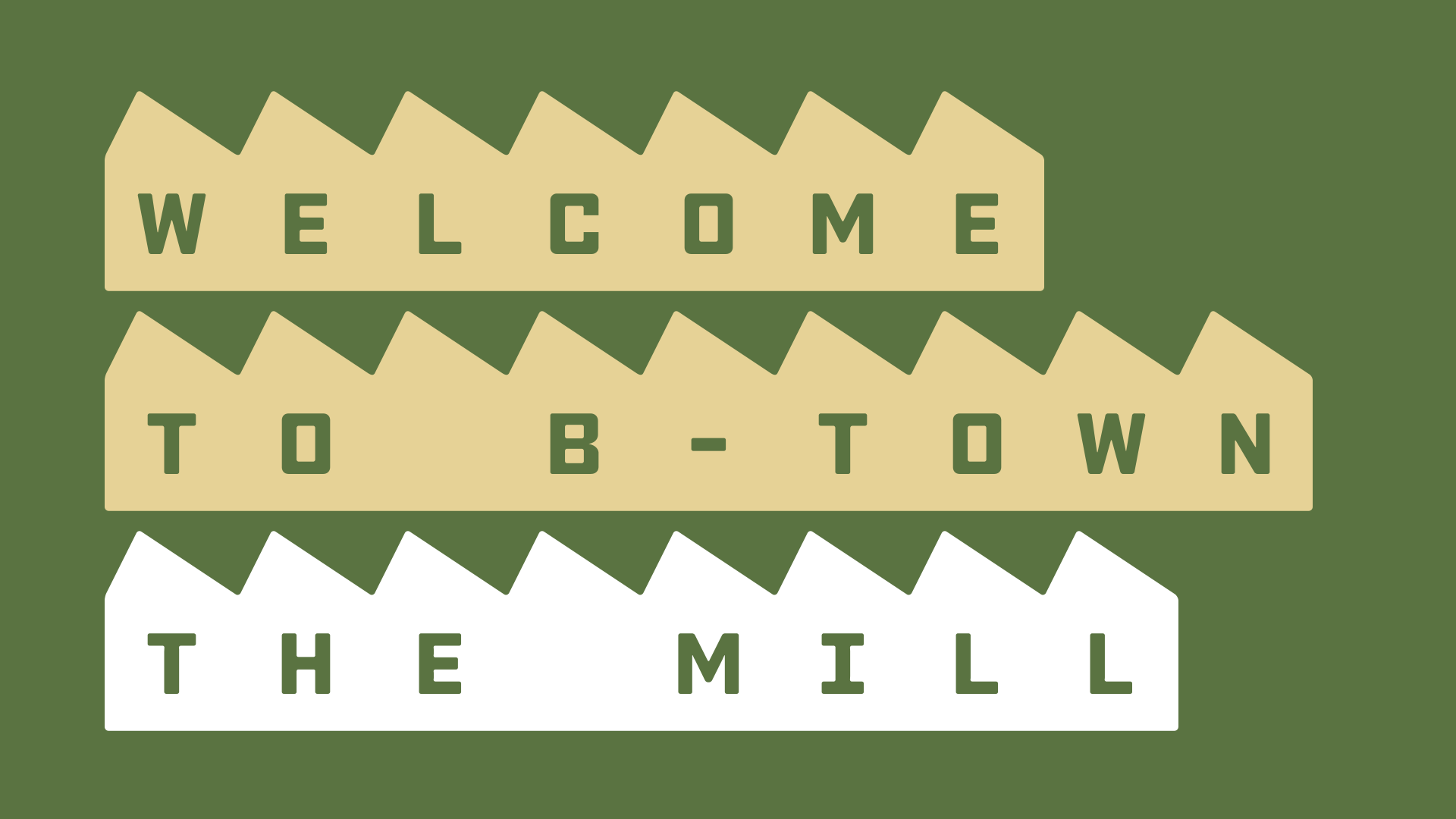
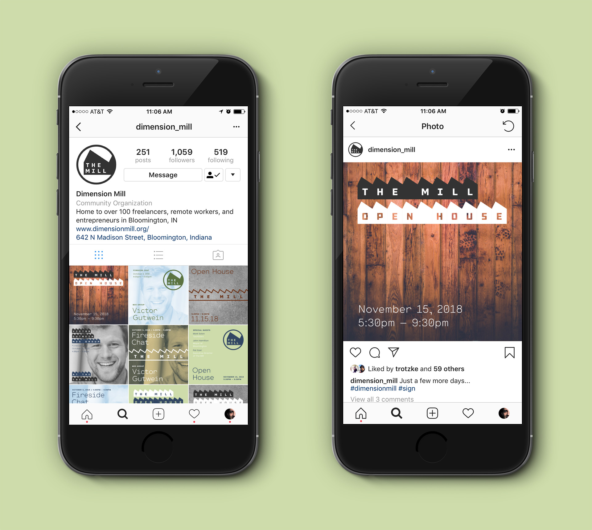
Having the motif/logo of repeating the roofline shapes of the buildings while simultaneously suggesting a saw blade at a mill that used to make furniture is a bit of genius — at least in concept.
Whether or not it all comes together and works might depend on the implementation. It might be easy to carry the idea too far, and just maybe all the examples shown suggest that. In reality, though, I suspect the implementation won’t be so ubiquitous or visually overpowering that it becomes annoying to those seeing it every day. Restraint could help. I think it’s growing on me.
First words that came to my mind were … abrasive … anguish , morbid … as in having been put through the mill.
This new start so mind blowing, here logo design is so amazing which is actually go with the flow. And table or desk design with mill logo very nice idea. Really appreciate it.
According to the pics there are only 3 peaks on the building, if it followed the actual roofline I think I’d like it better. More of an actual landmark. I really like the cups and the desk tho.
One of the links leads to the following. Apparently, the place is (or at least was) huge and really does resemble a long row of peaked roofs.

I came across this logo yesterday while researching for a project I’m working on.
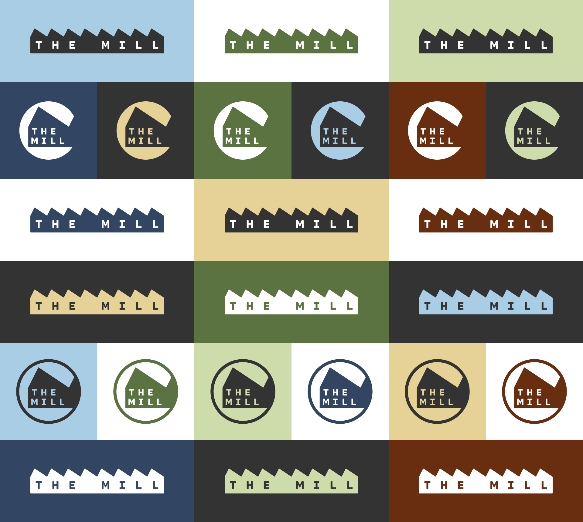
I like it all except the circular version.