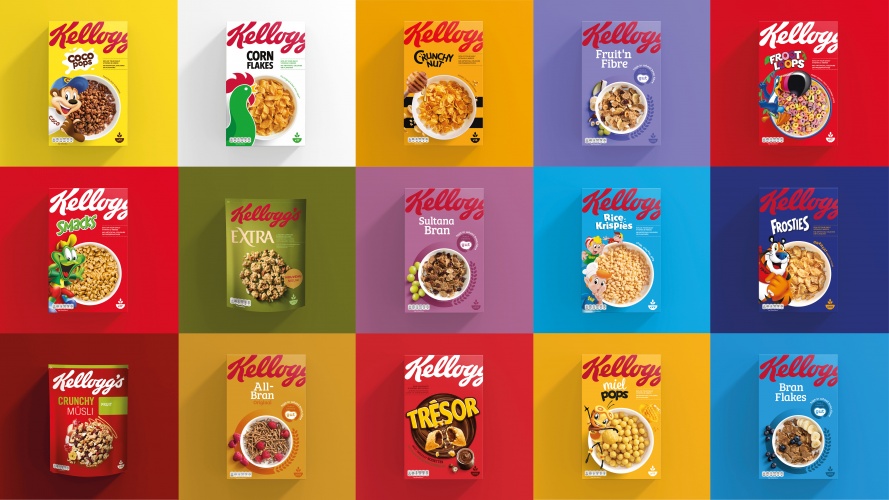
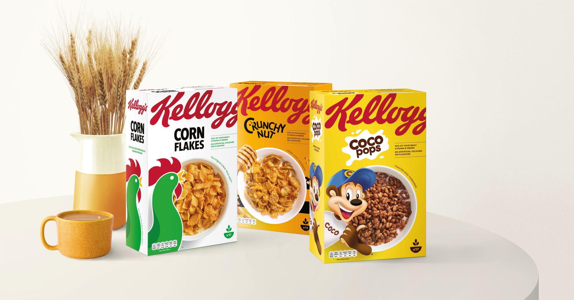
Kellogg’s new cereal pack designs created by Landor. The new bright and colorful designs help shoppers find the boxes faster on supermarket shelves. The box design focuses more on the food inside the box, and reduced the importance of the well known characters.
Simpler and clearer - seems to be a thing at the moment. Everything bigger and less clutter.
We should remember that it was Lemmy from Motörhead who said ‘Everything Louder Than Everything Else’. The man was a genius in ways even he could never know.
I don’t like the oversized/crowded-under brand look (looks a bit too much like the classic amateur space-fill mistake for my taste), but everything else is an improvement, IMO.
I can’t say I like the Kellogg’s logotype being so large that it no longer fits on the box and completely loses its last letter off the side.
When all the boxes of all their cereals are seen together, there is some nice brand consistency in the similar packaging. However, I’m not entirely certain that the parent company’s brand consistency is a major marketing plus when it comes to selling individual cereals. Then again, they’ve maintained the branding consistency of those individual products by incorporating the mascots for most of the cereals that they’ve used for many years.
Honestly, though, I’m not sure I would have even noticed this redo. Kellogg’s, along with most food-related companies, seems to so regularly tweak their packaging that it no longer registers.
They look very nice in this presentation.
On the cereal aisle shelf? Eh. I don’t think they did themselves any favors, especially when shelf real estate is by brand. Once you find the Kellog section, it’s all about the name of the cereal which is pretty much the tertiary element in all of these.
Damn, we’re a hard to please bunch. LOL.
They all look the same to me. A great vast blur as I go down the aisle for the Sue Bee Honey they keep with the waffle mix in that aisle.
My first impression is that I like the unity and simplicity.
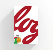
Pretty surprised to see the Kellogg’s logo cropped like that. I’d bet the agency told them the crop “presented the brand in a dynamic, fresh light to register with a younger generation.” Or something like that.
Also surprised to see they changed some of the names (e.g. Frosted Flakes is now Frosties). Maybe that happened a while ago. I’m not the grocery shopper in our family.
I usually like cropped off elements, but it looks forced here. It’s not balanced by the rest of the design, it’s just hanging off the top for no reason. Also second “g” is too cropped. Wondering if it wraps around or just ends there and has a small logo on the side like it is on the left side… Ok, apart from the crop I actually like the clean design and color variation with the placement consistency from one product to the other.
Having said that, I wouldn’t buy this cereal based on the packaging, even if it’s not true my brain always associates sleek clean design with extremely processed and unhealthy food.
Design is pleasant, helps create a branded family look in a space that is historically individually branded products. However this is a risky move.
When I think of Frosted Flakes, I don’t immediately think of Kellogg.
When I think of Smacks, I don’t immediately think of Kellogg.
When I think of Rice Krispies, I don’t immediately think of Kellogg.
When I think of POPs, I don’t immediately think of Kellogg.
If I were to ever have a ‘bad’ experience with one of these cereals, I wouldn’t immediately blame the Kellogg brand.If I were to ever desire another cereal to throw into my personal breakfast cereal rotation, I might unknowingly choose another Kellogg brand but still think of it as something ‘different.’
Even though the Kellogg logo has always been featured on the front of their products, its was very much a secondary/tertiary visual element. Now with it being the most prominent visual element on the package, I think this forces that thought process to change for the consumer.
Positioning a companies products to be individually branded is a strategic move - it allows for ‘more horses in the race,’ and providing the consumer a perceived wider array of brands to choose from.
Imagine if all of the Kraft owned Pizza brands (that’s almost all of them btw) displayed a large Kraft Logo on the front instead of small on the back. Or if all products owned by Coke decided to display a large COKE logo on the front of everything (vitamin water, smart water, bai, mello yellow, etc) instead of small on the back.
I’m sure this was a decision they didn’t take lightly. I’d be interested to see how consumers, and the market as a whole, responds.
I’ve worked with several corporate and government clients over the years who want to enhance their parent brand. This happens mostly because the larger corporation is what the corporate leaders deal with. Their customers, however, are mainly only concerned with and familiar with the child brands they actually use or buy, which creates a fundamental viewpoint disconnect with the corporate executives and their audiences.
When this problem has arisen in the past, I’ve asked them if they’ve ever heard of Yum? Hardly anyone has. Yum, however, is the parent company of Pizza Hut, Kentucky Fried Chicken and Taco Bell. These are three strong, well-recognized and seemingly independent brands. Yum has been smart enough to not muddy the branding waters by promoting the parent Yum brand at the expense of their child fast food brands.
Kellogg’s might be in a very different situation, since the parent brand is well-known. But I doubt hardly anyone buys cereal just because it’s from Kellogg’s, so why Kellogg’s wants to promote their parent brand ahead of their consumer product brands, I don’t know. Maybe they have a good, data- and strategy-driven reason for doing so, but I wouldn’t be at all surprised if it’s just another example of corporate management focusing on the wrong thing.
At this level, I’m sure they have a strategic reason. It could be as simply as cross-selling other Kellogg cereals. A consumer could go to the store for Frosted Flakes and subconsciously decide to try another Kellogg cereal based on their like of Frosted Flakes when they see the billboard effect the new design will have on a store shelf. I’m not saying that’s the reason, but a possible example of their thought pattern. I have to believe these went through focus groups and testing before hitting the general market.
My client’s aren’t quite at the Kellogg level, so maybe I am giving them more credit than what is deserved. From what I’ve read, though, if a change is made in the packaging that results in a 1% drop in sales, heads roll. So I’m assuming they’d test this before a market roll out. But I’ve been wrong before, and I’ll be wrong again.
You know, a lifetime of paying attention to these kinds of things has led me to believe that there’s not a whole lot of difference is good judgment between those at the top of the ladder and those only halfway up.
Those on the top rungs might be better at ladder climbing, but that’s about it. They’re also prone to confuse their ladder climbing ability with general competence and good judgment. But in reality, they’re often not much smarter or less prone to screw-ups and stupidity than the people vacuuming their offices.
It’s just the first step in becoming as ubiquitous as coca cola by phasing out the unimportant details and expanding the name to a symbol.
In 50 years, when kids are waking up every morning to their bowl of log, you’ll look back on this moment as a turning point in history. Every cereal by that point will be called log, similar to the way people refer to all sodas as “coke”.
The names of the cereal aren’t even important, because by then- any kid’s ability to read will have rapidly declined and emojis will be used everywhere.
In the 70s in the UK Kellogs ran an ad campaign (billboards, bus stops, etc.) with just the ‘K’ from the logo. It was held as a stellar example of superior advertising, only possible for a mature brand with nothing to prove.